Formulas Part 2: Variety of buttons
Formulas become particularly interesting when they are used to trigger variable commands – and the trigger is a button. Buttons are a sophisticated tool for incorporating automation, especially in RagTime forms. With buttons, the user of the document can see what they are doing (without always knowing exactly what is happening in the background). That is exactly what we will explore in this chapter.
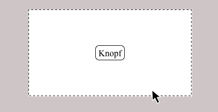
Among the various RagTime component types, buttons play a special role. They cannot be opened directly via the Inventory, but they can conceal an enormous range of functions. The best way to do this is to take a button directly: define a frame with the content «Button» in a layout. Double-clicking in the frame (not directly on the button) opens the «Button Information» panel.
If the button component is placed in a spreadsheet cell, the button is often the same size as the cell itself. In this case, it is impossible to click in the frame, and each click on the button triggers what is defined as the button command, but does not open the «Button Information» panel. To open the information panel, you must hold down the
“/6 key while double-clicking the button.
On the «General» panel you will find a selection of button types that have different areas of application: a simple or invisible «Button» – we will come back to the latter later – triggers an action. The type of action can be vary greatly – with a few tricks, it is even possible to trigger multiple actions. A «Checkbox», on the other hand, is an On/Off or Yes/No switch. Checkboxes can be used for questions with multiple permitted answers, such as “Which sports do you practice?” A separate checkbox button must be defined for each possible answer.
With buttons of the «Radio Button» or «Pop-Up Menu» type, only one of several options can be selected at a time.
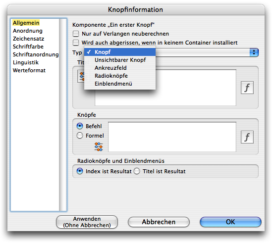
This button is used to make a selection that always automatically overwrites the previous one. These button types are therefore suitable for asking questions such as “Which of these colors do you like best?” in a form, i.e., whenever only one of several suggested answers is allowed.
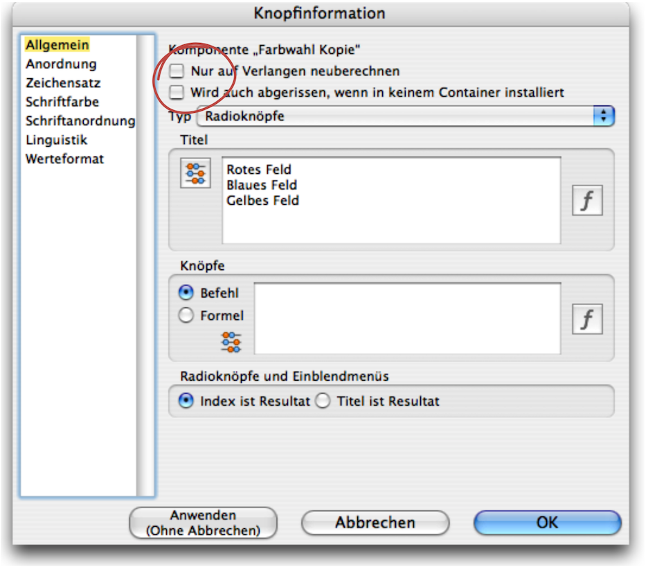
Let's take a closer look at the other settings in this panel. You will rarely use the two options at the top. The first option allows you to prevent button text from being recalculated until you explicitly allow it with «Extras ➝ Calculation ➝ Calculate All» or «➝ Calculate This Component». The second option is only used in those rare cases where a button is included in the Inventory of a RagTime form block but is not used in any layout. If this option is not activated, the button would be missing in the document torn off from the form block.
The following two fields, «Title» and «Buttons» are more important. In the «Title» field, you can directly enter a fixed text that should appear in the button. For pop-up menus and radio buttons, a multi-line text is entered. For each line of text entered, a radio button or a separate line will appear in the pop-up menu.
The option to calculate these texts is interesting. In this case, the button with the abacus  must be activated – it is dark when active. Now a formula can be entered in the white input field. For the simple button, this is usually a reference to a cell or an «If» function that selects between two texts.
For pop-up menus/radio buttons, you usually need to enter the reference to a column or row of a spreadsheet here. Only as many radio buttons or menu lines are created as there are cells with content in the specified range.
In the «Buttons» field, you can specify which action should be triggered when simple and invisible buttons are pressed. If you select the «Command» option, you must specify an existing menu command that should be executed when the button is pressed. The spelling must match the menu command exactly. On Macs, AppleScripts integrated as commands can also be called up in this way.
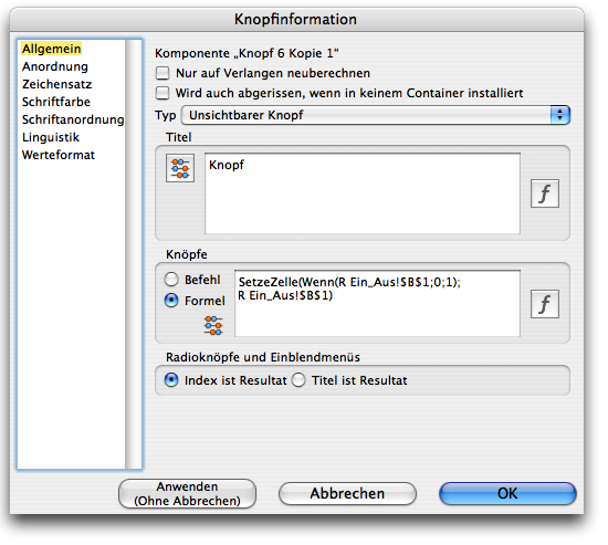
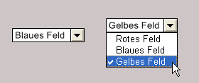
For pop-up menus and radio buttons, you must specify which value should be returned when the button is referenced in a formula. For example, if the texts «Red, Blue, Yellow» were entered on separate lines and the second radio button is active, the reference to the button with «Index is Result» returns the value 2. If the «Title is Result» option is selected, the value «Blue» is returned. Which option you choose depends on your application. To make calculations dependent on the selection made with the button, the index is certainly more suitable.
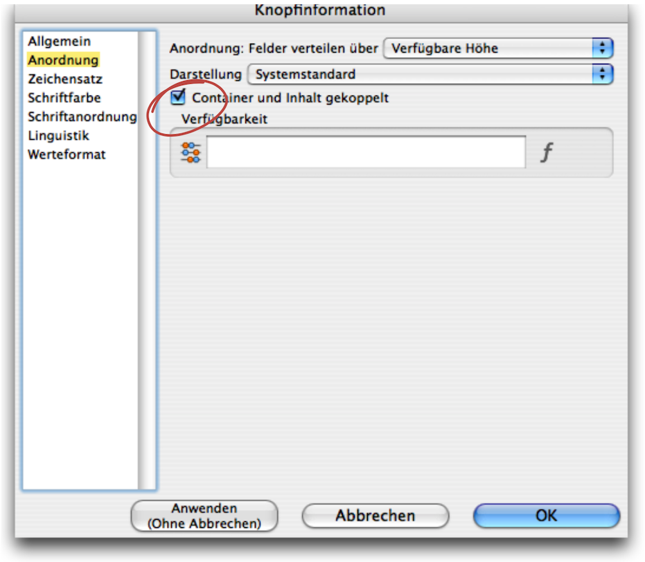
The «Arrangement» panel allows you to determine how the buttons are displayed. Under «Distribute Fields Over», the drop-down menu offers the options «Available Width», «Available Height», «One Row» or «One Column». These settings only apply to radio buttons and define their display width or height. The «Connect Container and Contents» option ensures that the size of the button is always identical to the frame size for normal buttons. Enlarging and reducing the frame therefore scales the button at the same time (similar to image containers and images). We will discuss the «Availability» function in more detail later. The remaining settings relate to the button text and are self-explanatory – they work in exactly the same way as for text.
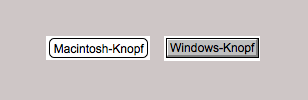
Under «Appearance», you can choose whether the buttons should be displayed according to the system standard of the respective computer or according to the standard display on the Mac or Windows platform. There is a significant difference in the appearance of the buttons (see Fig. F-2.6). With «Appearance», you can decide whether your document should look the same everywhere, or whether users should see the buttons as they are familiar with from their usual user interface.
It is extremely important to have a good overview, especially when it comes to buttons. Because buttons are always linked to spreadsheet cells or ranges or referenced in formulas, it is important to give each button a logical and memorable name. Since each new button is simply listed as «Button» in the Inventory, you can quickly end up with a jumble of «Buttons». While other components can be opened in the Inventory by double-clicking, this is not possible with buttons, which makes a quick “inspection” impossible. Meaningful names are therefore essential for identifying buttons.
And once again on the subject of checkmarks in the Inventory: we recommend not checking buttons so that valuable formula work is not accidentally deleted.
As with hardly any other RagTime component, it is worthwhile creating an archive for buttons. The prerequisite for this is that each button is precisely documented in terms of its function. When archiving, do not forget to copy all components that the button refers to in any way.
Normal or invisible buttons trigger an action when pressed. This means that they do not have a status that can be queried. The status or value of the other button types, on the other hand, can be queried in formulas in exactly the same way as the content of a spreadsheet cell. The reference to the button is «Name of the Component» followed by «X». The easiest way to do this is to simply click on the button when entering the formula, as you would for a cell to be referenced. RagTime 7 then inserts the correct reference into the formula.
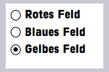
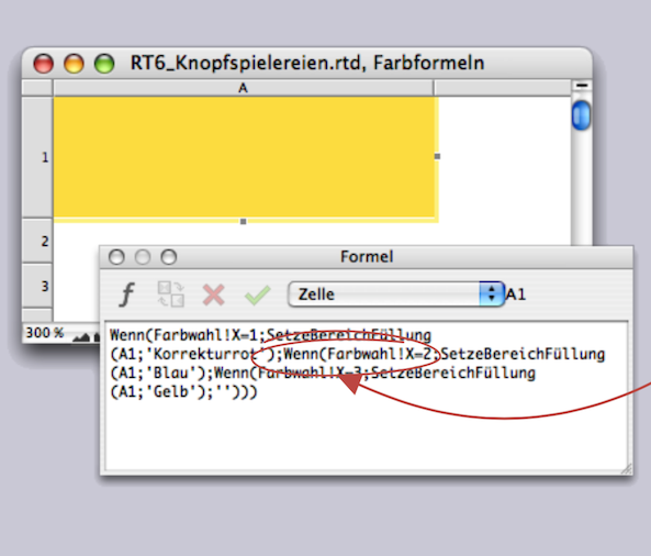
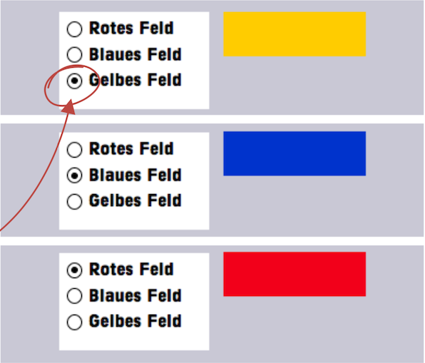
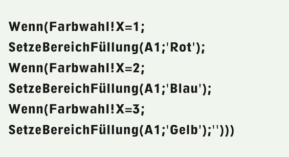
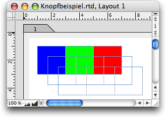
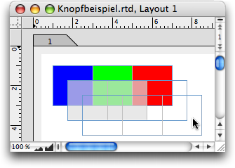
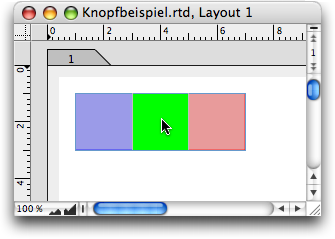
Checkboxes return the value 1 or 0, depending on whether the box is checked or not. Radio buttons and pop-up menus return either the selected text or its index in the table, depending on the settings in the «General» panel of the button information. The index, which corresponds to the order of the entered terms, can then be used to trigger another action. Here is a simple example with colored areas. We have created a radio button. In the «General ➝ Title» Field, “Red Field,” “Blue Field”, and “Yellow Field” are listed one below the other. The reference is set to «Index is Result» (see also Fig. F-2.3). Then a spreadsheet has been created, which we have named «Color formulas». Cell A1 contains the formula (requires the RagTime extension «Power Functions»):
In Fig. F-2.9, the button is shown three times. Depending on which of the radio buttons is selected, the yellow, blue, or red fill appears in the spreadsheet cell next to it. Of course, this requires that the corresponding fill style sheets have been created beforehand and given these names.
Do you find the above solution to such a simple problem rather complicated? Then you are absolutely right! It is a good example of how choosing the right button option for the form of the result («Index …» or «Title is Result») can lead to a much simpler solution. In the solution above, three fill style sheets were defined with the names of the colors, while the names of the radio buttons were specified as “Red field” etc. Based on the index resulting from the button selection, the correct fill was assigned using the rather complicated Formula F-2.1.
If we had chosen the same names for the button texts as for the fill style sheets, and for the button option «Title is Result», the formula would have been short and concise:

If you do not have the «Power Functions» extension, the solution in this case is a little more complicated, but the formula is just as simple: create a drawing with a rectangle in the desired color in each of three spreadsheet cells, e.g., B1:B3.
The rectangle must be the same size as the cell to be colored, positioned at 0/0 in the drawing, and use the «Container Border» line style. For the button, select the «Index is Result» option. The formula in cell A1, which is to be colored, must then be:

Have you ever had a button missing from your coat? If you didn't have a spare button, it can be difficult to find the right one, even with a large selection to choose from. RagTime 7 makes it easier: design your own buttons! That's exactly what the «invisible button» is for. And even if it's only available as a standard button type, don't despair! In addition to pop-up menus, you can use it to create all types of buttons exactly to your liking! However, this requires a considerable amount of effort, so you will probably be satisfied with the buttons suggested by RagTime 7 in documents for your own use. But if you want to design something to present to others, you may be willing to invest some time in creating “customized” buttons.
In a drawing component, you can create a square drawing in the desired button size. Four polygons with a «Red Gradient» fill are used to form a button that becomes darker toward the outside, creating a depth effect (see Fig. F-2.10). Another smaller square frame with a 40% fill forms the center of the button. Using graphic text, write «Off», select the font and size, and center the text. Using the drawing command palette, you can now align two polygons to form an angle, group them, then center all elements and group them together. To remove the distracting lines in the button drawing, create a «Transparent» line style sheet and assign it to the group.
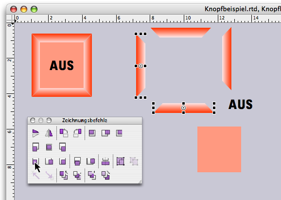
Now move the grouped button to the top left so that the top left corner is at the coordinates 0/0. In the Inventory, give this drawing the name «Z_OffKey». Make a copy of the component and name it «Z_OnKey». Then open this drawing component and change the button to green with the text «On» using new fill style sheets. To do this, you must first ungroup the components. You now have one drawing for the On button and one for the Off button (see Fig. F-2.11).
- Tip:
-
Experienced RagTime users will get the impression when skimming through this chapter for the first time that everything is very familiar. But there are certainly a few explanations hidden here that are new or have been forgotten. From the section Without “Power” it remains dark onwards, it is also worthwhile for experienced users to read on in more detail.
Of course, you could also have made round buttons with a color gradient, or the button surface could have been given a radial gradient. Or, instead of a drawing, you could have used a photograph of an empty button. Depending on the application and design environment, a wide variety of options are possible here. Let your imagination run wild!
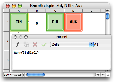
Now create a new spreadsheet component «R On_Off» in the Inventory. Open this spreadsheet and drag the drawing «Z_OnKey» from the Inventory into cell C1 and «Z_OffKey» into cell D1. Enter the following formula in cell A1:

Depending on the content of cell B1, this will bring the drawing from C1 or D1 into cell A1. Set the width and height of the four cells A1:D1 to the key size.
Now open a layout and drag the spreadsheet component «R On_Off» into the layout. Select «Drawing ➝ Object Kind ➝ Rounded Rectangle». Next to it, draw another rectangular frame, also with rounded corners, with the content «Button», whose size corresponds to that of the spreadsheet cells containing the drawings with the buttons.
For this new button component – let's call it «K On_Off» – «Connect Container and Contents» under «Arrangement».
In addition, the button must be invisible in our case, as the drawing underneath should be visible. So select «General ➝ Type ➝ Invisible Button» (see Fig. F-2.12). Under «Buttons», activate «Formula» and enter the following formula in the formula field:

In RagTime, the values «True» and «False» correspond to the numbers 1 and 0. The value written to the cell by the formula is therefore always the logical opposite of the current value, due to the use of the «NOT» function. This corresponds to the classic on/off function.
Use the keys to reduce the spreadsheet frame to the size of cell A1 and place the invisible button on top of it so that they are aligned. You will immediately notice that you still need to assign the «Transparent» fill pattern to the frame with the invisible button so that the button drawing behind it becomes visible. Group the button and spreadsheet frame.
Now your On/Off switch is functional! When you click on it, the On or Off button appears alternately in cell A1 of the spreadsheet «R On_Off», i.e., in the button itself. If you press «On», a 1 will appear in cell B1, i.e., the value «True» or «On»; if you press «Off», a 0 will appear, i.e., «False» or «Off». The status of the switch can be queried anywhere using the reference «R On_Off!$B$1».
Your On/Off switch functions exactly like a checkbox. However, when used in a document, it looks much better than a normal checkbox. A normal button without a changing image would have been somewhat simpler. An image or drawing with an invisible button superimposed on it would have been sufficient. And, of course, many other variations of an On/Off switch are conceivable. But now you already have a nice button for your collection.
Radio buttons / selection buttons with multiple options / can also be designed yourself. Since we already know how to add an image or drawing to an invisible button, we will make it easier for ourselves in this example and limit ourselves to colored areas. For your application, you should of course select symbols or images that correspond to the function of the button.
Draw a frame 6 cm wide and 2 cm high with a «Transparent» fill style sheet. Duplicate this frame twice. Then assign the content type «Spreadsheet» to the first frame. Name the spreadsheet «Color Selection» in the Inventory. Open this spreadsheet in a separate window and specify a size of 2x2 cm for cells A1:D1. Assign a fill style sheet (or your images or symbols) to each of the three cells A1:C1. We have used the three predefined colored fill patterns. Now drag the «Color Selection» spreadsheet from the Inventory into the other two frames. You have now created three frames of the same size with the same spreadsheet as content.
Click in the second frame in the spreadsheet and select the “Append layer” command from the spreadsheet menu. Select cells A1:A3 and set their fill pattern to «Transparent». Do exactly the same in the third frame: append layer, cells A1:A3 transparent. The three frames now each show one layer of the same spreadsheet. If you move the transparent spreadsheet frames on top of each other, you can see the layer below through the layer above (see Fig. F-2.13). This is exactly what we want to achieve in the end. The advantage of using layers in a spreadsheet is that the cells on top of each other must be exactly the same size.
The finished three-button button with the three options should only show the active color. The fields in layer 2 should cover the inactive color fields. This can be done with any non-transparent fill, but also with white («Normal Fill») with a transparency so that the colors, images, or symbols of the inactive fields are still slightly visible. Starting from the «Normal Fill», define a new fill style sheet «Opaque» with 70% opacity / this is a good value. To distinguish the opaque fill from the transparent fill, we have given the «Normal Fill» a light gray tone in the example document in Fig. F-2.14, so that the cells with opaque fill appear gray.
How should the arrangement work? Plane 1 contains the colors, plane 2 covers the inactive fields. Plane 3, at the top, contains invisible buttons. The following solution requires the «Power Functions» add-on.
To cover the inactive colors completely or partially, enter the following formula in cell A1 of plane 2:

The formula calculates its own fill style sheet depending on the value in cell A2. Only if cell A2 contains the value 1 does cell A1 become transparent and the color in plane 1 fully visible. If cell A2 contains a different value, the color is covered by the opaque fill of the second plane. Of course, in the condition of Formula F-2.6, it would also have been possible to compare with 1 instead of with the column index.
But then you wouldn't have been able to simply copy the formula to the right up to cell C1. Do that now / thanks to the comparison with «Column», the formula will adjust itself in each column without any further action on your part.
In plane 3 of the spreadsheet, select cell A1, assign «Button» as the content type, and open the button information. Set the button type to «Invisible Push Button» and enter the following formula:

Then activate cell A1 in the spreadsheet and copy it to the right to cell C1. Open the information for the buttons in cells B1 and C1 one after the other and correct the formula in each case so that the value used corresponds to the column index.
Now all you need to do is align the three frames (preferably using the «Drawing Commands» palette or «Arrange Objects» («Drawing ➝ Arrange Objects») and your color button is ready to use (see Fig. F-2.14 and Fig. F-2.15).
It is also possible without power functions – in this case with relatively little effort. You will also need a «Z Opaque» drawing that contains a 2 x 2 cm rectangle at position 0/0 with the «Opaque» fill style sheet known from the first solution. Create a «Transparent» line style sheet and assign it to this square. Place the drawing in plane 2, cell D1 of the «Color Selection» spreadsheet. Now all you have to do is adjust the formula. Instead of using the “power command” to control the fill directly, retrieve the opaque drawing from cell D1 as needed:

If you use buttons for user guidance in a form, RagTime 7 provides the option of preventing their use with the «Availability» setting. Going one step further and making it even more user-friendly is to only display the buttons when they make sense in terms of function or can be used. RagTime offers several options for creating such buttons. We explain three of them in more detail in the following sections.
Decken Sie den Knopf mit einem Rahmen ab, der eine Rechenblattzelle enthält. Versehen Sie sowohl Rahmen wie Rechenblattzelle mit der Füllvorlage «Transparent». In diese Rechenblattzelle wird nun, in gleicher Weise wie im letzten Beispiel, per Formel eine nicht transparente Zeichnung geholt. Mit der Erweiterung «Power-Funktionen» könnte auch in diesem Fall die Zelle direkt mit einer deckenden Füllung versehen werden. Sobald die Zellfüllung transparent ist, wird der darunter liegende Knopf sichtbar.
Cover the button with a frame containing a spreadsheet cell. Apply the «Transparent» fill style sheet to both the frame and the spreadsheet cell. Now, as in the last example, a non-transparent drawing is imported into this spreadsheet cell using a formula. With the «Power Functions» extension, the cell could also be given an opaque fill in this case. As soon as the cell fill is transparent, the button underneath becomes visible.
Here, the button is located in a cell of a spreadsheet and is only brought into the cell visible in the layout when it is needed. And that, in turn, is done by a button. That sounds complicated, so we will show you how it works in a practical example.
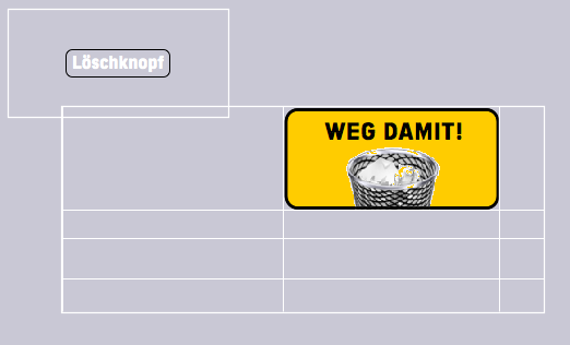
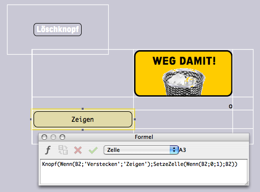
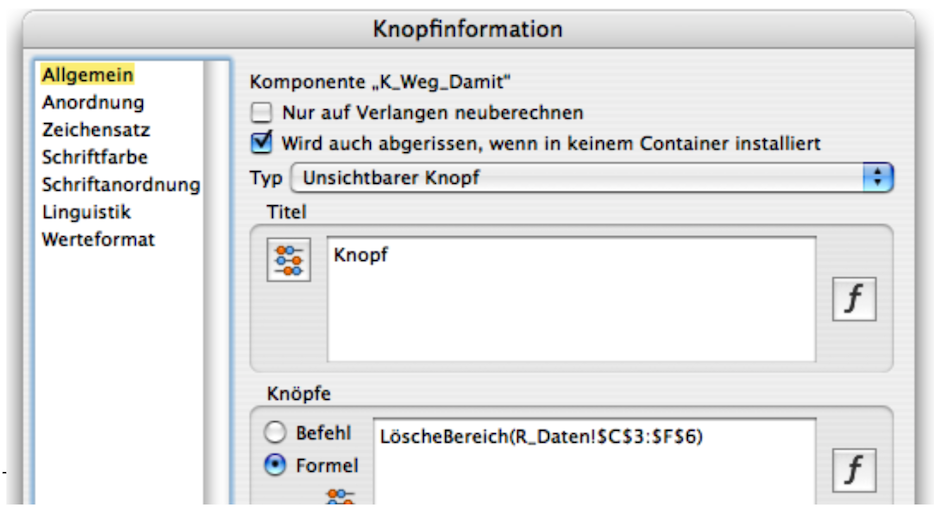
The goal is to create a delete button that deletes certain areas in a form when needed. Its button text is «Delete!». To prevent the button from being pressed unintentionally during daily use, it must first be retrieved. For this exercise, we have created a second button with the text «Show» or «Hide» if the delete button is to disappear again.
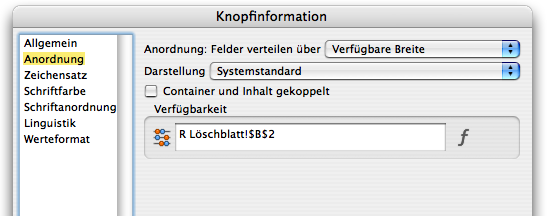
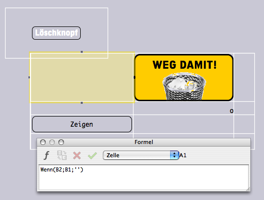
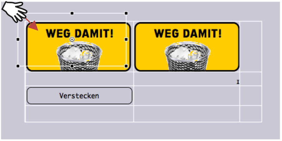
In Fig. F-2.16, we have the first “ingredients”: an invisible button (so that it can be shown in Fig. F-2.16, it is not yet invisible 😉 and it displays the text «Delete button») and a spreadsheet in which a drawing component with the image for our delete button has already been inserted in cell B1. We call the spreadsheet «R Delete_Sheet». The decisive control function for the show/hide operation depends on cell B2, whether it contains a «0» or a «1». The delete button refers to this cell. In the «Button Information ➝ Arrangement» panel, we see the reference to cell B2 under «Availability» (see Fig. F-2.17). The button is therefore only available if cell B2 contains a «1». Please note: The unavailability of a button does not cause it to disappear – it only prevents an action from being triggered when it is clicked!
However, we have an invisible button. To ensure that the image of the button is now also visible (and “magically” disappears again), cell A1 contains the formula which, as soon as the button is to be activated, retrieves the button drawing from cell B1 (see Fig. F-2.18):

Now back to the important control in cell B2. Whether there is a «0» or a «1» is determined by the other button with text «Show/Hide», which is housed in cell A3. This button is provided with the following formula:
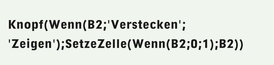
This gives us a double magical effect: the button itself is constantly regenerated by the formula. This button cannot be found in the Inventory and does not allow you to open an information panel. In the reference, the button function is described as «obsolete». However, we find it practical. The button generated in this way is always the same size as the cell in which it is located. However, there are no design options for a button created in this way (see Fig. F-2.19). Reminder: if a formula begins with «Button» RagTime creates a button. In our case, with variable button text, depending on whether cell B2 contains «0» or «1».
When pressed, the value in cell B2 is alternately set to 1 or 0. A button like this is a must-have for your collection. It can be used for all kinds of actions, assigned other tasks and button texts, and is of course much simpler (in terms of effort and result!) than the On/Off switch we created and designed at the beginning of this chapter, but it serves the same purpose!
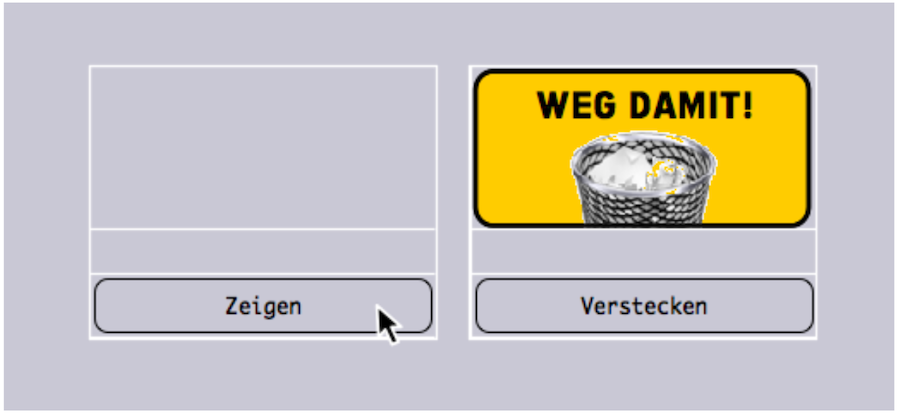
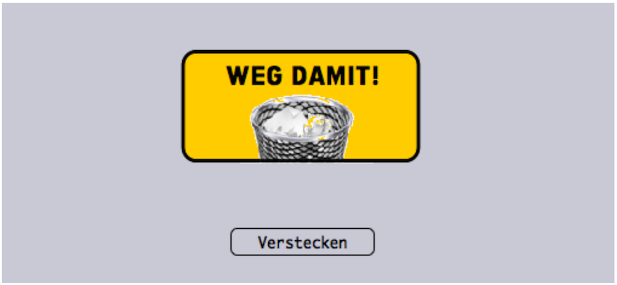
The functions are set, now all that remains is to sew the button on neatly: place the now truly invisible button exactly over cell A1 (see Fig. F-2.20), set the spreadsheet frame and cell to transparent fill, and deactivate the cell grid for both printing and the screen. Then reduce the size of the frame so that only cells A1:A3 are visible. In Fig. F-2.21, we have duplicated the entire arrangement to illustrate the action. Click on «Show» on the left button; A1 is empty. Click on «Hide» on the right button to make the button in cell A1 disappear. Finally, if you want the «Show/Hide» button to be located somewhere else in the layout, you can of course place it in a separate spreadsheet and in a smaller cell (as in Fig. F-2.22 – but then check/adjust the references again!). What the «Delete!» button itself can trigger is described in the section after next, Delete, but selectively.
As a third option for making a button disappear or appear: place a button in a spreadsheet that is not present in any layout – i.e., only in the Inventory. Then you need to reference the corresponding cell in the layout, in the visible spreadsheet. This works in exactly the same way as when you retrieve a text module or an address from a spreadsheet that serves as a database (see also chapter 2.5.6 “Mail merge with selection”).
But be careful. When you create such references, it is essential that the option «Torn Off Even If Not Installed in Any Container» is selected in the «General» panel (see Fig. F-2.23). Otherwise, the button may actually disappear – but unintentionally …
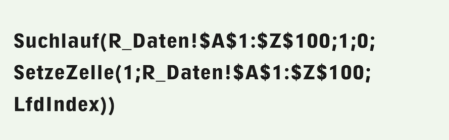
Now that you have created the «Delete!» button, we will show you how and what can be deleted with it – after all, it is supposed to be a delete button that deletes certain areas in a spreadsheet on demand. The simplest solution: in the button under «General ➝ Buttons», click on «Formula» (see also Fig. F-2.23) and enter the following in the formula field:

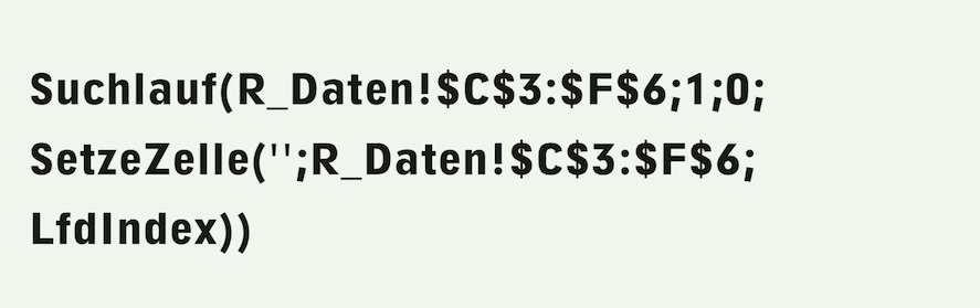
It goes without saying that the Inventory must contain a spreadsheet named «R_Data» and that the area to be deleted at the touch of a button must comprise cells C3:F6. The delete function described above can also be implemented without «Power Functions», in this case with a relatively simple search (see Formula F-2.12). Nevertheless, we prefer the previous, more readable formula with the «DeleteRange» function.
And in the next example step, it becomes clear that the RagTime extensions «Power Functions» and «MetaFormula» are actually indispensable for anyone who frequently works with formulas in spreadsheets! In the search, the specified range is searched cell by cell and deleted with the «SetCell» command.
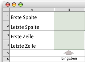
It is not always possible to define a deletion area precisely. Sometimes the boundaries of the area must be kept variable, e.g., with an input option. This requires a few specifications in a spreadsheet, which the delete button can then refer to. For simplicity's sake, create a new spreadsheet and call it «R_DeletionArea» (see Fig. F-2.24). Of course, the functions described below can also be included in another existing spreadsheet.
By entering a letter in B1 and B2, the columns are entered, and by entering a number in B3 and B4, the rows of the area to be deleted are entered – according to the explanatory texts in column A. These entries are then used in the deletion formula. However, this is not entirely straightforward, as an area in a formula cannot normally be defined with variable references. This time, the «MetaFormula» functions, together with the «Power Functions», come to the rescue!
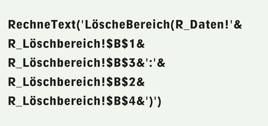
Formula F-2.13 must then be entered in the formula field of the delete button («Button Information ➝ General ➝ Buttons/Formula»), which RagTime uses to calculate the entered range and execute the delete function. It is interesting to note that the range is first compiled from the entered values as text. This text is then interpreted as a formula using the MetaFormula function «CalculateText» and calculated. The familiar Power Function «DeleteRange» is used in the formula compiled in this way. Thanks to the use of the two RagTime add-ons, Formula F-2.13 is quite easy to read. The arrangement is now complete!
At this point, it should be noted once again that this book assumes the availability of the RagTime extensions «Power Functions» and «MetaFormula». These small add-on programs expand the functionality of RagTime in many ways. They are a must for anyone who works extensively with formulas and functions. The delete function described above can also be implemented without PowerFunctions and MetaFormula. However, if you are not very familiar with search runs, it is better to avoid such “gymnastics” because the interpretation of the corresponding formulas will remain “in the dark”. The procedure described below and the formula used are a good illustration of the usefulness of Power Functions on the one hand, but also of the nesting of search functions on the other. These are explained in the chapter “Formulas Part 3: In full swing”.
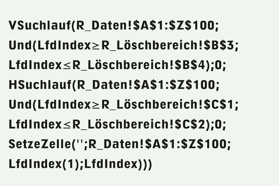
Without Power Functions, it takes a lot more power! First, the columns specified in letters that delimit the area to be deleted must be converted to a numeric column index, i.e., C=3, F=6. We don't want to make the example unnecessarily complicated, so we'll limit ourselves to a formula that can only handle columns A-Z and rows 1-100, i.e., no column addresses with more than one letter. Enter the following formula in cell C1 of the «R_DeleteArea» spreadsheet:

The code for the letter «A» is subtracted from the code for the letter entered. Adding 1 gives the numerical index for the column specified by the letter. You still need to copy the formula into cell C2. That was easy. The delete command for the button, on the other hand, is quite complicated. Unfortunately, the formula window for the button information cannot be enlarged. First test complex formulas that you want to assign to a button in a spreadsheet, preferably in a new one. This way, all references will be as they need to be when you want to transfer the tested formula to the button. However, you must delete the test formula in the spreadsheet after transferring it to the button, otherwise it will continue to be executed, not only at the push of a button, and you will wonder what exactly is happening. To make corrections to the formula afterwards, you must transfer it back to the test spreadsheet. When you have finished testing, you can delete this additional spreadsheet.
In order to not only check the syntax of the formula, but also to actually test it, it is advisable to create a second button that you can use to fill the test area. Give this button the title «Fill» and the Formula F-2.15, which does not need to have variable area limits for this purpose.
Regarding the formula for the delete button (Formula F-2.16): An outer vertical search runs through the range A1:Z100 row by row. Only for the rows that lie within the specified range is the inner horizontal search executed, which in turn runs through the relevant row from column A to column Z. Only for the columns that lie within the specified range is the SetCell command then executed, which addresses the row of the cell to be deleted with the current index of the outer (vertical) search, and the column with the current index of the inner (horizontal) search.
You can find out more about the search functions and their enormous capabilities in the chapter “Formulas Part 3: In full swing”.
A comparison of formulas Formula F-2.13 and Formula F-2.16 will convince even the most frugal RagTime users of the usefulness of the “Power Functions” and “MetaFormula” extensions. The investment pays for itself very quickly if you work with formulas.
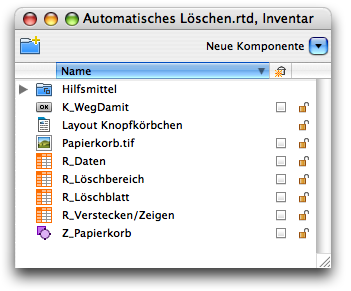
At work, we often focus on individual steps. It is easy to lose sight of the big picture. So let's take another look at the Inventory (see Fig. F-2.25).
The individual nesting levels and formula references can be quite confusing. So we have a button in the Inventory named «K_Delete». This button is assigned the image «Trash.tif», which is combined with the yellow background field and the graphic text in the drawing component «Z_Trash». The entire button is inserted in the «R_DeleteSheet» spreadsheet. This is also where the references that make the button visible/invisible are located. The control for this can be found in the «R_Hide/Show» spreadsheet in the corresponding formula. The actual delete function in Formula F-2.13 refers to the spreadsheets «R_Data» – in which certain areas are to be deleted as desired – and «R_DeleteArea» – which is used to enter areas to be deleted individually. This is also a button that you should add to your button collection so that you can use it when the opportunity arises.
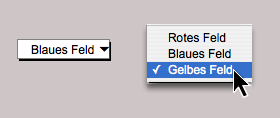
This chapter would be incomplete without an example using a pop-up menu button. Instead of the radio buttons shown in Fig. F-2.4, a pop-up menu button could have been used, as already mentioned there. Radio buttons require more space in the layout, but have the advantage that all possible options are always visible. The pop-up menu (see Fig. F-2.26, Mac or Fig. F-2.27, Win), on the other hand, only shows the current selection (left), unless it is expanded (right).
The ability to nest pop-up menus is particularly interesting. Why is this needed? To make a rough selection first, and then a fine selection. Let's first consider the two-dimensional case: a first pop-up menu is used to select between several items, and a second pop-up menu is used to select between different versions of the item selected in the first pop-up menu.
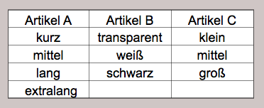
For simplicity's sake, we will create a spreadsheet called «R_Articles» in which items A, B, and C are listed in row 1, and the variants of each item are listed in the cells below (see Fig. F-2.28).
We want to use a first pop-up menu to select between the three articles. In the second pop-up menu, the variants of the selected article should then be automatically offered for selection. In the first pop-up menu, we therefore enter the following simple formula in the «Title» field:

The first pop-up menu thus offers the items listed in row 1 of the spreadsheet for selection. For the title of the second pop-up menu, we can use the relatively unknown «Selection» function in the formula for this relatively simple case.
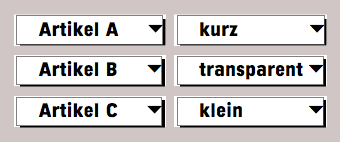
Its first argument is the index used to select the applicable range from the following list of arguments. In this case, the index is provided by the first drop-down menu. This means that the second pop-up menu automatically adapts to the item selected in the first menu (see Formula F-2.18 and Fig. F-2.29).

Fig. F-2.29 shows the first pop-up menu in all three positions on the left and the second pop-up menu with the corresponding selection, or rather its first line, on the right. You can use this arrangement to offer authors with their works for selection, or movie titles with the actors, or … The limits here are not the areas of application, but rather the complexity of the formula for the second button. Even for a private library (in the example with authors and works), the number of areas in the selection function would be far too large to be even remotely manageable.
But first, a quick note about component names in the Inventory: it is very tempting to simply call both the spreadsheet and the button for the first pop-up menu “Article.” We strongly advise against this! It may seem to work at first glance. But if you then try to adjust the formula for the title of the second pop-up menu, e.g. because one of the articles has more types of execution than initially assumed, RagTime will not accept the change because the referenced components with the same name cannot be distinguished from each other. That is why we use «R_Article» and «K_Article».
The formula with the selection function is very elegant, but as already mentioned, it is quite useless for more complex cases. Therefore, here is a more general solution: Define a new spreadsheet called «R_Execution». Column A should contain the execution types for the item selected in the first pop-up menu. They are transferred from the «R_Articles» spreadsheet to cell B1 of this spreadsheet using the following formula:
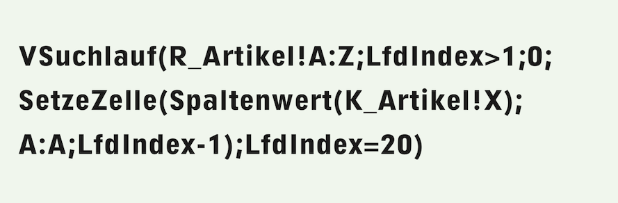
The formula searches for a range in the «R_Articles» spreadsheet that starts in column A but does not necessarily have to end in column Z. This right range boundary must include all columns filled with articles. With the condition «CurrentIndex>1», the header row, i.e., the article name, is skipped by the search. The «SetCell» function takes the value to be inserted from the current row of the search run from the column determined by the article selection made with the first pop-up menu. This value is inserted in column A, but one row higher, since the header row with the article is omitted here. The search also has a termination criterion, which is assumed here to be 20, i.e., with 19 possible execution types for an article. The formula for the second button is now much simpler and more general than in Formula F-2.18:

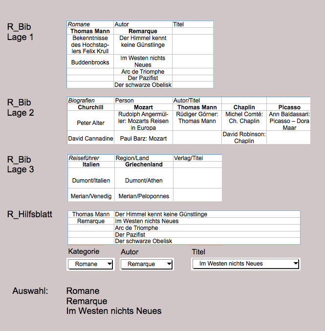
Would you like to categorize your books according to non-fiction, novels, biographies, travel guides, geographical works, etc.? We will use the «R_Lib» spreadsheet in which you have recorded your books. All non-fiction books are recorded in location 1, novels in location 2, and so on, with one location per category. When recording, we note that novels are best recorded by author, while non-fiction books are better recorded by subject area, and travel guides and geographical works by country. We do not want to pretend to be library experts here. The point is simply to use an illustrative example. See the overview in Fig. F-2.30.
- Tip:
-
With the example of book title management, we are entering the realm of advanced formula artists. Clearly, such calculations require several hours of concentration. But the result can bring many years of enjoyment and make work easier.
In each situation, enter the category name in cell A1, i.e., «Novels», «Non-fiction», etc. In cell B1, enter the second criterion used to differentiate within this category, i.e., «Author» for novels and «Person» for biographies, and in cell C1, enter the criterion for the third selection, i.e., «Title» for novels and «Author/Title» for biographies. In the following formulas, we will assume that the spreadsheet «R_Lib» contains 20 categories (layers), that the columns in the individual layers do not extend beyond column Z, and that the longest column is filled up to row 30.
Create a spreadsheet called «R_Helper». Column A should contain the values for the second pop-up menu, which are taken from row 2 of the location selected by the first pop-up menu in the «R_Lib» spreadsheet. In column B, enter the values for the third pop-up menu in the same way, corresponding to the selection made with the first and second pop-up menus.
Here are the formulas used to create these auxiliary tables. The formula used to insert the titles for the second criterion in column A is located in cell C1 – the selection of this cell is completely meaningless – and reads:
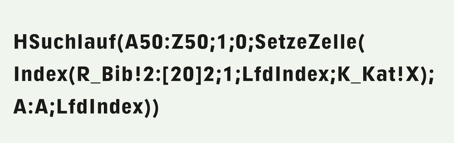
In this case, the search range is purely hypothetical – the cells in this range are irrelevant. It limits the search to columns A:Z in accordance with the task. Row 50 was chosen because it lies outside the range of interest. Row 1 would result in a «CIRC!» error because values would be inserted into the range defined as the search range during the search.
The target range for the «SetCell» command is column A of the auxiliary sheet, addressed with the current index of the search. The value used is taken from the index function of row 2 of the «R_Lib» spreadsheet. The row index is 1, since only this row is relevant. The column index corresponds to the running index of the search run. The position is determined by the selection made with the first pop-up menu.
Similarly, a second formula in cell C2 – the choice of cell is also irrelevant – enters the values in column B:
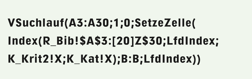
According to the task, values from rows 3:30 are to be taken from the spreadsheet «R_Lib». These row indices are used as boundaries for the hypothetical search range. The value to be used is taken from the range «A3:[20]Z30» of the «R_Lib» spreadsheet, with the row index corresponding to the sequential index of the search run, the column index corresponding to the selection made with the second pop-up menu, and the position corresponding to the selection made with the first pop-up menu.
The formulas for the titles of pop-up menu 2 are now very simple:

and the one for the third pop-up menu analogously for column B instead of A.
In order to know what is selected with each pop-up menu, we label them with graphical text. The first pop-up menu is always called «Category», while the other two depend on the category selected. The formula for the text for the second pop-up menu is:

and the one for the third analogously, with range reference to column C instead of B. The entire arrangement is illustrated in Fig. F-2.30.
Last but not least, let's display the selection we have made. For a graphical text, we enter this formula:
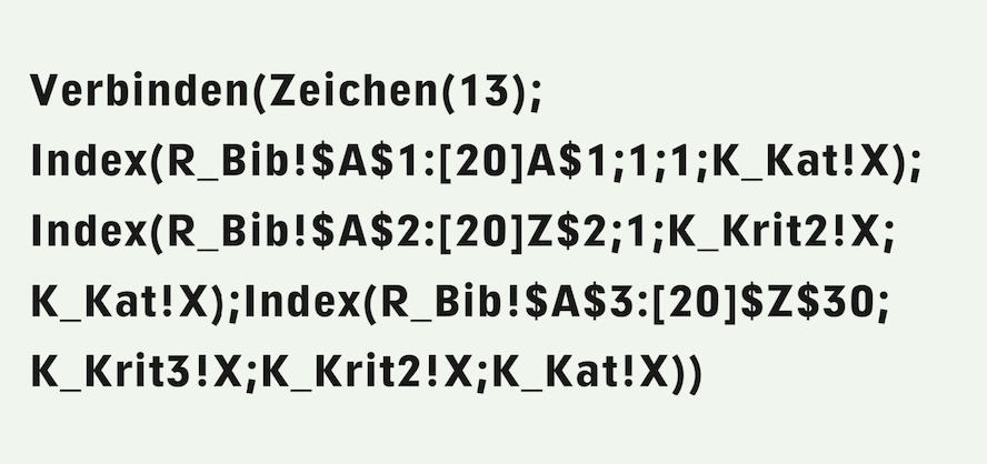
The «SmartConcat» function strings together the selected texts, which are retrieved from the «R_Lib» spreadsheet using the «Index» function. The values provided by the three pop-up menu buttons serve as indexes.
This gives you one more button for the collection. When it comes to buttons, it is worth examining all possible tangible templates and forms, opening the formulas, and checking how they can be modified and used for your own needs.
Become a button collector and create your own buttons, which you can then make available to other RagTime users via the RagTime Experts pages. There are always interesting examples to discover on the websites of RagTime, Pumera Publishing, and other sources (see appendix in this book). What could be better than a button that fits and works?