4 That's quite impressive
The best place to see how RagTime convincingly presents the texts, tables, diagrams, and layouts you have created is where presentations are part of everyday business: at a market research institute. Here, it becomes clear once again that RagTime's diversity can hardly be classified into standard categories. Finally, conduct your own opinion poll: evaluate your best presentation with RagTime.
At the market and opinion research institute MFA, the preparation and presentation of data is given just as much importance as its collection and analysis. Statistics are only one form of presentation; alongside them are charts and diagrams to clarify complex issues and illustrate trends. If you ask us for our opinion, this is exactly the ideal basis for presenting some new aspects of RagTime here.
Because presentation is an important task for MFAs, we devote considerable attention to the various forms of graphs in RagTime. It is impossible to show them all, but we also show an additional form that is created entirely without graph components. This is because in RagTime, every container can be “calculable,” or conversely, every spreadsheet can have a free form and thus become a chart. These can be city districts, the states of the Federal Republic of Germany, or the arable land of a farm with harvest statistics. There are no limits to the possibilities for presentation. We also focus on the special presentation format «SlideTime». This is a PowerPoint alternative for all those who have had enough of constant spinning, flashing, panning, and flipping. We want to prove that this form of “slide show” has its own power.
In the last part of this chapter, we deal with more extensive scientific reports. This includes automatic headers as well as footnotes, the table of contents as well as a keyword index, consecutive numbering as well as hyperlinks. In short: everything that needs to be clearly structured in extensive documents.
4.1 Hiking regions in a 3D view
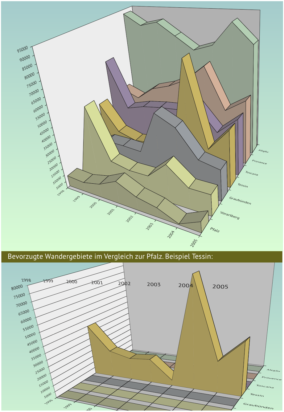
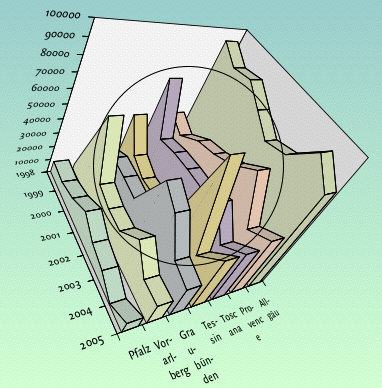
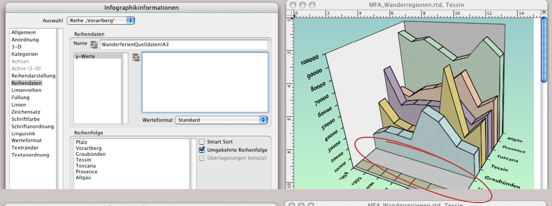
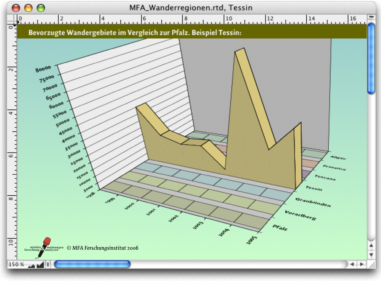
One of the numerous studies conducted by the MFA dealt with the popularity of hiking regions and their image profiles. First, quantitative studies of regular guests over a period of eight years were used to create a comparative chart. The regions were then to be examined in more detail, particularly with regard to significant increases or “slumps” and their causes. Of course, we are not primarily interested here in the hiking trails, inns, and sights, but rather in the appearance of the graphs in Fig. 4.2 and their structure.
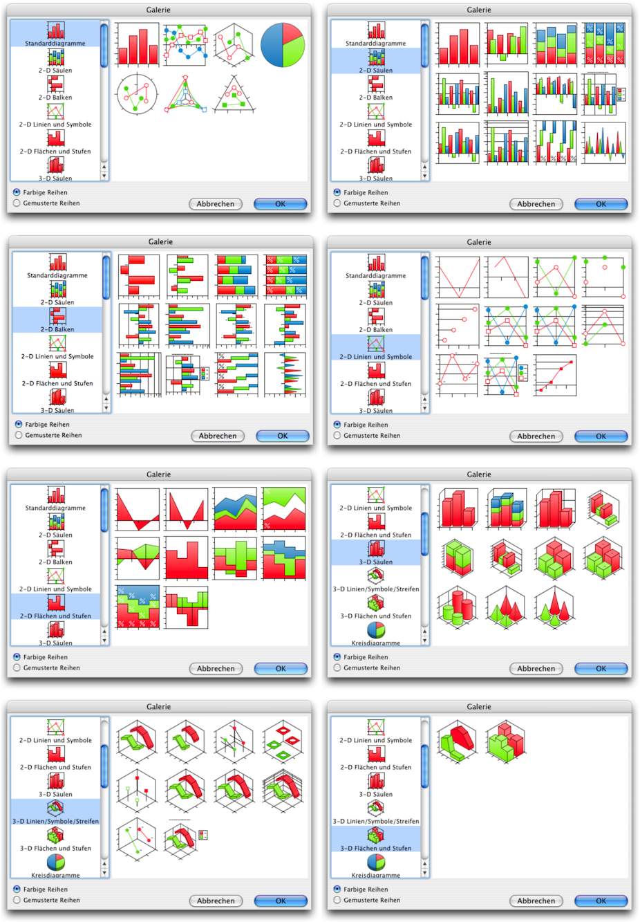
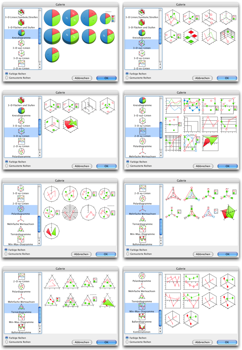
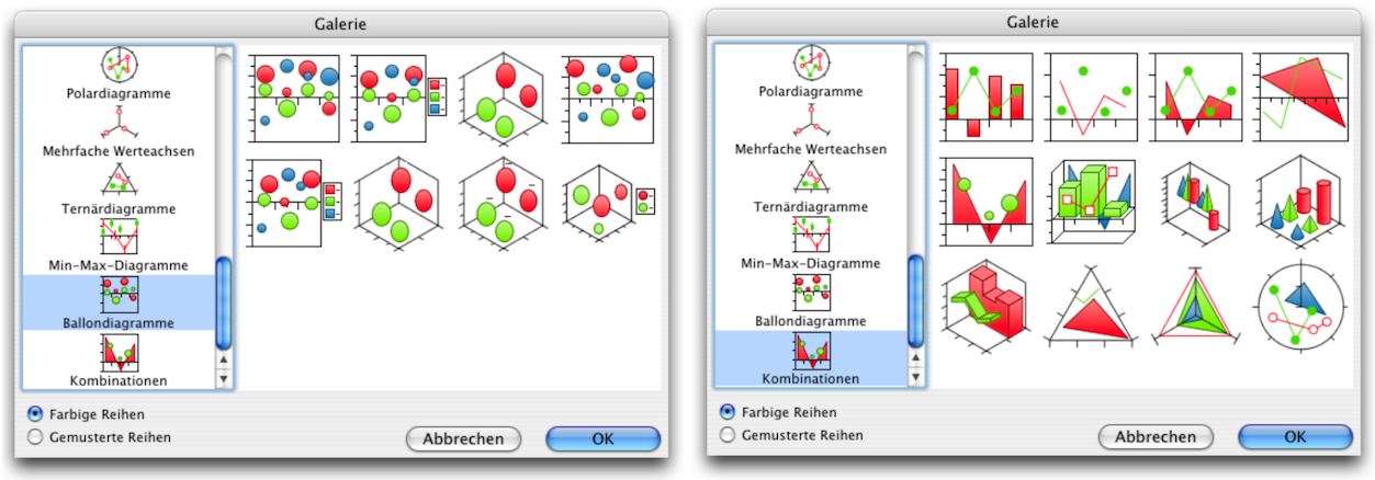
Under the menu item «Graph ➝ Gallery», a window opens where you can choose from over 150 standard chart types. Each of these chart types also offers numerous options for customization. The individual panels of the gallery are shown in the The famous population pyramid section. For the hiking region statistics, the 3D area chart was selected.
As with all other RagTime components, you can either build your graph systematically with clear ideas or proceed intuitively, try things out, and make changes later. Fig. 4.3 shows the same data content implemented with different chart types. Under «Graph ➝ Graph Type» and «Graph ➝ Dimensions of Graph» there are two drop-down menus that you can use to change your graph to a different display type at a later stage. The individual display types are not equally suitable for all data. It is worth trying them out and then deciding on your own standards.
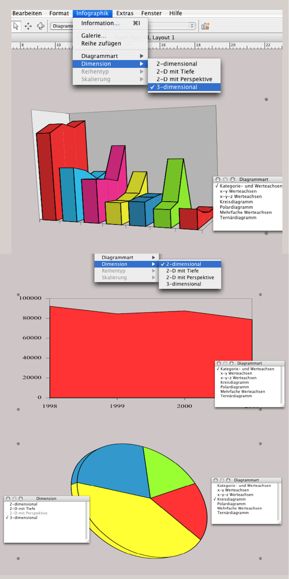
If you are one of those intuitive “experimenters” you must get into the habit, at least when working with graphs, of using «Save As…» to save your work under a different name before going one step further or trying out a new variant. Especially when changing the graph type, accurate settings for color and presentation can be irretrievably lost. RagTime has a habit of assigning default colors (as in Fig. 4.3) when changing the graph type and returning to the starting position for 3D presentations. The colors (hopefully saved as fill style sheets) must then be reassigned individually.
4.2 A 3-D area graph
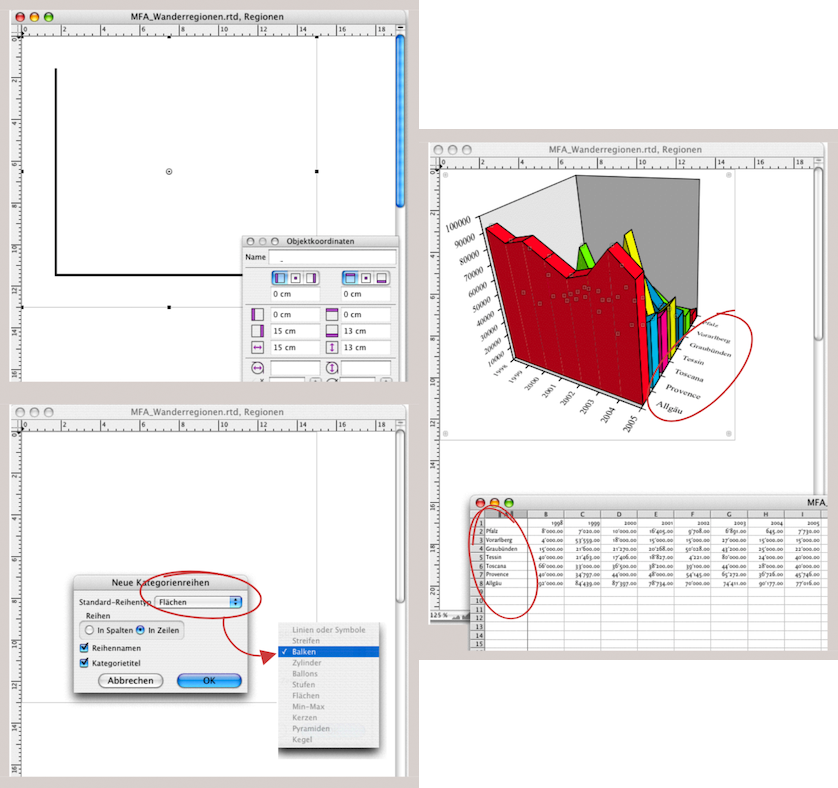
Let's now take a look at the graph in Fig. 4.2. Here we have two representations of the same data. Both the basic data and the finished graphs are “packaged” in the spreadsheet. This has the advantage that you always have all the necessary information together. Even if you drag the spreadsheet into the Inventory of another document, the other components come along immediately. At the same time, this representation provides an immediate overview if you need to change something in the basic data. This is because you can see the effects on the graphs inserted in the merged cells from K1 or S1 in the same window. In our case, the graphs are not placed directly in the cells, but are also located within a drawing component. The reason for this is that we do not yet know whether additional text or image information should be added to the graph. For example, comments, legends, or images. Drawing components give you more design freedom. Either way, whether you insert the graphs directly into the spreadsheet or within a drawing component, they can be easily imported into different layouts using a formula reference. For example, one time for a slide show and another time for a report. In any case, the structure for this first graph is less complex than it may appear at first glance.
- Tip:
-
The many settings options in the graph component can be confusing at first. It may help to imagine a cube when working with three-dimensional graphics. This gives you six walls and 12 axes, all of which can be labeled or configured with colors.
This is how almost every instruction in RagTime begins. Once you have opened the Inventory, select «New Component ➝ Drawing». Draw a container in the drawing with zero point 0/0, approx. 15 x 13 cm, and assign the «Graph» component to it as shown in Fig. 4.4 above. Then copy the relevant data from your source file – in our case, the cell range A1:I8 from the spreadsheet. Click in the graph component and select «Paste» AV/6V. Now you can select, in a small window, how the rows or columns should be inserted into the graph. At the same time, you can use a selection menu to choose the chart type – in our example, «Bars». After confirming with «OK» the graph appears as shown in Fig. 4.4 below.
4.2.1 Change the series
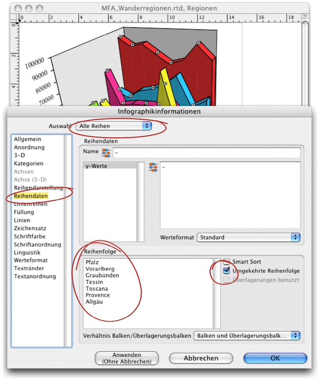
However, you can see at a glance that this representation is not very meaningful. The highest curve obscures all the others behind it. You now have two options: either you sort the rows in the spreadsheet in reverse order or, if the source data cannot be moved for valid reasons, you can change the order in the graph. To do this, open the «Graph Information ➝ Series Data» panel (see Fig. 4.5). Under «Select», both «All Series» and «Reversed Series Order» must be selected with a check mark. Under «Series Ordering», you will see all row titles. Here, you can also manually move the titles and thus the display in the graph individually with the pointer.
In the graph component, you can format exactly as you would in all other RagTime components: with font style sheets, color, fill, and line style sheets. Put together a color palette for the areas in the graph that clearly shows the differences but does not create too much “wild dissonance”. As mentioned, RagTime automatically uses colors: red, cyan, magenta, blue, yellow, and green. If there are even more series, the colors will repeat, and you will have to choose your own colors for differentiation anyway.
For formatting, you can select all elements individually in a graph with the pointer, but you can also use «Select All» (for example, to assign the same formatting to all fonts and all lines). As already explained in chapter 3 “Ready for print by notes” (Examples for checking), curiously, only the line borders of the legend colors cannot be adjusted.
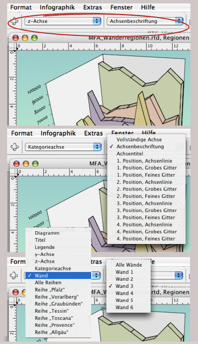
Because individual elements in complex diagrams can be hidden and are then difficult to select with the pointer, the graph component in the toolbar has special selection menus (see Fig. 4.6). The selection menus change depending on the selected element (axis, wall, category axis, series, etc.). This means that all elements can be accessed via these menus.
4.2.2 And then the background
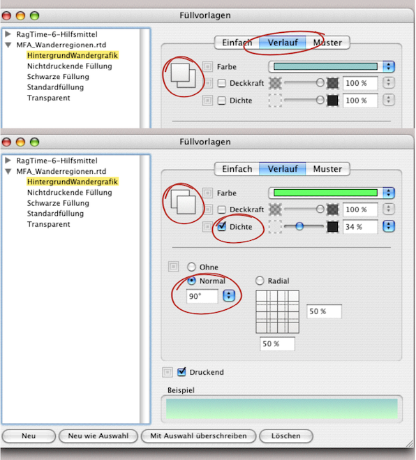
As with the other RagTime components, the background of the container can also be colored in the graph. In our example, it is a two-color gradient. To repeat: Select «Windows ➝ Auxiliaries ➝ Fill Style Sheet Editor» and click «Create». Also select «Gradient». Here you can specify the first color. The overlapping square symbols indicate whether you have selected the first or second color (see Fig. 4.7).
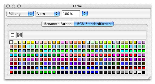
Under «Format ➝ Color ➝ Other», you can bring up the color palette on the screen as a drop-down menu and select from the standard colors available in RagTime. An even easier way to access this palette is under «Windows ➝ Palettes ➝ Color» (see Fig. 4.8).
In the «Fill Style Sheet Editor» window, you can change the color intensity by selecting «Tint». Do not confuse «Opacity» with «Tint». «Opacity» refers to making the color more transparent so that objects behind it remain visible. Both values are entered as percentages. Once you have also specified the gradient direction (90° in our example), the background gradient for the chart display is complete. It should also be noted here that these colors were selected from the RGB color space. If the graph is to be printed, everything must be converted to the CMYK color space via PDF or another conversion (this topic is covered in chapter 3 “Ready for print by notes”, section Are color spaces habitable?. As a reminder, many colors that look wonderful on the screen with RGB cannot be reproduced with the same luminosity and color nuance in four-color printing.
4.2.3 Light and perspective
The primary purpose of any graph is to visualize a statement. This is often easier to do with a three-dimensional representation than with a two-dimensional one. Nevertheless, the right perspective is important in order to be able to recognize all the connections correctly. With RagTime, it is possible to rotate the axes in all directions, and it's quite easy to do. Select the rotation tool  from the toolbar. A circle appears in the graph and the pointer becomes an almost closed circle with two arrows (see Fig. 4.9). Hold down the mouse button and move the graph with the pointer until the best possible perspective is achieved. Depending on the perspective, the arrangement of the row and category labels changes automatically. Don't let this influence you. You can change this later independently of the rest of the graph.
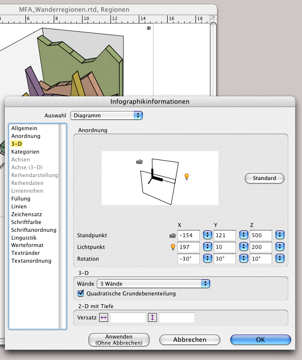
The same result, only slightly more accurate, can be achieved with «Graph Information ➝ 3-D ➝ Orientation». Two symbols are of interest here: a camera  and a light source
  . Both symbols can be selected and moved with the pointer. The camera symbolizes the viewing angle, while the light source can be used to change the shadow gradients. Moving these symbols intuitively can also lead to the correct display, especially if you have the window next to your graph and can immediately see the effects of the changes. This can be done precisely by entering numbers under «Viewpoint», «Light Point» and «Rotation» (see Fig. 4.10). If you need to create several similar graphs, you can note down the entries so that you can use them for all the other graphs in the same way.
4.2.4 A second view
We assume that our first graph (the upper image in Fig. 4.2) is now complete. There are often situations where a second or third view is necessary to better show hidden layers or details that appear too small. There are two ways to do this.
4.2.5 The simple section
The first method involves displaying the same graph in the same layout as an enlarged section. Since RagTime also allows individual components to be used multiple times in different frames or other components, this task can be completed quickly: open a new drawing component. Drag the graph you created earlier from the Inventory into the drawing component. Now you can use the move  and scale tool
  to determine the magnification and position of your section.
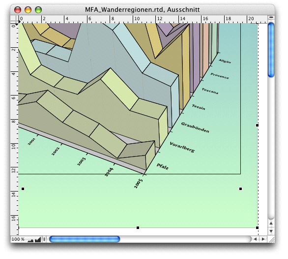
In Fig. 4.11, we have combined two different interaction options in one montage. The graph can first be moved within the container and resized: hold down the mouse button for a longer period of time – the move tool appears as a small hand. At the same time, a line border appears. Now you can move the position. If you drag the handles (the inner dots in the illustration), the graphic will enlarge or reduce in size. If you drag the handles on the actual container border (the outer dots with the X pointer in the illustration), you can “crop” the graph. On the other hand, in our case, the background gradient changes. Depending on the size of the graph frame, the blue of the upper part will fade into the green of the lower part more quickly or more slowly. These are effects that you will need to experiment with. You now have the enlarged section of the graph. Since it is the same graphic (not a copy), this display responds “synchronously” to all color and font settings.
4.2.6 The duplicated view
With this second approach, the possibilities for changing the second view are considerably greater. Here, you create a copy of your first graph. The easiest way to do this is to select the icon for your graph in the Inventory with the pointer – or, because we created our graphics in the drawing component, select the corresponding icon for the drawing component, hold down the mouse button, simultaneously press the “/6 key and drag the icon down. When you release the mouse button, a copy of the component appears immediately. The really clever thing about RagTime is that all copies are still linked to the original document, i.e., our spreadsheet with the source data. If an entry is changed there, all graphs change, regardless of which component they are displayed in.
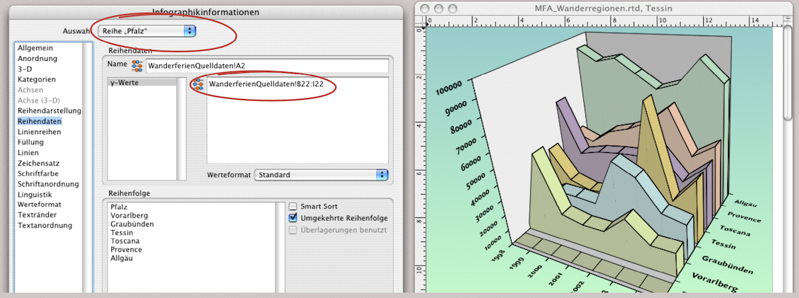
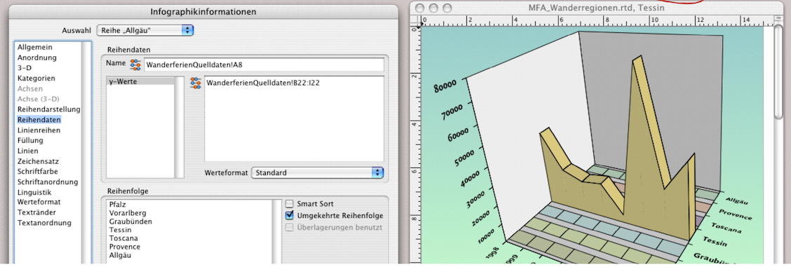
Now open the copy of the drawing component you just created. We want to extract individual area graphs or display them separately. Open «Graph Information ➝ Series Data». All individual series can be selected in the selection menu at the top (circled in Fig. 4.12). The reference to the spreadsheet with the source data is visible in the corresponding formula field. Change this formula everywhere except for «Tessin» to B22:I22. This is a row in the spreadsheet that is guaranteed to be empty. This results in a colored area with an empty value in the graph. If we were to delete the formula entirely – as shown in Fig. 4.13 as an example – the entire display would also disappear, which is not desirable in our case. Proceed step by step for each series. Unfortunately, the entry does not work with the «Apply (No Cancel)» button. This means that you have to confirm with «OK» each time, the window closes and requires a new selection with a double-click in the graph for the next row.
4.2.7 Distorting the dimensions
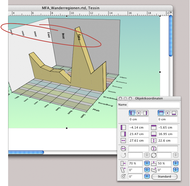
To make the individual section stand out more clearly from the base graph, we have chosen to distort it. This graph is therefore displayed slightly wider. To do this, open the «Object Coordinates» palette and select the container border of the graph. Enter 70% for the width of the container and 50% for the height. We should check whether we also want to label the category axis in the third position. Since the years cannot be clearly assigned at the top of the graph in its current perspective, we decide not to do so.
4.2.8 Side wall with axis lines
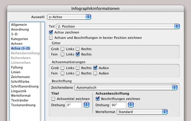
On the left-hand wall, however, we want to make the values more visible by adding lines. Open the «Graph Information» again. Under «y Axis» in the pop-up menu, select «Part ➝ 2nd Position ➝ Axis Drawn». Below that, select «Minor ➝ Right» for the grid. The remaining entries for «Tick Marks» and «Lettering» are already provided (see Fig. 4.16). The graph is now complete.
We created our graph in a drawing component. This allows us to add any additional information directly to the graph. This could be a specific legend, for example, or the copyright and creation date of the graph. In Fig. 4.17, the title of the graph is also included.
Of course, this could also be created directly in the graph. But the point here is to explain the advantages of the drawing component in connection with graphs. The title is a graphic text. It is placed over an empty frame that has been assigned an olive green color fill.
The principle of double graphs, placed in a different container, can be useful in a variety of ways. Not only to create enlarged sections or varied graph representations. A second container is also a possible solution when it comes to placing the legend of the graph in the layout so that it is closer to an image, in the middle of the text, or in the footnote. In chapter 3 “Ready for print by notes”, we looked at legends that were created entirely independently of the graph using spreadsheets (starting with the section A trick for design freedom). Here is another example of how the “original legend” of an graph can also become independent:
Duplicate the container with the graph. For the duplicate, select «Graph Information ➝ Arrangement». Under «Chart”, uncheck the box and check the box under «Legend» if it was not already selected. This will give you a graph in your duplicate that consists only of a legend. You can reformat the font and change the color of the background and line border or remove them entirely, as in the “normal” graph. Above all, you can move this duplicate with the legend freely within your layout. And as a reminder: changes in the source data or changes in the original graph automatically affect the legends as well. – With this tip, we conclude the first graph from the market research institute.
We are thinking of the often-cited graph from Western population statistics. As is well known, it will look like a pyramid if the older population continues to grow and the younger population continues to shrink. It goes without saying that the market research institute MFA also deals with such issues. That is why we are now turning our attention to creating a graph on the «Birth Deficit». It will be a graph with horizontal bars, but it will be duplicated. But first, let's take another look at the numerous possibilities for creating graphs with RagTime. On the following pages, we have displayed the gallery with all variants as screenshots.
4.3 Bar graph with photos
The graph in Fig. 4.21 was created by the market research institute for a presentation on baby food. This example is also deliberately not a standard solution. But you will quickly realize that with RagTime, it doesn't take much to turn dry statistics into an appealing presentation graphic.
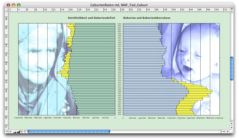
This is basically a very ordinary bar graph. Since images were used, this graph was also created in a drawing component. And strictly speaking, there are actually two graphs in this display format. However, the data from the spreadsheet (see Fig. 4.22) could just as easily be displayed in a single graph. This is exactly what we want to show in the following sections, before finally moving on to the “show graph” with the photos.
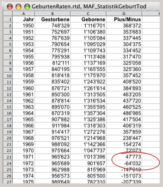
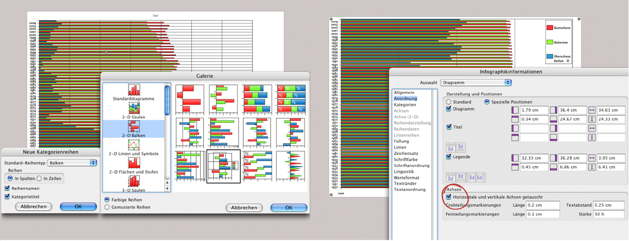
Open a drawing component and then a graph in the drawing component. Select «Graph ➝ Gallery ➝ 2-D Bars». From the gallery, you can either select a graph to which you then need to add additional elements (titles, legends, lines, etc.), or you can select a graph from which you can delete superfluous elements. The second option was chosen here (Fig. 4.23, left). Only excerpts of the data from the spreadsheet are shown in Fig. 4.22. They extend to row 56. (In column D, row 24 shows that the birth surplus changes to a deficit: from 1972 onwards with the so-called “pill slump”. Select the data sets and drag them into the graph (you can also use copy/paste).
Under «Graph Information ➝ Graph ➝ Arrangement», you can add or hide the title or legend. The layout of the individual elements can also be determined here. If the check mark is set under «Axes ➝ Horizontal and Vertical Axes Swapped» this means – as in our case – that the bars are arranged horizontally. If you delete it, the value axis moves to the left and the category axis with the years moves down, and the value series become columns. We'll stick with our bars. Remove the «Legend» by clicking on the check mark.
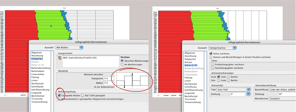
In the next step, we are in the window under «Graph ➝ Categories ➝ All Series». Here, under «Spacing», you can select how thick the bars should be and how far apart they should be from each other. The easiest way to do this is to drag the thickened ends of the sample examples (see Fig. 4.24, circled in red). Of course, you can also enter percentages. Then select «Series Stacking ➝ Stacked Series». Now the graphic looks pretty much the way we want it to.
In Fig. 4.24 on the right, the grid has already been deleted under «Graph ➝ Axis (2-D) ➝ Category Axis», the grid has already been deleted («Major Grid Drawn» or/and «Minor Grid Drawn»). On this panel, under «Labels» you can also choose whether or not to display the category axis here. We will come back to this later, so leave it as it is for now.
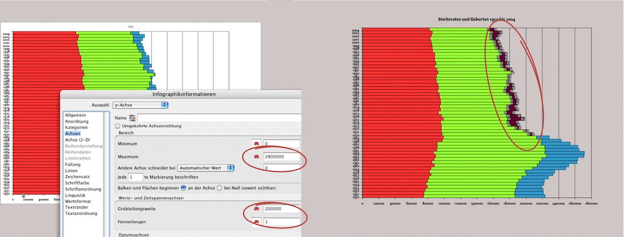
Under «Graph ➝ Axis ➝ y Axis» (Fig. 4.25 left), you can define the maximum/minimum values as well as the widths/spacing of the individual values. This allows you to make a graph more clear or “dramatic”. True to the motto “Don't trust any graph that you haven't dramatized yourself”, you can experiment with this and try out the effects. In any case, coloring serves to clarify or accentuate. In Fig. 4.25 right, the graphic is basically already finished. The following steps have already been changed here: the background has been given a transparent fill, the title has been written (click on «Title» and enter the desired text), and the entire graph has been slightly distorted in height (height 120%) using the «Object Coordinates» palette. Incidentally, the font and color formatting can be set in the same way as in any other RagTime component. To highlight the difference between birth surplus and birth deficit, the colors have been changed for the series from 1972 onwards. Each click in a row automatically selects the entire “column”. However, individual series can also be selected in order to assign colors individually (with a delayed double-click). This provides a simple visualization of death and birth rates as well as the deficit/surplus (Fig. 4.25 right).
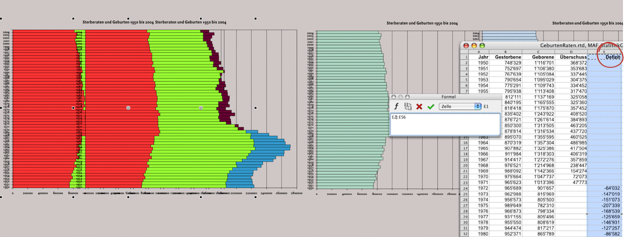
We want to separate the pieces of information even more clearly. To do this, duplicate the graph you just completed: select the graph and drag the mouse while holding down the Option key (Fig. 4.26 left). This creates a completely identical graph and the references to the spreadsheet are retained or transferred. Now separate column D in the spreadsheet into two columns. The new column E contains only the birth deficits, while column E contains only the birth surpluses (Fig. 4.26 right). In the first graph created, column D now only shows the birth surpluses. This first graphic thus becomes the “birth graphic”. Therefore, delete the series of mortality rates from it: select and cut. Similarly, the copied graph should become the “death graph”. There, delete both the series of birth rates and those of birth surpluses. To do this, select your newly created column E with the birth deficits in the spreadsheet and copy it. In Fig. 4.26 on the right, this column has not yet been inserted, but the fill style sheets in the series have already been changed. To ensure that the two graphs are actually opposite each other, the axes of the “mortality graph” must be swapped and their category values made invisible. The y axis also needs to be changed.
Go to «Graph Information ➝ Axis ➝ y Axis». Here, select «Reversed Axis» with a check mark. This will cause the series and labels to run from right to left (see Fig. 4.27 below). On the same panel, set the maximum for the y display to 2 million and the coarse division width to 200,000. We could have made this change before duplicating the graph, but sometimes you only realize after the fact that the empty spaces look too big.
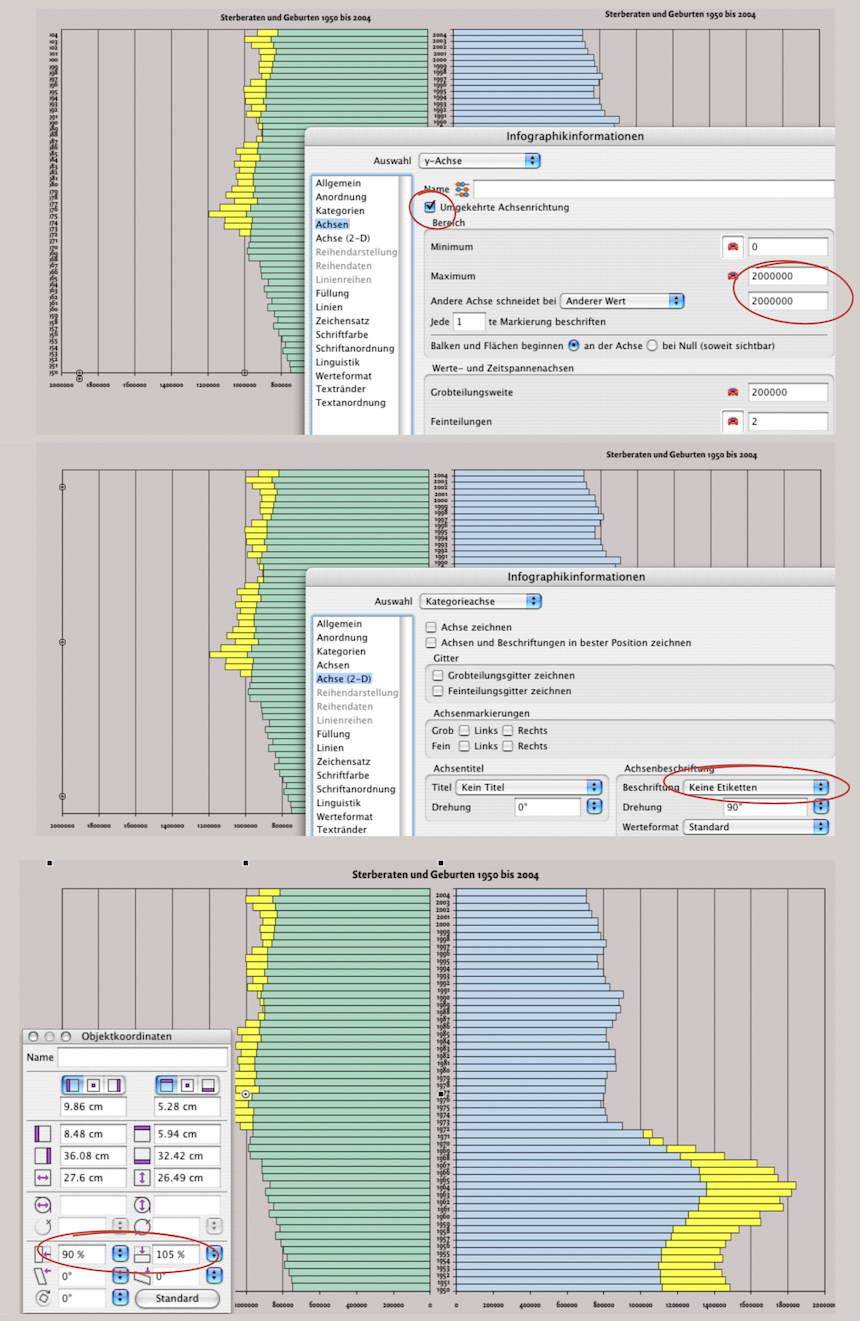
We still have the right-hand graphic showing mortality rates active. We want to remove the years from the category axis. In the panel In the panel «Axis (2-D) ➝ Category Axis ➝ Labels ➝ Labels», select «No Labels» from the pop-up menu. The years will disappear. The same applies to the title. Remember, it can be selected with a check mark under «Arrangement ➝ Chart» (see Fig. 4.23 on the right). Here, we remove the check mark because we will set a common title for both charts.
What about the category axis, what about the title, what about the series that we had already removed? RagTime behaves very differently here – but very logically: everything that refers to the source data in the spreadsheet is retained, but can appear visible or invisible in the graph (the years). We entered the title directly into the graph. If it is “clicked away” and then reactivated as visible, only the word «Title» appears, meaning that the actual text has been deleted. It would be different if we had referenced the title from the spreadsheet. Then it would reappear in full.
And the series? A general delete command that is not related to the graph information settings panels will cut off the references to the spreadsheet. You will therefore have to reinsert the series, as was the case with the «Deficit» row.
For the final appearance of the graph, we would like to insert images in the background. As with the spreadsheet component, the graph component also has different levels for fills. The first layer is the container frame. It must first receive the transparent fill style sheet. If this is not the case, you can assign «Transparent» to the individual elements as often as you like, but nothing will happen. In the graph, you can basically assign a transparent fill to every series, bar, pie segment, etc. If the container has a fill style sheet, it will be visible. If the container also has a transparent fill, the element behind it in the layout will be visible. And that's exactly what we want.
We have added a transparent fill to the “Mortality Rates” graph, removed the title, and now we are adjusting the outer proportions using the «Object Coordinates» palette (see Fig. 4.27 above). Of course, the settings we have made now need to be applied to the “Births” graph as well. Here, too, we have removed the title of the graph and then manually entered and centered the title using graphic text. To complete the design as shown in Fig. 4.21, all you need to do is draw an image container in the same size as the graph presentations, import the desired images, and then place the image containers on the backmost layer. The backmost layer is not quite right. This is because a container with a light green color has been inserted as the background at the very end on the backmost layer (compare Fig. 4.21).
This completes the bar graph. Many of the steps involved are not only applicable to bar graphs, but also to most other types of RagTime graphs. One example is the following multi-axis graph.
4.4 Multi-axis graph
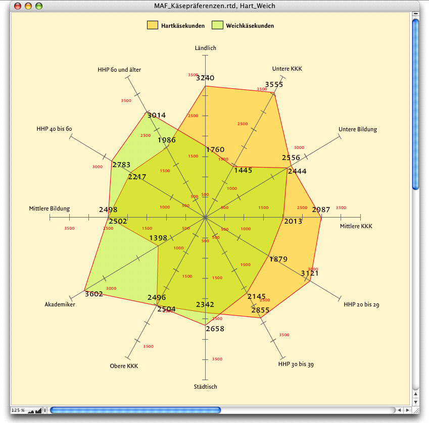
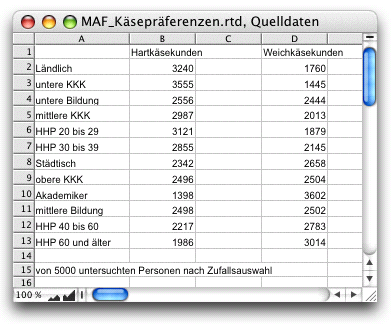
The MFA Institute conducted surveys on preferences for soft cheese and hard cheese. The multi-axis diagram in Fig. 4.28 is useful for highlighting the different profiles. The color transparencies available in RagTime make it easier to show the overlaps. The example graph clearly shows at a glance that soft cheese tends to be purchased more in urban areas, by people in lower purchasing power classes (PPC), and by middle-aged to older heads of households (HOH). The source data from the spreadsheet (see Fig. 4.29) is simple. Creating the diagram is also relatively straightforward.
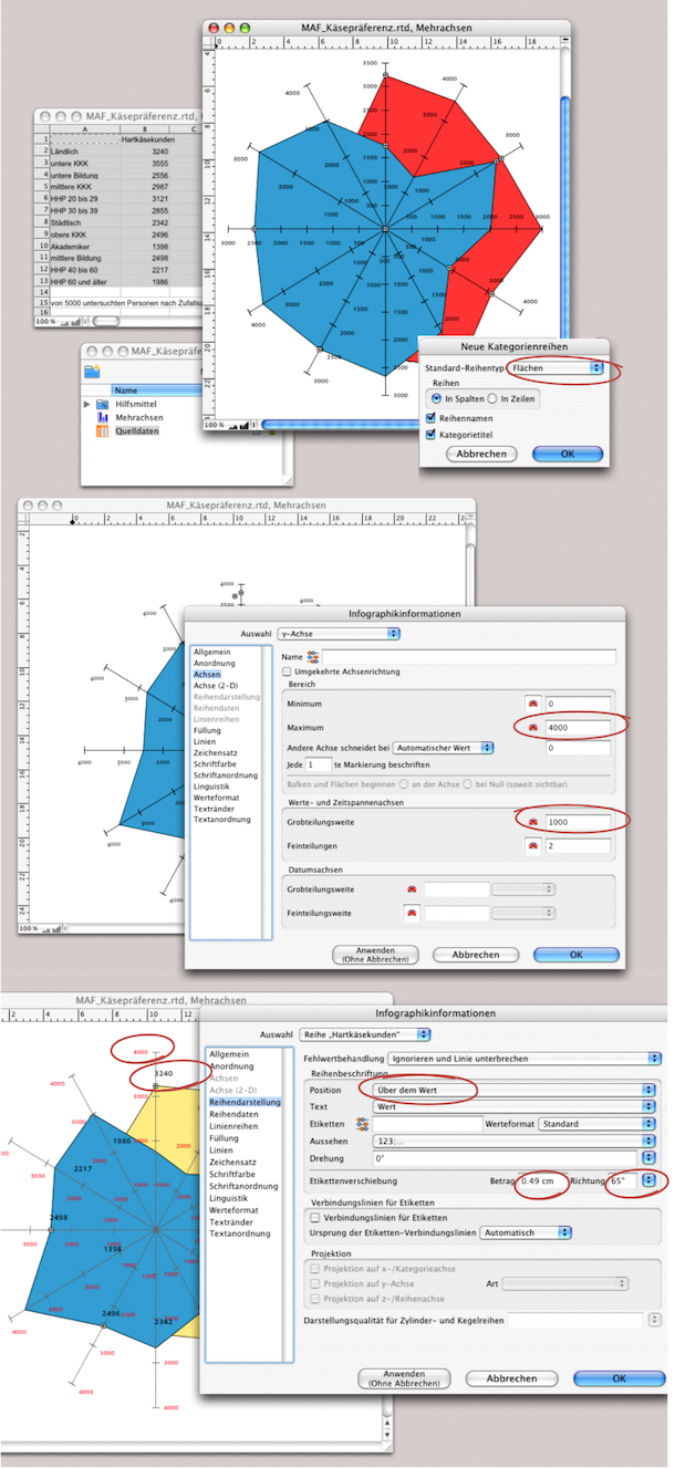
Open a new graph (for example, from the Inventory under «New Component» or from the Foyer under «Graph ➝ Gallery ➝ Multiple Value Axis» select the graph type with the areas. Now activate the range A1:D13 in the spreadsheet and copy it into the graph. First, select the series names and «Series in Columns» as shown in Fig. 4.30 above. The multi-axis graph is now visible.
The next steps are just a matter of formatting. Under «Graph Information ➝ Axis ➝ y Axis», enter the maximum value «4000» so that all axes are the same length. On the same panel, under «Lines», we set the black fill to 70% density. Under «Axis (2-D)», make sure that «Axis Drawn» and «Axes and Labels Drawn at Best Positions» are selected. You can then define the font, font size, and font color. Here, we have chosen a smaller font and a red color.
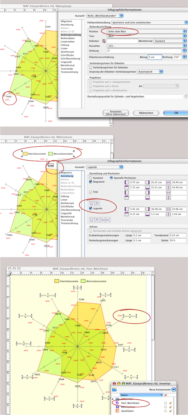
In Fig. 4.31, the fill style sheets and red line borders for both series have already been set. You can label the series in the open «Series Drawing» panel. «Above the Value» has been selected for «Hard cheese customers»; for «Soft cheese customers», select «Below the Value». Under «Offset Series Labels», you can move the labels – together with «Direction» – so that there is no overlap between the fonts. Despite these options, it is still possible for two series labels to overlap.
To correct this manually, select the move tool from the toolbar and double-click on the number to be moved (circled in red in Fig. 4.31, center). Use the same tool to align the legend after you have set it.
To be able to place the categories precisely, we will take a small intermediate step. Open a new drawing component, as we want to continue working with graphic text. Drag the graph you have created so far from the Inventory into the drawing component window. A tip: when working with RagTime graphs, save more often than usual (using «Save As»). This allows you to revert to previous documents if something goes wrong – or if RagTime crashes at the worst possible moment without warning, which can happen from time to time in the graph component.
In the drawing component, add labels to each axis using graphic text (see Fig. 4.31 below). We have given the graph a transparent background and then moved the graphic text to the back layer («Drawing ➝ Stacking Order ➝ Send to the Back»). This results in a paler font and leaves the more important values in the foreground.
The multi-axis graph is now complete. As you have seen, you can switch from one component to another at any time while you are working. It is generally recommended to work in the drawing component for more complex graphs. In the drawing component, you can also place the spreadsheet with the source data outside the visible window so that you have everything in one “package” whenever you copy or transfer data. This applies especially if you create an archive of graphs.
4.5 Bar graph with image
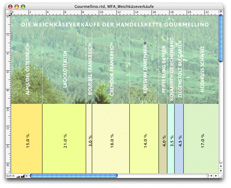
The chart showing the soft cheese sales of a delicatessen chain (see Fig. 4.32) demonstrates that RagTime can also be used to create very simple, modern presentations. The market research institute MFA wanted to use this study and the corresponding presentation to acquire a new customer.
This continues what was already used in the chart on birth and mortality rates: stacking bars. For the implementation, another option for nesting components was deliberately demonstrated. Here, a graph and its duplicate are located in a spreadsheet. The spreadsheet, in turn, is located in a drawing component. This is because the picture of an alpine pasture was used as the background. Of course, you can also store the required source data in the spreadsheet.
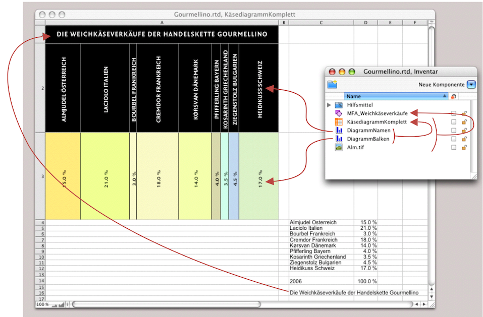
Open a spreadsheet or use the one containing your source data. Widen column A to approx. 22 cm. Set the row height of row 1 to approx. 1.8 cm and rows 2 and 3 to approx. 7.5 cm each. In Fig. 4.33, cells A1 and A2 are filled with black for clarity. In the finished chart, these two cells have white text and a transparent fill. With the correct fill style sheet, only a white rectangle would have been visible in the figure.
Cell A1 contains a reference to cell C16, the title of the source data. The Inventory shows how the graph is structured: The open window is the spreadsheet «Cheese Graph Complete». Cell A2 contains the graph «Graph Names», and cell A4 contains the graph «Graph Bars». The spreadsheet is located together with the image «Alpine Pasture» in the drawing component «MFA_Soft Cheese Sales».
Strictly speaking, the two graphs are identical. The only difference between them is the formatting and value assignments. But let's take it one step at a time. Open a «Graph» component. Select the stacked variant from the «2-D Columns» gallery (Fig. 4.34 above). Under «Categories», set the bar height (or bar width) and remove all axis lines, grids, and axis markings: for the category axis, the y axis, and the lines of the «Wall» by selecting transparency under «Lines» (Fig. 4.34, second from top). Now you need to assign a fill style sheet (create first) to the individual series:
«Series (Name) ➝ Fill ➝ Fill Style Sheet». The next step is the labeling under «All Series ➝ Series Drawing ➝ Centered ➝ Value». Enter «90°» for the rotation. This completes the first graph. Create a twin or a copy of it. Change the label under «All Series» from «Value» to «Series Name» (see Fig. 4.34 below).
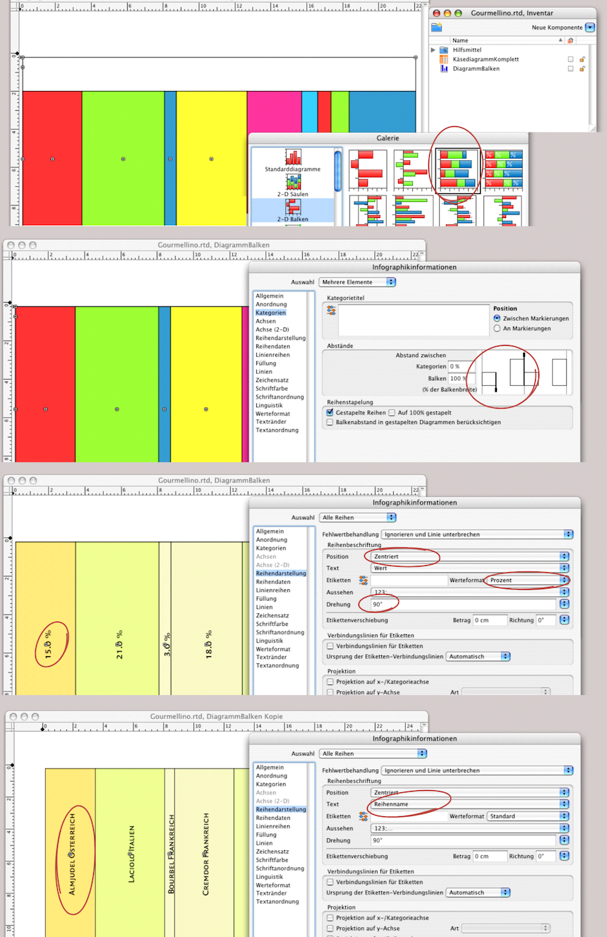
For the next steps, you will need to use a trick to see what you are doing. Remember, the upper part of the graph should have a picture as its background. This requires a transparent fill for the graphic that lies on top of it. In Fig. 4.35 above, all series have been assigned a transparent fill. If you now give the text and lines a white fill, you will no longer be able to see your graph. To select an element, don't grope in the dark, but in the white. We have two tricks: Select «Graph Information ➝ Arrangement ➝ Legend». Use the move and scale tool to move this legend all the way to the bottom, outside the actual graph display; it will serve as a guide. In the spreadsheet, give cells A1 and A2 a black fill for now until the graphs and title are correctly placed and formatted.
Now apply the transparent fill style sheet to all series in the «DiagramName» graph (this is what we named the copy of the first graphic). Unfortunately, this cannot be done with a single command for «All Series», so you must select each series individually and set it to transparent. In Fig. 4.35 center, both graphs and the spreadsheet are visible in their own windows. Here, the two graphs from the Inventory have already been dragged into cells A2 and A3. If both graph windows are open, you can select the graphs and use the «Object Coordinates» palette to position them so that they are optimally aligned in the spreadsheet cells. If you want the upper or lower part of the graph to appear taller or shorter, simply vary the row height. Incidentally, to reduce the size of the bars with the percentage values in the graph, you must enter a higher percentage value under «Graph Information ➝ All Series ➝ Categories ➝ Spacing» under Categories or drag the right slider bar to the left (see Fig. 4.35 center).
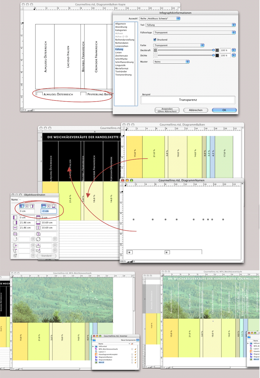
Now fetch the chart title in cell A1 using the reference to C16. Set the font formats: size approx. 18 pt, font color white, axis centered, and distance to the cell border approx. 5 mm. All that remains is to “assemble” the image and graph. Open a drawing component. Drag the spreadsheet from the Inventory into the drawing component and align it at the zero point (0/0). From the zero point, draw an image container that is exactly the same size as cells A1 and A2 combined. Import your picture and align it as desired. Now select the picture container and move it to the backmost layer. All you need to do now is set the fill of cells A1 and A2 back to transparent and the graph is ready. If the picture behind cells A1 and A2 is not visible, you must ensure that the container frame itself also has a transparent fill. Your diagram should now look like Fig. 4.32.
4.6 The spreadsheet as graph
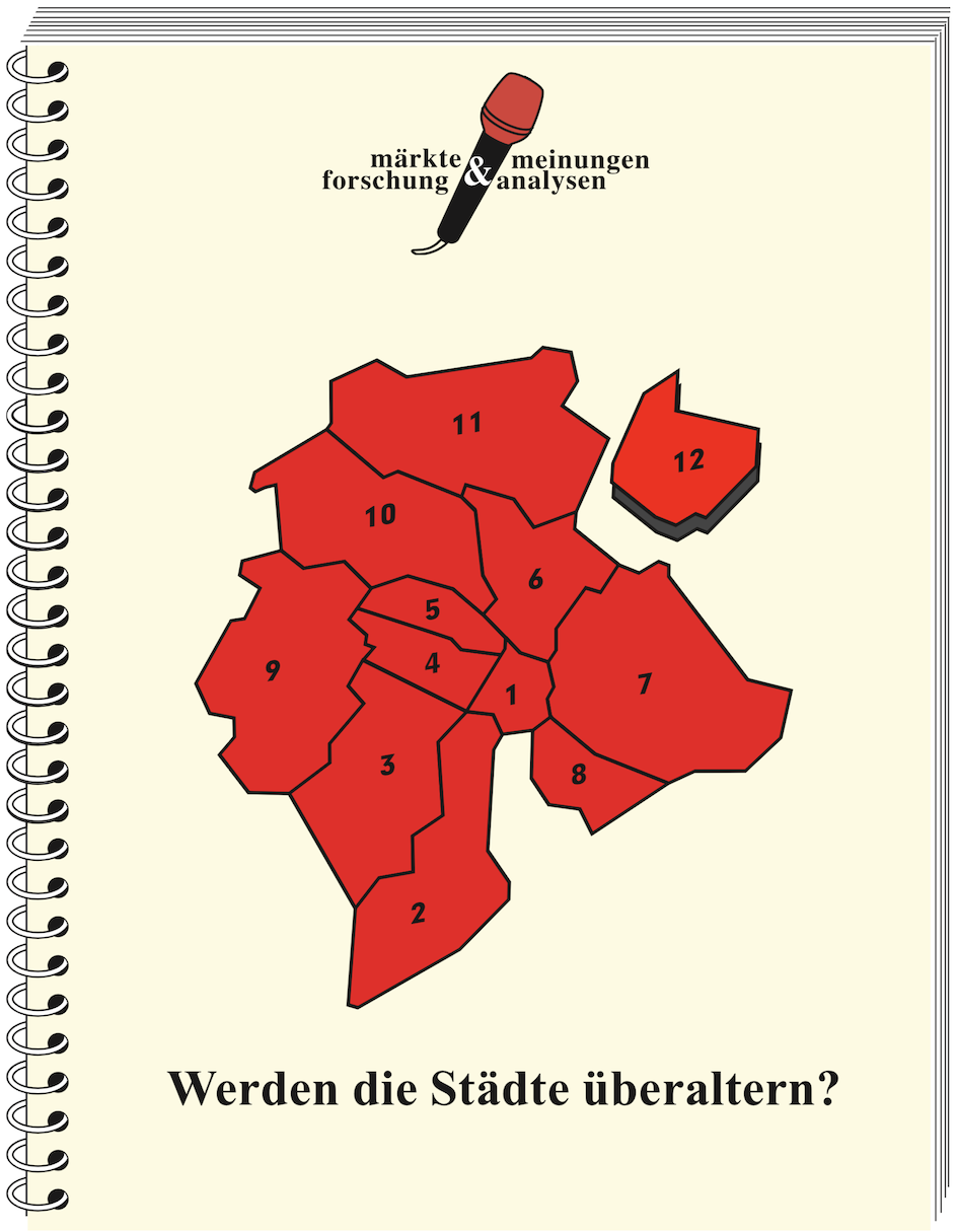
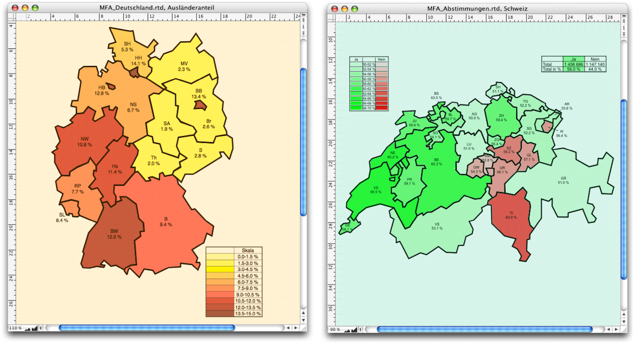
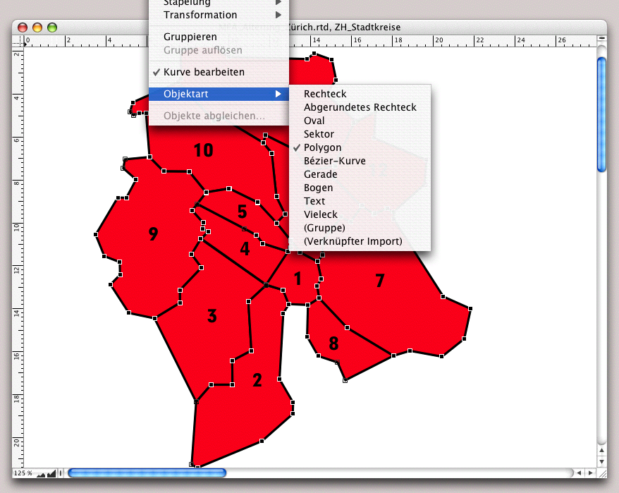
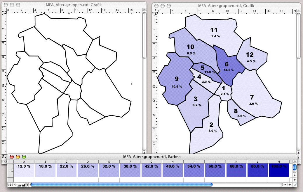
There are dozens of other types of graphs that can be created quite easily with RagTime. In chapter 3 “Ready for print by notes”, Fig. 3.92 we showed the pie chart. In this context, we also pointed out that spreadsheets do not always have to be square and can also be used to create graphs. The two graphics of the German federal states and the Swiss cantons in Fig. 4.36 consist of spreadsheets. If you would like to present statistics for these two countries in this way, take a look at the expert pages of ragtime.de. In the «Beispiele» section, you will find these two documents, which you can adapt to your needs. The individual areas represent value levels using different colors. These are dynamic representations that can be variably “fed” with new data. This is a practical option not only for market research institutes, but also for anyone who wants to graphically represent different facts or changes using a consistent area division. Here we show you step by step how to create such a document. We do this using the example of hypothetical age statistics for the Swiss city of Zurich with its twelve city districts. The procedure remains the same, regardless of what your “statistical area” looks like.
Let's start with the form: find a geographical map on which the borders relevant to your statistical representation are clearly visible, preferably approximately A4 size. If necessary, you can scale the image in RagTime. You can also find such maps on the Internet. Otherwise, you will need to scan a template on which you have traced the boundaries with a marker. How to draw the map is explained in chapter 2.6 “Drawing location maps” in connection with the access plan for the YesNon school. Here is a drawing related to our example, just for review. Fig. 4.37 shows what we are aiming for: each subarea is drawn as a polygon and each polygon later becomes a container for a spreadsheet component.
4.6.1 Polygons according to plan
Draw the polygon lines in the drawing component relatively generously, i.e., not down to the smallest details of the boundary line, but in such a way that known area boundaries remain clearly recognizable. It is advisable to work with a display scale of 125-150% when drawing. This makes it easier to align the boundaries of adjacent areas. However, it does not matter if you do not hit the points exactly. Small deviations will become invisible later when a larger line width is assigned to the area boundaries. Are there any exclaves in the areas or does an island belong to them? Then draw these as separate polygon chains! Once the polygon chain for a subarea is complete, press the Enter key so that it is selected as a whole object and the individual corner points are no longer marked.
Since a map with sub-areas necessarily has shared borders, once you have drawn the first polygon, you can copy it and use the shared border for the next area. This ensures that the borders of the adjacent subareas are completely identical, saving you a little work. Under «Extras ➝ Settings ➝ Drawing» set the offset for duplication to 0/0. Any object you duplicate will now remain directly above the original without any offset. Let's assume that district 2 in Fig. 4.37 is the first area you drew and that district 3 is the next part you want to trace. Select the polygon drawn for district 2 and make a duplicate with AD/6D. Press the Enter key or double-click on the line to make the anchor points visible. Grab the first anchor point outside the shared border and drag it into the new polygon to be drawn. Continue point by point. If the previous area has more points, delete the excess points (select the point and press the >/> key; or click on the point with the “minus pen”  ). If there are not enough points for the new area, add more (click anywhere on the line with the “plus pen”
  ). Once you have drawn all the parts, group them, assign a transparent fill to the group, and a line style sheet «Border»: line thickness at least 3 pt, fill style sheet «Black”. Position the upper left corner of the group at the zero point. Name the drawing component in the Inventory: «Graphic».
4.6.2 Color scale for percentages
Consider how you want to use the colors. Different colors make differences more apparent. However, shades that differ only in intensity are better suited for representing gradations. We therefore choose the second option here. When choosing colors and color gradations, consider whether the graphic is also to be reproduced in a printing process. If so, avoid colors with a density below 12%. Select colors that will produce good gradation. Fig. 4.38 shows the grouped polygons on the left. The finished graphic – our goal – can be seen in the right-hand drawing component. The spreadsheet below shows a color scale with percentage values for the density of a RagTime RGB color. Only ten levels are normally used for statistical representations. So let's first lay the foundations for our color distribution. To do this, you need to know the maximum dimensions of your subareas or their polygon lines.
4.6.3 Calculable colors
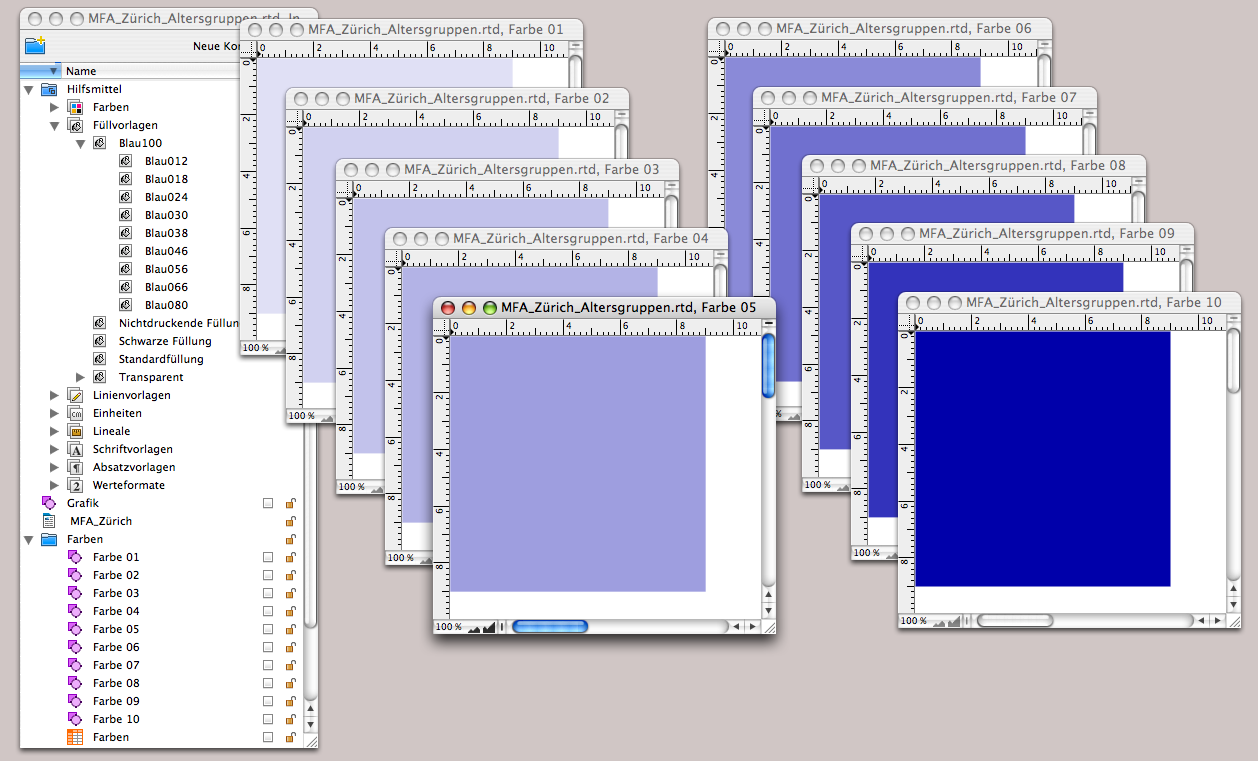
Create a fill style sheet with the color of your choice and 100% density. Name it, for example, «Blue100». Make nine copies of it, all dependent on the first one – they should inherit the color so that we can change it in a single style sheet and all others will automatically follow. Assign descending opacity levels to the nine copied fill style sheets, starting with larger increments for better differentiation, then smaller ones, and give the style sheets appropriate names. 100, 80, 66, 56, 46, 38, 30, 24, 18, 12 is a good sequence of values for the density (see Inventory in Fig. 4.39).
Open a new drawing component and drag a frame from the zero point so that it is large enough to safely enclose the maximum dimensions of all subareas – in our case, 9x9 cm is sufficient. Assign the darkest fill style sheet to the frame and its border. Give this drawing component a name («Color 10») in the Inventory and create a folder called «Colors» there. Now copy the drawing component «Color 10» nine times and rename them «Color 01» to «Color 09». Then open all drawing components and assign the corresponding fill style sheet to each drawing component (Fig. 4.39). In a «Colors» spreadsheet, dimension the ten columns A:J to a width of 18 mm each and the first two rows to a height of 12 mm each. In sequence, drag the drawings «Color 01» to «Color 10» into the cells of row 1. This makes these drawings (i.e., our color scale) referable and can thus be retrieved anywhere as the result of a calculation. At the same time, you have prepared the color scale as a legend. We will come back to this later.
- Tip:
-
It's true that presenting statistical values using spreadsheets requires a fair amount of work. But the benefits are considerable, because once you've created the chart, you can use it to visualize new content again and again. The formulas can also be useful in other contexts.
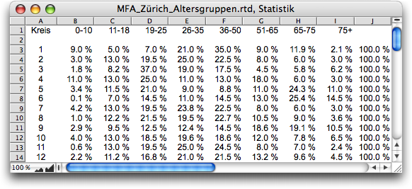
Now we are ready to turn our attention to the actual statistics. It is worth taking a moment to sit back and consider exactly what needs to be done. The «Statistics» spreadsheet lists the proportions of the various age groups in each city district. Only one of these age groups can be displayed graphically at a time.
A pop-up menu is used to select the age group whose data is to be displayed. These values are then transferred to a table that is used to calculate the color values. The distribution of the percentages varies depending on the age group. However, an optimal spread of the representation across the color scale should be achieved for each age group. Therefore, the assignment of color levels to percentage values depends on the minimum and maximum values of the selected age group. Before we start implementing the representation, we need to perform the necessary calculations: minimum value and step size of the color scale in relation to the percentage values.
In the drawing, place (non-printing) an «Age Levels» button of the type «Pop-Up Menu», of course with the index as the desired result. The formula for the title is:

Next to or above the button, we write «Age Level:» as graphic text.
Create a spreadsheet called «Graphic Data» in which the necessary calculations are to be performed. Enter Formula 4.2 in cell A3. This will retrieve the value from the column in the same row of the «Statistics» spreadsheet that is determined by the index of the «Age Level» button. You can copy this formula down to row 14 so that the values for all city districts are transferred.

The minimum is calculated in cell A16 and the maximum in cell A17. We only show the first of the two formulas here:

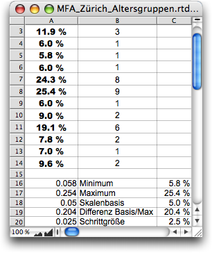
To maintain an overview, always write the value in column A in column B at the same time, and display the same value as a percentage in column C – simply refer to the cell in column A and assign the value format «Percent» (see Fig. 4.41). Calculate the lowest point on the scale in cell A18. Start with the minimum and round up to the nearest whole percentage using the following formula:

Round the difference between the calculated base value of the scale and the maximum (cell A19) so that the increment is a multiple of half a percent. This is done using the following formula in cell A20:

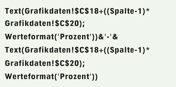
Now you need to determine the level of the color scale to be used for the value of each city district. Place this scale level next to the value, i.e., in cells B3:B14. The first of these cells contains Formula 4.6.

You can then copy this formula down into the other cells. But how do you get the colors into the chart?
The next step is to create spreadsheets for the areas or city districts (see Fig. 4.42). Open the first spreadsheet and name it «District 01» in the Inventory. Size cell A1 so that it covers the largest dimensions of all areas – i.e., the same as the “color drawings”. Enter Formula 4.7 in this cell. It refers to the color scale range and uses the index calculated with Formula 4.6 for this scale. It is interesting to note how this index is taken from the row in the table that corresponds to the city district.

To do this, it is important that we have given the spreadsheet the name «District 1» or «District 01». This is because the formula with the «Mid» and «MPFComponentName» functions extracts the row index from this. You must adjust the last two arguments of the «Mid» function if you choose different names. If, for example, you are dealing with countries, you could prefix the country name used as the component name with a run index and extract it using the «Left» function instead of «Mid». Only by following this procedure, you can now create eleven copies of this spreadsheet – close it first – and name them «District 02» to «District 12». Each spreadsheet will then retrieve the correct color from the scale (see Fig. 4.42)!
Now drag one spreadsheet after another from the Inventory into the polygon corresponding to the city district in the «Graphics» drawing. This turns the pure polygon frames into spreadsheet containers. If one of your subareas includes exclaves or islands, simply drag the spreadsheet onto its polygon as well. Use graphic text to write the city district numbers and place them next to the individual areas, preferably using a character style sheet so that you can change them all together if you want them to be larger, smaller, or displayed in a different font.
The «Graphic Data» spreadsheet is also used directly in the graphic to display the labels. Create a suitable character style sheet «Labels» and assign it to cells A3:A14. Align them so that they are centered. We have already anticipated this in Fig. 4.41 – however, you now have to set the cell borders to «Transparent» so that they are not displayed in the graphic.
Then drag the window of the «Graphic» drawing component wide enough so that you have space next to the area illustrations. There, draw a frame measuring 25 x 6 mm, fill style sheet «Transparent», line style sheet «Container Border». Copy this frame 12 times and draw a vertical pipeline from the first to the last frame. To do this, you must increase the display scale of your drawing component to 150%, otherwise the small frames cannot be controlled with the pipeline tool. Once all frames are connected to the pipeline, drag the «Graphic Data» spreadsheet from the Inventory into the first container. Enlarge this first container so that it shows cells A1 and A2, so that the actual twelve values are displayed in each of the other containers. If the containers and the display are not aligned, you must either adjust the column width and row heights in the spreadsheet or adjust the character style sheet of the labels. Now you can place the individual containers on the correct city district. Drag the container with cells A1 and A2 far to the right out of the area visible in the layout. You could also have used the same technique with a spreadsheet for the city district numbers. If areas with names were displayed instead of simply numbered city districts this would certainly be the more flexible solution.
Now all that remains is the legend, which has already been prepared in the «Colors» spreadsheet. Draw a conatiner with a transparent fill below the city district display: 18 cm x 1.2 cm, and create a duplicate of the container. Connect both containers with a vertical pipeline and drag the «Colors» spreadsheet into the first container. In the second container, you will see the still empty spreadsheet cells A2:J2.
Give them a transparent fill and enter Formula 4.8 in A2. Of course, copy the formula to the right into the other cells. This displays the percentage values that correspond to each scale level. Since the color scale is dynamic, these values must also be adjusted. Can you understand the formula? If not, experiment a little with the functions used in it: you will see how the colors change.
Then use the drawing command palette to align both frames. Position the legend at the top, centered in the cells. If the font is barely legible in the darkest color fields, assign it the font color «White».

For the title, write «Shares of the age level » using graphic text, then insert Formula 4.9 and write the rest of the sentence: «of the population in the city districts of Zurich». Format the font as desired and place the title above the «Graphic» drawing in the layout.
Of course, the entire title can also be made dependent on the content of the «Statistics» spreadsheet if not just one element – in our case, the age groups – but the entire title is to be changed.
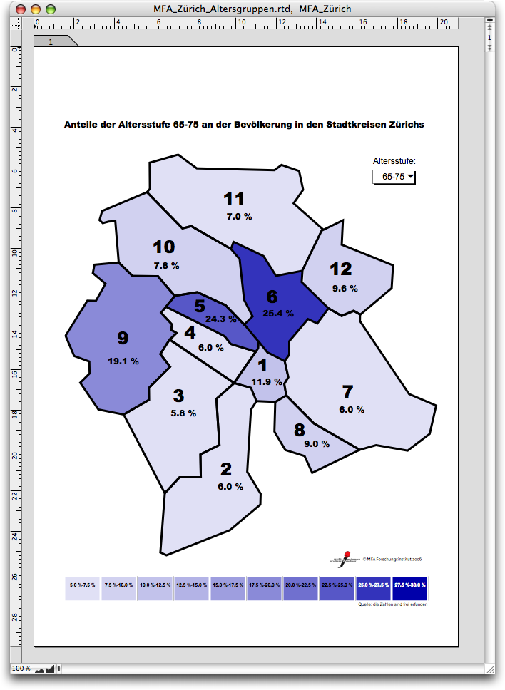
This completes the task (Fig. 4.43). The rest has nothing to do with the task at hand: Of course, such statistics require a source reference for the figures and a date to which the figures refer. And, of course, the logo of the market research institute must not be missing.
Admittedly, it wasn't a walk in the park. But we assume that the data recorded in the «Statistics» spreadsheet (see Fig. 4.40) can be replaced again and again by new surveys, even on completely different topics. Our graphic is therefore a permanent tool for continuously displaying other data. Of course, you will have to change a few things if you want to create such a graphic for the area you are interested in. But it's not rocket science if you follow the above instructions step by step and adjust the formulas where necessary.
4.7 SlideTime – not only slide show
SlideTime is an integral part of RagTime. But be honest – have you ever used it? If not, then you should take a look at it – and if you have, take a closer look! SlideTime may be RagTime's presentation module, but it can also perform completely different tasks! But first things first.
Let's start by highlighting a few important points: SlideTime “prints” a layout on the screen, i.e., not a document, but only a selected layout. Which layout – if there are several in the document? The menu command «Extras ➝ Slide Show» is only available when a layout window is in the foreground, which, logically, is then the layout. With the SlideTime function «STStart», the first and possibly only argument must be the name of the layout to be presented, as it appears in the Inventory.
Anything marked as «Nonprinting Items» in the layout will not be displayed on the screen with SlideTime. You cannot work in the “printed” document, i.e., in the screen presentation, operate any buttons (except the forward and backward buttons), or make any changes. During the SlideTime slide show, the keyboard and mouse act only as control elements and do not affect the document itself in any way.

4.7.1 “Input not allowed!”
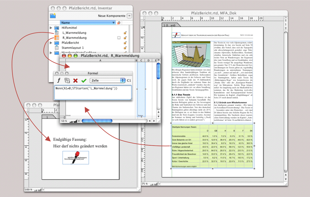
The sample documents from RagTime are very instructive, although unfortunately not explained in exhaustive detail. Let's take a closer look at one of them: «Slide as Warning». The principle consists of a formula that triggers a SlideTime function when a condition is met. In the RagTime sample document, it is a negative account balance that triggers a warning message. We apply the same principle here in an example of an unauthorized entry.
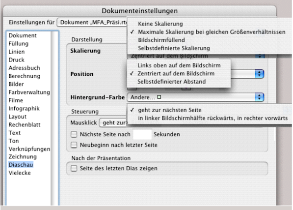
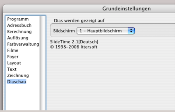
Basically, all you need is a formula in a spreadsheet and a layout with a page for the warning text. The prerequisite is that in «Document Settings ➝ Slide Show ➝ Navigation», you select how many seconds should elapse before moving to the next page (see Fig. 4.45). Since SlideTime automatically displays the document in the state it was in before the slide show started after the last page of a slide show, unless otherwise selected, we do not need to make any further entries. Unless, of course, you want to change the scaling or position. Under «Background Color», you can select a color from this panel. However, you can also select «Transparent» here so that the colors are then defined on the layout page. In our example, we selected the color from the palette.

We want to ensure that no one makes entries in the table in the document (see Fig. 4.44). Of course, you could protect the cells, protect the spreadsheet, and also protect the document. We will discuss this at the end of this chapter. Our protection is quite temporary and should be very quick to remove. Drag a spreadsheet over the table (slightly larger), set its colors (borders and cells!) to «Transparent». Open the component, enlarge cell A1 so that it is much larger than the entire container, and write the Formula 4.10 in any adjacent cell (in the example = C1).
The covering transparent spreadsheet frame alone prevents any changes being made to the actual table. However, if you enter something and press the Enter key, this triggers the start of the slide show with the screen-filling “warning message” (Fig. 4.45 right). The “warning message” is canceled after 3 seconds.
This is a great example of how the supposed presentation module «SlideTime» can be used for purposes other than presentations. However, it should be noted that only one layout can be called up for a slide show, i.e., neither master layouts nor individual components. But now let's turn to the actual function of «SlideTime», namely presenting.
4.8 What is different about «SlideTime»
There are two main differences between the well-known presentation programs and RagTime with SlideTime: first, every RagTime layout with SlideTime can easily be presented page by page as a slide show. So if the possible presentation is planned from the outset, a layout with its components can be created in such a way that not too much rework is necessary. Second, RagTime documents do not feature any of the familiar animation effects. But are these effects really that impressive? Does it really matter whether keywords and bullet points fly across the screen like bullets or whether each page flips over when you change it? Often, these gimmicks only distract from the actual message and give the impression that someone wanted to try out all the PowerPoint effects.
4.8.1 Highest level
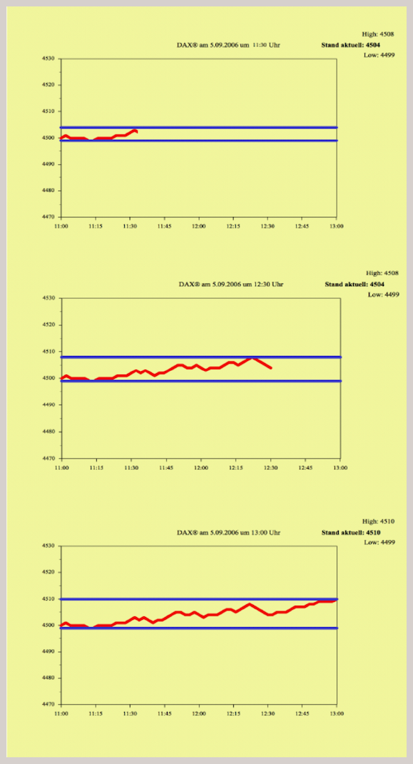
But let's stick with animation for now. The «Live Dax» example from the SlideTime sample folder shows one of the possibilities for animation. In this case, the same layout page containing a graph is updated during the slide show using the SlideTime function «STUpdate». This creates a “moving image” on the screen. The prerequisite for this is that the change on this page can be made mathematically dependent on the progress of the slide show animation. The SlideTime functions «STShownPage» and «STLastChange» provide the basis for this. A word of warning: attempting to build such a document using the functions themselves will most likely end in frustration. We have been there ourselves! The reason is that it is not entirely clear at what point one of the SlideTime control functions delivers the desired result and which status can be relied upon to perform the next calculation. It is better to start with the sample document and use it for your own purposes.
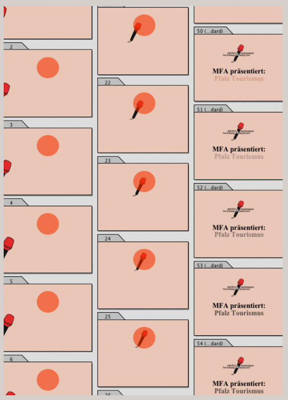
But there is also a more “clumsy” approach: if an animation effect is actually useful for the presentation, you can use the cartoon or flip book technique. This means that you design around 20 identical layout pages for a movement effect and move the object to be moved a few millimeters on each page. The flow of movement (jerky or smooth) depends on the number of movement steps (number of layout pages) on the one hand and on the time specifications you set for the presentation steps in SlideTime on the other. Fig. 4.47 shows a compilation from an intro for the MFA market research institute, which runs at 0.10 seconds per image (layout page). Of course, this requires a computer that can handle this speed.
Do you want an endless presentation to run automatically at reception, at a trade fair, or on an open day? You can already select a number of presets for control under «Extras ➝ Document Settings ➝ Slide Show». It should be noted that only colors and no fill style sheets can be selected for the «Background Color» option. If, for example, you want to use color gradients as the background for a slide show, draw a full-page frame – preferably in the master layout – and assign a fill style sheet to it. But be careful not to use color transparencies, i.e., always leave the opacity set to «Opaque». Otherwise, the image rendering that SlideTime uses for “printing” can become so slow and uncontrolled that a reasonable slide show is no longer possible. The situation is different if you set color shades with «Tint»; SlideTime accepts this.
In Fig. 4.48 we have displayed the «Document Settings» panel so that all drop-down menus are visible. Under «Scaling» the main distinction is between «Maximum scaling keeping ratio» and «Full screen scaling». The first option is based on the proportions of the document, while the second option fills the entire screen. Specifically, the first option usually results in stripes at the top and bottom or left and right of the screen (these stripes are the color selected under «Document Settings ➝ Slide Show ➝ Background Color»). In the second case, fonts and images are distorted because SlideTime fills the screen size without regard to the proportions in the layout.
If you want to run your SlideTime presentation on another monitor or via a projector, you must ensure that the correct screen is selected in the «Settings ➝ Slide Show» panel (see Fig. 4.49).
The bottom option, «Show Page of Last Slide» causes the slide show to display the page that was last presented by SlideTime as a slide when the slide show is interrupted in the corresponding layout. This function is particularly useful when testing a slide show. You can then interrupt the slide show where you want to make a correction and immediately see the page to be corrected on the screen.
4.8.2 Quick control
The selection in the «Slide Show ➝ Position» panel is self-explanatory. However, there is a little more to say about «Control». You can navigate to the next page either by clicking with the mouse or by moving the mouse to the left or right edge of the screen (left = previous page, right = next page). You can also set a fixed page change in seconds. The minimum value here is “0.01” seconds if you want to trigger a “flip book effect” in a layout.
Of course, layout pages that are to be viewed or read for longer must then be available in the appropriate number in succession. Otherwise, the time available for reading the slide would be too short, and a change of pace during the slide show would only be possible with formula control. You can achieve endless loops by checking the «Restart after Last Page» option. With these few settings in the «Document Settings» panel, you can turn any layout into an endless slide show. To quickly trigger slide shows from any document, you can also set up a keyboard shortcut: «Extras ➝ Keyboard Shortcuts ➝ Layout Commands ➝ Slide Show».
Nevertheless, we would like to emphasize that it is worth taking a closer look at the formula functions for SlideTime. There are only twelve functions, and a spreadsheet with a control can be used for any document that you want to present as a slide show.
4.8.3 Control with formulas
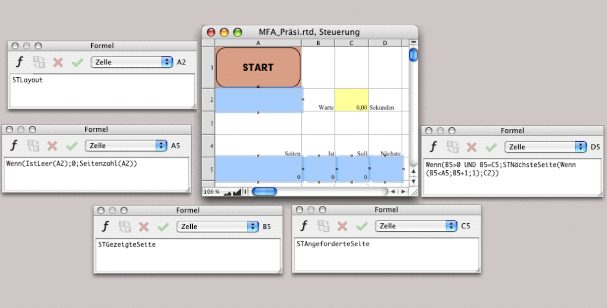
If you control your SlideTime presentation with formulas, the corresponding settings in the «Document Settings» must be disabled, otherwise they will retain control. The mouse click or mouse movement and the cancellation of the slide show using the 0 key cannot be disabled. The example folder for SlideTime contains a document called «Automatic with Formulas».
This document contains a spreadsheet for automatic control. You can copy this spreadsheet into any layout you want to use it as a control. In Fig. 4.50, we have shown this spreadsheet with the corresponding formulas. We have also added a start button.
However, make sure that this spreadsheet is set to «Nonprinting». Then it will be visible on the first layout page, but will not be shown in the slide show.
4.8.4 SlideTime functions
There are twelve formula functions available for controlling SlideTime, all of which begin with «ST». Since there are relatively few of them, we will present them here with a brief description.
STStart – This function starts a slide show from a layout. The name of this layout must be placed in parentheses after the function (in quotation marks). The function can be supplemented with additional parameters, e.g., «Page Number» (the page from which the slide show should start).
STShownPage – This function returns the page number of the page currently being displayed as a slide.
STNextPage – This function allows you to request the next page: first parameter = number of the requested page. In a second parameter, you can also enter a “delay time” (number corresponds to seconds). This is useful if a page to be shown later is to be prepared while a page is being displayed.
The number you enter as the second parameter corresponds to the number of seconds that this request should be held back. Other slides can be displayed during the specified delay time. However, no consecutive “queue” can be created, as each newly entered delay time deletes the previous request.
STSetPreviousPage – This function allows you to define a page that should be displayed when scrolling back.
STPreparePage – This function affects the request for the page that should be displayed next when you click with the mouse. You can also use it to control the order of the slides in a manual presentation.
STRequestedPage – This function returns a value, usually that of the STShownPage function. This allows for advance calculation while SlideTime prepares pages for slides.
STUpdate – This function allows you to show a page that is currently being displayed as a slide again. A delay is also possible here with a waiting time (number corresponds to seconds). This function allows for “programmed animation” – in contrast to our previously shown “manual flipbook”.
STStartTime – This function returns the time at which the current slide show was started as a value. This allows individual layout pages to be displayed for longer or shorter periods of time.
STSlideCount – This function returns the number of all slides shown so far (including the slide currently displayed on the screen) as a value. This allows you to control the page order (in conjunction with the «Index» function and a list of page numbers).
STLayout – This function returns the name of the layout currently being displayed. You can refer to this value to create other formulas related to the page number for control purposes.
STLastChange – This function returns a time value. Specifically, it returns the time at which the current slide was displayed or updated.
STStop – This function also returns a time value. Specifically, it returns the time at which the current slide show should end.
These twelve functions can be used to control both simple and highly complex slide shows.
4.8.5 Control with time entry
Fig. 4.50 shows a simple control for continuous playback with a time input for page changes. The spreadsheet can be dragged from the Inventory to the first page of the layout. Reduce the size of the container frame so that only cell A1 with the start button is visible. Set the spreadsheet to non-printing using «Drawing Information ➝ Objects» («Print Object» without a check mark). You can then start the slide show from the layout and the button remains invisible. As already mentioned, it is pointless to try to start the slide show from the open spreadsheet because only the layout component is possible for a slide show.
The start button itself is simple: under «Button Information ➝ General ➝ Title», enter the word «START», select «Push Buttons ➝ Command» and enter «Slide Show» as the command. Then all you have to do is select «Return Their Index». And what does the button trigger? The layout on which the button is located is displayed as a slide show according to the control in the spreadsheet. The slide show then runs endlessly until you cancel it with 0. In the yellow field, you can enter the number of seconds after which each slide should change.
Let's take a closer look at the control formulas: cell A2 displays the name of the layout that is currently running as a slide show. Like all other control commands, you cannot follow this because the functions run in the background while the slide show fills your entire screen.
Cell A5 refers to this name: as soon as a name is entered there, cell A5 shows how many pages the document has. Cell B5 shows the page currently being displayed, and cell C5 shows the page currently requested by SlideTime (corresponds to the page being displayed).
Cell D5 selects the command for the page to be displayed next: Only if B5 does not display a page should the next page of the layout be displayed. As long as the page number is greater than B5, this will continue; if not, the program will jump to page 1. This guarantees an endless loop. The last parameter then affects the speed of the change in cell C2. If, as in the example, «0.0» is entered there, the change will be “lightning fast”. However, this depends on how fast the computer can calculate and how complex the content of the pages to be built is.
4.8.6 Control short or long…
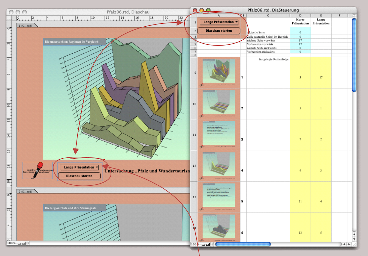
English or German, etc. After the more theoretical explanations, here is another example from everyday life. The market research institute MFA presents a study on the reasons why vacationers repeatedly prefer the same region. The presentation takes place in front of various committees. Once in front of the client's managers and decision-makers and other times in front of employees. This means that different versions of the presentation are required, and it should be possible to select them at the touch of a button.
Since such tasks occur repeatedly, we prepare controls that meet various requirements. Fig. 4.51 shows the layout to be displayed as a slide show in the background. There are two buttons on page 1: a selection button and a start button below it. Both buttons correspond to cells A1 and A2 of the «Slide Control» spreadsheet. Again, the spreadsheet was dragged from the Inventory into the layout, where the container frame was reduced to fit the two cells and the spreadsheet was set to «Nonprinting».
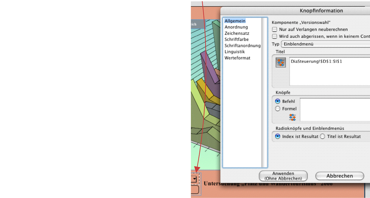
The start button is created in the same way as explained in the previous section. The selection button (Fig. 4.52) uses the formula to select all entries in cells D1:I1 of the spreadsheet. This means that it does not need to be changed if the slide show is to be run in more than two variants. Now you can copy column E, enter a new title in the top cell, and change the yellow-colored cells accordingly. But before we get to the formulas for the actual control and explain the structure, here's a tip for professional presenters.
When preparing for a presentation, it is helpful to have an overview, especially when selecting the appropriate charts. That is why our «Slide Control» spreadsheet has thumbnails in column A starting at row 9, which are reduced images of all slides (or pages) in the layout. Printing out the spreadsheet makes it much easier to plan the individual versions. In addition, it is easier to create a so-called “handout”, i.e., a document to be distributed, if such cells can be referenced from the layout.
4.8.7 Overview thanks to PDF
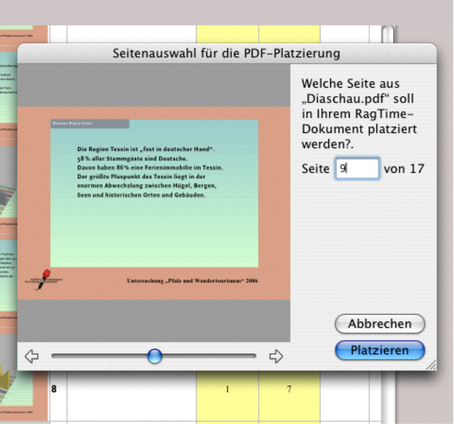
Once your slide show is complete, create a PDF. Then click in the cell of the spreadsheet where you want your first reduced image to appear (in the example, A9) and select «File ➝ Import…». Now you can select the PDF you just created and RagTime will display a window for selecting the pages of this PDF document (see Fig. 4.53). You will not only see a reduced version of each page, but also how many pages there are in total. Click the «Place» button to insert the PDF page. Of course, with larger presentations, it takes a little time to insert all PDF images into the spreadsheet in this way. It is therefore clear that the effort is only worthwhile if the slides created once have to be used frequently. As soon as the presentation itself changes, either in individual pages or with additional pages, you will need to create a new PDF and reinsert the changed pages into the spreadsheet.
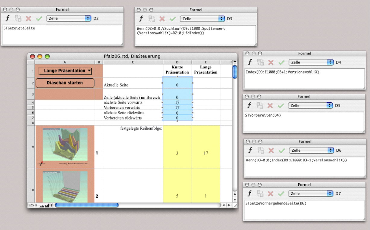
Whether with or without reduced representations: the formulas for control and the entries for selecting the slides remain the same. In Fig. 4.54, we have shown the spreadsheet again in a montage with all formula entries. The page numbers of the layout are entered in column B. In the cells highlighted in yellow, you must enter the page numbers in the order in which you would like the slide show to appear. In the example of the market research presentation, only the text slides are to be shown in a short version (compare with Fig. 4.55). The long version starts with slide 17, a slide that was added at the very end. Since the start and selection buttons are on the first slide, we didn't want to go to the trouble of repositioning the buttons, so we simply added the new page at the end.
You have already learned about the search function in detail in the chapter “Formulas Part 3: In full swing”. Here it is used successfully again. The formula in D2 needs no explanation. The formula with the vertical search function in cell D3, on the other hand, is very interesting: as soon as a page number is displayed in D2 – i.e., immediately after starting –, RagTime searches for the next page number in the specified range corresponding to the selection button («Version Selection»). An extremely large cell range was deliberately selected so that the formula is still correct even if the slide show is very long (1000 slides are unlikely to be reached).
In cell D3, again in accordance with the selection button, the index number is incremented by one for the current page. While the next page is being prepared in cell D5, RagTime uses the formula in cell D6 to calculate the page that is to be shown as the previous page in the manually specified order, which is then executed with the formula in D7. This backward calculation is necessary because SlideTime otherwise refers to the previous page in the layout. However, with the manually entered sequence, this can be a completely different page.
4.8.8 Slide show with sound and film?
It would seem obvious that RagTime 7, which already has a component called «Sound», would allow you to add sound to a slide show. This component is not new and, unfortunately, has not been updated. This is a shame, because this component is simply useless. Not that it doesn't work. Sound recordings are possible. Use a frame tool from the toolbar to draw a frame labeled «Sound». Or convert an empty frame under «Drawing ➝ Contents Type ➝ Sound» into a sound component. The component will then display a red dot button  in the center, which you must press. Of course, you will need an external microphone if your computer does not have a built-in one. The sound component is displayed with a speaker icon
  in the Inventory.
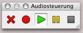
An audio component that has been recorded appears with a green dot button in the center. To play it, press this green dot. There is also a playful palette: «Windows ➝ Palettes ➝ Sound Controls». Fig. 4.56 below shows how (from left to right) the “audio content” can be deleted and how recording, playback, pause, and stop are possible. For the sake of completeness, it should be mentioned that the quality can still be changed under «Document Settings ➝ Sound».
4.9 A page-strong document
In section 3.5.1 “Automatic chapter titles”, we showed how to create a layout with automatic chapter titles. Here, we go one step further and assume that the MFA market research institute is creating a very comprehensive report. The individual chapters are so complex, with graphs, tables, and images, that a separate layout was created for each chapter. Such a document poses a number of problems. RagTime has a good solution for linking the page numbers of the individual chapter layouts. However, chapter numbering cannot be easily automated and must be created using a complex formula.
The trickiest problem is adding chapters with odd page numbers. Since a new chapter should always start on a right-hand page with an odd page number, a blank page must be added to the previous chapter if it ends with an odd page number. Of course, this requires a “control.” We call this spreadsheet «R Control».
4.9.1 Master layout for all chapters
Create your master layout for double-sided printing as shown in chapter 3 “Ready for print by notes”. For the first master page, enter «Whose Index Counted from the Start Is Specified» as the rule in the layout information and simply enter 1 in the formula field at the bottom. This means that this master page will be the master page for the first page of each layout. In the «General» panel, enter the Formula 4.11 for the number of the first page.

The formula requires that all layout components be named «Chapter kk» (kk = 2-digit chapter number) (see Fig. 4.60). With this formula, you no longer have to worry about linking the number of the first page to the last page number of the previous chapter in the individual layouts – the formula does that for you.
- Tip:
-
Those who deal with scientific work have more important things on their minds than constantly having to deal with updating headers and page numbers. Although a document that is largely controlled by formulas cannot be created in a matter of minutes, working with it afterwards can save a lot of time.


The «R Control» spreadsheet (see Fig. 4.59) looks slightly different from the simple document in chapter “Formulas Part 3: In full swing”. There will be a number in cell A1 – enter «70» for now and add the explanation «Number of single-line paragraphs per page» in cell B1. This will make it easier for you to deal with the blank page later on. The formula in cell C1 (Formula 4.12), which calculates the chapter numbers, is a vertical search and enters the chapter number consecutively in column A as soon as an entry with a chapter title is made in column B in the respective row. In cell B2, enter «Chapter Title» as the heading. Below that, starting in cell B3, enter your chapter titles.
To ensure that the chapter titles appear correctly in the headers of each newly opened layout, Formula 4.12 is required in the master layout. Use graphic text to place Formula 4.13 next to the logo in our example. You could also place the first part of the formula, which results in «Chapter kk», on the left side of the header and the actual text of the chapter title, which begins with «Index» in the formula, on the right side of your header (and the page number at the bottom of the page). Either way, don't be confused if the error «VALUE!» appears on the master page. It will look completely different on the layout pages (see Fig. 4.61).
Now create a text component and name it «Text kk». In this component, start with the «Heading» paragraph style and enter, with «Text ➝ Paragraph Numbers ➝ 1 – Digits», a paragraph number followed by a space or tab, depending on your layout preferences. Then enter the Formula 4.14 immediately after that. Don't worry if the formula returns an error value at this point. It will retrieve the chapter titles from the «R Control» spreadsheet in the individual chapter layouts. Close the heading with the end of the paragraph and simply enter «Text». followed by the character «>». Select this character and give it the name «End of Text xx». Also assign the fill style sheet «Nonprinting Fill» to the character. Formula 4.15 follows immediately after. Ignore the fact that this formula also generates an error value. The formula causes the character «>» to be followed by as many blank paragraphs as specified in cell A1 of the spreadsheet, provided that this character (as the end of the chapter) appears on an odd-numbered page.
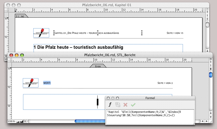
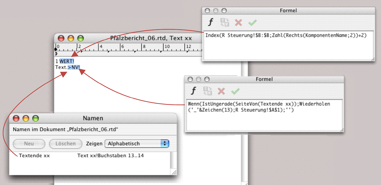
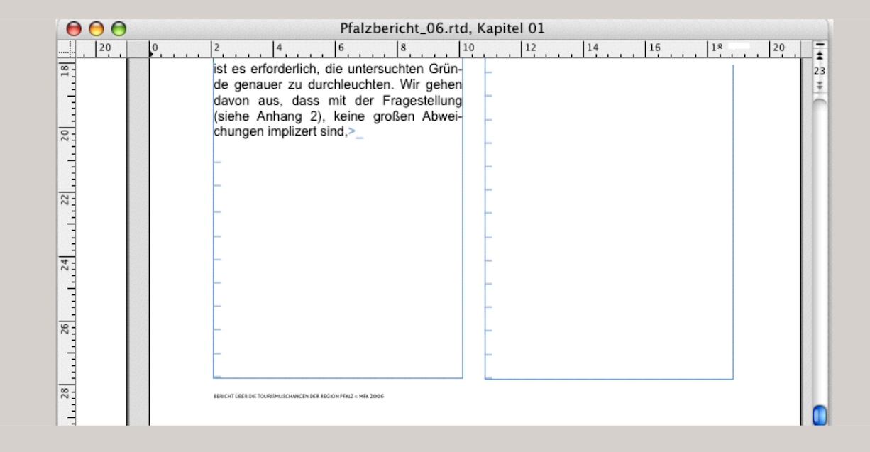
The number specified in cell A1 of the spreadsheet must be exactly large enough to fill a page with blank paragraphs using your format settings for standard font and standard paragraph. Strictly speaking, the formula does not insert blank paragraphs, but also adds an underscore so that you can see what is happening. Since the assigned fill style sheet is non-printing, the characters will not appear in the printout. You will only determine the correct number that belongs in cell A1 of «R Control» when writing the text in the layout of Chapter 1. As soon as the end of the text moves to page 3, the formula will add the blank paragraphs. As long as the end of the text is still on the first line, adjust the number in cell A1 until the added blank paragraphs are exactly enough to force the additional page.
4.9.2 The “instructions for use”
This will enable you to automatically insert chapter titles and add pages so that all chapters begin on the right-hand side. When working with this prepared document, there are a few specific steps to follow. The order of the following steps is not mandatory, but it is recommended. When you open a new chapter in this document, proceed as follows:
● Enter the chapter title in the «R Control» spreadsheet. It can be changed again at any time. Complete the entry in the cell by pressing the Enter key.
● Create a copy of the «Text kk» component in the Inventory. Rename this new text component according to the chapter number: for example, «Text 01» (or the next two-digit chapter number).
● In the new text component, select the «<>» character and change its name to «Text End kk» under «Windows ➝ Auxiliaries ➝ Name Editor» (kk = 2-digit chapter number).
● Select the chapter number at the beginning of the new text component and change it to «<n=k>» using «Text ➝ Paragraph Numbers ➝ Other Paragraph Number» (k=chapter number, without leading zeros – for more information on the use of chapter numbering, see section 4.10.1 “The paragraph numbering”).
● Create a new layout component in the Inventory (depending on the master layout) and rename this new component according to the chapter number to «Chapter kk» (kk = 2-digit chapter number).
● Drag the text component «Text kk» from the Inventory into the first container intended for the title in the layout «Chapter kk». The title will already appear (see also Fig. 4.61).
● Replace the word «Text» that appears in the actual text column with your content text for the report. You can also start typing your text before this word and delete the “placeholder word” at the very end. In any case, make sure that you never delete the end mark and the subsequent calculated text.
One more note: as we have noticed when working with such documents, RagTime occasionally displays the error «NV!» at the end of the text, even though everything is defined correctly. In this case, use the command «Extras ➝ Update Cross Page Functions» and everything will be fine again!
4.9.3 A whole book with RagTime
If a single RagTime document becomes so large that it is almost impossible to work with, then there is no other option than to create a separate document for each chapter. This is clearly the most complex solution. However, it also offers the best protection against data loss if a document suddenly becomes corrupted for any reason. Such disasters can be prevented by making frequent backup copies. This is particularly recommended if you want to create a work such as this book with RagTime. Always keep several generations of these copies and do not simply overwrite the previous one with the new one. We have created such a document and will make it available on the website www.pumera.ch, as it would go beyond the scope of this book.
4.10 What belongs in the report
In these sections, we summarize everything that is needed repeatedly in a larger document. This includes components that can be used creatively in a very useful way with RagTime. Let's assume that the market research institute has largely prepared all the graphics and tables for the study and is now compiling the report. The starting point for this is the document described in the previous section with several layouts – a separate layout for each chapter.
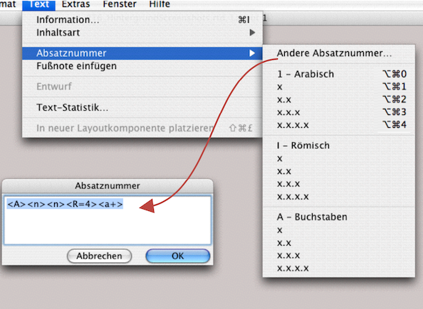
4.10.1 The paragraph numbering
First of all: for chapter numbering, it is definitely worth creating one or more keyboard shortcuts («Extras ➝ Keyboard Shortcuts… ➝ Text Commands ➝ Paragraph Numbers»). In Fig. 4.64, we have already entered such shortcuts under the paragraph numbering with digits – anyone who has already numbered chapters with RagTime 3 will recognize old acquaintances. This screenshot also shows which forms of numbering are possible. In addition, there are individual input options under «Other Paragraph Number…».
4.10.2 The types of numbering
The prepared commands for paragraph numbers in RagTime support up to 4 levels of decimal classification. For additional levels or mixed display (digits, Roman numerals, letters), the convention in Fig. 4.65 applies. With each new entry under «Text ➝ Paragraph Numbers ➝ xyx», RagTime counts the next consecutive number, where «xyx» stands for your chosen counting convention.

By entering «Text ➝ Paragraph Numbers ➝ Other Paragraph Number…» you can create your own complex classifications. Fig. 4.66 lists a few examples. The last two are particularly interesting for our report. Since we have a separate layout for each chapter, the paragraph formula must be re-entered or continued manually in each layout when the paragraph numbering is entered for the first time. RagTime then continues to calculate automatically as normal. Unfortunately, there is no function in RagTime that could make manual entry unnecessary. We would like to see an automatic function here.
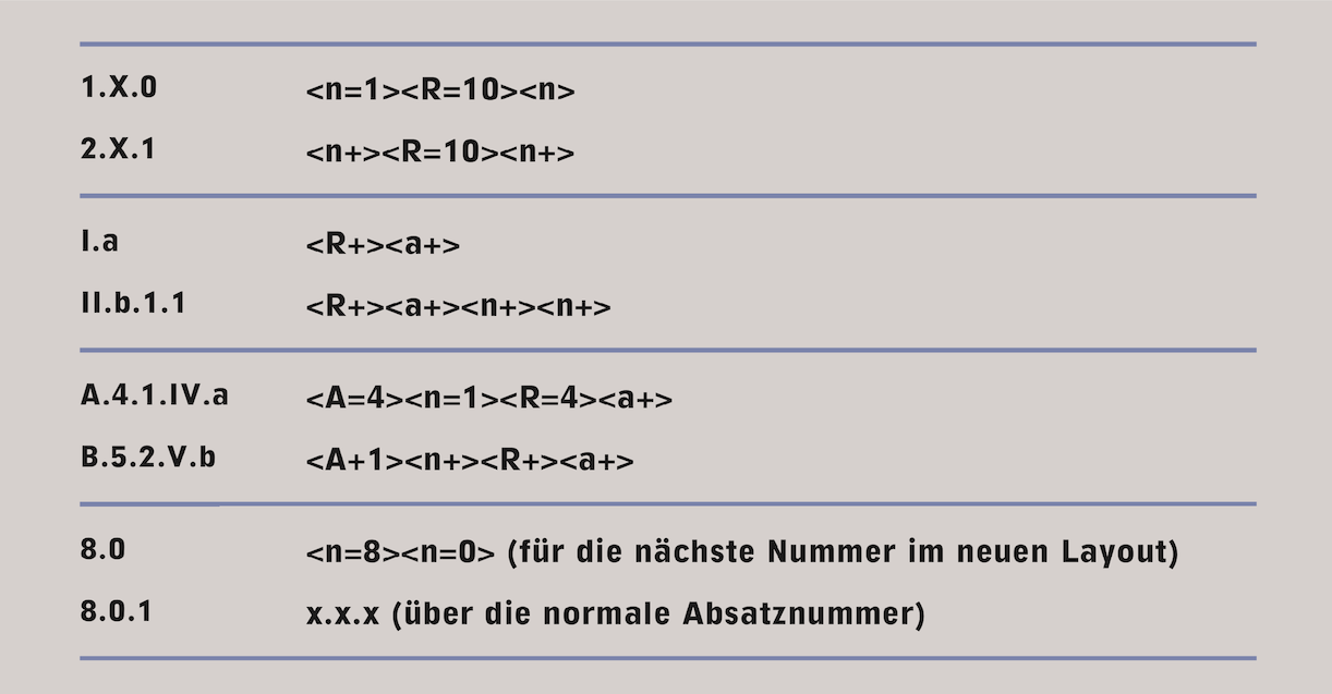
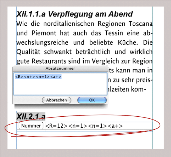
4.10.3 A paragraph number help
If you have a really complex structure for your paragraph numbering, it can be easy to lose track. You can create a small, simple aid for this: open a spreadsheet and insert a button in cell A1. Name it «Number» and insert it in the information panel under the «Paragraph Numbers» command. The «Return Their Index» setting must be selected. Now click on the last position of your text in the layout in which you want to enter the complex numbering. Drag the spreadsheet you just created into the text as a running component. Reduce the size of the component so that you only see two cells: cell A1 with the button and cell B1 for your “paragraph number cheat sheet”. The linked spreadsheet container is circled in red in Fig. 4.67. When you click the button, the input field for the paragraph numbers opens. Enter the desired numbering formula. Then, before confirming your entry, copy your numbering formula. After confirming, place your formula in cell B1 of the accompanying spreadsheet. This way, you will still have your last entry in front of you even many pages later. Then proceed as described above for each new numbering. Please note: the formula does not offer the option of inserting complex chapter numbers with a single command. Paragraph number formulas have nothing to do with RagTime's calculation formulas and there is no possibility of interaction. This is merely a “flowing reminder”.
4.11 Footnotes and a handstand
Every scientific paper needs footnotes. Most of the time, they are used for references, but sometimes they are used for special explanations. In RagTime, it is very easy to insert footnotes because they are generated almost automatically. Click on the somewhat amusing icon in the toolbar ( ) or select «Text ➝ Insert Footnote» and RagTime will insert a sequential number (or a selected character) at the insertion point in the text and, depending on the settings, a line and the footnote symbol at the end of the page or chapter. The insertion point will then flash there so that you can enter the footnote. Write your footnote and click back into the main text to continue. Functionally, it's not complicated, but a number of settings are necessary for the design. This is no problem for a single-column text across the entire width of the type area. But as soon as you work with a two-column layout or use the baseline grid, the typography no longer looks quite as pleasing.
But first things first: the «Document Settings ➝ Text» panel includes a section where you can define basic settings for footnotes. The same settings options can also be found in the «Text Information ➝ Footnotes*» panel. Logically, the higher-level document setting would take precedence over the text setting. However, the opposite is true, and any changes you make in the Text Information panel will immediately affect your open layout. We therefore recommend that you only use this panel to avoid any surprises.
The «Marking» setting allows you to manually insert a character for a selected footnote, which then only applies to that footnote. Under «Automatic Markings», you can work either numerically or with marking symbols. In the input field, you again have two options: a single character that should appear everywhere, or a series of characters separated by semicolons. These characters are then assigned to the footnotes in sequence. If you have more footnotes than there are characters available, RagTime starts again with the first character.
If you want to use a special character that is not available in the current character set, you must first search for the desired character via «Edit ➝ Insert Symbol», copy it, and then reopen the text information window for the footnote to insert it there. Of course, only characters from the character sets are possible; images or drawings are not allowed. The next settings relate to numbering – whether it should be continuous throughout the entire text component or start over again with each new container. This also depends on your layout design. The same applies to the «Position» setting. If you have selected «At End of Containers», a footnote bar will appear in both columns in a two-column layout (with two containers). If, for example, you want the footnotes at the end of the chapter, you must interrupt the pipeline of your text containers there and start a new pipeline again in the next chapter.
You can define the Separator Line» either across the width of the column, which corresponds to 100%, or shorter, depending on your requirements. The «Vertical Margins (Relative to Line Width)» is a somewhat unusual setting. It defines the distance between the line and the footnote text (and not the distance between the entire footnote and the main text, which cannot be defined manually). If the setting for the lines is too high (over 5000%), the separation line will suddenly appear somewhere in the main text. You can treat the separation line itself like a normal line in the line formatting: with color, line thickness, dots, etc.
- Tip:
-
The new links and hyperlinks feature in RagTime adds a long-awaited tool. The link properties are particularly useful for graphic text and spreadsheets. Other new features include the PDF function described in chapter 3 “Ready for print by notes”, and export as HTML files.
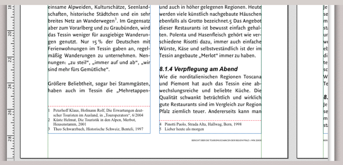
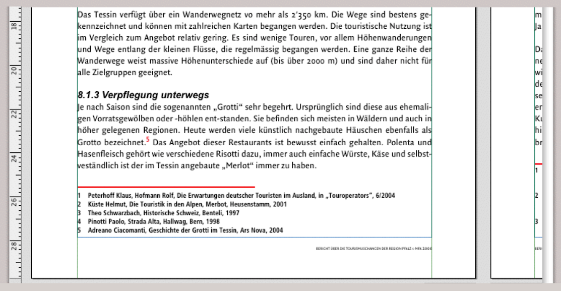
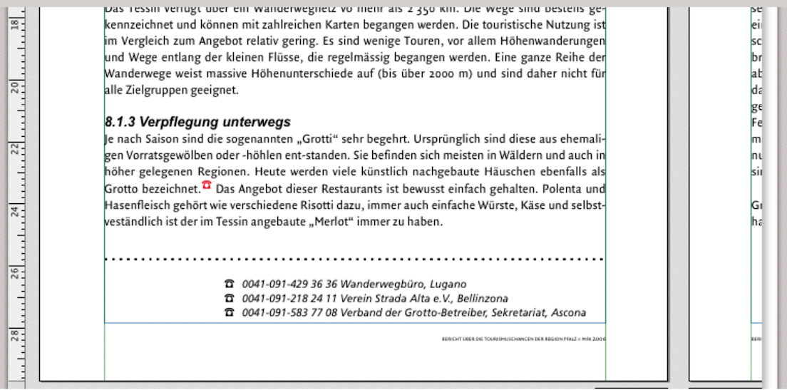
4.11.1 Format footnotes
Footnotes can be formatted like any other text. Be sure to create a character style sheet and a paragraph style sheet for your footnotes. You will probably even need two character style sheets: one for the character you use in the main text and one for the footnote text. This is because footnote characters usually appear slightly smaller and superscripted in the main text, which is hardly appropriate for the footnote text itself. When using superscript, you must ensure that it does not conflict with the line spacing of the main text in combination with the font size. This is particularly important when using a baseline grid.
4.11.2 A critical footnote
Although footnotes are an absolute must for anyone writing academic papers, RagTime's built-in footnote function is hardly impressive, meaning that the export options for footnotes are rather limited. We exported a document as a PDF or HTML file, and these were the only formats (apart from image formats and EPS files) in which document export with footnotes worked.
Another unacceptable feature is that footnotes cannot be selected as a whole, but only individually. This is tedious if you want to work with the footnotes in other ways. And the question mark becomes even bigger when you look for a directory where the footnotes are summarized, such as the image directory, the index entries, etc. So, for professional handling of footnotes, you have to come up with something yourself.
4.12 Hyperlinks for jumping…
Links are possible in RagTime 7 in all texts, both in text components and in graphic text, and even in spreadsheets. RagTime offers two options for creating interactive connections in text passages: links within a document and links as hyperlinks to websites. Under «Document Settings ➝ Hyperlinks», you can specify the colors and underlining for both types of links (Fig. 4.73).
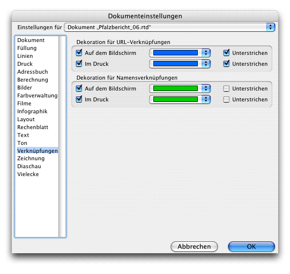
The steps for creating a URL link are extremely simple: write the website address in the text, highlight the entire address with the pointer so that it is activated, and select «Extras ➝ Mark as Hyperlink». When you hover over it with the pointer, the hand icon will appear. Clicking on it will open the corresponding page in your browser (Fig. 4.74).
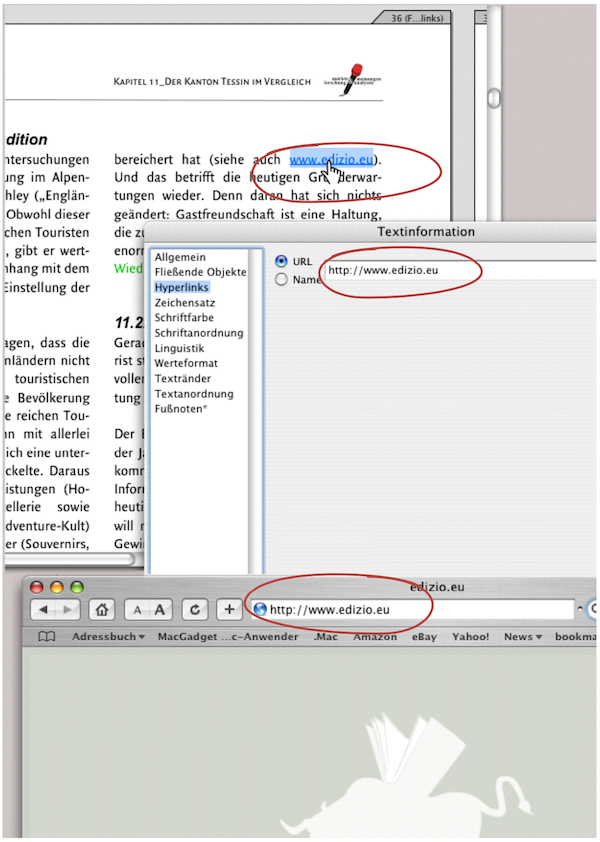
Jumping from one text passage to another is a little more complicated. Because RagTime needs to know where to jump to, you must first define the target text. This means it needs a name. Highlight the word with the cursor and select «Windows ➝ Auxiliaries ➝ Name Editor». Enter a name there. This name does not have to correspond to the word you selected as the target text.
Then go back to the place in your text where you want to create the link. Now highlight the start text and select «Extras ➝ Mark as Hyperlink». The «Text Information ➝ Hyperlinks» panel will open automatically, and you can enter the name of the target text there. This makes the start text clickable, and RagTime jumps to the desired target text. If nothing happens, you have either entered the name incorrectly or it does not exist. It is best to open the «Name Editor» palette («Windows ➝ Auxiliaries ➝ Name Editor»). Move the palette to the side of your workspace so that you can still see it clearly when you call up the «Text Information» panel.
If there is no entry under «Hyperlinks», enter it again. However, if the correct destination text is missing from the name list, it is better to repeat the process of assigning a name and then linking it. Incidentally, duplicate names can be deleted or changed in the name list.
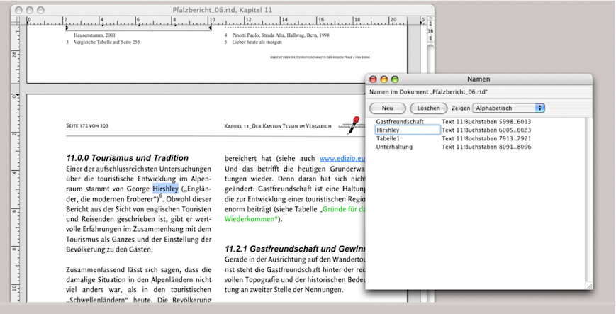
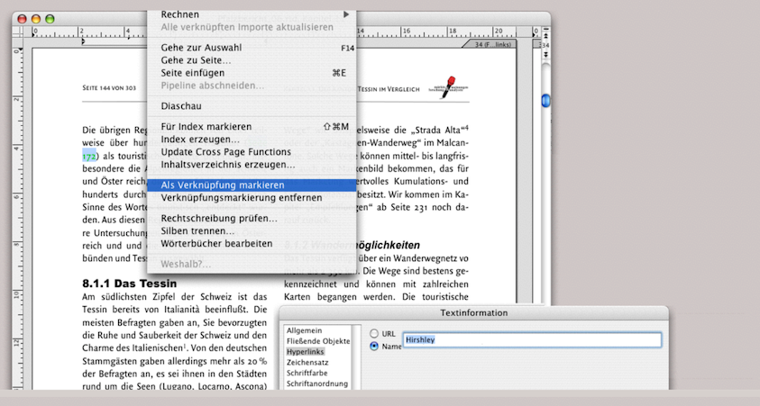
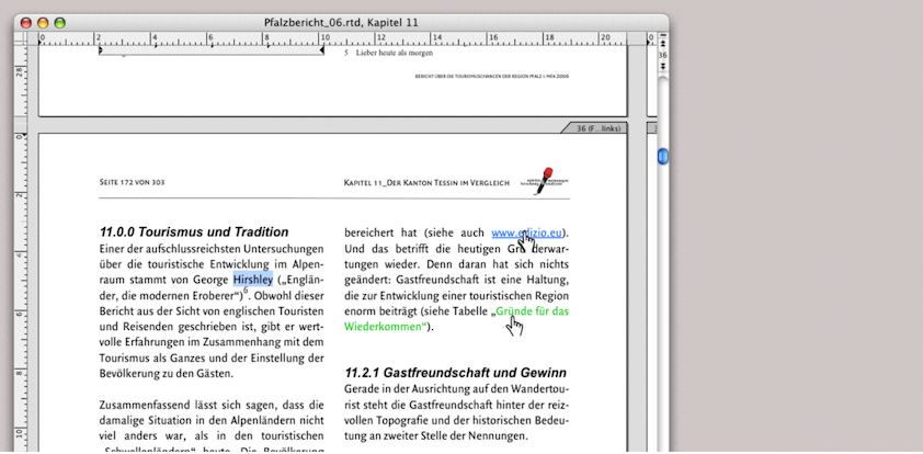
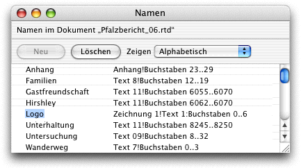
4.12.1 Page jumps are possible
Links can be created within a layout across multiple pages. This can provide useful references not only for the recipient of the document, but also for the creator of the document. For example, if a longer text is created intuitively and the structure of the individual paragraphs is only finalized at the end. In this case, such links can save a lot of searching.
Within a document, links can even span multiple layouts. If the corresponding layout windows are open, the window containing the target text jumps to the front. If this layout window is not open or if the target text is located in a text component that is not in any layout, the corresponding text component with the target text opens.
In Fig. 4.79 we wanted to push RagTime to its limits with links, which we succeeded and failed to do at the same time. Every further attempt to create a link resulted in a crash. But first things first, because there are some interesting things hidden here.
The document contains a spreadsheet and two graphical texts. With the exception of cells B2:B3 («Text in Cell Target»), which have «Text» as their content type, all other cells have no specific content type. The light green texts with the little hands have links. For example, «Start» in the graphic text leads to the words «Cell Target» in the spreadsheet. «Cell» in the spreadsheet leads to «Target» at the bottom right of the graphic text, «To» leads to cell A6 («500.00») and «445» in cell A4 leads back to «Cell Target» in B2:B3.
It is interesting to note that the entry «445» remains calculable even though text that has been marked as linked can no longer be formatted and, in this case, cannot be given a value format.
Basically, only the first letter of the selected start text is selected. This means you can delete all but the first letter of the word and the link will still work. However, you cannot copy the selected text and paste it elsewhere. It is possible to select the marked text and drag it with the pointer; the link will remain intact. If an entire graphic text is marked as a link – for example, the graphic text consists only of a URL address – you will have difficulty moving this object in the layout. Logically, the pointer immediately turns into the “link hand”. You have to aim very precisely to catch the edge of the graphic text. A tip: highlight the object with the mouse so that it is selected and move it with the arrow keys or define the position using the «Object Coordinates» palette. Even smarter: when creating the graphic text, don't just click in the layout and start writing, but draw a container that is larger than the actual text will be. Then you can later grab the handles next to the selected text without the pointer immediately turning into a hand.
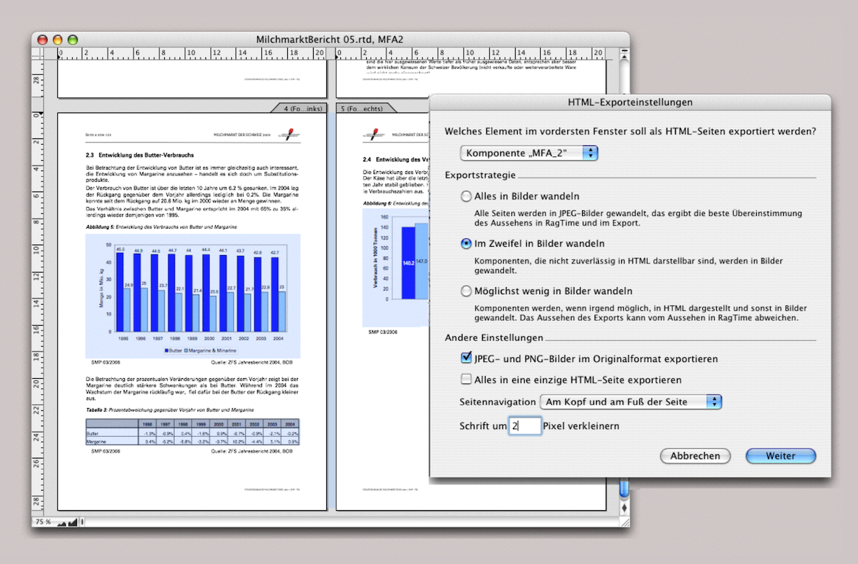
Links and hyperlinks are lost when exporting to .RTF / .DOC files. However, they are preserved when exporting to PDF, as well as when exporting to HTML. This brings us to the next point, exporting to HTML.
4.13 HTML – that is also possible
4.13.1 HTML export as text
Under «File ➝ Export to HTML…» the «HTML Export Options» window opens. You can see this panel in Fig. 4.80. In the first selection menu, you can define either the entire layout or a selection. The component that is currently activated with the pointer is always selected. Here, it is the text component. In addition, the export setting «Export Everything to a Single HTML Page» has been selected. Previously, we inserted special link texts in this text component (circled in red). At the start, there was a linked text that led to the end of the text and one that led to the next section of text. From each section of text, a marked text led to the next, and so on (see the «Name Editor» palette in Fig. 4.80). This worked as desired in the original RagTime document. However, it did not work in the HTML page in the browser. The links did not work. What a shame for all that work. Nevertheless, the text was “Internet compatible” (see Fig. 4.81). But let's move on to the export settings. The main questions for «Export Strategy» are as follows: do you want the layout to appear as accurately as possible on the website? Then the only option is «Convert Everything to Images». Or would you like your text to be directly copyable from the website? Then the option «Convert to Image as Rarely as Possible» is the right choice. We call the middle option button the “doubt button” because it leaves you in doubt about the outcome either way … You will see that a lot of HTML export has to do with trial and error. This also applies to the «Reduce Font Sizes by … Pixels» setting. As a rule, a value of 1 or 2 will result in a better font appearance on the website. The options under «Other Settings» are self-explanatory. Under «Page Navigation», the options «None», «At Top of Pages», «At Bottom of Pages», and «At Top and Bottom of Pages» are available. The corresponding navigation texts then appear on the website (see Fig. 4.83).
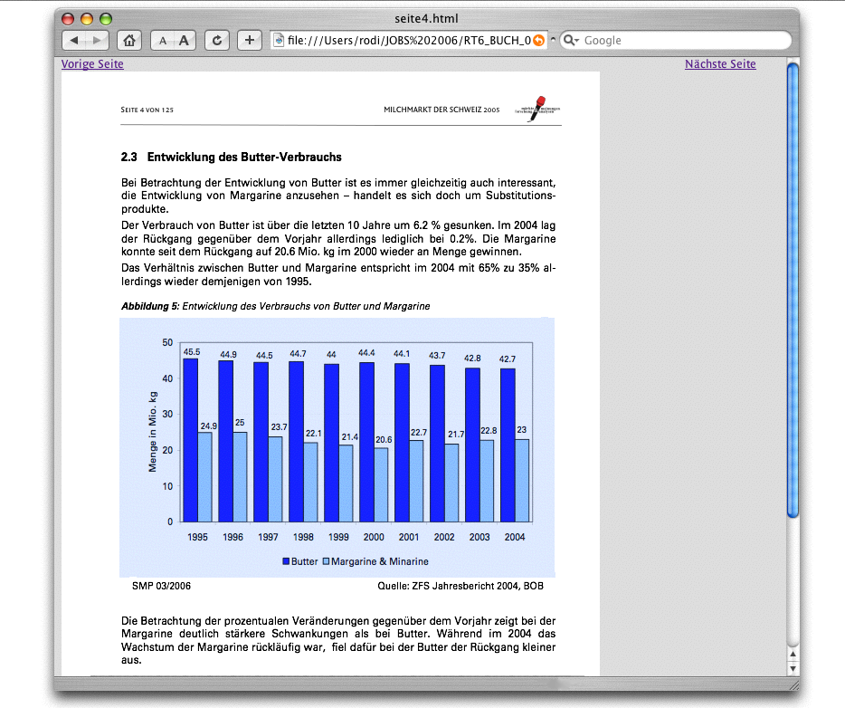
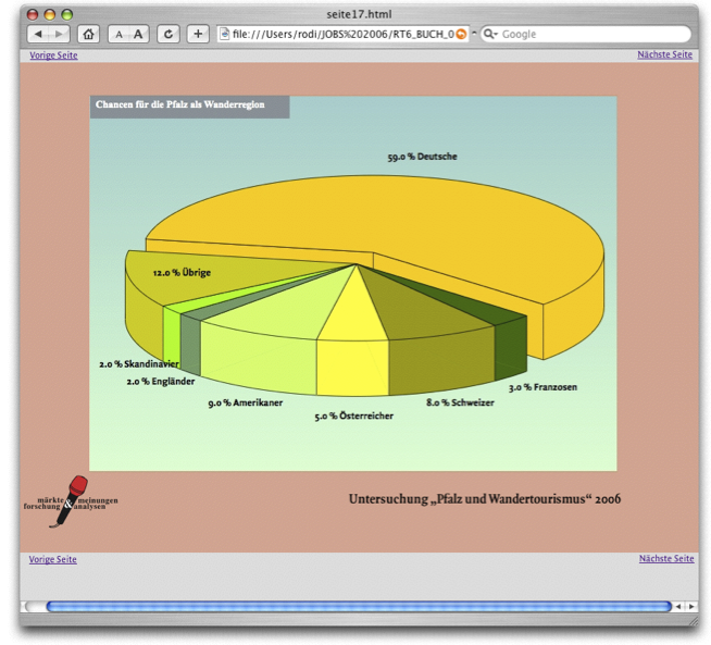
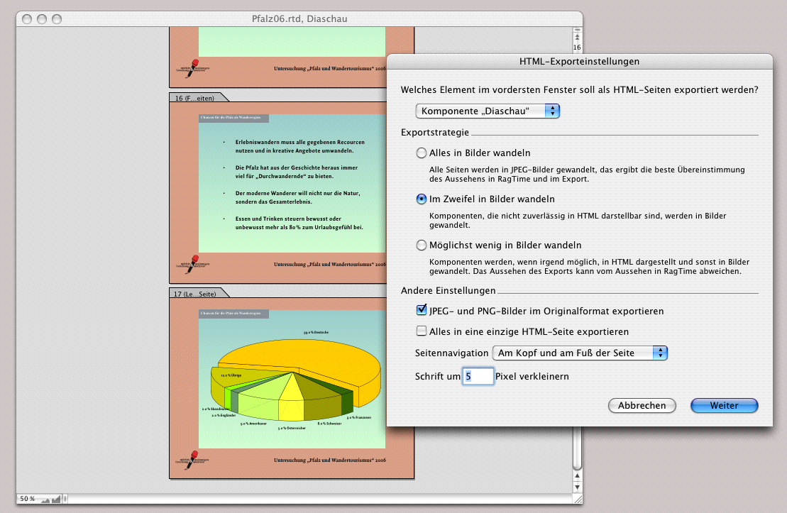
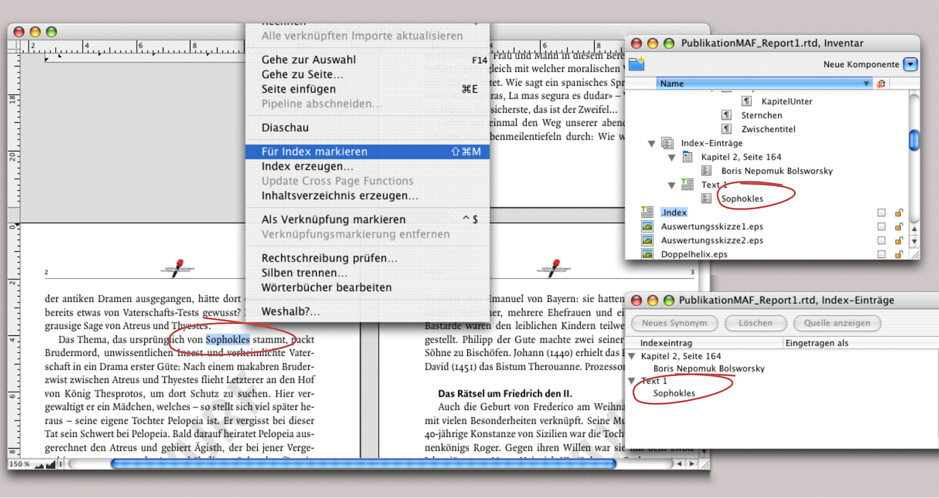
4.13.2 HTML export as document
In the second example, the entire layout was selected as a component. In addition, the navigation «At Top and Bottom of Pages» was selected. This solution is also appealing. However, the graphics and tables in the original document were images. In the third attempt, the entire layout was also converted. The layout consisted of graphs, EPS images, graphic text, and text components. The result in the browser was satisfactory (see Fig. 4.84). Only the setting «Reduce Font Sizes by 5 Pixels» was an attempt that was not satisfactory. The smaller negative font in the gray bar became illegible. In summary: this export functionality is suitable for smaller and spontaneous web publications. For comprehensive, functional websites, RagTime can be a good starting point for further processing the files with specialized website design programs.
4.14 Generate an index
A RagTime tool that has been around for a long time and is certainly indispensable concerns the index functions. Similar to links, this function involves marking text as words or entire passages. RagTime then creates an index with a single command function («Extras ➝ Generate Index…»). Let's go through the individual steps again using an example.
4.14.1 The simple index
Before we go into detail, here is an important note: the index is a fixed inventory of your entries. It has no relative relationship to the layouts. This means that if you insert or delete some text sections in your layout, rearrange entire sections, or even change the starting page number of the layout, some terms marked for the index will end up on other pages. The page references in the index will then no longer be correct. The «Generate Index» command must then be executed again (the markings themselves are not lost).
Creating the index, like the table of contents, is the very last step you take after making corrections to your layout or document. Conveniently, the index does not only apply to the layout that is currently open. You have the option of creating a common index for all layouts in your document or selecting individual layouts for it. Logical condition: you must first apply the markings everywhere. For a simple index, select a term from your text, choose «Extras ➝ Mark for Index» and move on to the next term. Once you have marked all the desired terms, select «Extras ➝ Generate Index…» and a new text component called «Index» will be created in the Inventory. This index text component contains all the marked terms with the corresponding page numbers. This text component can be formatted like any other text and dragged into a frame in your layout.
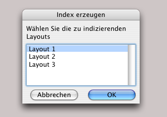
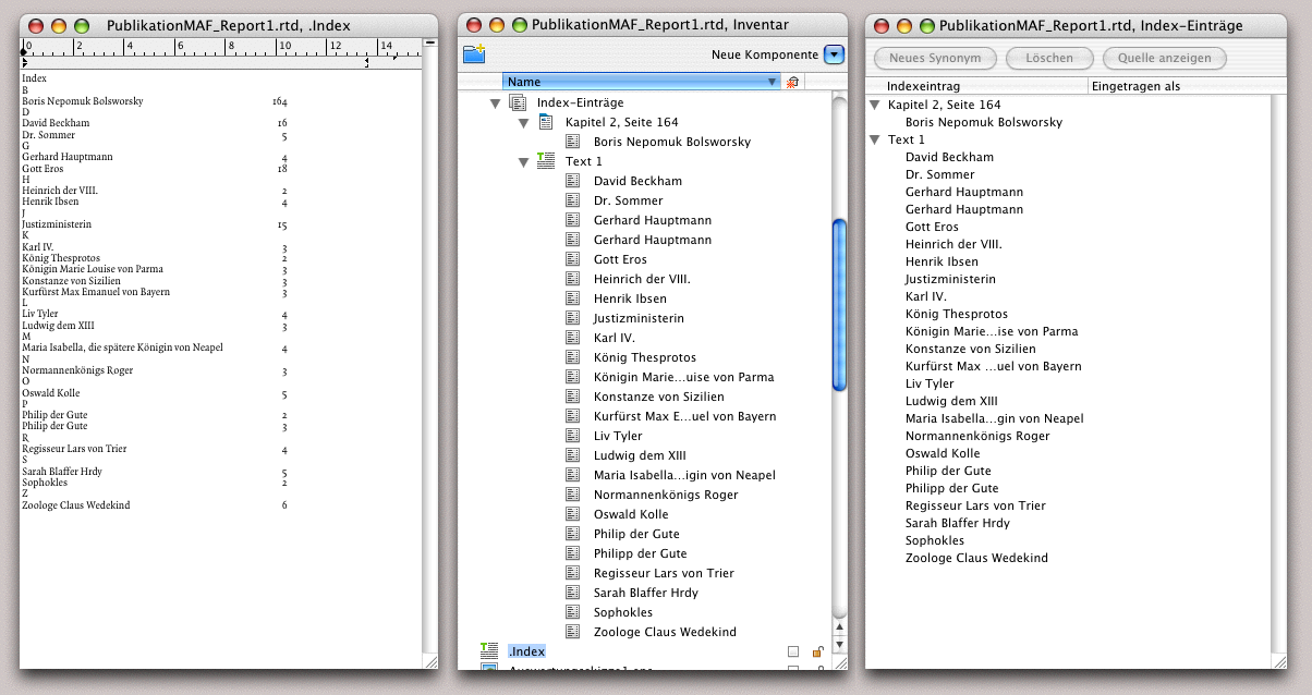
In Fig. 4.86 we have compiled the various windows and palettes in a montage. The term «Sophocles» is highlighted in the layout, then «Mark for Index» was selected (incidentally, keyboard shortcuts can also be used here to speed up the process), and the highlighted text immediately appears in the «Index Entries Editor» palette. Since an index has already been created, a text component called «Index» can also be seen in the Inventory. An icon appears in the «Auxiliaries» folder of the Inventory, which shows the hierarchy levels of the index like a folder. If you want to delete entries, you can do so either here in the Inventory or in the «Index Entries Editor» palette.
Let's assume we have selected all the desired terms in the text and then triggered the «Generate Index» command. Our index could then look like Fig. 4.90: on the left, the open text component of the index; in the middle, the index entries in the Inventory (from the auxiliaries folder); and on the right, the «Index Entries Editor» palette.
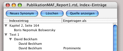
4.14.2 A “marked” trick
If you have a term in your text that appears very often, there is a simple trick to make it easier to mark it for the index. Select the first term in the text and mark it for the index. Then copy it. Open «Search and Replace», enter the term as the search term, and click «Search». RagTime will find the term in the text and activate it. Now all you need to do is enter AV/6V and then AG/6G for «Search Again». With these two commands («Search Again»/«Paste»), you can “replace” all instances of the term in the text. This is because the first term you marked will be marked each time you insert it. Observe this with the «Index Entries Editor» palette open. With each «Paste», the selected term reappears in the list there.
4.14.3 The «Index Entries Editor» palette
You can go one step further in the «Index Entries Editor» palette. The terms you have marked in the text may not be exactly the same as those you want to have in the index or glossary. And then there are terms that you may also want to search for as synonyms. All of this can be changed in the palette. The palette has three buttons: «New Synonym», «Delete», «Show Source». The «New Synonym» function allows you to list a term several times under different keywords. We will come back to this. The «Delete» button is logical; it allows you to delete all selected entries (it is only logical that this not only deletes the entries here on the list, but also removes the markings in the text). If you want to delete entries from your index but are not sure whether you still want to use them, do not do this in this palette. Select the «Index» text component in the Inventory, drag a copy and give it a different name (e.g. «Index_061202» – as the attached date). Then open this component and delete all entries that you do not currently want. Remember that the «Index» component is overwritten every time you trigger the «Generate Index» command. You can therefore create a new index again and again, but you cannot retrieve a previously created index – that is why you need the copy.
In our example, we have compiled a list of names as an index. If you want to create several index variants – for example, names separately, years separately, glossary terms separately – then it is easier to copy your layout and perform each marking process separately with the final index creation. The text files for the individual index types can be renamed in the Inventory. Depending on the situation, this approach is easier than separating the different terms from a single index. Finally, there is the «Show Source» button: select a term in the index palette, click the button, and RagTime will display the text passage in the document where the marked term is located. If the layout is open in the background, RagTime will bring the layout window to the front. If nothing is open, RagTime will open the corresponding text component and display the index-marked text passage.
4.14.4 Synonyms and peculiarities
If you want the entries in the index to be different from those in the index list, there are various options. We have listed some of them in Fig. 4.90 and shown on the right how they are then presented in the «Index» text component.
Case 1: The name in the text – selected as an index marker – is «Klaus-Dieter Balsing». In the index, the last name should come first, followed by the first name. To ensure that it is listed under the correct letter, double-click on the entry in the index palette. This makes the text editable. Change the first and last names as is customary in name lists.
It should be noted here that with an extensive index list containing many such names, it may be easier to make these name changes in a spreadsheet using a formula; see also the sections on address processing in chapter 2 “RagTime at school”. To do this, copy the index text component into a spreadsheet and create the necessary formula. Then copy the changes back into the layout.
Case 2: The name should appear under two headings – under «Bolsworsky…» and under «Writer/Poet». Select the entry and click the «New Synonym» button: the entry appears twice. Change both entries as described in case 1. Select the second entry and then click under the «Entered as» column. An input field will appear. Enter the synonym here. You can repeat this process as often as necessary. An index term can then appear under a whole series of different headings.
Case 3: The text contains «€-Currency» as a marked term. The special character is not listed under «E» in the index. Create a new synonym as in case 2. In the first term list, enter the keyword «Currency» in the right-hand column («Entered as») because that is where the term should also be found. In the second listing, write «/Euro» after the entry (to make the term easier to find) and immediately after it in angle brackets «<Euro>». This causes the term to be listed under «E».
Case 4: The main text contains «David Beckham» as a marked index term. In the index, it should firstly appear under various keywords (synonyms) and secondly be accompanied by notes. Therefore, create three new synonyms. Enter «Beckham, David, football player» as the main term, «see Beckham, David» as the synonym terms, and the keywords under which this name should be listed (in this case, «Family Men», «Celebrities» and «Athletes») under «Entered as». In the text component, «see Beckham, David» can then be found under each of these keywords.
Case 5: Here, only the last name was accidentally selected when marking the index term. You do not need to re-index the name separately, but can add the full name to the index entry. In addition, «New Synonym» was selected twice: the first time because the name should also appear under «Writers/Poets» and the second time because this poet has a pseudonym by which he is better known. In this example, you would then enter «see Hauptmann, Peter, known as Malcom “S”». In the «Entered as» column, enter «Malcom “S”<S>», which means that this entry will be found under «S». Of course, this entry can also be made in the same form under «M».
Finally, once your index is complete and created as desired, you can format the text file like any normal text file, for example, with fill characters (dots, etc.) between the keyword and page number. RagTime normally uses its own predefined paragraph style sheet for the index. You can modify this paragraph style sheet, but you should not rename it. This paragraph style sheet is particularly important for hierarchically structured indexes. Further information on this can be found in the «RagTime Reference».
4.15 The table of contents
Similar to the index, the table of contents also requires referenced text passages so that RagTime can create the table of contents. However, in this case, the work is a little easier. RagTime refers to the predefined paragraph style sheets «Headings». These paragraph style sheets contain an internal marker, so to speak. All titles, subtitles, subheadings, etc. that contain such a paragraph style sheets are automatically transferred to the table of contents when it is created. A tip: use such a paragrap style sheet for image captions as well, so you can quickly create a list of illustrations or copy it from the table of contents as a by-product.
Once again, RagTime cannot create an automatic table of contents without heading formatting. You must not rename the «Heading» paragraph style sheet. If you create a hierarchical structure under paragraph style sheets, the table of contents will also be structured hierarchically. Paragraph formats and their hierarchies (including “inheritance” within the hierarchies) are explained in detail in section 1.5 “Paragraph style sheets”.
The command for creating the table of contents can be found under «Extras ➝ Generate Table of Contents». Just like with the index, you will find a new text component in the Inventory after executing this command. Like the «Index» component, the «Table of Contents» component is a “snapshot», meaning it has no references to the layout. If you insert pages, delete pages, change sections, etc., and thus move the headings to another page, this has no effect on the «Table of Contents» text component. This means that you must create a new table of contents every time you change the layout. Therefore, it is only logical that the table of contents is created at the very end – and forms the conclusion of the chapter.
This concludes our market research case study – and all the others – and we wish you every success with your own work.