3 Ready for print by notes
Now the baton is raised to perform a complex work: the activity report of a music foundation. From the texts and figures to the finished files ready for printing. RagTime can set the tone here, from the correct preparation and revision of texts to layout design and the sophisticated use of linked data from spreadsheets.
We imagine working for a foundation for young musical talent. The foundation is relatively new, and you have just started your job. Your task is to coordinate and produce publications and to support media relations.
The activity report is due. The first award winners were honored last year. A large concert brought in additional sponsors. Everything is still in the early stages. This means that flexibility is a daily, almost hourly companion in your work. Nevertheless, you want to standardize your working methods as much as possible. Let's see what RagTime can do to help.
3.1 An activity report and more
Specifically, this chapter analyzes the three double pages opposite in more detail and builds them up step by step. The individual steps are as follows: brief recap of layout and master layout, creating a flexible organizational chart, linking spreadsheets with text, first pie chart, exchanging addresses in connection with mail merges, and an introduction to color spaces and exporting PDF files so that the activity report can be printed as it was prepared.
3.2 Layouts and master layouts
Experienced RagTime users are familiar with the many possibilities offered by master layouts. We will demonstrate this using a specific example. We will create the master layout for the foundation's activity report, which will be 54 pages long.
- Tip:
-
Master pages, master layouts, layouts, layout pages, and libraries are part of the daily routine for some, while for others they are a recurring cause of confusion. Sections 3.2 “Layouts and master layouts” to 3.3 “What is a library?” are a good refresher for precisely these others.
Master pages offer three key advantages: first, elements can be placed there that reappear in the layout on every page dependent on this master page (headers, page numbers, logos, or even non-printing elements such as radio buttons, etc.). Second, each master page can be used to define which container should trigger the addition of a new page via a pipeline. And third, master pages can be used to make subsequent changes that affect all dependent pages of a document. This is particularly useful if the width and/or height of the type area needs to be realigned or a new logo needs to appear on all pages.
Master layouts are basically there to facilitate arrangements and controls across a layout or an entire document. Containers on master layouts therefore usually do not contain any content, but control the appending of certain pages to the layout dependent on the master layout. Only there are the containers filled with content (text, spreadsheets, etc.).
Sometimes the name alone is enough to cause confusion. Logically, a master layout is created to generate layouts that depend on this master layout. A master layout can contain various individual master pages that have very different requirements (e.g., for a chapter title, as a continuation page on the left, continuation page on the right, for landscape image plates, for directories, etc.). Under certain circumstances, it may also be useful to create different master layouts. Conversely, however, a layout can only depend on a single master layout.
Even though a master layout can be copied, it always belongs to the document in which it was created. It is therefore not a separate document. And the layouts of different documents cannot depend on one and the same master layout. Unfortunately, RagTime 7 does not have any “meta master layouts” on which master layouts in multiple documents could depend. If, for example, a company's corporate identity is changed (with new fonts, colors, a different logo), then all master layouts in every form or document must be adjusted individually.
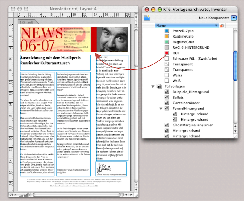
The adjustment process is not that complicated. You can drag master layouts from one Inventory to the Inventory of another document. All components on the master page are then automatically transferred (empty containers, buttons, spreadsheets linked to formulas, graphic text, etc.).
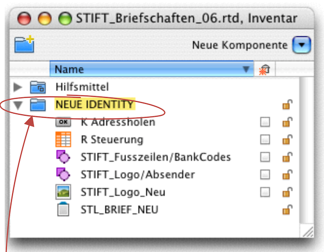
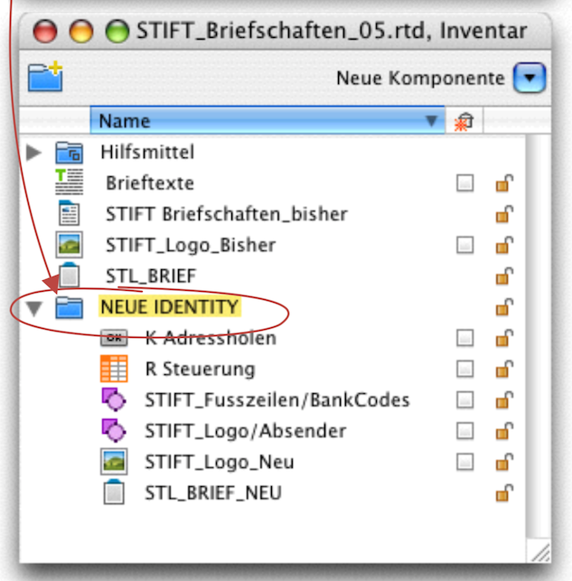
To avoid confusion, it is important that the individual components have different names. It is even better to place the new components together with the new master layout in a separate folder. This way, the folder is transferred completely to the other Inventory (see Fig. 3.5). In the example described here, however, the question now arises as to how to deal with the old master layout «ML_LETTER» – because, as already mentioned, each layout can only depend on a single master layout.
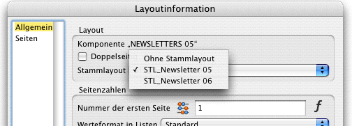
To link a layout that already depends on a master layout to a new master layout, you can double-click on the page tab. The «Layout Information» window will pop up, allowing you to select from the various master layouts in the document (see Fig. 3.7). But be careful: this will delete all content in the layout that depends on the first master layout and replace it with the components of the new master layout—a process that is rarely desirable.
You will then have to select the original master layout again to undo the process. Although technically possible, the above step makes little sense, as mentioned above. Either you change or replace the existing master layout, or you start a new layout based on the new master layout (see Fig. 3.6) and incorporate the texts from the old layout into it. To ensure from the outset that existing texts and content of the layout are retained in the Inventory, there must be no check mark behind the names on the right!
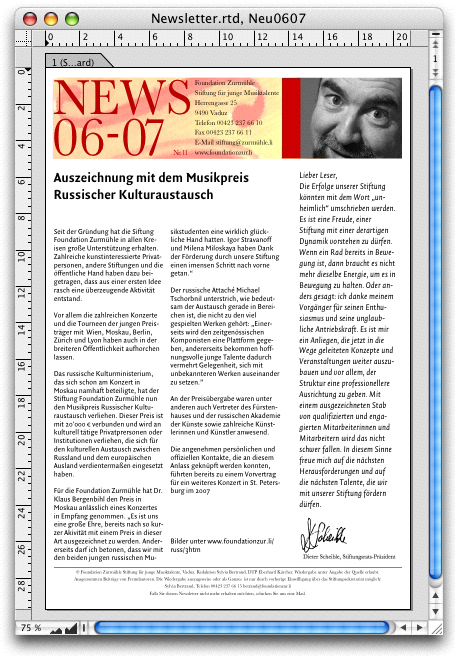
When working with RagTime, you will often find yourself in a situation where you can choose between completely different solutions, selecting the one that is right or easiest for you at that moment. Let's say you are responsible for the newsletters at the Zurmühle Foundation. A new foundation president has arrived and decides that the newsletters should include a column by the president and his portrait from the next mailing onwards. The next newsletter is actually already finished. You have been working on the previous layout and would only have had to update the date from «05-11» to «06-07». Now you need to change the layout and insert the new president's column. In this example, we assume that you have all previous issues as separate layouts in a single document.
How you proceed depends on various factors. In some cases, starting from an old issue, the text can be updated with a few changes – in which case, adapting or replacing the master layout in the existing layout is one option. However, if largely new texts are published in each issue, then a new layout, depending on the new master layout, is probably the simpler solution. If necessary, you can also incorporate older, existing text into the new layout for updating purposes. Where necessary, font and format style sheets will then need to be adjusted.
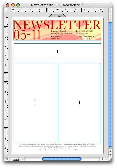
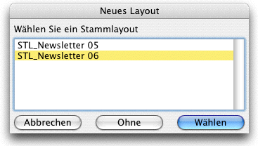
In the section Moving master layouts, we saw that master layouts can be moved to the Inventory of another document. Here we will look at the option of moving individual master pages. As with layout pages, master pages can also be selected individually by their tabs and moved, in particular to the master layout of another document. Specifically: You have both the master layout of your old document (Fig. 3.8) and that of your new newsletter document (Fig. 3.10) open. If you now click on the master page in the right-hand master layout in the tab and drag it over to the left above the «Standard» master page in the «ML_Newsletter 05» master layout, you will get two master pages there: the new master page as «Standard Copy» and the old master page «Standard» below it.
You now have three options, one good and two bad. First, the bad ones: you decouple the corresponding layout from the master layout and reassign it to the now changed master layout. What happens: the components of the old master layout remain on your layout and are covered by the components of the new master layout.
The second, already usable version: You delete the old master page under the newly inserted master page (in the dependent layout, all components are deleted—but not the text content in the Inventory). Then you basically have a new layout and have to reinsert the text. The third and most sensible option: You don't decouple the entire layout from the master layout, but only your first page. Under «Layout Information ➝ Pages ➝ Master Page», you can select the master page of the master layout that you now need. All other pages in the layout remain dependent on the previous master page and do not change.
The point here was not to highlight nonsensical processes, but solely to clarify the principle of master page and master layout dependencies. Only then can you decide in each individual case which process makes less work or more sense.
Extreme caution is required when deleting master layouts in the Inventory. This is because too much work could be lost in one fell swoop. RagTime prevents this by displaying an error message. However, if you still want to delete the master layout, you must first “decouple” the layouts that depend on it, i.e., select «Layout Information ➝ General ➝ No Master Layout». This anchors the components of the master layout in the layout, allowing the master layout to be deleted without deleting its components.
- Tip:
-
Pantries, in RagTime called «Libraries», are not only popular with squirrels. They can also become an indispensable tool for RagTime users. That's why it's worth knowing where you can tap into your supplies again and again.
3.3 What is a library?
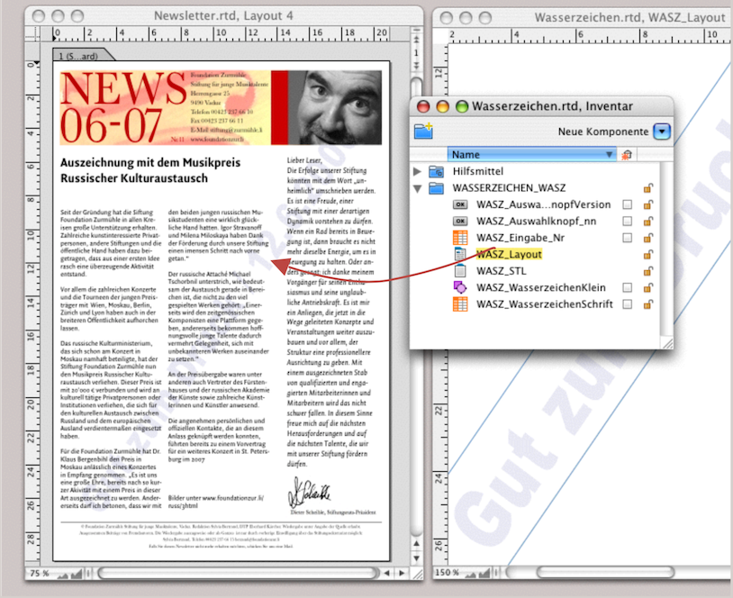
Libraries are links to other RagTime files that are used to transfer pages or components from the source file to the target file. In the case of a document that has been torn from a stationery, the stationery automatically becomes the current library. You can open the source file under «File ➝ Open Current Library». It will then appear as a reduced (10%) page preview in a separate window. The page view cannot be enlarged, but the window can be moved. From this window, individual pages can be dragged directly into your open document. This works with both layout pages and master pages.
If you drag a layout page that depends on a master layout into another document, all elements that depend on the master layout will be transferred, but without any dependencies. The master layout will not be transferred to the new document. In contrast, any style sheets used will be copied to the target document!
This may seem a little complicated at first glance. However, regardless of the topic of master layout, libraries can be extremely useful. That is why we will take a closer look at the topic of libraries in a brief insert here.
3.4 The library mentality
Help yourself to what you have stored away! Put simply, that is the idea behind libraries. The library of your open document is automatically provided when a) the document is torn off from a stationery (the stationery then becomes the library) or when b) you have two open documents and you drag any component or style sheet from one document to the other. The source document automatically becomes the stationery of the target document.
So it makes sense to create one or more source documents that can serve as active library over and over again. For example, a document with all reusable graphs, a document with various reusable font, color, and line style sheets, etc., or a document with buttons.
This allows you to create a folder with various documents that all serve as libraries. You can switch between libraries as you wish in the documents you are currently working on: «File ➝ Select Library» and select the document. Either a window with a reduced view of the layout pages from this library document will appear (see Fig. 3.12) or a window with the master layout of the library document.
The source document cannot be edited, but the Inventory can be opened and all components can be accessed from there. This means that you can drag and drop the various components from the Inventory and the open layout into the target document (see Fig. 3.14). What is not possible: moving parts from the components themselves (for example, individual text passages or individual cells and cell ranges from a spreadsheet). However, since you can open the Inventory, you can of course drag all tools from there into the Inventory of the target document – again into the Tools folder or directly onto an element in the layout (see Fig. 3.13). It goes without saying that you can also drag other components from Inventory to Inventory, as already mentioned.
But be careful: if, after dragging and dropping from the current library document, you want to switch back to the previous library document, a master layout in it may bring the containers and components of the master pages back into the current layout. These components from the master layout will then cover the others. Under certain circumstances, you may end up with some components overlapping each other. You can delete these components using the backspace key >/>. Depending on the number of components and pages affected, this can still be an extremely tedious task. Solution: first, detach all pages in the document from the master layout: double-click on the page tab and select «Layout Information ➝ General ➝ Master Layout ➝ Without Master Layout».
3.5 Double-sided master layout
For each project, you should first consider what RagTime has to offer in terms of procedures. Smaller documents may only need one layout, medium-sized documents may have several layouts for each chapter, and larger documents – such as this RagTime book – may have a separate document for each chapter. On the one hand, this increases clarity when working and makes it easier when several authors are involved or when the individual chapters are not created chronologically but are composed of independent parts.
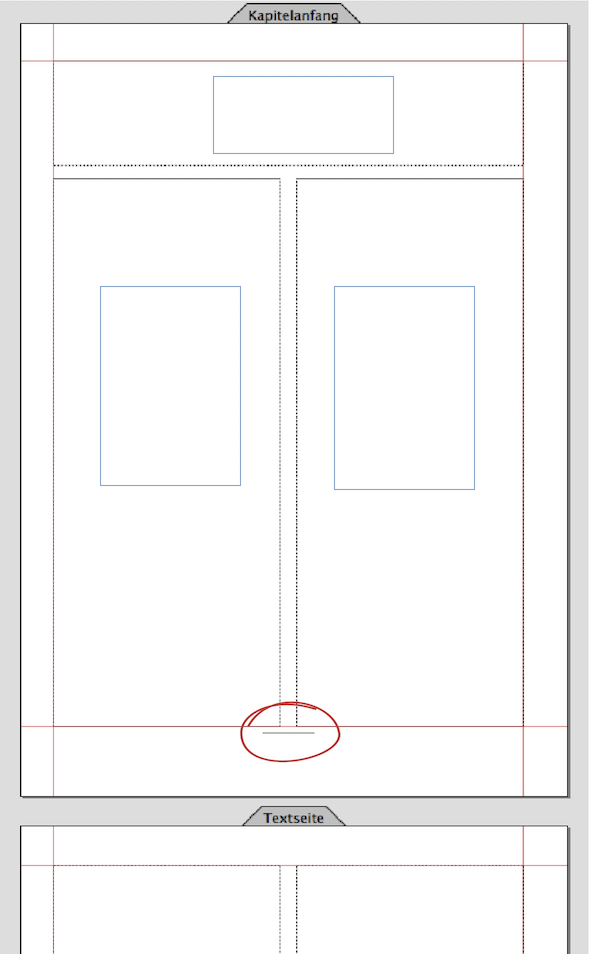
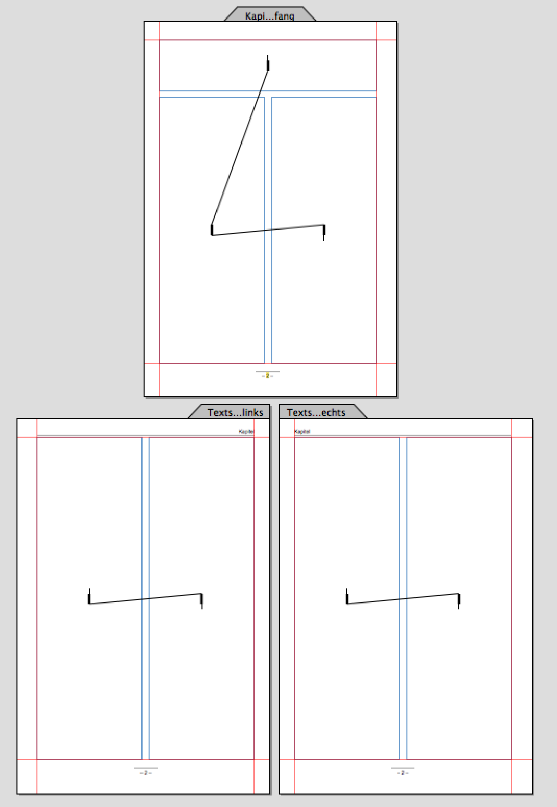
In our example of the music foundation's activity report, there will be different chapters, but they can all be created in a single document and also in a single layout. To do this, create a new document, starting with the master layout. Save the document immediately with a name so that RagTime can recognize it as an active document. Give the first master page the name «Chapter Start». Create a frame. In our example, use the following positions (left / top / width / height in cm): 1.3 / 1.5 / 18 / 4. A second frame has the positions 1.3 / 6 / 8.7 / 21. Duplicate this frame and move the duplicate to 10.5 / 6 (Fig. 3.15).
To set the page number automatically, inexperienced users often try to use a spreadsheet on the master page to enter a formula for page numbering. This cannot work because every page in the layout then contains the same formula, but refers to different pages at the same time. Here, you need to select the graphic text tool. Graphic text is not a component. Formulas embedded in graphic text can therefore be calculated independently on each layout page.
So draw a graphic text below the type area – about 2 cm wide (see Fig. 3.15) – and enter the formula:

Or simply write «– | –» and insert the page number at the position of the vertical line using «Edit ➝ Insert Special Text ➝ Page Number». Note: Use em dashes (“-, under Windows with «Edit ➝ Insert Symbol ➝ Favorites ➝ En Dash»), as simple hyphens are too short. Align the text centrally. Position the text vertically at 27.3 cm. You can draw a line between the text columns and the page number, either across the entire width of the type area or, as in our case, only 2 cm. The line thickness should be at least 0.2 pt for professional printing; if it is finer, it may not be reproduced correctly in print. Center the line and page number horizontally on the type area. The chapter title page is now almost complete. Now copy the master page, paste the copy below the page, and name the new page «Text Page». Remove the top frame on the second page and then drag the two columns to the top edge of the type area. Fig. 3.22 also shows red guides that define the type area. Additional guides can be added later if necessary. The right-hand page of your master layout is now complete.
- Tip:
-
If you want to automate larger documents with formulas – for example, with chapter titles, consecutive page numbers across multiple layouts, or even documents – it will be easier if you have familiarized yourself with the formula chapters in advance.
3.5.1 Automatic chapter titles
On the pages following the chapter heading, there should be a header with the corresponding chapter title. First, draw a line across the width of the type area, 1.3 cm from the top. If you want RagTime to calculate or assign the chapter titles automatically, some preparation is required.
For a well-synchronized assignment, it is best to work with an additional spreadsheet «R Control». Make columns A and C about 1 cm wide and column B about 5 cm wide. Leave row 1 blank (it will be used later for the header of the table of contents). In cell C1, enter Formula 3.2:

This formula ensures that the chapter number appears in column A as soon as a chapter title is entered in column B. This means that you will not write the chapter titles in the text, but in column B of «R Steuerung».
Enter the following formula in cell C2:

Copy the formula (it requires the MetaFormula functions) downwards, depending on how many chapters your document will have. This formula will determine on which page the relevant chapter title appears. Enter the title of the first chapter now, or – if you cannot decide on this yet – simply enter «Title of the first chapter».
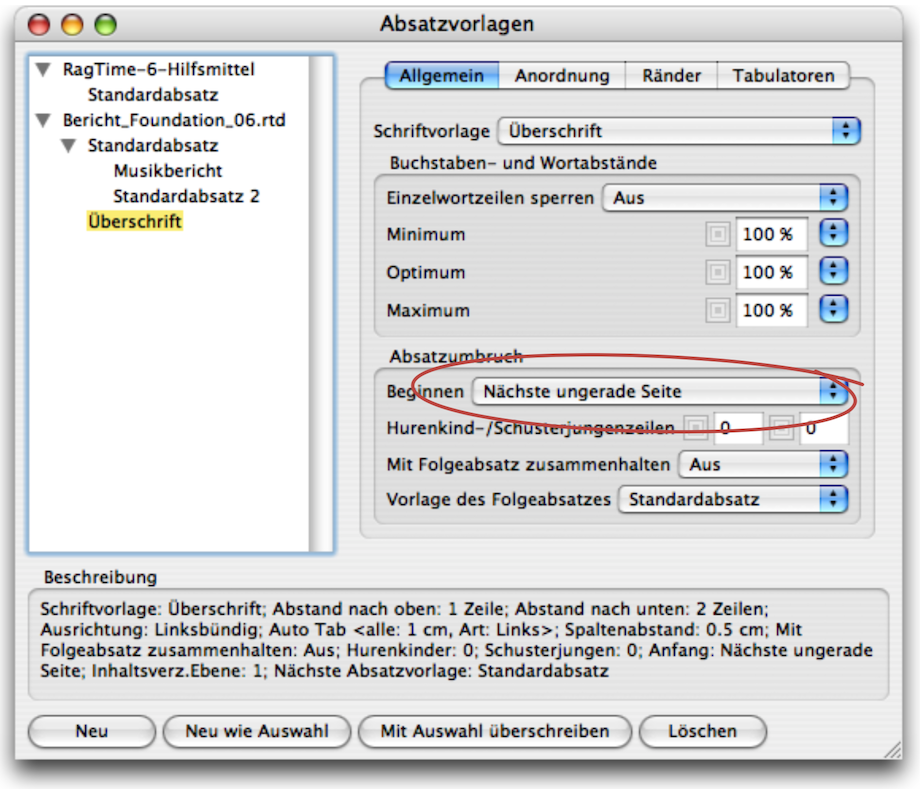
Open the character style sheets and set the fonts for the standard font and heading. First, drag the «Heading» style sheet from the tools to the list of style sheets in your document. Proceed in the same way for the paragraph style sheets. For the «Heading» style sheet, select the option «Next Odd Page» under «General ➝ Breaks ➝ Start».
As you know, master pages can be controlled with formulas so that they are only used for layout pages when certain conditions are met.
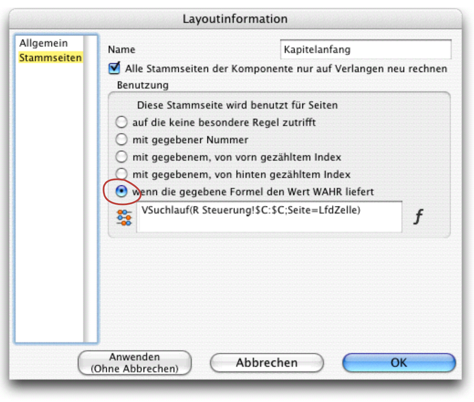
In this case, all pages on which a chapter title appears should depend on the first master page. So return to your master layout and set Formula 3.4 for the first master page under «Layout Information ➝ Master Pages ➝ Usage».
using the option «If the Specified Formula Returns TRUE». Name this first master page at the top of the same table «Chapter Start» (see Fig. 3.17).
The formula searches for the number of the current page in column C of the «R Control» spreadsheet, i.e., in the table of contents. If it is found, this master page is authoritative for the page in question. If the search is unsuccessful, it returns the value 0, i.e., «False», and the text master page is used. This forces this master page to be used at the beginning of each chapter.
All that's missing now is the header, or rather the formula that puts the correct chapter heading on each subsequent page. So go back to the master page «Text Page». Above the line, drag a text box with graphic text to the left edge of the type area. Make sure it is not too short (about the width of a column). Enter the text «Chapter », followed by the formula:

The formula searches for the number of the current page in column C of the «R Control» spreadsheet – if it is not found, the next smallest value is used – and returns the value from column A on the same row, i.e., the chapter number. For the actual chapter title, draw a second frame above the line using the graphic text tool. Starting at the right side of the type area towards the center, also about one column width. Select the alignment («Format ➝ Alignment ➝ Right Aligned») and enter Formula 3.6 there.

Just like the previous formula, this one takes the current chapter title from column B. Now, if necessary, click on the two header elements and align them vertically to the same height.
Now we need to create the master page for left-aligned layout pages and control the text flow with pipelines. Click on the page tab for the «Master Text Page» and then select «Layout ➝ Double-Sided Master Page» to create a mirror-image page – except for the alignment in the header. On this new left master page, you must align the right header (where «Chapter » is located) to the right in the text, while the text in the other header element must be aligned to the left.
To draw the pipelines, reduce the display scale so that you have all three pages in front of you. Now draw vertical pipelines from the top frame of the «Chapter Start» page to the frame of the left column and from there to the right column. From there, draw to the bottom left page in the frame of the left column and continue to the right column and logically on until all frames are connected with a pipeline. Unlike pipelines in a form, you do not need to create a “ring pipeline” for the last frame. Your double-sided master layout is now complete and should look similar to Fig. 3.18. All that is missing is the adjustment in the layout itself.
Create a new layout that depends on the master layout you just created. Assign the content type «Text» to the top frame. Click in the frame, select «Format ➝ Paragraph Style Sheet ➝ Heading» and then get an automatic paragraph number «Text ➝ Paragraph Numbers ➝ X» (i.e. not «1»!). Give this number a name under «Windows ➝ Auxiliaries ➝ Name Editor». Write «Chapter 01» there (see Fig. 3.19). The chapter number may be followed by a period, then a space or a tab, depending on your layout preferences. After that, enter a calculated text – i.e., a formula – to retrieve the chapter title from the «R Control» spreadsheet. This is, of course, the same Formula 3.6 that we already used in the header of the master layout. In Fig. 3.20, we have left the palette with the formula open to show this function again.
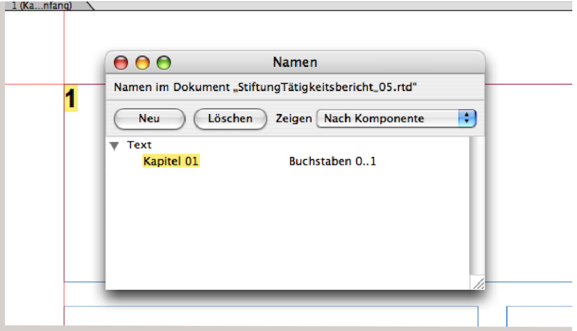
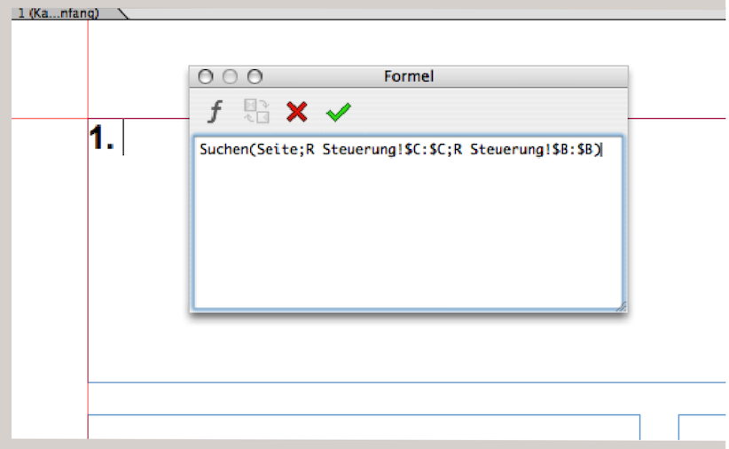
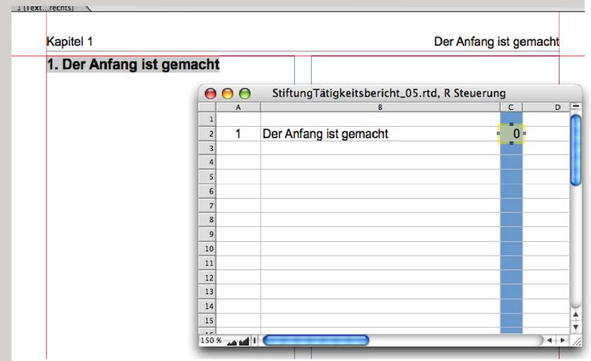
Fig. 3.21 shows the «R Control» spreadsheet, where the chapter title has been entered. It appears automatically, both as a heading in the text and in the header of the text pages. Your style sheet is now ready. You can save this document and file it in your archive. The layout can be easily adapted to other design requirements using the master layout. Four more tips for use: 1. To start a new chapter, copy the title line of an existing chapter and insert it at the end of the text (after the end of the last paragraph). – 2. Select the chapter number of this heading and enter a new name «Chapter kk» («kk» corresponding to the chapter number) under «Windows ➝ Auxiliaries ➝ Name Editor». – 3. Do not insert the chapter title in the text, but in the spreadsheet that is used for control. There it can be changed at any time and will appear correctly throughout the layout. – 4. Enter the command «Extras ➝ Calculation ➝ Calculate All» several times until the table of contents has been calculated correctly and the correct master page has been assigned to the chapter start page.
Such solutions absolutely require instructions for use. Every RagTime document containing several coordinated formulas should be documented. This is necessary both to demonstrate how the formulas work and to explain how to proceed when working with the document. Otherwise, many things will be forgotten and you will wonder what one formula or another is for. Or worse: you will get annoyed when it doesn't work and no longer know which processes follow each other.
3.6 Layout: getting typesetting in shape
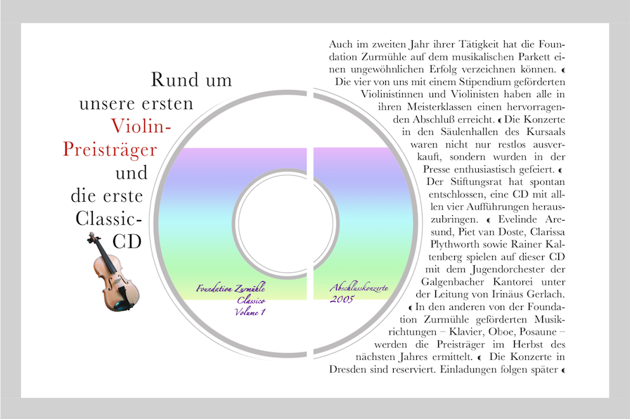
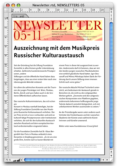
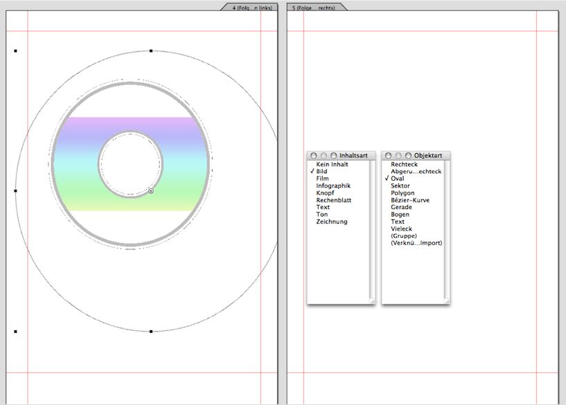
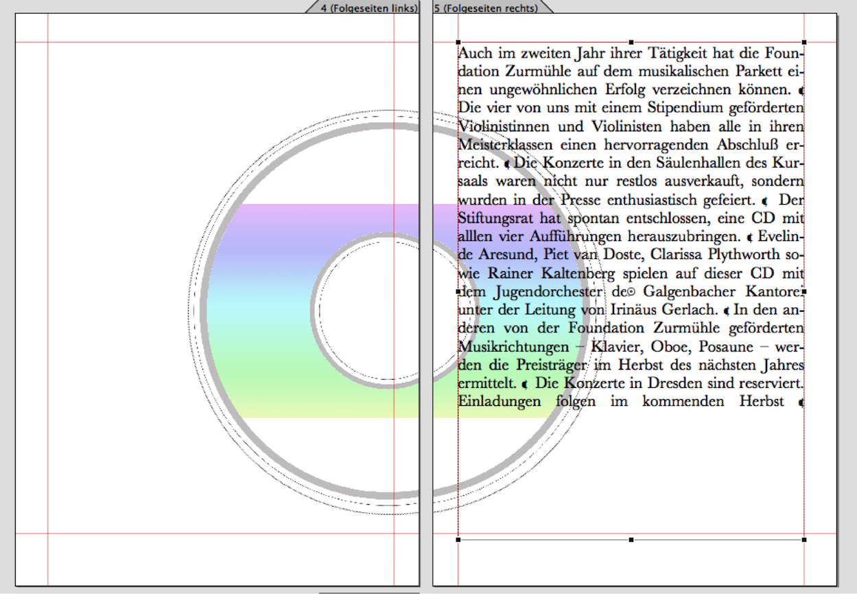
To demonstrate how RagTime simplifies layout with typesetting, let's take a look at the double page from the music foundation's activity report shown in Fig. 3.22. For the design professionals among you: the double page is not in the middle of the printed report (where it is easy to layout text that extends beyond the gutter). In our example, we have also omitted the so-called «bleed» on full-bleed and cross-fold pages for the sake of simplicity. In the layout we have just created, we draw a circle on the left-hand layout page – select the «Oval» drawing tool and hold down the Shift key. Please note: First click the mouse button, then press the Shift key – it does not work the other way around. We select this circle to be approximately the size we need for the CD image. Then we select «Drawing ➝ Contents Type ➝ Picture». Now we can import the desired image – in this case, a CD.
Due to RagTime default settings, imported images are always imported proportionally so that they fill the container either in width or height. Another default setting concerns the linking of image and container. If you then drag a handle at the edge of the container, the image changes accordingly. You can change this (either via the menu bar under «Picture ➝ Connect Container and Contents» or by double-clicking on the image to call up the image information). We choose the second option because we now want to adjust the size of the image by entering it in the image information.
Move the «Picture Information» panel so that you can still see the layout clearly (unlike in our example in Fig. 3.24). When entering the «Scaling» value, you can try out different sizes to see which one suits you best. After each entry, select the «Apply (No Cancel)» button so that the «Picture Information» panel remains open. When entering the percentage values, it is important to click the «Preserve Original Proportion» checkbox. This ensures that the width and height are treated equally and you only need to enter one scaling value; the other will be applied automatically by RagTime. If the checkbox is not selected, the image will be distorted horizontally or vertically. If the CD image on the left side is correct, activate the container: First press the mouse button, then press the “1/61 keys, and finally drag the container to the right side with the mouse. A copy will be created at exactly the same height. To avoid confusion in the Inventory with different image copies, open the Inventory and drag the original image file from the CD into the container you just copied. RagTime will delete the image copy: both picture containers now contain exactly the same image.
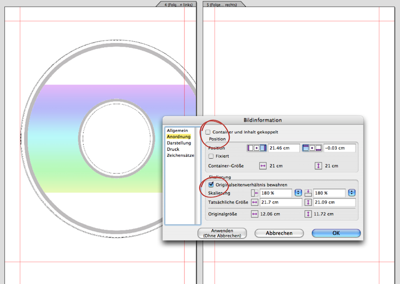
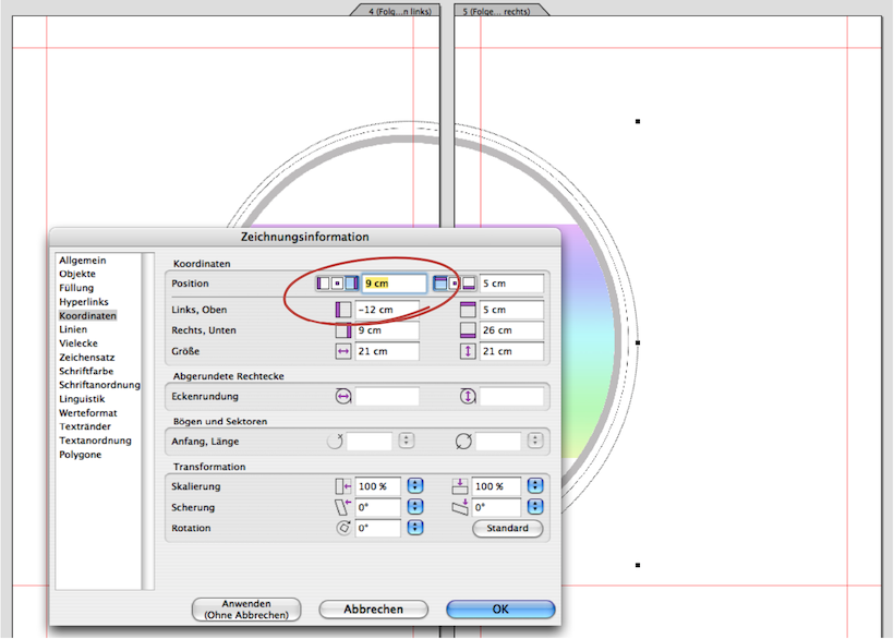
The CD halves should be exactly aligned on the left and right sides. Here's a little math problem: Both images are exactly 21 x 21 cm. The image on the right side is placed 9 cm from the left edge of the paper. The width of A4 paper is also 21 cm. How far from the right edge of the paper should the image be placed? We admit that this is a trick question: the answer is again 9 cm, but from the right edge of the paper. So, when you call up the drawing information for the image on the right, just click on the setting for the right margin and enter 9 cm as well (see Fig. 3.25). Logically, the principle of continuation calculation also works with non-symmetrical dimensions. Professionals know that the corresponding millimeters must be added for trimming in the case of full-bleed printing.
3.6.1 The text around the image
Draw a text frame in the type area on the right-hand page and write your text in the font formatting that suits you, but in justified alignment (Fig. 3.26).
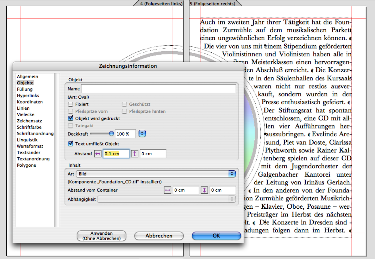
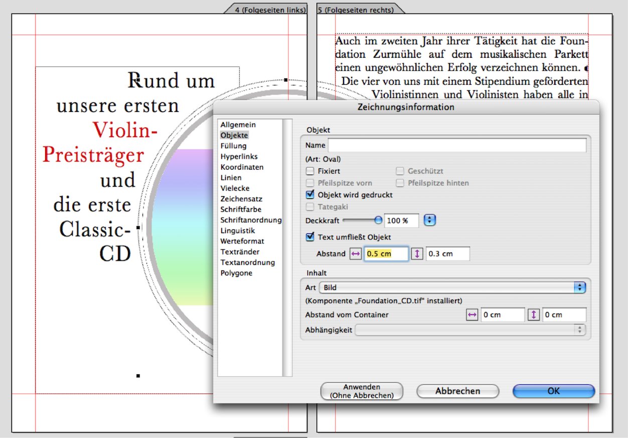
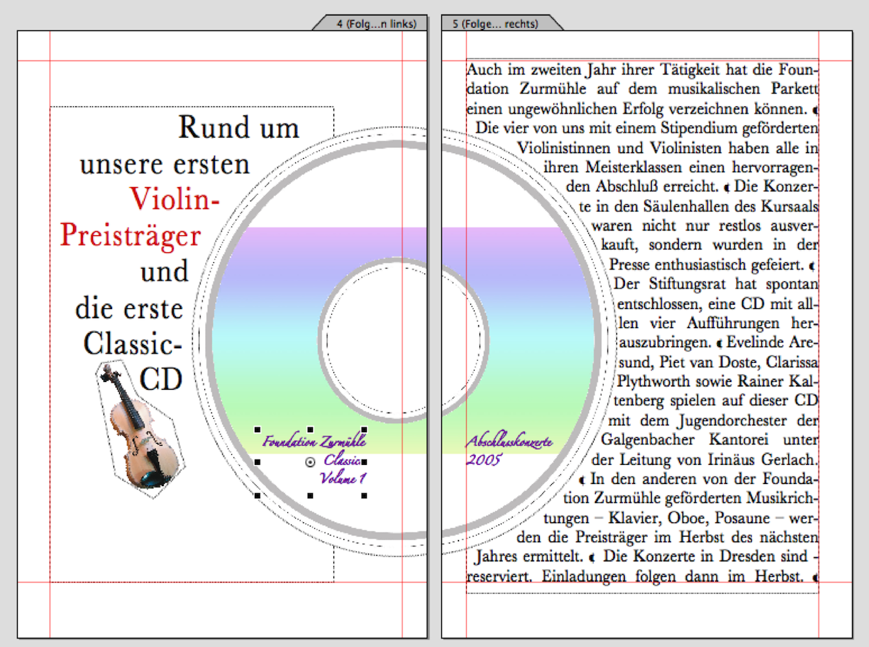
Click on the image frame with the CD. Open the drawing information and enter the measurement in cm or typographic points for the horizontal under «Objects ➝ Distance». We have chosen 0.1 cm (Fig. 3.27). It is important that the «Text Flows Around» option is selected. If the text does not already fit the circle segment, select «Drawing ➝ Stacking Order ➝ Bring to the Front» while the image frame is still selected. If you are still not satisfied with the line spacing of the text, you can move the selected image frame pixel by pixel using the arrow keys +-/+- (but you must then apply the same vertical alignment to the image frame on the left!). On the left-hand side, draw a text frame for the title. Proceed as described in the previous section. For the forced text spacing between the image frame and text frame, we have entered two different measurements for vertical and horizontal spacing (Fig. 3.28). You can also try this out individually until you are satisfied with the result. Finally, use the «Graphic Text» tool to add the label to the CD and place the image for the violin in the desired location.
3.7 Excursion into eccentric typography
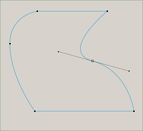
Here is a brief digression on cropping and unusual typesetting: typography, i.e., typesetting design, can be influenced in RagTime using a wide variety of tools. The text flow around an existing shape, i.e., a normal picture container, is just one of them. But let's stick with that for now, because we only used a simple round shape in our CD example. So now let's look at a freeform shape as shown in Fig. 3.30 to Fig. 3.33.
In RagTime, any container can be converted into a polygon or a Bézier curve. The shape properties are listed under «Drawing ➝ Object Kind». With the «Bézier Curve» object type, it is possible to give the frame any shape. Since object types can also be changed retrospectively, this offers a great deal of design flexibility. In the example in Fig. 3.30, a rectangular frame was first drawn in a drawing component, with the image component as its content. After importing the logo – we added a red background to illustrate the process – the frame was converted into a Bézier curve. When the frame is active, you can select the individual anchor points under «Drawing ➝ Edit Curve» and add curves to the line. The same activation can also be achieved by clicking on the symbol in the toolbar. Once you have finished the shape around which the text is to flow, proceed in the same way as described in the example page with the round CD shape.
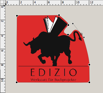
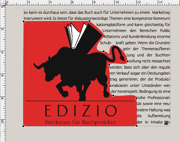

To achieve optimal text flow, you can repeatedly move the anchor points of the Bézier curve or adjust the curve guides using the drag points. Alternatively, you can leave the component frame unchanged and draw an additional Bézier curve with a transparent fill over the image to be cropped. However, you will then need to change the layers of the objects so that the logo/image is at the back, the text in front of it, and the frame with the Bézier curve at the front.
The same principle that applies to shapes around which text should flow also applies in reverse when text should be placed within a shape. As shown in Fig. 3.34, a frame defined as a text component can also be converted into polygons or Bézier curves and edited, even after the text has been written and formatted.
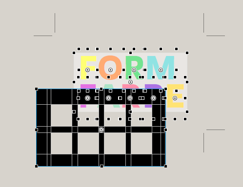
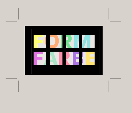
Another example of the typographical possibilities offered by RagTime is the logo design in Fig. 3.36. Here, individual letters were first set using graphic text and colored differently. Individual letters were used because the spacing between letters had to be freely defined or tried out. A spreadsheet with black-filled cells was placed over the letters. Only those (square) cells that appear as individual “letter snippets” in the final result are filled with a transparent color. However, the spreadsheet container itself must also be set to «Transparent». In order to be able to vary the color of the letters and the contrast of the areas to the black grid, a frame with a white fill is placed over the letters. The fill in the example is set to a transparency of 45%.
3.8 Flowing elements
Let's return to our activity report for the music foundation. The sample pages in Fig. 3.40 cover four topics: flowing elements in a text container, a somewhat more specialized type of initials, spreadsheet tables in text, and a simple graph.
Flowing elements in the text make it easier to maintain the connection between images, captions, and text in the layout. Without this function, every time text passages are deleted or added, an image suddenly appears on a completely different page from the accompanying text. This is particularly annoying when the captions are located somewhere in the text frame, but the images have to be searched for. RagTime offers several options for components that flow with the text frame: an image component, a spreadsheet – which can also be reduced to a single cell – or a drawing component. The spreadsheet cell can contain a reference, for example, or a button, an image component, another text component, or an graph can be embedded in it. This means that components that run alongside the text offer a creative element that makes layout work with tables, logos, and images easier.
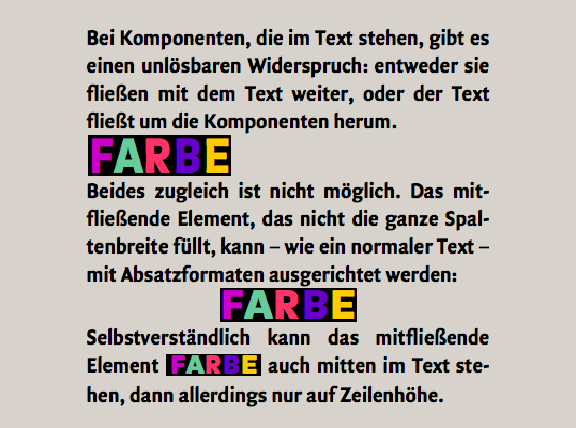
If a document is less about design and more about a compelling presentation of content – as is the case with academic papers – practically anything can be included. In Fig. 3.38, a drawing component is included. If a line break is triggered before the flowing component, the component can be given its own paragraph format (for line height and alignment left, center, right). Only one thing is not possible: flowing does not allow simultaneous wrapping. An image in a layout is usually wrapped by the text. This is shown in the double page with the CD illustration. However, an image or component that is to flow cannot be wrapped by the continuous text at the same time. If the flowing component is inserted directly at the insertion point in the continuous text – by dragging and dropping or copying and pasting – there are two possibilities: either it fits into a line height or it takes up the space it needs. Half of it then protrudes above the insertion point and half below it. If you are working with automatic line heights, be sure to leave the top and bottom spacing at «1 line» in the paragraph style sheet settings and change the line spacing in the right-hand input fields with «±» to the desired size (in pt).
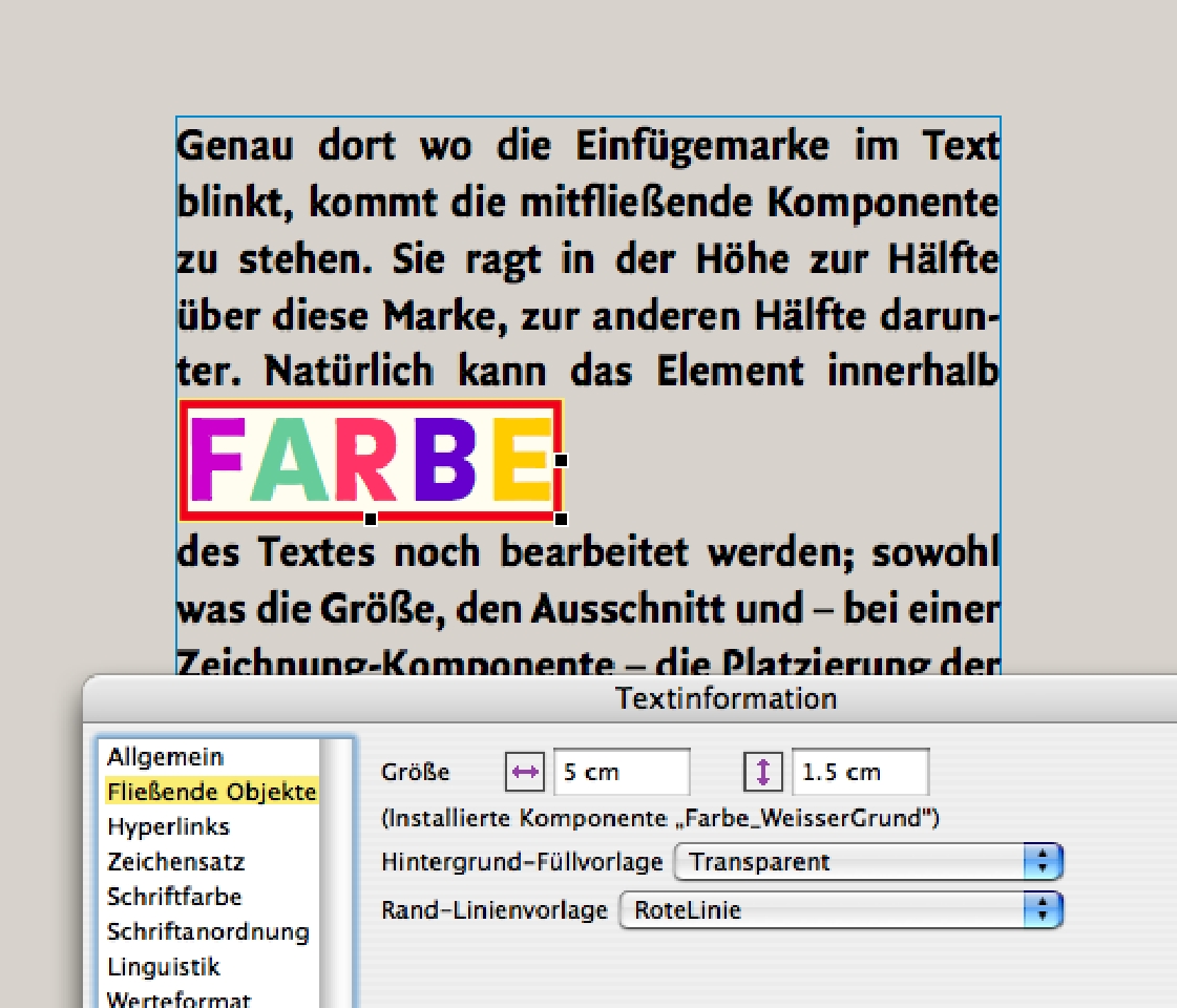
Clicking on the edge of the inserted component reveals anchor points that allow you to enlarge or reduce the size of the component frame. Changes can also be made via «Text ➝ Information ➝ Flowing Objects». As can be seen in the example in Fig. 3.39, where the size was subsequently changed with precise measurements, as well as the background color and the line border. The principle that RagTime allows a wide variety of components to be nested within each other is also advantageous here. This is because the flowing components can also be changed within the layout, either directly or by opening them in their own window («Windows ➝ Open Component»). This allows images, graphic texts, etc. to be enlarged, reduced, moved, reformatted, and replaced without having to change the overall layout. This diversity can sometimes be confusing, and the question arises: When is it best to use which function? We have decided to use a single example – the double page in Fig. 3.40 – to show some applications and, at the same time, a trick that makes even more possible.
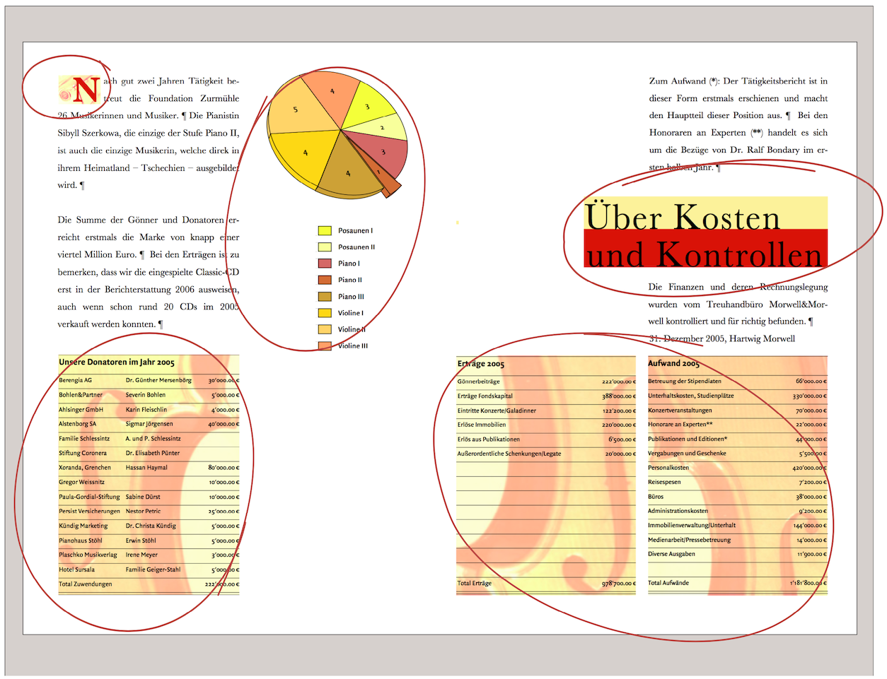
In the section Everything flows…, we claimed that a flowing component cannot be surrounded by text at the same time. There are tricks you can use to get around this in certain cases. The circled elements in Fig. 3.40 are all flowing, from the initial to the two tables on the bottom right. But what about the title field? It extends beyond the column width. This is also fundamentally impossible: components that are outside a text frame – whether partially or completely – cannot be flowing. Unless you find a trick …
The solution for flowing elements that are supposed to extend beyond a text column visually can be found in a “double column.” In Fig. 3.41, the entire text frame is visible: it extends across the entire type area, i.e., across both column widths. The right-hand text column was achieved by indenting the paragraph formatting. The flowing title field consists of a drawing component with two colored containers without content, but with fill style sheets. The title font was created with the graphic text tool. Both tables are also combined in a single drawing component. Since both are aligned with the column widths of the layout, this also creates the impression of two columns. However, the flowing frame extends across the entire width of the type area.
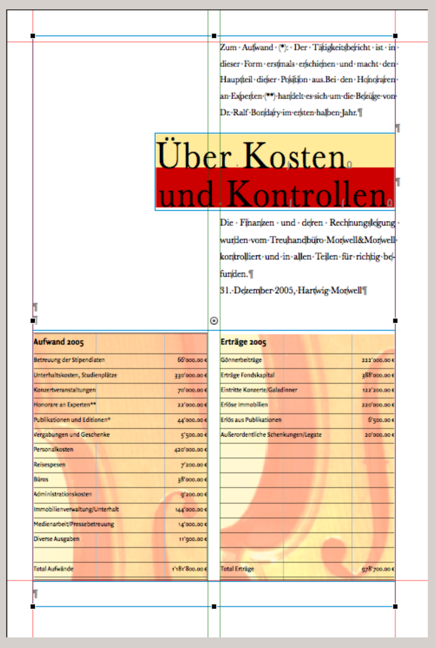
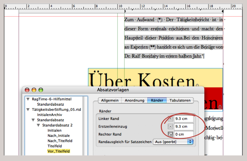
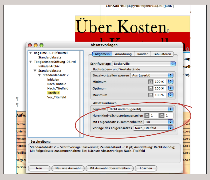
What looks like a two-column layout in print is actually a text frame across the entire width of the type area and indented text in the RagTime layout. Three paragraph formats were created: one for the indented text above the title field. It is labeled «Before_Title Field». It has a left indent for all lines. The indentation is one column plus the column spacing in the middle (in the example in Fig. 3.42, this is a total of 9.3 cm). The following paragraph formatting for the title field («Title Field») has no indentation, but is right-aligned (flowing elements can be formatted as shown above). The next paragraph formatting is called «After_Title Field» and has the same formatting as «Before_Title Field». But why create a new paragraph formatting if it is the same? The reason is to simplify your work: when paragraph formats are linked to each other («Keep with Next Paragraph» and «Style Sheet of Next Paragraph» – see Fig. 3.43), the next paragraph is already set. When writing text in one of the paragraph formats, RagTime automatically selects the next linked paragraph style sheet when you trigger the line break </<. You can simply continue writing without entering any further formats. In our example, the next manual selection of the paragraph format is only necessary before a new title field.
3.9 Table layout – faster than ever
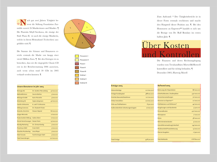
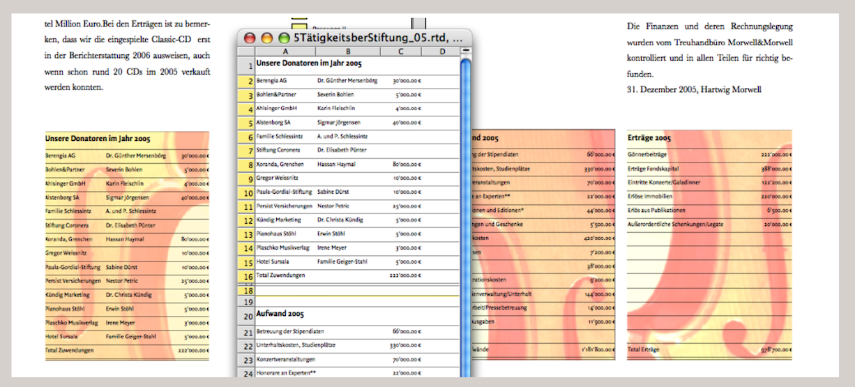
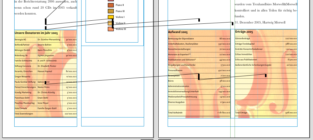
RagTime really comes into its own when it comes to linked or nested components. The spreadsheet component is ideal for table layout. In our activity report, we have a spreadsheet in which all data is entered one below the other, formatted with fonts and lines. In Fig. 3.47, the window of the corresponding spreadsheet is open. In the finished page layout, the tables are still backed by a photo. The spreadsheet and image (background photo) are therefore “packaged” together in drawing components. Without the photos, the spreadsheet could also be included directly as a component in the layout. In the layout, the tables are placed on different pages. To explain how this works, we will focus here on the two tables «Expenses 2005» and «Income 2005», which are located on the right-hand side.
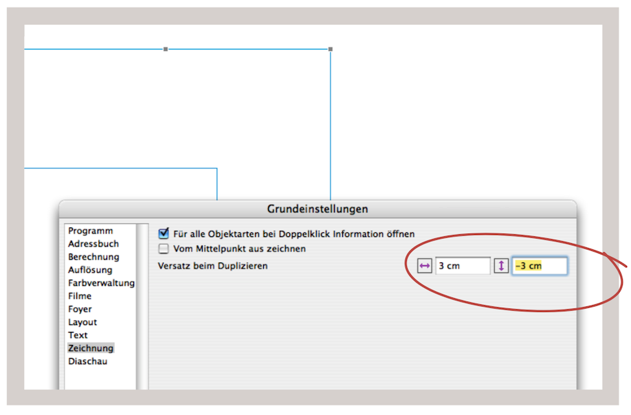
The procedure is simple: draw a frame and assign the Drawing component to it («Drawing ➝ Contents Type ➝ Drawing»). In the drawing component, draw another frame (column width and approximate height). Duplicate this active frame (either with AD/6D, or by holding down the “/6 key and dragging with the mouse). Because this function is used repeatedly, here is a small insert with an even more elegant duplication option.
Somewhat hidden – under «Extras ➝ Settings ➝ Drawing» – you can set the offset that should occur when duplicating a frame. This applies not only to drawing components, but also to components in the layout. The setting can even be 0 (no offset) or a negative value (offset to the top or left; see Fig. 3.45).
If the duplicated frame has been moved, repeat this process so that you have three identical frames. Connect the three frames with a vertical pipeline and then drag the corresponding spreadsheet from the Inventory into the first frame. All three frames are now filled with the spreadsheet. However, the three frames (tables) can now be moved independently of each other. We used the vertical pipeline here because our tables in the spreadsheet are all placed one below the other. Of course, the same can also be done side by side. (In this case, the «Horizontal Pipeline Tool» is used. This is necessary anyway if the column widths in each table are different.) In our current task, the first table is to be placed on the left and the second and third on the right (see Fig. 3.46 and Fig. 3.47).
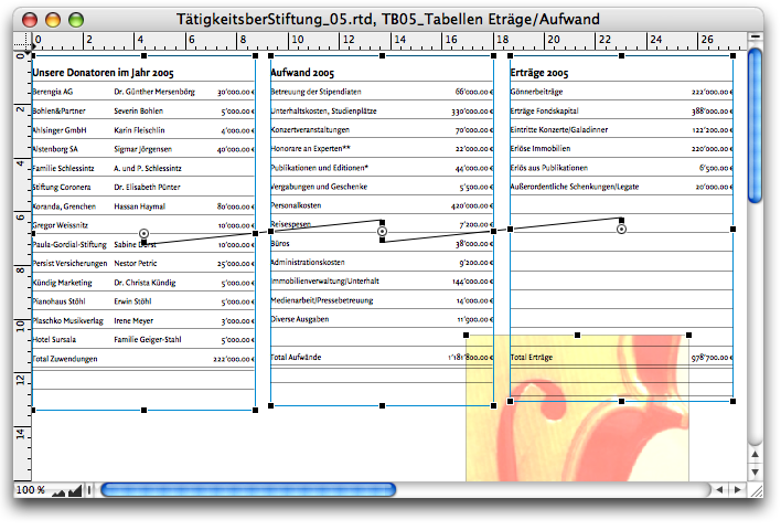
At the moment, however, we have all three tables in the same drawing component. This is only so that we can better coordinate the design of the tables in the foreground and the images in the background. Once everything is designed to our satisfaction, we make a copy of this drawing component in the Inventory (rename it immediately). At the moment, the spreadsheets/tables and background images are also available as copies in the Inventory. If these are checked, the copies will disappear in the next step. We insert drawing component 1 as a flowing component into the layout of the left-hand page. The frame must be adjusted so that it takes on the column width. We proceed in exactly the same way with the second drawing component: it will fill the entire width of the type area on the right-hand page.
Now we can draw a vertical pipeline from the «Our Donors» table on the left to the «Expenses 2005» table on the right. The content (spreadsheet copy) is deleted and thus also disappears from the Inventory. You can then delete the superfluous container in the drawing component on the right and position the other two correctly (group them and move the group to the zero position at the top left). To ensure that the copies of the violin images also disappear from the Inventory, drag the originals from the Inventory into the layout or into the corresponding picture containers there. Without the desire to arrange all three tables side by side, the whole process would of course be easier: first, finish designing the drawing component on the left side with the «Donors». Then draw a drawing frame on the right side of the layout across the entire width of the page (again, as a flowing component, of course).
In this drawing component, draw two single-column frames of equal height. Then create the pipeline connection as described above and finally place the two background images over the tables (draw one image frame exactly over each table and drag the images from the Inventory into the frames). Finally, place the images on the backmost layer. Because it is often surprising that the tables are not transparent despite being set to transparent fill, remember: Both the cells (select all) and the component itself must always be set to transparent fill.
3.9.1 Design precise tables
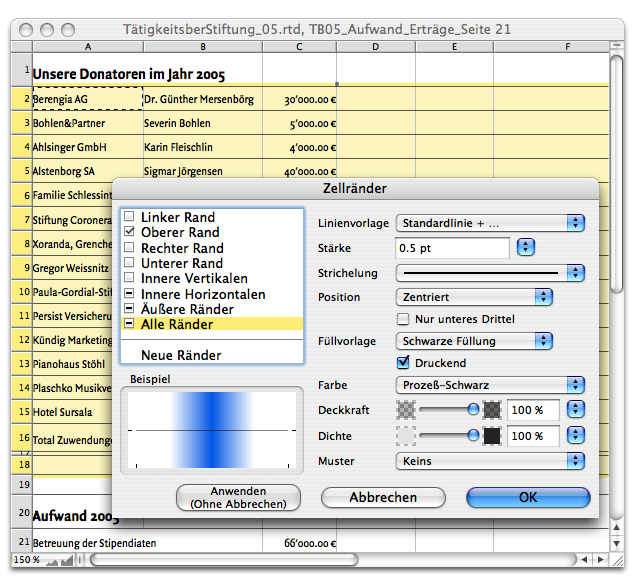
Let's go one step further into detail and take a look at how a spreadsheet can be formatted with fonts, colors, and lines so that it appears as a well-designed table in the layout. Basically, it doesn't matter whether the spreadsheet is formatted before or after it is placed in the layout. First, the lines: Fig. 3.48 shows the «Cell Borders» panel («Spreadsheet ➝ Borders…»). Here you can configure the settings for the lines that surround the cell or the selected cell range. For professional printing, the line thickness should not be less than 0.08 mm, which corresponds to approximately 0.2 pt.
When you select «Inner Verticals» and «Inner Horizontals», lines are added to all cells in a selected range, with the exception of the outer border of the range. The opposite is achieved by selecting «Outside Borders»: then there are no lines within a range, but only around the entire selected range. In our example, only the top borders of the selected cells have been given a line.
Designing with lines is basically a quick and easy task with RagTime. Anyone who works a lot with table design will certainly want to create a keyboard shortcut for «Spreadsheet ➝ Cell Borders». It's a pity that RagTime 7 doesn't offer any tools for working with lines/cell borders in the «Spreadsheet Commands» palette.
When enlarging or reducing row heights, several rows can be adjusted at the same time: Select all the desired rows at the edge of the spreadsheet in the row header and then drag the bottom dividing line between two rows down (or up) with the pointer. All rows selected in this way are enlarged or reduced by the same amount. If any of the separator lines of the selected rows is used as a handle, this action will compress the rows below by the amount of space used and simultaneously enlarge the rows above (or vice versa). What works with row heights also works with column widths (drag to the right or left).
- Tip:
-
For most users, working with tables is part of their daily routine. Nevertheless, we have covered the basic commands and design options for table sets in detail here once again. Firstly, everything is at hand when needed, and there are always commands that you forget.
To make all columns/rows the same width/narrower or height/tighter, hold down the “/1 key and drag a dividing line that runs through a selection.
If «Windows ➝ Rulers and Grid ➝ Snap to Grid» is enabled, the columns or rows can be snapped to the dividing lines. (You can also use the grid to create your own “graph paper” with the help of a spreadsheet and the cell borders). If you only want to temporarily turn the grid on or off, press the A/6 key before selecting a dividing line with the pointer.
If you want to insert columns or rows, hold down the “ key and click on the column/row header (Mac only). The new column will appear to the left of the column you clicked on or above the row you clicked on.
When it comes to filling a frame with exactly the desired number of rows or columns, there is a setting called «Calculate Height to Fill Container with Rows». RagTime automatically calculates the selected area so that all selected rows within the frame are of equal height from top to bottom (the same applies to the width of columns: selecting «Average Width to Fill Container with Selected Columns» gives you columns of equal width).
Another scenario: You have a spreadsheet container and your designed table is not quite as wide as the frame. Simply grab the last visible dividing line in the selected area and drag it beyond the edge of the container. This will proportionally widen all visible columns in the container to fill it. Of course, this can also be done with row lines and row heights.
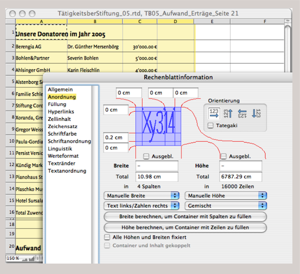
You don't always want the column width and row height to be the same. It often makes sense to let the width or height be defined by the content. This means that a column automatically becomes as wide as the widest cell content entered. This can be done by selecting «Manual» from the drop-down menu under «Arrangement» on the «Spreadsheet Information» panel. Here you have three options:
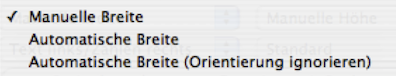
If «Manual» is selected, RagTime will write the text content beyond the adjacent cell if the column is too narrow. However, if the adjacent cell already contains content, RagTime will only display the content of the narrow cell up to the cell edge. If «Automatic Width» is selected, RagTime will always display the entire text content; the column width will be automatically expanded. Double-clicking in the column header causes the column to immediately adjust to the widest entry (this also works analogously for rows). For cells with continuous text, the required height is automatically adjusted; the column width is ignored. If «Automatic Ignoring Orientation» is selected, rotated cells are included in the automatic expansion of the column width. Of course, the same selection option can also be set for the row height (see Fig. 3.49). Centimeters, points, and all other units of measurement defined by RagTime can be used as units.
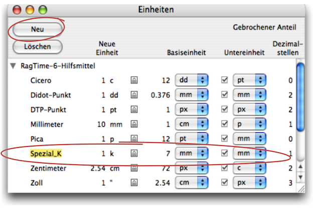
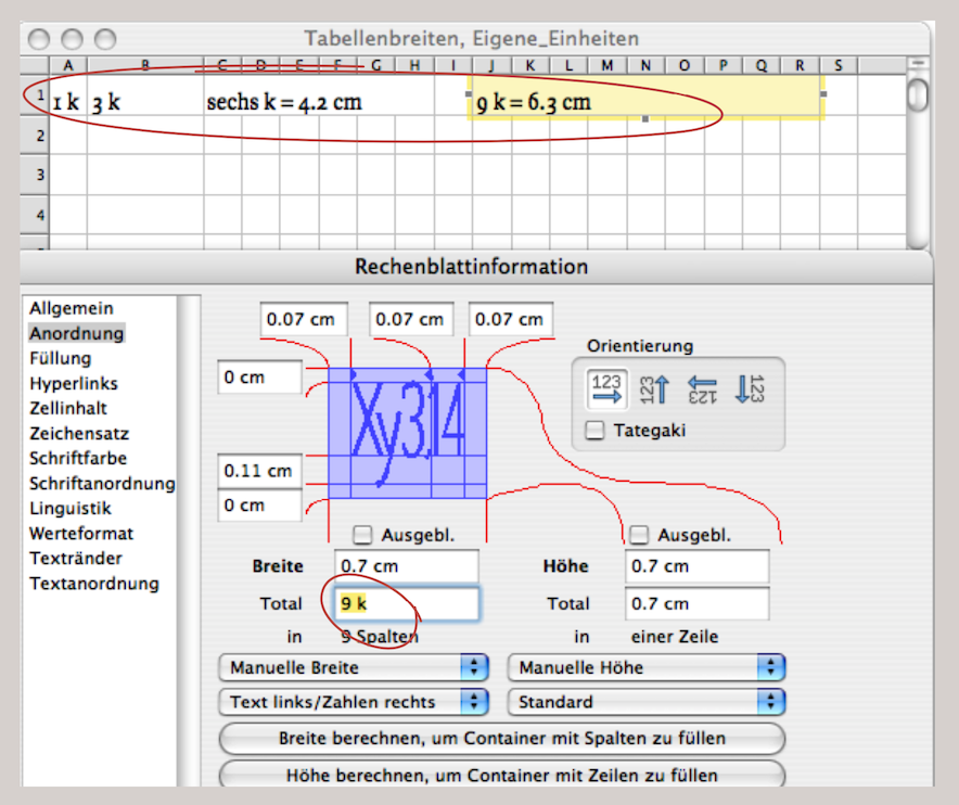
3.9.2 Individual measurement units
In addition to the standard units of measurement, RagTime also offers its own definitions. In the example shown in Fig. 3.51 and Fig. 3.52, a unit of 7 mm was defined and named «Special_K» in order to format a grid in the spreadsheet. It is easy to see that any other unit of measurement can also be constructed here. The units of measurement are not only applicable to tables (or spreadsheets), but can also be used as a general RagTime auxiliary for any other component. This is certainly useful in the drawing component.
3.9.3 Format ranges
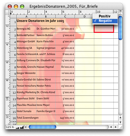
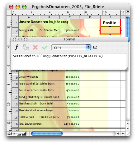
When designing spreadsheets as tables, fill style sheets can of course also be used. Each cell can be assigned a fill individually, or specific areas can be selected. The «Power Functions» extension includes a function called «MPFSetRangeBknd». This allows cell areas to be “calculated” with a fill style sheet. Depending on certain specifications, cell ranges can be colored automatically. This can also be controlled using buttons. As one of many possible examples, let's return to our «Donors Table». This table is now to be used in form letters. It should have a green background for the addresses of the thank-you letters and a red background for the addresses of the begging letters (see Fig. 3.54 and Fig. 3.55). Here, we are simply demonstrating the principle and selecting a “manual” condition with a button (i.e., not controlled by conditions from an address list). The procedure: Create a «Positive» fill style sheet with a pale red tone and a «Negative» fill style sheet with a pale green tone. In our example, both fill style sheets are set to around 50% transparency so that the image of the violin remains visible.

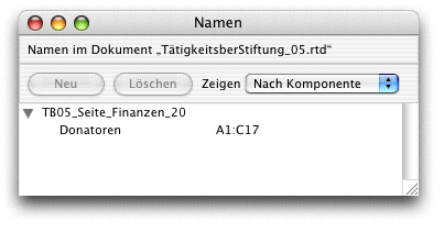
Then select cells A1:A17 in the donor table and open the «Name Editor» palette («Windows ➝ Auxiliaries ➝ Name Editor»). Select «Create» and give the selection the name «Donors». In cell E1 of the donor table, create the button «Pop-Up Menu» with the two names «Positive» and «Negative». Then enter Formula 3.7 in cell E2. Now you can use the drop-down menu to choose whether the table should be colored red or green. As is often the case with RagTime, there are several ways to achieve this result. The special formula chapters in this book are intended to inspire you to find your own solutions. The following example of automated table design with preformatted cells goes in a similar direction. With «SetCell…», cells and cell ranges can then be specially marked under specified conditions. The trick here lies in the value formats.
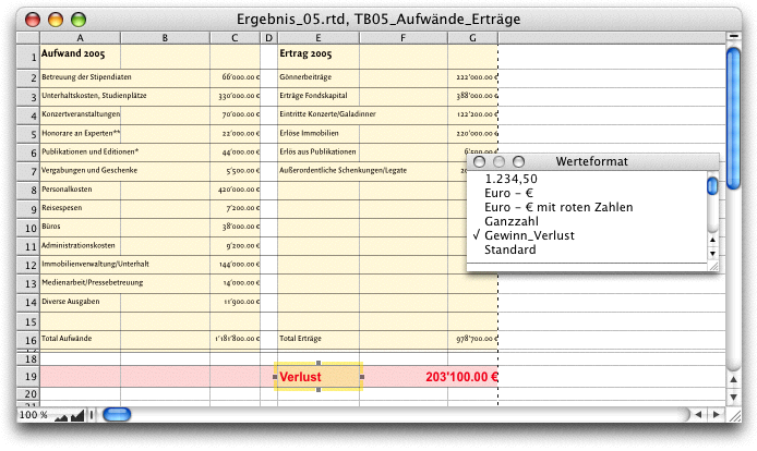
Let's go back to our two tables, «Expenses» and «Revenue», from the foundation's activity report (see Fig. 3.56). Profit, loss, and balanced results should be shown in a special row, but with special formatting. A loss should appear in red, a profit in black. The background colors should also change. The result from row 19 of our example should then be usable in various publications (documents and layouts) with the style specifications created in this way.
- Tip:
-
3.9 “Table layout – faster than ever” and 3.10 “Organizational chart: constantly new…” cover topics that can also be useful for completely different areas of application. Some of these applications may be new even to experienced users. In any case, the flexibility of spreadsheets for design purposes is astonishingly great.
Row 19 shows the current loss. That is why the font in the cell is red and the background of the cells is pale red. This entire formatting is controlled by three formulas and two value formats. But for these formulas and value formats to work, we first need to create color and style sheets. We have a fill style sheet called «NegRed» for the background of cells that relate to losses. We have a fill style sheet «PosGreen» for the background of the cells that relate to profit and a fill style sheet «AreaYellow» for the balanced result. In addition, a fill style sheet «Red» has been created for the red font (the fill style sheet «Black» for the black font is already provided).

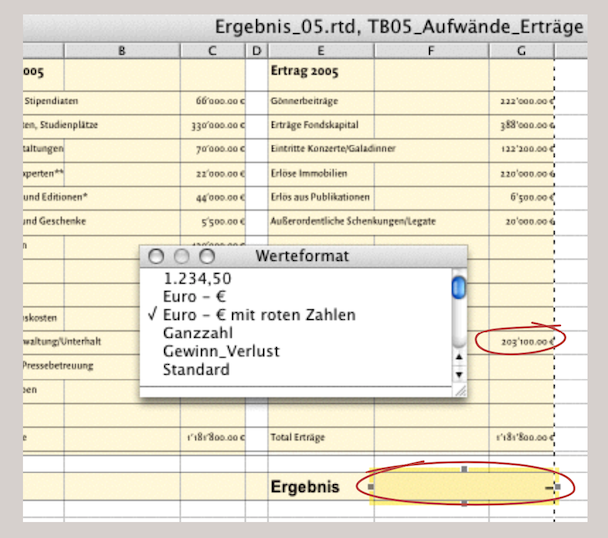
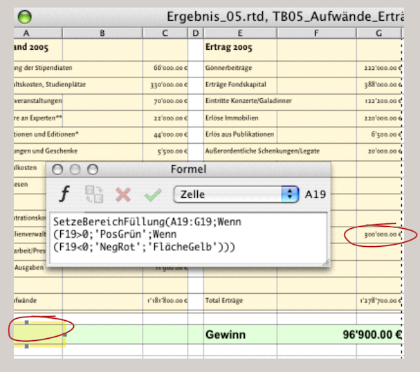
It should also be noted that cells F19 and G19 are merged for the cell references in the formulas. Although the values appear to be in cell G19, cell F19 must be referenced. This “specification” is due to our table layout, in which column G would be too narrow for larger numbers. Remember: these tables were originally placed below the «Donors» table in the same spreadsheet, and we left the column widths unchanged. The cell F19 and its formula are self-explanatory: «G16-C16» is the result of «Total Expenses» and «Total Revenues». Cell E19 should display different text depending on the result in cell F19. This cell is therefore dependent on F19 – hence the formula: «F19».
Cell A19 contains the formula for the background fills, whose function «MPFSetRangeBknd» we are already familiar with (Formula 3.8). If the result is neither greater nor less than 0, then the fill style sheet «AreaYellow» is delivered; i.e., only if the result is balanced. In Fig. 3.57 and Fig. 3.58, we have “fudget the balance” to show the effects of the formulas. But how do the red font, the changing terms in E19, and the «–» in F19 come about?
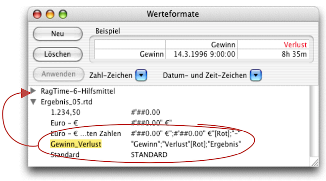
For this task, we have made use of the options offered by value formats. Value formats allow you to assign values to individual cells or entire ranges, which can also be variable. Open «Windows ➝ Auxiliaries ➝ Value Format Editor» and click «Create». Then enter a name on the left – we've called ours «Profit_Loss» (see Fig. 3.59). On the right is the value format, which looks similar to a formula and works in the same way. Note the square brackets for «[Red]», which corresponds to a fill pattern of the same name. If the cell with this value format now contains a positive number, the word «Profit» is inserted there in black; if it is a negative number, the word «Loss» is inserted in red. If the result is balanced, «Result» is displayed in black. In our example, this value format is assigned to cell E19. The same principle also applies to cell F19 with the value format «Dollar [Red]». Here, too, the variables are predefined with other value results. You can, of course, drag such self-created value formats to the top in «RagTime 6 Auxiliaries». They will then be available in every new document and can greatly simplify formatting—not only in table design. This concludes the table design in the narrower sense, but we will continue working with spreadsheets in the next section.
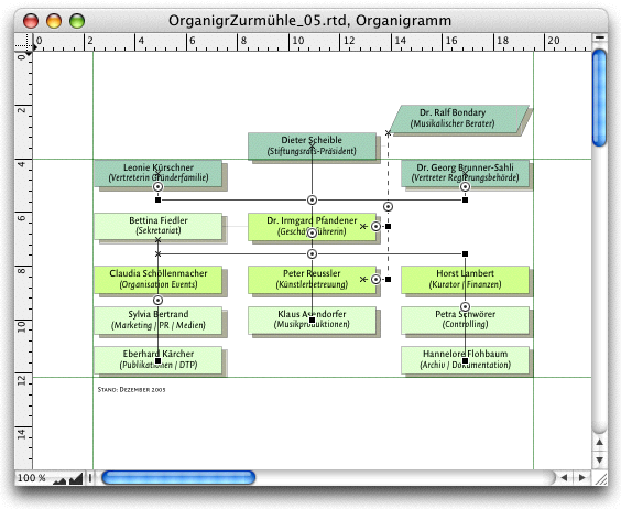
3.10 Organizational chart: constantly new…
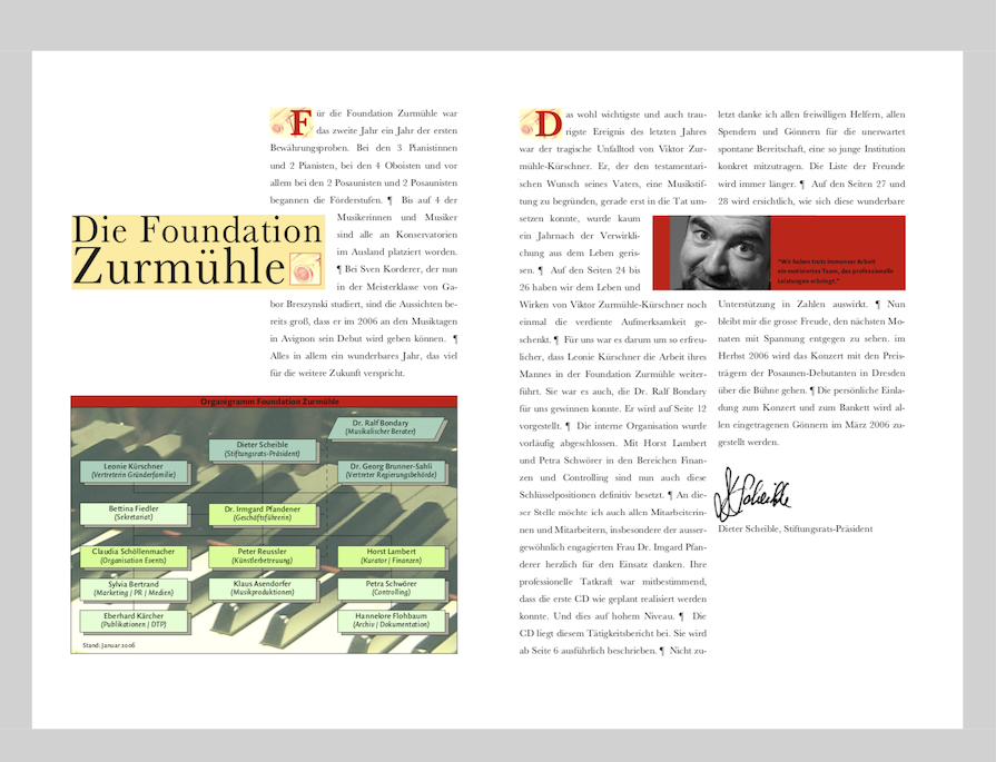
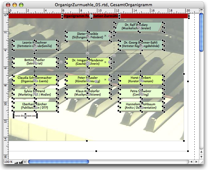
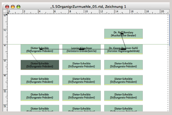
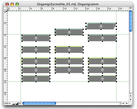
In the Foundation Zurmühle, much is in the building phase. The organizational chart must be redrawn. You know that this will not be the last time. And you also know that your foundation council president sometimes wants to decide in minor things: For example with the colors. So you design with RagTime an organizational chart that is flexible in many ways.
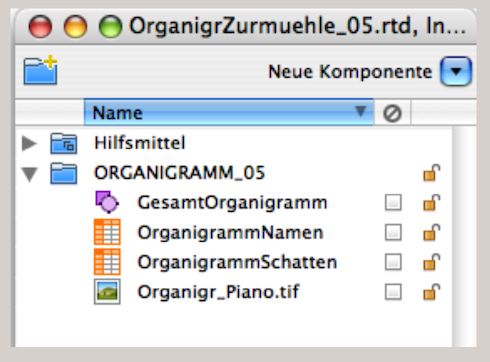
The drawing component is ideal for this kind of work. You can insert a wide variety of containers and elements into this component. At the same time, you have everything available in a single component, so you can either move it around in the layout or copy it from one Inventory to another. Our organizational chart has four components in the Inventory, as shown in Fig. 3.62: one drawing component, two spreadsheets, and one image. Let's click on the drawing icon in the Inventory to take a closer look at the drawing in its own window (Fig. 3.60). First, we find over 40 different components or lines in it. All of them can be moved and edited individually.
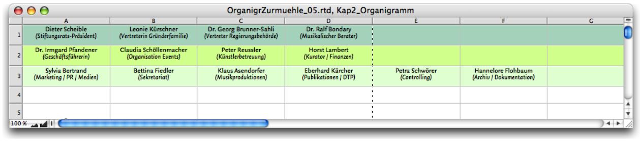
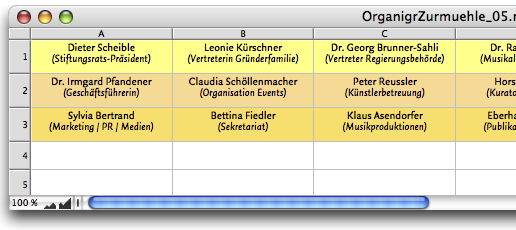
The different colored fields with the names and responsibilities in the organizational chart are all summarized in a spreadsheet. There are two tricks behind this. On the one hand, you have all the names nicely together, and on the other hand, you can easily change the colors, which also represent the hierarchical levels of the foundation. The spreadsheet has been taken apart, so to speak, so that each individual cell in the layout can be moved freely.
It is important that you place the names that are on the same hierarchical level next to each other in a row (see Fig. 3.61). This makes it possible to click on the entire row and assign a fill color to it – and change the fill color if necessary. As with any professional work with RagTime, it is important to have clearly defined style sheets for colors, fills, fonts, paragraphs, etc. You may want to consider in advance that the individual fields in the finished organizational chart will be arranged in a completely different order. The explanation for this will follow later.
Let's stick with our spreadsheet and remember: our foundation board president has a penchant for colors and just wants to express his opinion. This request can easily be “anticipated”. You define three color harmonies – let's say yellow, red, and the same in green.
3.10.1 The spreadsheet planes
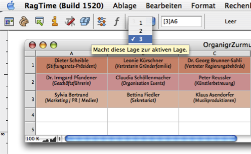
Spreadsheet planes were actually developed for more complex, three-dimensional calculations. Here, we are utilizing the advantage of planes in a different way. What exactly are planes? Each spreadsheet in RagTime has 16,000 cells in each column and just as many columns, resulting in a total of 256,000,000 cells. Strictly speaking, this can be multiplied by 16,000, because each spreadsheet can be expanded with multiple levels, or “planes”. When you are working in a spreadsheet, you will see a drop-down menu with numbers in the toolbar between the active cell and the symbol for calling up the formula palette. There are 3 planes preset here (see Fig. 3.64). You can install several additional planes under «Spreadsheet ➝ Append Plane».
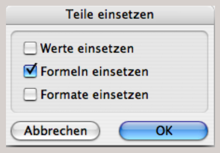
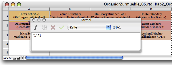
You have formatted the cells in plane 1 using the character style sheets and, above all, the color style sheets. Then switch to plane 2 and insert the formulas that refer to plane 1. A square bracket in the formulas indicates which plane is involved (see Fig. 3.65). If you want to copy the font formats, you must place a «#» before the cell reference. Copy this formula to all affected cells. You also insert these formulas in plane 3. The easiest way to do this is to select all the desired cells from A1 to F3, copy them, and paste them back in using «Paste Special». Make sure that only «Paste Formulas» is checked in the selection palette.
We now have a spreadsheet with three planes: each plane has the same name, but with different formatting of the fill style sheets. If it makes sense for the presentation of your task, you can also format the fonts differently in each plane. Now open a new drawing component. In our example, we have named it «TotalOrganigram» in the Inventory (compare Fig. 3.62).
Now simply drag the spreadsheet icon from the Inventory into the open window of the drawing component. Then reduce the size of the spreadsheet by clicking on the frame and moving the handle at the bottom right up and to the left until the spreadsheet frame only shows cell A1. Duplicate this small spreadsheet frame with AD/6D, drag the new spreadsheet frame a short distance to the right of the first one, and press AD/6D again. When you duplicate an element that has already been duplicated, the new element always jumps to the right by exactly the same distance as the previous one. Alternatively, you can hold down the 1“/16 keys, select the element with the mouse, and drag it to the right. This automatically creates a copy, but it remains on the same axis horizontally (or vertically).
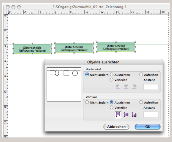
For our example organizational chart, we have three fields next to each other at each hierarchical level; there can, of course, be more. To check whether all fields are at exactly the same height, drag an imaginary rectangle over the three elements with the mouse at a certain distance: this activates all of them. Under Under «Drawing ➝ Arrange Objects», open the «Arrange Objects» panel and enter the alignments as shown in Fig. 3.67. Click «OK» to finish: the spreadsheets are now aligned at the same height.
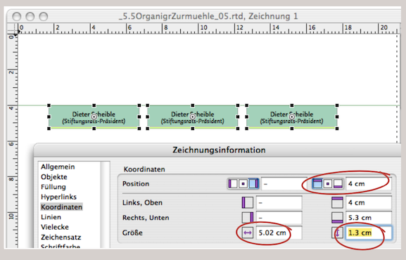
You can also achieve the same result with the “Drawing Information” panel under «Coordinates» (see Fig. 3.68). By entering values in the coordinate fields, you can also define the exact position, height, and width of the selected “mini spreadsheets”. The dimensions you enter here for the height and width of the objects must, of course, match those of the spreadsheet for the height and width of the rows/columns. Only then will each component be exactly one cell in size. Depending on the design of the organizational chart, you can also adjust both later.
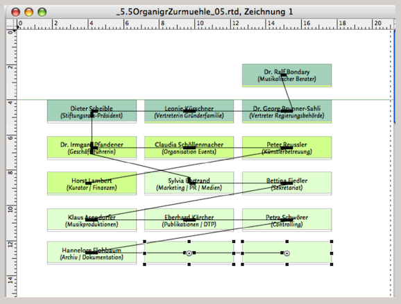
However, we still have three different spreadsheets. But we create even more: for each row in our organizational chart, we copy our three existing ones again. This time using a different method: hover over the three “mini spreadsheets” to reactivate them. Hold down the 1“/16 keys, grab one of the three elements with the mouse pointer, and drag it down. All selected elements are copied simultaneously and dragged down vertically. You now have three more spreadsheets that are still activated.
Repeat the process as described above and repeat the process two more times until you have five rows of three fields each. The musical advisor of our foundation is located separately at the top right. For him, drag the top right element of your arrangement upwards in the same way as before (PS: save your work regularly!).
3.10.2 Horizontal pipelines
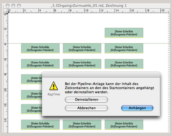
Now it's time to use the pipeline tools. In the “executive suite” of our foundation, we have four names together with the musical advisor. So use the horizontal pipeline tool to draw a horizontal pipeline from the top left to the top right element (see Fig. 3.69 and Fig. 3.70). A query appears asking whether you want to attach the targeted spreadsheet or uninstall it. Click on «Uninstall». This deletes the targeted spreadsheet and replaces it with the one from which the pipeline originates. You will notice that the next cell from our original spreadsheet appears in the linked spreadsheet, while the spreadsheet copy disappears from the Inventory. Try this with the Inventory open: a spreadsheet copy is removed each time.
If you want to go to a name in the next lower company hierarchy, i.e., one row lower in the spreadsheet, draw a pipeline using the vertical pipeline tool. It is helpful to have the spreadsheet with the names open on your screen (or a printout of the spreadsheet in front of you). At the end of the pipeline links, you will again have a single spreadsheet in all name fields of the organizational chart, namely the one labeled «OrganigramNames» in Fig. 3.62. You can also start the entire process with empty frames and only insert the spreadsheet at the end.
3.10.3 Arrange elements
Now we have all the names, but they are arranged in a way that does not correspond to what we need. Use guide lines (click on the ruler in the drawing window with the pointer and drag down from the top ruler or to the right from the left ruler while holding down the mouse button) to create a grid for the initial layout.
Then move the elements to where they should be in the finished organizational chart. There are two ways to align them correctly: one is the familiar manual entry in the «Drawing Information» settings panel under «Coordinates». Here you can enter the position and size with exact measurements, either in metric units (cm) or – even more precisely – in the typographic unit «pt». You can also adjust the scaling of a field here, as shown in Fig. 3.72 for the «Musical Advisor».
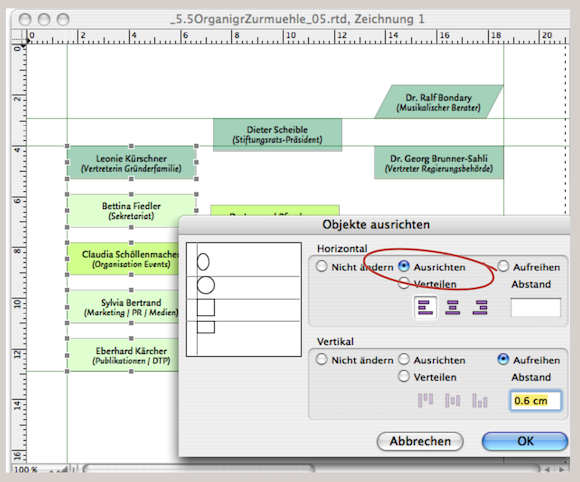
The second option for arranging objects is via the «Arrange Objects» window, which can be accessed under «Drawing ➝ Arrange Objects…». Incidentally, this settings window can only be used if at least two elements have been activated in the layout or drawing component beforehand (otherwise there would be nothing to align). In the «Arrange Objects» palette, the settings are easy to understand via the icons. We would like to mention «Distribute» and «Align» (see Fig. 3.73) in particular here. With «Distribute», RagTime calculates the distances between the furthest elements and arranges the others so that the spaces between them are evenly sized. With «Align», you can enter a fixed distance between the elements. This can generally save a lot of work when layouting.
Two further options to facilitate alignment: the «Drawing Commands» palette (Fig. 3.76) and the «Object Coordinates» palette. Both can be accessed under «Windows ➝ Palettes» and freely positioned on the workspace or “parked” in the palette dock. Incidentally, «Object Coordinates» corresponds exactly to the «Coordinates» panel in the «Drawing Information» window, with the added advantage that you do not need to confirm your entries with «Apply» or «OK»; instead, you can see the changes immediately with each entry.
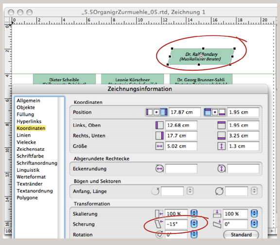
3.10.4 Screwed skewing
In Fig. 3.72 we have skewed the top right element by entering percentages. We don't really like this in our organizational chart, as the font is also skewed. The same thing happens if you hold down the “/6 key and drag the middle anchor point. In this case, too, the object is skewed along with its content. To remove this unwanted distortion, select the object and go to «Drawing ➝ Transformation ➝ Remove Transformation» to straighten the font as desired. Another option is to convert the frame from a «Rectangle» to a «Polygon» and move the top two corner points.
As we all know, big names cast long shadows. That's why – no, of course it's just for better contrast – we want a shadow behind each name field in the finished organizational chart. To do this, select all fields, duplicate them, and then combine them into a single element under «Drawing ➝ Group Objects».
Open the «Object Coordinates» palette and enter 5 pt or 3 mm more than what is shown in the input fields for both the left and top margins: all “shadow fields are shifted to the right and down. However, the shadow color is still missing. Assign a separate (dark) fill style sheet to the new spreadsheet in the first three rows. If you are satisfied with the result, use «Drawing ➝ Stacking Order ➝ Send to the Back» to place the element group behind the name fields. For the sake of tidiness, you should now rename the copy of the spreadsheet in the Inventory. We have named the newly created spreadsheet OrganigramShadows». It is even more elegant if you create a fourth plane with the fill style sheet for the shadow in the «OrganigrammNames» spreadsheet. Then drag this spreadsheet from the Inventory into the first of the linked cells for the shadow and select «Plane 4». This ensures that the shadow will “move” with you when you change the cell sizes. And you have one less spreadsheet in your Inventory.
The line network connecting the individual organizational chart fields is probably one of the simplest things to do: while still in the open drawing component, click on the line tool (the slanted line) in the toolbar. If you hold down the mouse button and then press the Shift key 1/1 while dragging the pointer, which has now become a crosshair, it is easier to draw horizontal or vertical lines. As you move the pointer, RagTime simultaneously displays the current length of your line and the height of the page ruler at which the pointer is currently located. You can draw the lines up to the edge of the name fields or directly into the fields. This is because, at the end, we will move all lines as a group to the back of a layer so that they lie between the shadow and name fields. To change the layers, go to «Drawing ➝ Stacking Order ➝ Send to the Back». Now the line group is at the back. Click on the grouped shadow fields again and execute the same command: now the shadow group is at the back and the name fields are at the front. If you want, you can group everything together.
- Tip:
-
Line style sheets have already been explained in chapter 1 “Order at all levels”. Here is a brief recap in connection with the practical example of the organizational chart. Thicker lines in particular require careful formatting to achieve good connections.
The line settings in RagTime are versatile. But there are a few special features that you should keep in mind, especially when working with documents that you want to send to a printer and need to be very precise. As a general rule, do not use hairlines in a document that is to be professionally printed. Hairlines are too fine for printing. You should adhere to a minimum of 0.2 pt for thin, dark lines (light colors at least 0.5 pt). Another special feature is the line caps.
For example, if you have drawn a vertical and a horizontal line that meet, you cannot always be sure that the caps of the two lines actually touch without using guide lines. Try it out: grab the cap of one of the lines and move it back and forth with the pointer. Whenever the cap of one line meets the cap of the other line, a small gray magnetic dot appears and brings the caps of the two lines together.
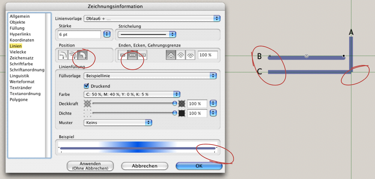
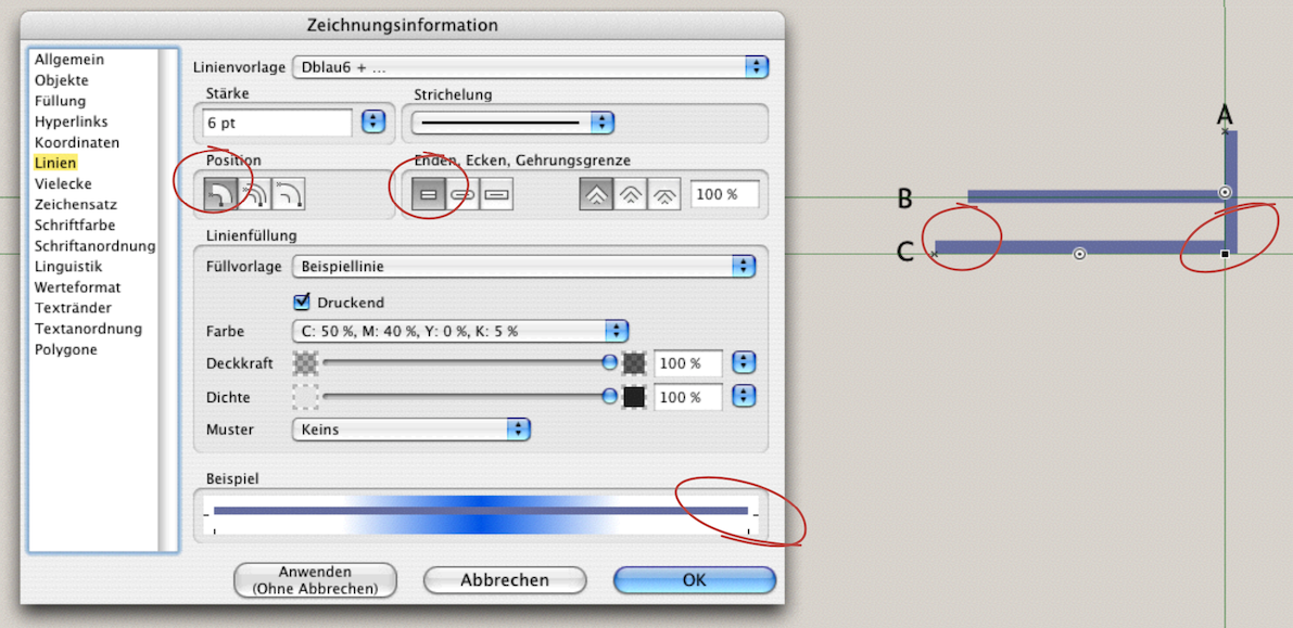
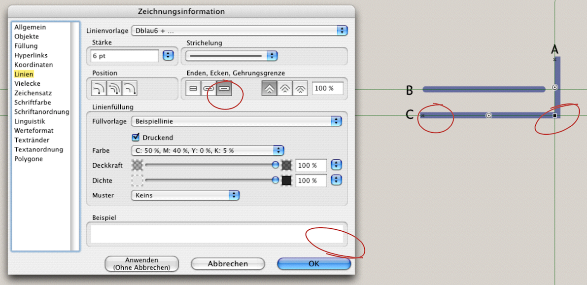
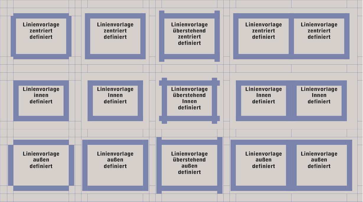
However, if you have thicker lines, the result may not be what you had in mind. The lines in Fig. 3.77 are 6 pt wide and are drawn on guides. The point of contact between lines A and C does not produce a smooth connection, even though the caps touch exactly. The reason for this is that the lines are centered or the caps are defined incorrectly. However, the thicker a line is, the more clearly you can see why a small corner is created at the caps. Round caps were selected for the active line B. The rounding extends slightly beyond the straight line C (both lines were aligned with each other on the left axis). A clean line connection for thicker lines can be achieved by either setting the lines as non-centered, as with lines A and C in Fig. 3.78, or by extending the caps of the lines beyond the actual endpoints, as in Fig. 3.79. If protruding line caps are selected, the lines are extended at each end by half the line thickness, i.e., by 3 pt in the examples shown. In Fig. 3.79, the «Drawing Information» panel no longer shows an example line in the lower field because two lines were selected that no longer match the «Dblue6» line style sheet.
Other special features occur when formatting lines in spreadsheet cells: when thicker lines meet thinner lines (Fig. 3.80, first column from the left), when protruding lines are defined (third column from the left), and when adjacent cells have lines on all cell borders (the two columns on the right). The cell content can also be affected by unfavorable cell borders. With thicker lines, it is therefore important to check the formatting carefully. After this digression on lines, let's return to our organizational chart.
All that's missing from our organizational chart now is the background and title. Once again, we'll continue working in the open drawing component. Before doing so, we recommend saving your work under a different name so that you can revert to it if necessary, in case something is accidentally changed or even deleted in the following steps.
Drag a frame with the «Picture» component over your entire previous organizational chart display. The organizational chart will now no longer be visible because it is covered by the image component. Click on the component: the line border will turn into a “marching ants” line. Now you can select the image you have chosen for this purpose from your hard drive under «File ➝ Import». The same process is even easier if you double-click on the empty image component.
We have changed the name of the imported image to «Organigr_Piano.tif» in the Inventory (see also Fig. 3.62). Always use names that are logical for you and correspond to your project. However, the image «Organigr_Piano.tif» is too large for us and does not correspond to what we have in mind, even in the image section.
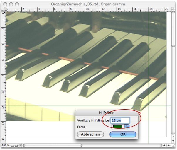
For better scaling, now is the time to set guide lines that define the overall size of your organizational chart. Tip: to place guides even more precisely, double-click on the guide. An input window will pop up in which you can specify the exact position of the guide in cm or pt (see Fig. 3.82). If you want to remove guides from the drawing component or layout, you can also do this using this palette. Move the pointer over a guide line: the pointer changes to a small double arrow. Double-clicking on the guide line brings the window (Fig. 3.82) back to the foreground. Simply enter a «0» there and the guide line will disappear.
RagTime offers a range of options for scaling. Admittedly, it can sometimes be confusing to keep track of everything, especially when different components are nested within each other.
The simplest tool is the scaling arrow from the  toolbar. The pointer then changes to an arrow (see Fig. 3.81). By dragging in one of eight diagonal directions, the image section in the container frame is enlarged or reduced. Depending on where it is located on the image, the arrow takes on a different direction: it points up, down, diagonally down to the right, or diagonally up to the right. This allows you to see in advance what will happen when you drag to scale the image. More precise scaling can be achieved by entering the dimensions in the «Picture Information» window or in the «Object Coordinates» palette.
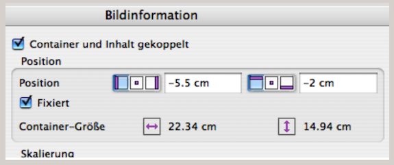
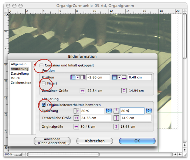
You can open the «Picture Information» palette (see Fig. 3.86) by double-clicking on the picture container. You can also hold the pointer on the picture container for a longer period of time (press the right mouse button in Windows), which will bring up a selection menu where you will find the picture information at the bottom, among other options (see Fig. 3.83). We will discuss the other menu functions in the next section.
Under «Picture Information ➝ Arrangement ➝ Scaling» you can enter the exact percentage values. The «Preserve Original Proportion» setting should always be activated. Only in very rare cases does it look interesting when an image is compressed on one side. If the setting is activated, you only need to enter the percentage in the left or right field – RagTime will automatically add the second one.
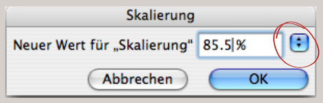
If you only want to enter this percentage value when scaling an image, you can also call up a help window: with the image activated, use AM/6M, or by selecting «Picture ➝ Scaling ➝ Other». In this help window (see Fig. 3.85), you will see a pop-up menu in the upper right corner. RagTime offers a range of percentage values to choose from. It is just as quick to type in the value directly.
A helpful tip: if you want to restore the original value of the image (i.e., 100%), you can do so quickly and directly using the keyboard shortcut 1AH/6H. We don't need to mention here that scaling an image has its limits: unsightly pixelation quickly reveals when the enlargement becomes too coarse. To be on the safe side, you should never scale files that are going to a print shop above 100%, but rather choose a reduction factor.
Finally, there is another way to scale images in RagTime: using the container frame. The «Container and Contents Linked» option is important here, as it ensures that scaling the container also affects the image inside the container. Whenever the container is dragged or compressed using a handle, the image is also adjusted accordingly.
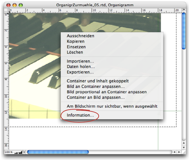
If this function is not active, you can only use the container frame to limit the image section – the size ratio of the image itself does not change. For deliberate image distortion, the original aspect ratio can be disabled here. Or vice versa: if «Preserve Original Proportion» is not enabled, the image will be distorted. Let's now turn to the pop-up menu function that we omitted in the previous section on Fig. 3.83. The top four options are self-explanatory. We are also already familiar with «Import». «Acquire» allows you to retrieve data directly from a connected device such as a scanner or digital camera. «Export…» allows you to export any activated image either in the original data or – together with other components – as an EPSF file (see chapter 3.16 “Exposing EPS files”).
RagTime allows for different ways of working here, too. Which is the simplest in each case depends on your personal workflow. For example, whether you have simplified some functions with keyboard shortcuts.
The easiest way to move an image within the container is to use the hand  in the toolbar. Click on this moving tool in the toolbar: the pointer will change to a hand. Move the hand to your image and press the mouse button. The hand will now literally grab the image and you can move it anywhere within the container.
Not only the scaling, but also the position of the image within the picture container can be controlled using the «Picture Information» input palette (see Fig. 3.84). The same applies to the «Object Coordinates» palette. It is interesting to note that negative units are also possible in the input. This causes part of the image to “disappear” within the container frame. Incidentally, if the «Fixed» input option is active, the image can no longer be moved with the hand tool. However, the position can be re-entered at any time via «Picture Information» or the palette «Object Coordinates» palette, even if «Fixed» is set.
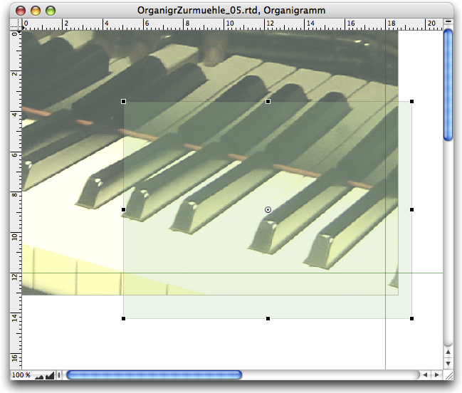
In our example, there is another way to move the image so that it fits our layout. Since our drawing component represents the outermost container, the drawing component also forms the border for the finished organizational chart composition. This border also limits the picture with the piano keyboard and all elements in the container. The activated picture container can also be moved as a whole – again, negative units are possible in the input.
RagTime is a powerful program. However, for editing photos, you should use specialized programs such as Photoshop. Nevertheless, there is a trick to reduce the color density or achieve a desired “color cast”. The magic word in RagTime is «Opacity»
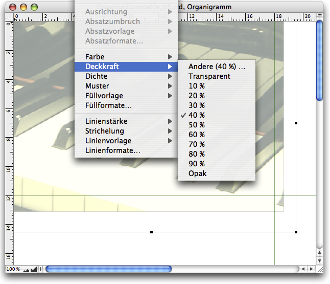
If we were to use our piano photo as a background as it is, we would have a problem with the contrast to our organizational chart fields. Just to show what opacity is all about, we have drawn a new frame in Fig. 3.87, assigned it a green color, and selected an opacity of 30%. However, we don't want a green tint, we just want the image to be paler. So draw a frame that is slightly larger than the photograph to be on the safe side. The easiest thing to do now would be to first assign «Format ➝ Color ➝ White» and then select «Format ➝ Opacity ➝ 40%» (see Fig. 3.88). However, as already made clear in 1 “Order at all levels”, we are advocates of meticulous order (which guarantees clarity).
RagTime has various ways of assigning color and fill, which can sometimes be misleading. Opacity adds another possibility for ending up not knowing where which setting was made (and then wondering why the color doesn't match your expectations…).
That's why it's important to keep things organized! Select «Windows ➝ Auxiliaries ➝ Fill Style Sheet Editor». Click «Create» and give the new fill style sheet a meaningful name. We have named it «Photo_Bleach». Select «Color ➝ White». Click on the «Opacity» selection field and enter 40% (various percentage values are preset in the settings menu at the top right of the palette). Finish by pressing the Return or Enter key.
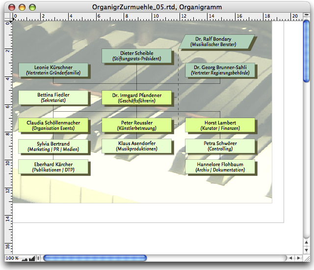
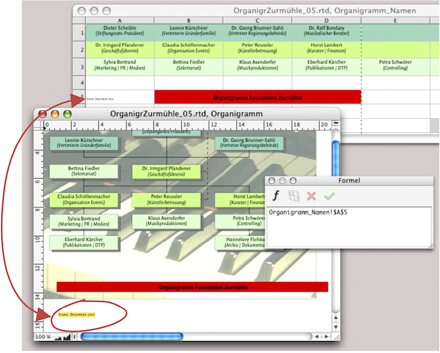
Now assign the new fill style sheet «Photo_Bleach» to the frame you created earlier. To change the layers, select «Drawing ➝ Stacking Order ➝ Send to the Back» and the newly created “color bleach frame” will disappear to the back. Do the same with the picture component of the piano photo. The layer with the spreadsheet cells, which is still behind it, reappears and all elements are on the correct layer. Your organizational chart now looks pretty much finished (see Fig. 3.89).
The clever thing about your organizational chart is that all text elements are combined in a single spreadsheet. We want to keep it that way with the title and creation date. Draw a spreadsheet frame to hold the title. Give this title frame a size that spans the entire width of the organizational chart and has a height of approximately 12 mm. Drag row 1 and column A so that one cell fills the entire frame. Then define a new fill style sheet, as we did in the previous section with «Photo_Bleach». Assign this fill style sheet, for example «Title Field_Red», to cell A1.
Open the «Organigram Names» spreadsheet in the Inventory and adjust the size and display of your open windows so that you have everything clearly in front of you as shown in Fig. 3.90. In the spreadsheet with the names, enter the title of the organizational chart in cell B5 (combined cells B5:D5) and the current creation date in cell A5. With the formula palette open (toolbar  ), you can now create the formula links: from your red title bar (cell A1) to cell C5 of the spreadsheet with the names and also from the small component for the date to the graphic text (see arrow in Fig. 3.90). The graphic text object must have a transparent fill style sheet, as it is to be placed over the photograph. Place it in the correct position, along with the spreadsheet container with the title. The organizational chart is now complete: save it again. Of course, you could also have created the title and the date line using graphic text: instead of the spreadsheet, you would then have to draw an empty frame for the color fill and place the graphic text over it.
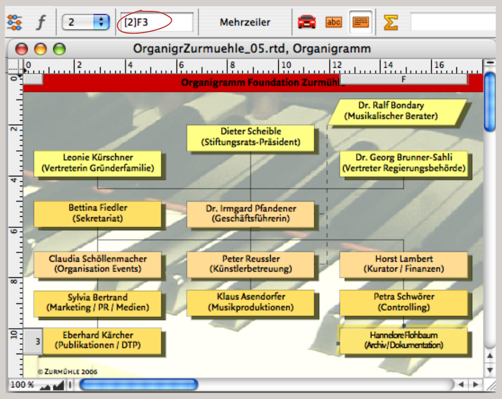
In our case study, it is now time for the foundation board president to take a look. Reduce or enlarge the frame of the drawing component to the desired display size. If you now click on any cell with the names and set the pop-up menu for the planes to 2 in the toolbar, the yellow variant will appear. Remember: we had the red variant on plane 3 and the green variant on plane 1. You can also use the technique shown here for other presentation purposes with selection options: for color concepts, font families, or even image variants.
● In the Drawing component, you can activate, move, and modify each component individually. ● Spreadsheet frames can be connected to pipelines with only a single visible cell, serving as flexible design elements. This allows you to freely design organizational charts, flowcharts, or family trees. ● Use referenced spreadsheets as a basis for text or information that is to appear in different places in your layout. This makes corrections faster and more reliable throughout the document. ● Try out how spreadsheet planes can help you when presenting design variations (colors, fonts, etc.). ● When using lines, pay attention to reproducibility in print (minimum 0.2 pt for black lines, 0.5 pt for light lines). Check the connections of thick lines to ensure that no “hollow corners” are created. ● For design tasks with many different elements, work in a drawing component if possible. This not only keeps everything together, but also allows you to compress or enlarge the entire drawing frame with all its contents. ● Always work with style sheets and memorable, informative names to keep track of everything. ● When creating a complex document, make several backup copies that you can fall back on if necessary.
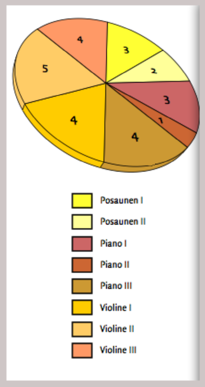
3.11 A simple business graphic
In RagTime, the component used to create bar charts, pie charts, and other diagrams is called «Graph». Since our activity report includes such a graphic, we will briefly introduce this topic using a pie chart. The RagTime Graph component is described in more detail in chapter 4 “That's quite impressive”. You will also find further examples there.
The introduction to RagTime also shows that it is not rocket science to quickly create graph. In the «Help/Info» menu, you will find the document «Annual Report.rtd» in the folder “«Sample Files ➝ Evaluation, Presentation». This is a good example of how business graphics work with RagTime. Here, we will briefly review how the graph component is also suitable as a “spontaneous tool” using a pie chart.
As with all other RagTime components, the graph component allows you to place something visible first and then apply all formatting afterwards. With increasing practice, however, you will set most of the formatting beforehand. Especially when using graphs and diagrams frequently, it is worthwhile to create a well-documented archive so that you have frequently used fill and character style sheets ready to hand, or even finished graphics where only the underlying data needs to be replaced.
- Tip:
-
When it comes to graphs, some users will already be true experts, while others have not yet ventured into this area. The examples shown here quickly “fly over” the individual elements and settings. Less experienced users are therefore advised to first read chapter 4 “That's quite impressive”.
RagTime already offers a large selection of prepared basic shapes under «Graph ➝ Gallery». Don't be confused if legends are not provided everywhere. These can also be added later. For our presentation, we opted for the three-dimensional shape with the values within the circle segments.
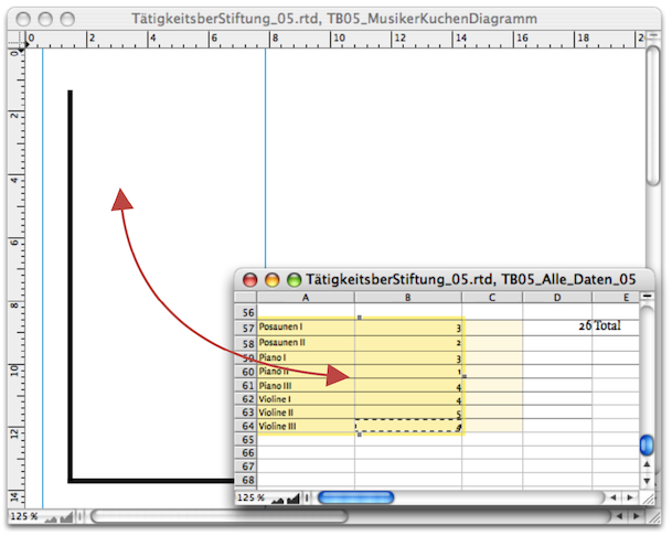
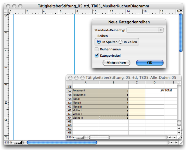
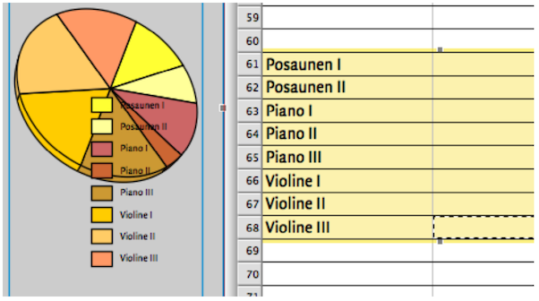
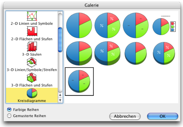
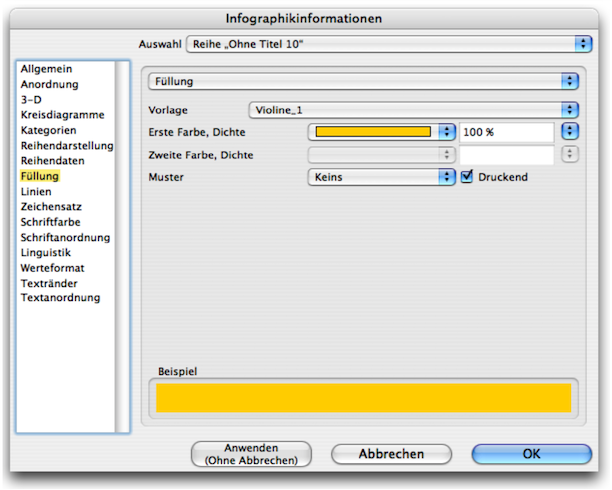
Let's start with the practical stuff: draw a frame with the content type graph. Open the spreadsheet with the relevant source data and select the desired data range. Transfer this range to the graph component by dragging and dropping. Finally, determine whether the categories refer to the columns or the rows (in our case, columns) and select «Category Names» (see Fig. 3.93 and Fig. 3.94). The result in Fig. 3.95 shows the trained eye that various other settings have already been set here, such as the type of pie chart, fill style sheets, character style sheets, and position specifications. Let's first take a look at the color style sheets and how they can be applied specifically to graphs.
RagTime automatically generates a color assignment (or a black-and-white grid) for each graphic in order to clearly distinguish the individual values. This can quickly appear very colorful and garish. For a carefully designed graphic, you will therefore want to define the colors and fill style sheets yourself. More than anywhere else, it is simply a prerequisite for graphs to work with color style sheets and give them a logical name (preferably that of the value itself, as in Fig. 3.97). The same applies to lines to a similar extent.
However, a major disadvantage of color assignment in the graph component becomes apparent when changing the chart type. RagTime then reverts to using the program's own colors red, blue, green, etc. without asking, which requires the fill style sheets to be reassigned. Tip: only assign fill style sheets at the very end.
You need to be careful here too: if you drag a graph from one document to another, RagTime does not transfer the referenced spreadsheet at the same time. This means that the graph can no longer be displayed in the new layout. However, as soon as you drag the spreadsheet into the Inventory of the second document, everything will be back to normal. This is a little easier with the folders in the Inventory: put all the components that belong to a graph in a separate folder and then drag this folder from one Inventory to another. Another tip: put both the graph and the corresponding spreadsheet in a drawing component. When you drag the drawing component into another document, all other components are automatically included.
In the «Graph» settings panel (AI/6I) you can assign all the important specifications in sequence. Under «Arrangement» you can specify whether and where a legend should appear. In our example, we first placed the legend in the center below the pie chart by entering the dimensions. But be careful, RagTime may initially react “stubbornly” because it aligns itself with the widest designation of the value (here «Trombone III»). This width naturally depends on the font and, above all, on the font size. It is better to first create a character style sheet and assign it before attempting to precisely define the arrangement of the legend by entering dimensions.
It is easy to move diagram parts, legends, and titles using the move tool  from the toolbar. This allows the object to be moved to the desired location according to your “design instincts”. The pointer changes to a hand icon when the mouse button is held down. If the mouse button is not pressed, the eight grip points around the element can be used to enlarge or reduce it like a container frame. For more information, see chapter 4 “That's quite impressive”.
RagTime allows you to label the individual diagram segments in various ways: there is a drop-down menu under «Position». The position selected in Fig. 3.99, «Above the Value» means that the labels are outside the pie chart; «At Value» means that they are placed directly on the edge of each segment; «Below the Value» results in a downward shift, which makes little sense in pie and circle charts; «At Center» places the label values in the middle of the segments; Close to Axis» places the values in a tighter concentric circle around the center. The same options also apply to lines that can lead to the value labels. Finally, under «Text», you can open a selection menu to determine what should be displayed in the labels (see Fig. 3.100). For diagrams that are rotated in perspective, it is usually desirable for the label text to remain straight. To do this, you can define a degree value under the «Rotation» setting (Fig. 3.101).
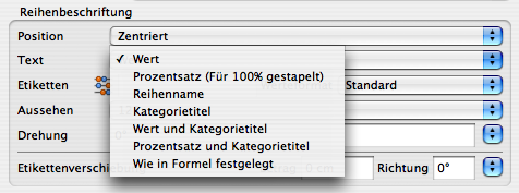
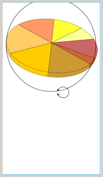
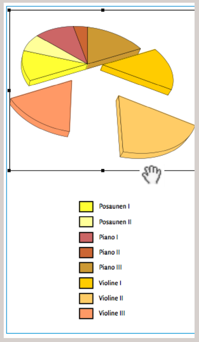
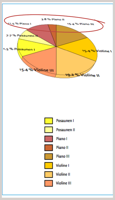
There are three ways to rotate a diagram in perspective: first, using the rotation tool in the toolbar; second, using the information panel under «3-D»; and third, by entering numbers (in the Information Panel under “3-D”). When rotating in perspective, the fonts in the labels are also distorted. This can make them quite illegible in some cases, but at least the font in the labels can be made reasonably vertical again.
Individual segments can be pulled out of the pie charts. This is easily done by clicking on a circle segment and dragging it. The other option – pulling out segments using formula input – is only recommended for experienced users, as subsequent manual changes are no longer possible. However, the further a segment is pulled out, the smaller the overall pie becomes so that all parts of the graphic remain visible within the frame. If you want to adjust the size again, this can be done easily with the move tool from the toolbar. However, the new size usually also requires the entire component frame to be enlarged further.
The settings options for the graph component are so diverse, even for experienced RagTime users that an entire book could be filled with information on graphs. For the sake of clarity, we will summarize the most important settings using sample images:
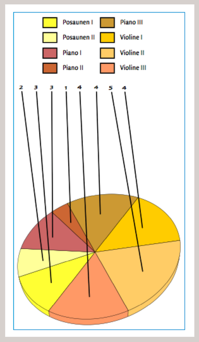
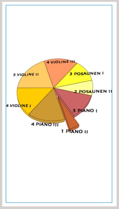
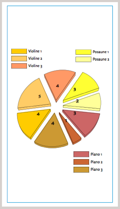
Fig. 3.102: When using the rotation tool from the toolbar, a circle appears around the diagram and the pointer changes to an open circle symbol with arrowheads. This allows the diagram to be rotated in all axes.
Fig. 3.103: Here, the chart has been rotated so that the segments «Violin 1, Violin 2 and Violin 3» are at the bottom. The segments were then moved to different positions. Finally, the position and size of the pie chart were changed using the move tool. The captions were also realigned or repositioned.
Fig. 3.104: Here, labels with «Percentage and Category Title» were inserted. «Below the Value» was selected as the position. The rotation of the label font was set to 150° to make it reasonably legible. Since all elements can be moved individually, the three top terms were also moved up manually to make them more legible. This example clearly shows that the rotated font is not very reader-friendly in a perspective-rotated graph. This cannot be changed significantly in the component. The only remedy for this is to create your own labels and legends as described in the following sections.
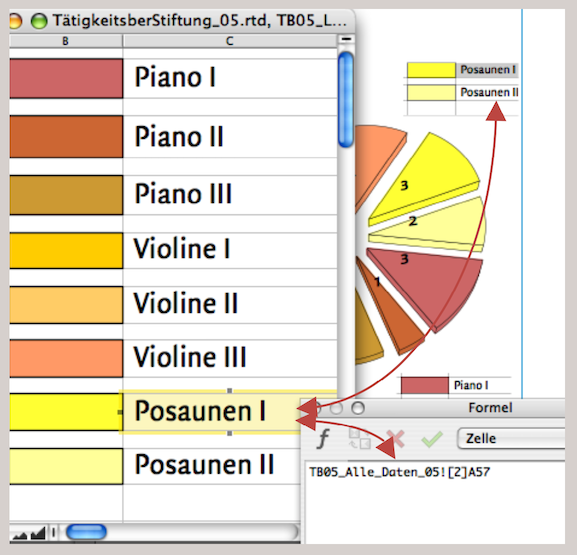

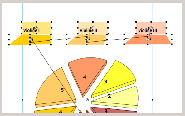
Fig. 3.105: The labels are defined with “Values.” The legend has been moved to the top. The «Spider Legs for Labels» option is enabled. The setting for «Spider Leg Origin» is set to «At Center». When working with connection lines, these can also be modified using the move tool. Click on the value (or text section) and move it with the mouse button pressed. The line moves automatically. In the example, an attempt was made to align all values on one line. This is an inadequate attempt for well-designed graphics: the numbers are still distorted and the lines are too thick. The thickness and color of these lines cannot be changed, nor can the border lines in the legend.
Fig. 3.106: In this example, the legend has been omitted entirely and the value labels have been selected with «Value and Category Title», with the position set to «Below the Value». The font has then been changed and formatted to be larger. The perspective distortion of the font is still tolerable here.
Fig. 3.107: In this implementation, «Value» was selected as the label and the position was defined as «Close to Axis». The individual circle segments were all drawn by hand. A legend was placed in three parts, somewhat logically corresponding to the three groups of musicians. Attentive readers will have paused here: Why do the color fields of the legends suddenly have such a thin line?
As is well known, the elements of the graph component cannot be dragged out of the frame, as is the case with a drawing component. This restricts the design within a layout. For example, if the legend for the graph is to be placed far away from it at a specific point in the text. However, since graphs are usually linked to spreadsheets, a great deal of design freedom can be regained with the help of spreadsheets. Let's take a closer look:
In the last example described (Fig. 3.107), a new spreadsheet was created for the legend. The color fills of the cells are, of course, taken from the fill style sheets of the graph. The contents (category names) of the legends refer to the source spreadsheet. This spreadsheet summarizes all the important data from the music foundation's activity report. It is the same spreadsheet that the graph refers to. So if changes are made there, the legends are automatically changed as well.
In this case, too, the spreadsheet was taken apart in the next step to display the legend and then reconnected with pipelines (the same principle as was used in the working example of the organizational chart (3.10 “Organizational chart: constantly new…”). This means that the three frames – one for each musical instrument group – no longer have to be directly adjacent to the pie chart; they can be placed anywhere in the layout. Of course, the legends can be varied in this way: by using cell borders in different line thicknesses and colors, by using colored backgrounds for the font, etc. Such an example is constructed in Fig. 3.109/Fig. 3.110. The legends for violin 1 to violin 3 and the color shadows below them are all cells in the same spreadsheet, connected by horizontal and vertical pipelines. The frames of the colored shadows were changed to irregular rectangles under «Drawing ➝ Object Kind ➝ Polygon». For the cells containing the names of the musical instruments, the color tone was entered with 50% density. The method of inserting spreadsheet components into freely designed frame shapes is explained in detail again in chapter 4 “That's quite impressive”, in connection with geographic statistics.
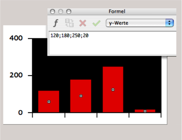
3.12 Graphs without spreadsheet
Finally, here is the simplest and fastest way to create a quick graph. Although in practice it is unlikely that the data for a graph will be typed in quickly – i.e., not taken from a spreadsheet data set – this application is mentioned here for the sake of completeness: draw a graph frame and click on the «Append Series» tool icon. The formula window pops up and you can enter the series values there, separated by semicolons. A graph is created immediately (Fig. 3.111), which can then be formatted as usual via the «Graph Information» panel in terms of fonts, colors, lines, etc.
● Individual elements of the graph component cannot be moved outside the frame. If you want to design graphs specifically and be largely independent when laying them out, it is best to work with legends using spreadsheet components. ● Only assign color style sheets to the individual bars or circle segments once you have decided on the type of graph you want to create; if you change the diagram type, RagTime will revert to the default colors. ● If you have linked several elements and components (spreadsheets, graphic texts, images, etc.) to a graph, it is best to use a drawing component in which all these parts are placed. The individual elements remain movable, but are integrated into a single container. ● Don't forget to group legend elements that belong together. ● Create an archive of graphs you have already designed. Then, when required, you only need to replace the values in the spreadsheet. ● For an archive of graphs, it makes sense to also include the spreadsheet components with the source data in the drawing component – in a non-visible area and defined as non-printing. This ensures that all parts of your graphic are always copied. ● Of course, it is essential to work with style sheets, especially for graphs: for fonts, lines, colors, fills – and to name them accordingly. ● It is also advisable to date each graph and make notes on the sources used. If the source data is reused, you will know which year and which source data the references refer to.
3.13 Prepare “Ready for printing”
Once the music foundation's activity report has been completed as a RagTime file, it should be sent to the printer. You have corrected all errors and saved the document as a backup copy.
Once you have confirmed that your print shop also has RagTime installed, you can simply forward your document to the printer on a data carrier or electronically. We have deliberately chosen the subjunctive “could”. This is because for users who have less experience with printers and print data, there are many details that can become stumbling blocks. We generally recommend that beginners seek advice from printing experts. It is best to do this before creating a complex document for high-quality printing. This is because what you see on the screen is not always what actually appears in print. This is especially true for colors, an area that experts can discuss for hours. There are meters of reference books available on color reproduction and color separation alone. Therefore, we will only take a brief detour into the world of colors and reproduction here.
- Tip:
-
Dealing with profiles and color management for professional printing requires a certain amount of training for non-experts. Today, exposing files in connection with the PDF format has become somewhat easier. However, good printing results also require good preparation.
When dealing with colored images and documents, the term “color spaces” comes up again and again. Basically, this is nothing more than an attempt to use standardization to find agreement on what, for example, carmine red should be or how much green the color olive has – a very difficult task, since colors are seen slightly differently by almost everyone. But that is precisely why standards are needed. One such standard was developed by the Commission Internationale de l'Éclairage. The assumption was that spectral energy distributions could be summarized in a model where virtually all viewers would consider the colors to be identical. This reference model is known as CIE-Lab (also Lab50 or Lab65). Based on this reference, the International Color Consortium has standardized color profiles, which are therefore called ICC profiles. Within these ICC profiles, there are program and printer specific adjustments. The aim of such profiles is to ensure that, as far as possible, all color reproduction processes on monitors and in print are based on reasonably similar specifications.
How different or difficult color reproduction can be is shown by the color samples in Fig. 3.112 and Fig. 3.113. Of course, we have the problem here of wanting to show comparisons based on a four-color print in this book, which actually should take place between print and screen. Therefore, it can only remain an attempt to represent the approximate difference between CMYK and RGB colors. Besides some of the color nuances that are never reproduced in the common four-color print as they appear on the screen.
The color samples in Fig. 3.112 and Fig. 3.113 show how varied and difficult color reproduction can be. Of course, we have the problem here of wanting to make comparisons based on a four-color print in this book that should actually be made between print and screen. Therefore, we can only attempt to illustrate the approximate difference between CMYK and RGB colors. In addition, some of the color nuances that are never reproduced in standard four-color printing as they appear on the screen.
In contrast to what the human eye perceives in terms of colors, four-color printing with CMYK in the so-called Euroscale or ISO scale can only reproduce a limited range. Colors in the green and orange range are particularly tricky. They always lose some of their brilliance in four-color printing.
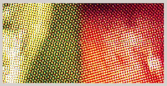
Some color shades cannot be achieved using four-color printing. If you want to reproduce colors absolutely true to the original, you have to choose additional mixed colors (spot colors) as an extra printing step in addition to four-color printing (or print each color individually in screen printing). Both are rather expensive options that are probably only suitable for elaborate art reproductions or sample collections that require absolute color fidelity.
Images can come from a wide variety of sources: e.g., digital photos, conventional photos, electronic data. And these images and their colors are mainly reproduced on two media: on a monitor and by printing on paper (or other print media). RagTime can work with three of the color spaces mentioned at the beginning.
As mentioned, the human eye is outlined with «Lab D50». Digital images, scans, and screens work with «RGB» (=Red/Green/Blue). Finally, what is printed with pigment inks in four-color printing is described with «CMYK» (= Cyan/Magenta/Yellow/Key). This refers to the color black, which is mainly used in images to enhance contrast and is referred to by printers as “depth”. In four-color printing (CMYK), an image is broken down into individual dots and separated into four colors. When printed together, the eye perceives color gradients and nuances. In reality, these are different colored dots arranged next to each other in a specific pattern (see Fig. 3.114).
3.14 Convert – but with profile
When creating print templates (film and–or plate exposure), the data must first be converted. Usually from RGB to CMYK. And it is precisely this conversion that poses the greatest “risk” of color shifts. To minimize these, there are profiles that must be the same on all devices used (from your computer to the exposure unit at the print shop). However, such ICC profiles only work if a so-called color conversion engine is installed on the computer. On Mac, this program is called «ColorSync» and on Windows «ICM2». RagTime includes a color matching module in the Windows version. This ensures that the screen display and the print display are comparable.
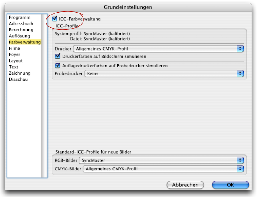
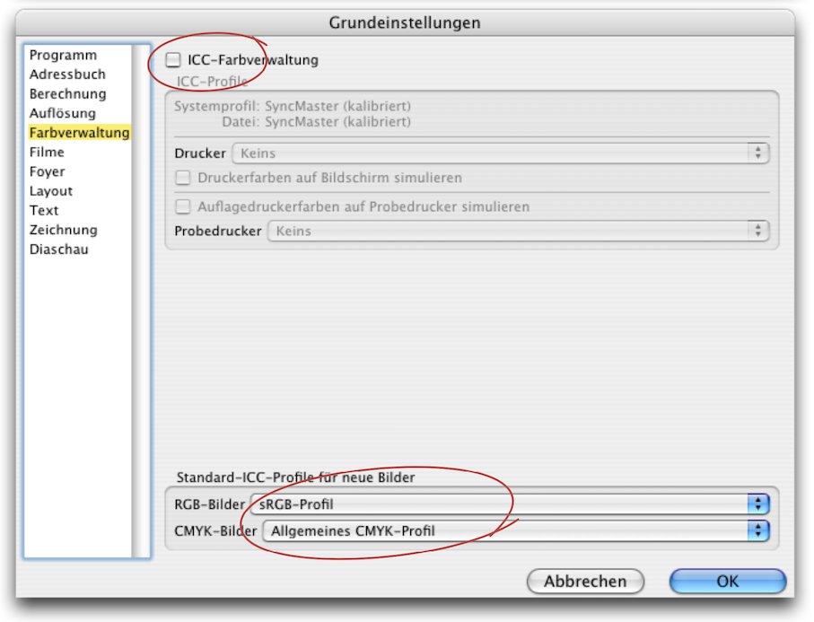
From colorful yet gray theory back to the tangible. Anyone who has worked on different screens is already familiar with the wide variety of color renditions. A reasonably comparable image effect can only be achieved with calibrated (i.e., color-calibrated) screens. Screens – or, more precisely, calibrated screens – are able to display colors as they appear in print. Basically, the reproduction of RGB colors depends on the devices/monitors on which they appear. Only an assigned RGB profile makes the colors independent of a device. However, comparable colors from one computer to another are only possible if the same color profiles are used. This consistency is referred to in technical jargon as “color management”. This requires professional knowledge.
It is tricky to work with settings that you don't know enough about. Our recommendation: if you are unsure, it is better to work with the default settings. As a general rule, if you are working with CMYK, all images must be defined with the CMYK color space. In this case, the printer will usually not take responsibility for the reproduction. If multiple color spaces have been used in a document, it is very difficult for the print shop to make uniform corrections to the images or colors. This means that a blue in one image, which is actually exactly the same blue as in the second image, may look different.
RagTime uses your computer's system settings to simulate the colors on the screen so that they correspond to the CMYK or RGB color space. In Windows, a profile must be assigned in RagTime's basic settings. If no such profile is available in your computer's system or monitor settings, RagTime will not be able to simulate the colors.
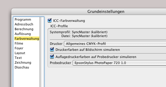
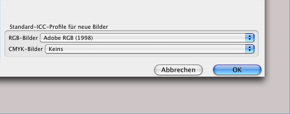
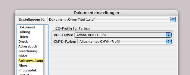
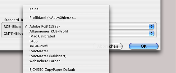
Under «Extras ➝ Settings ➝ Color Management» the check mark must be set (see Fig. 3.117) to be able to select «ICC Profiles» at all. Then in the «Printer» selection menu, you can specify the profile that corresponds to the image setter or output device (or «Generic CMYK Profile»). If «Simulate Printer Colors on Screen» is activated the colors on your monitor will be displayed as they appear in print. Once again, it should be noted that color accuracy can only be close to 100% calibrations have been performed at a high quality level. The additional setting under «Simulate Edition Printer Colors on Proof Printer» only makes sense if your “office printer” is capable of producing high-quality results. This allows you to print a so-called “proof”, which is a kind of preview. Finally, at the bottom of the same «Settings» panel, you can select the desired profiles from the drop-down menu as the default for all new images. Either select the profile for your camera or scanner, or select the default profile «Adobe RGB». Set the «CMYK Images» setting to «Generic CMYK Profile» or «None».
Under «Extras ➝ Document Settings ➝ Color Management», you can also set the profiles individually for each document to determine how the images and colors should appear on the monitor. However, it is not only the colors themselves that are important for printing, but also the resolution of the images and their screen ruling.
3.15 Setting for halftone images
We have already mentioned that printed images are broken down into dots. The density and fineness of these dots is defined by the “resolution” of the grid. A good inkjet printer can achieve approximately 1800 dpi (dpi = dots per inch; 1 inch = 2.54 cm). An office laser printer is normally designed for 600 dpi or 1200 dpi. Professional exposure devices achieve resolutions of 2400 dpi and more. Photos should have 300 dpi for reasonably good reproduction. The screenshots in this book have the resolution of the screen, i.e. only 72 dpi.
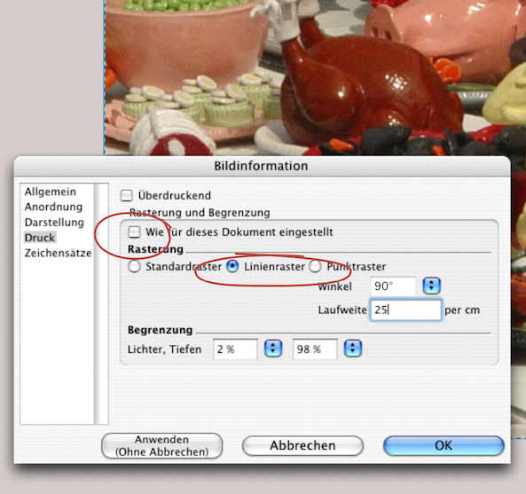
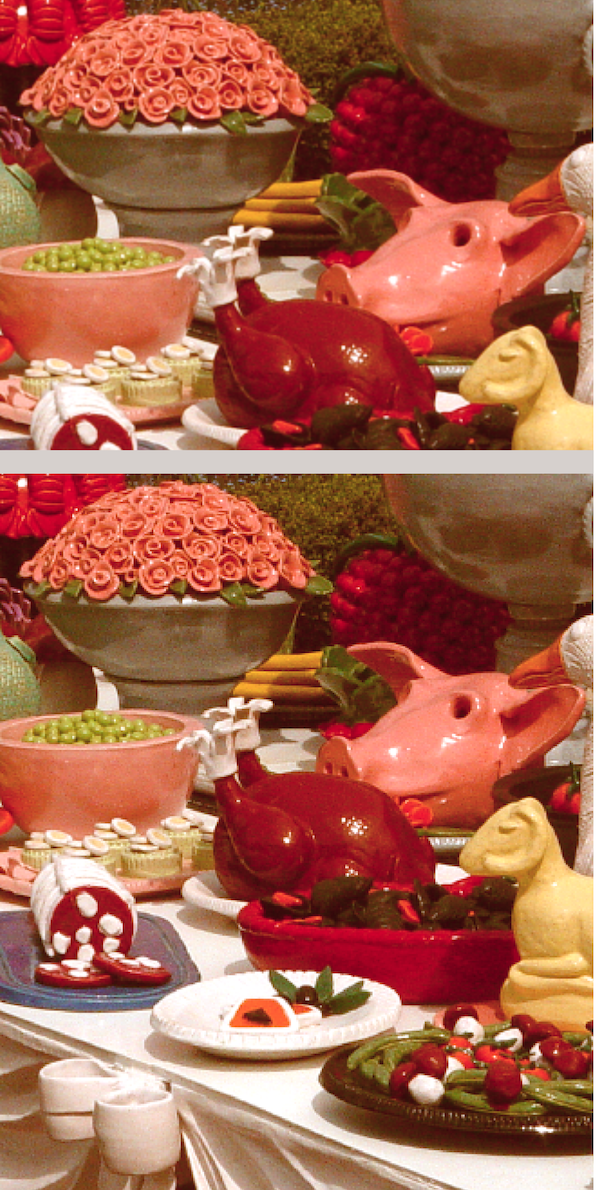
The photograph in Fig. 3.122 below has a resolution of 300 dpi. The screenshot with the «Picture Information» (Fig. 3.121) has only 72 dpi. For the image in the middle, a setting for «Line Screen» and «Frequency» was made for this image only via «Picture ➝ Information ➝ Print». «Frequency» is a rather inaccurate term here and should more correctly be called «Screen Frequency». Normally, the option «As Set for This Document» is selected on this panel. This means that all images in the document are defined for output in the document settings.
If you have selected the default settings for the raster options in both the “Image Information” panel and the «Document Settings ➝ Print» panel, these settings will be passed on to the imagesetter during conversion or when the print command is issued. We will come back to this in section 3.17 “Much much simpler – a PDF”. There we will also discuss color separation. This is because every multicolor document requires a separate film for each individual color in professional offset printing.
The term “spot color” dates back to the early days of letterpress printing, when a color other than black (usually red) was used for initials or decorations. Spot colors are not broken down into the four-color scale. They are always colors mixed specifically for the printing process. These can be used in addition to four-color printing as a fifth, sixth, or further color. Alternatively, the document can be printed in one or more spot colors, usually in combination with black. In the printing industry, there are also standard scales for mixed colors. The PANTONE color chart has proven to be a fairly widespread standard alongside HKS.
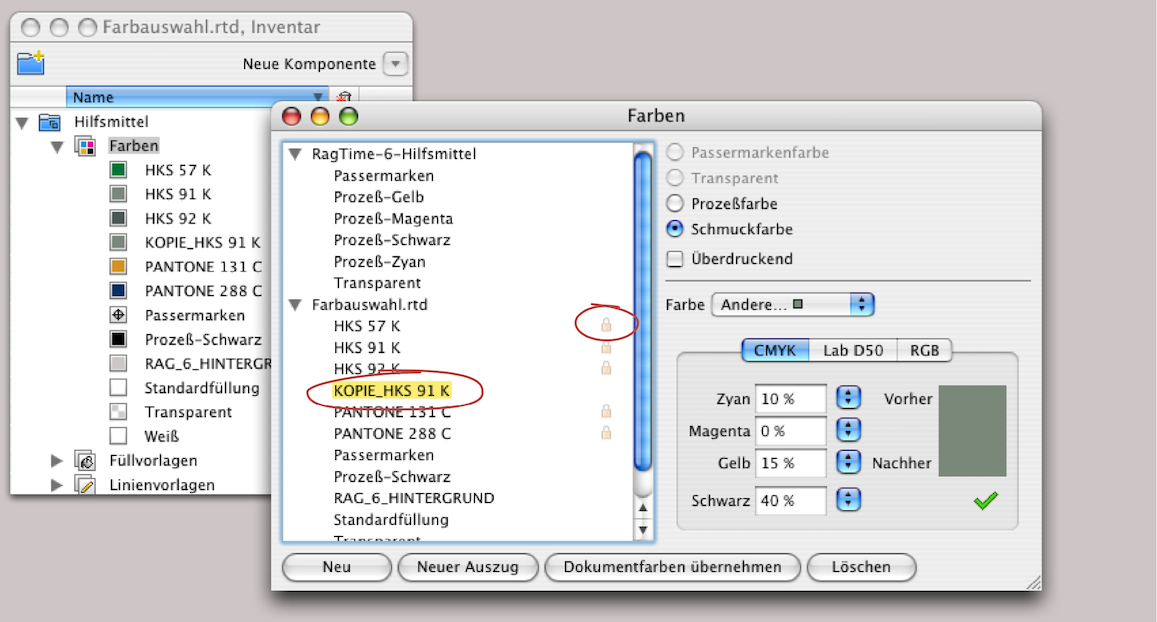
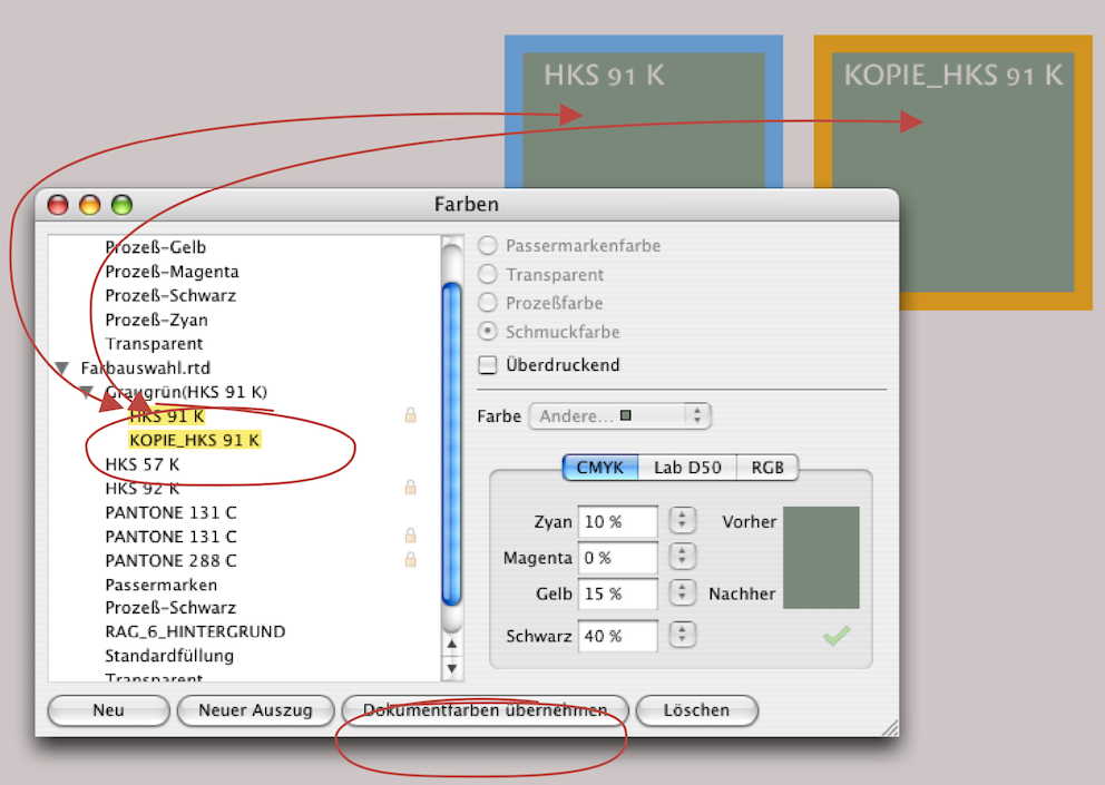
In order for RagTime to work with these colors, you need to purchase the appropriate software and color charts from Pantone to determine the colors. Exposure studios and print shops can also provide information on this. The same applies to other standard scales, of course. If EPS files with Pantone or HKS colors are imported into RagTime, they are listed in the Inventory or in the «Color Editor» palette – with a pale padlock (see Fig. 3.123).
Such colors cannot be changed, but it is possible to assign these colors to any object in a RagTime document. If you still want to edit such a color, you must create a copy of it (Copy/Paste). The padlock will then disappear and you can change the percentage values or density to obtain a matching color tone, for example.
If one or more colors are defined with the «Spot Color» option in the «Color Editor» panel, these colors will be output in a separate color separation during exposure – with a separate film for each color. Since every film is basically black (and transparent), it does not matter which color you assign. The easiest way is to assign one of the four colors (cyan, magenta, yellow) to all objects that have the same color. When exporting PDFs via Mac (using the print command), you can then set unused colors to be marked as «not used». Otherwise, four films would be exposed, and the “empty” ones would have to be discarded. Of course, the correct desired color is then mixed for printing the films and used in the printing machine.
Sometimes, when working intuitively, colors may be assigned without being given a name. With the «Collect Document Colors» function, RagTime lists all previously unnamed colors and gives them a “name”. This is a practical feature when it comes to tidying things up afterwards.
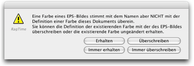
This “name” then consists of the percentage values of the color from the RGB color space. You should enter a meaningful color name instead of these percentage designations. A rare but tricky case occurs when you notice that several names for the same color have been created in your «Colors» folder. This can easily happen if you have imported EPS files from different graphic designers, and each one has named the color differently. In such a case, use «Create Plate» to create a new color with a new name and then drag the same but differently named colors onto this new color separation. This way, all colors of this color separation will appear on the same film when exposed. Another inconsistency when importing EPS files results in a warning message (see Fig. 3.125). Here, RagTime recognizes two identical names, but at the same time notes that they represent different color definitions. If you are unsure, select «Preserve» and then check the Inventory to see what the color definition is all about. You can then still delete any superfluous colors.
You should leave the «Overprinting» you should leave without check mark in the four-color separation. It only makes option unchecked for four-color separations. It only makes sense when using spot colors. But even then, the designer should know what they want to achieve with it. If two or more colors are overprinted, this results in another color that is not easily predictable. This happens, on the one hand, because the color pigments in offset printing are not opaque. And on the other hand, because the lower color shines through anyway in halftone areas.
To illustrate this, an attempt has been made in Fig. 3.126 to simulate this process in this book, as the book does not feature any spot colors but was produced using regular four-color printing. In the left-hand color combination, 100% yellow is printed with 100% magenta red above it, in the middle it is 50% and on the right 20% magenta. As explained, the new color tones in the overlapping areas are created by the different colored background shining through the halftone areas.
Just to clarify once again: if you wanted to achieve the same image with spot colors, you would have to print with five colors: one yellow, one gray for the background, and three different shades of red. In RagTime, you would then have to create two color style sheets for each of the three shades of red, with «Overprinting» selected for those assigned to the top row. For the color style sheets for the lower red tones, the «Overprinting» option would not be activated. Your exposure studio or print shop is familiar with various possible combinations and will also have print samples for them. However, if you choose very unusual color combinations, you must check the effect using a proof before going to press.
Neither your inkjet nor your laser printer can show you the desired result of overprinting and not overprinting. Only if you select the «Color Separation» under «RagTime» in the print command can you print your document as it will appear in the film exposure. Your printer will then deliver a paper copy for each color separation. The settings panels in Fig. 3.127 and Fig. 3.128 will, of course, look slightly different depending on the printer/printer driver used.
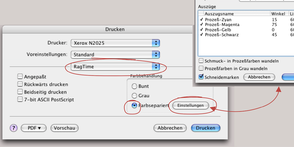
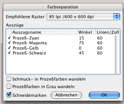
3.16 Exposing EPS files
When importing EPS files, RagTime defaults to a TIFF preview and font embedding. These settings can be changed under «File ➝ Export ➝ Options» if necessary. Even though colors that are exactly the same in the EPS file and in RagTime usually look different, they are identical with PostScript exposure. So don't be confused by what you see on the screen.
RagTime is a program that can print not only documents, layouts, and individual pages, but also individual components or a selection of them on a layout. The window that is at the front of the screen is always considered active. If you export a component, a selection, or a page as an EPS file, you can also send this file to the exposure studio or the print shop. EPS (Encapsulated PostScript File) embeds all print information. If you want to select an entire page of your RagTime layout for export, you must click on the page tab. Select «File ➝ Export» and «as… ➝ PostScript Illustration (EPSF)». The advantage of an EPS file is that everything needed for exposure is “packaged” and you can also import this file into other programs regardless of the platform. The disadvantage for exposure is that you can only export one layout page at a time. This can be a tedious task for a comprehensive document. A PDF file is a better option.
3.17 Much much simpler – a PDF
PDF (Portable Document Format) has become the standard format for communication with printers. Fonts, images, colors, etc. are embedded in a PDF document. This also includes characters that were inserted as special characters using the “Symbols” palette and originate from a different character set. (Please note: When exposing directly from RagTime, this is not noted in the character set directory).
This problem does not arise with PDF conversion, and of course formula calculations are also “frozen” and can no longer be manipulated in the PDF document. RagTime 7 (Mac and Windows) already has the “Ghostscript” program for PDF generation integrated. Alternatively, Acrobat Distiller can also be used for conversion to PDF. PDF creation from RagTime documents should always be done using the «File ➝ Export to PDF…» function and not via the print menu!
With Distiller and the correct PPD file for the imagesetter, you can even prepare color separations yourself and then leave the actual film exposure to the print shop or imaging studio. However, this requires some knowledge, which is why we recommend that you find out more about PDF documents.
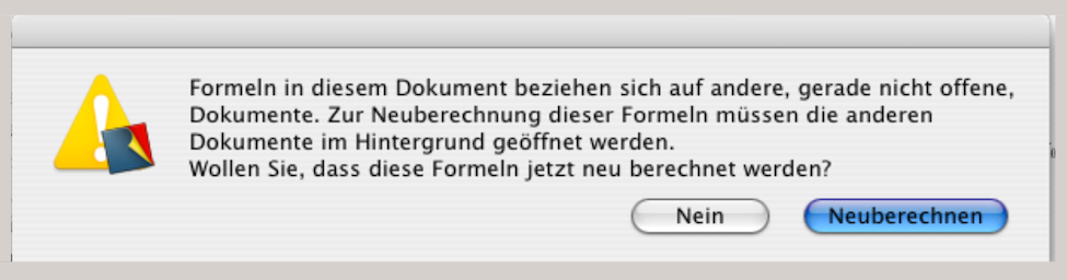
Finally, it should be mentioned that exposure can also be done directly from RagTime. This requires two things: first, the exposure studio or your print shop must also have RagTime – and be reasonably familiar with it – and second, fonts and images must be checked thoroughly for completeness. We only recommend this approach if the workflows between you as the client and the exposure specialists on the other side are already well established. One advantage of this is that corrections can be made to the document at the last minute before exposure.
A disadvantage can arise if errors creep in as a result of uncontrolled manipulation – especially with regard to calculated texts or tables. An initial query when opening the document can have fatal consequences for an inexperienced operator in the exposure studio (see Fig. 3.129). You must be sure to select «No» here. Otherwise, «Recalculate» could result in changed data (for example, if the date «Today» is used in a calculation somewhere). You can also prevent this query from appearing when opening the document. Under «Extras ➝ Document Settings ➝ Calculation», select the setting «Recalculation on Demand» before forwarding the document for exposure.
Regardless of whether you expose directly from RagTime or create a PDF, a final check of your document is necessary in either case. You will check whether all fonts and formatting are correct, whether the images are embedded, and, of course, that all corrections have been made to the content. Pay particular attention to page numbers and tables of contents, automatic headers, etc. RagTime offers various directories and settings panels to simplify document checking.
When you share RagTime documents—whether for printing or reading – the same character sets must be available on the recipient's computer.
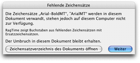
If this is not the case, a warning message appears when you open the document (Fig. 3.131). If such a warning message appears, there are two options: Either you open the document with «Continue» without worrying about the character sets. The document will then be displayed on the screen approximately as it is. The line breaks, paragraphs, and thus also the elements on each page will remain as they were intended when the document was created. However, RagTime will search for any approximate character set on the computer. The typeface will therefore no longer be the same.
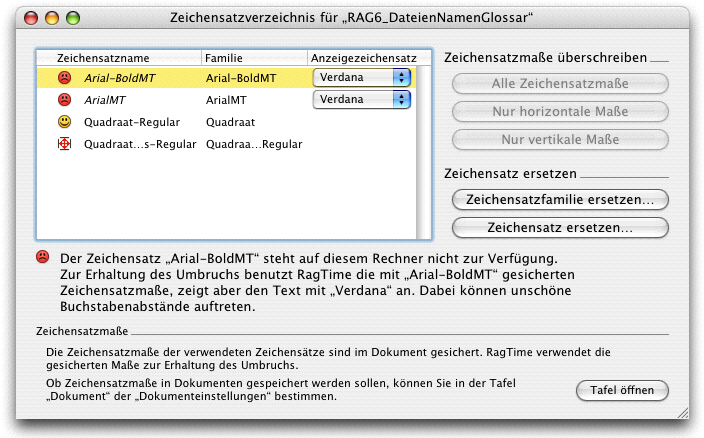
If you want your document to be printed exactly as it appeared on your monitor, you must also provide the fonts for your document to the exposure studio or print shop. If you no longer know exactly which fonts you used in your document, open «Windows ➝ Auxiliaries ➝ Fonts List». Actually, there should be yellow smileys for each font in this window, not just for one font as in Fig. 3.132. The fontslist will definitely appear with red “frownys”  if you clicked on the «Open Document's Fonts List» option in the «Missing Fonts» warning message described above. To get back to yellow smileys, the recipient of the document would have to replace the fonts or font family with those available on their computer. If the symbol with the border cross
  is visible in front of one of the fonts, this means that the font is available on the computer, but in a different version than the one used in the document. But be careful: if a change is made to the character set, the line spacing will usually change and, in all likelihood, a large part of the layout will also change. In this case, caution is advised and the document should not be saved when closing.
This unfavorable outcome is mitigated in advance, as the option «Save Font Metrics in the Document» is activated in RagTime's default settings under «Extras ➝ Document Settings ➝ Document». This ensures that at least the line spacing in the document is preserved (be careful not to “deselect” this setting without checking it first). However, the correct font must still be supplied with the document.
All images used in your document are listed in the image directory image list («Windows ➝ Auxiliaries ➝ Picture List»). All embedded images should have the same color profiles to ensure an efficient CMM workflow (for RGB images) during exposure. Different profiles make color corrections more difficult.
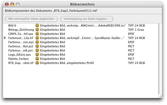
The images listed as «Embedded picture» (see Fig. 3.133) are an integral part of the document. They will therefore also appear on the recipient's computer (exposure studio). If the images are not embedded, you must also send the original files – preferably in a folder and with unique image and page names. The advantage of embedded images is that you can be sure you won't forget any of them. The disadvantage is that your RagTime file can quickly grow to many megabytes in size if it contains a lot of images and is a large file.
When sending a RagTime document to an exposure studio or print shop, take a few minutes to check the following tips.
● First, clarify whether the exposure studio/print shop also works with RagTime. ● Check all character sets (character set directory). Include the original font files (PostScript or TrueType font). ● Check in the image directory whether all images are embedded. If not, include all images used separately. ● If your document contains formulas, activate the «Recalculation on Demand» option in the «Document Settings» panel under «Calculation». ● When you hand over a RagTime document to a print shop or exposure studio, be sure to also provide a hard copy. ● In summary: Only send RagTime documents directly for exposure if you are dealing with specialists at the exposure studio/print shop who are familiar with RagTime. Alternatively, you yourself must have sufficient expertise to prevent exposure errors.
If you are working with PDF documents: ● Print out the PDF document and check it thoroughly. Everything will appear in the exposure as it does on the printout. ● For more complex color documents with overprinting components, it is best to also print out a color separation. ● Check with your exposure studio beforehand to find out what type of document you should send. In general, it is better for inexperienced users to talk to the exposure studio or print shop before creating a document.
General recommendations for submitting documents for printing: ● For halftone areas, do not go below a «Tint» of 10%. ● Black and white drawings should have a minimum resolution of 1200 dpi for offset printing, halftone images a minimum of 300 dpi. ● Do not set lines finer than 0.2 pt. Colored lines, especially light colors, should always be thicker. ● Always make a copy of the document before passing it on. ● Name the document and all associated files clearly and unambiguously.
When you hold a brochure or a comprehensive document such as this book in your hands, all pages are printed on both sides of large sheets, which are then folded, stapled, and trimmed. The printed sheet contains 16 or more pages side by side. The folded and trimmed sheets are stapled and/or glued together to form book blocks. For thinner printed works, the sheets can also be inserted into each other and stapled with wire staples. However, to ensure that the page sequence with the correct page numbers comes together again as it should be in the finished brochure or book, printers have developed a sophisticated system for each paper sheet size or page number. This process of correctly assembling the pages is called “imposition”. RagTime has an extension called «Johannes», named after the inventor of letterpress printing, Johannes Gutenberg, which performs this imposition on a small scale.
This extension enables quick printing of small booklets. Once Johannes is installed, «Print Booklet…» will become available in the RagTime «File» menu. The add-on program calculates how the pages to be printed must be sent to the printer in a specific order. Johannes then always prints two pages side by side on an A4 sheet (or A3, if you have such a printer). If you do not have a duplex printer that turns the paper itself, you must reverse the stack of printed paper and place it back into the printer tray after half the number of pages.
Once all the sheets have been printed on both sides, all you need to do is fold the stack in the middle and the brochure is ready, with consecutive numbering. For users who work with brochures a lot, this can be a useful extension to better check the finished document in advance. On the other hand, this allows you to distribute smaller versions of the final printed work to participants during presentations.