1 Order at all levels
With version 6, RagTime had already received an elegant entrance hall: the «Foyer». Here, you are invited to create your own order for projects, frequently used documents, stationery pads, or components. RagTime 7 also has a lot useful features to offer. For example, in the Inventory. It is worth recalling tried-and-tested organizational aids.
1.1 The Foyer: A good welcome
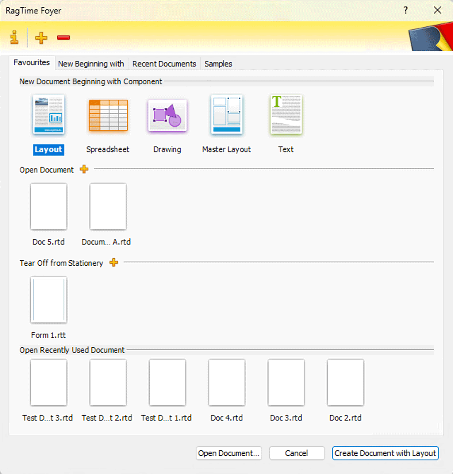
When starting, RagTime 7 opens the Foyer. This is preset by default. But like so much in RagTime, this can be customized to suit individual preferences. Even those who prefer to start with an empty layout page – as accustomed from RagTime 5 – do not have to do without the comfort of the Foyer. With a click on the icon  in the toolbar or with the corresponding keyboard shortcut AN/6N it can be opened at any time (see Fig. 1.1). The Foyer is truly a wonderful innovation to find all RagTime documents quickly and easily. Let's first take a look around the Foyer so that you can set it up exactly as it best suits your needs. The startup settings for the Foyer are accessible in two ways: by clicking on the
  in the header bar of the Foyer, or via «Extras ➝ Settings ➝ Foyer».
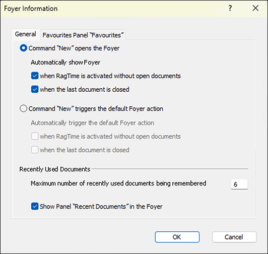
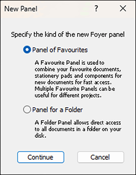
If in the «General» panel (see Fig. 1.2) the first radio button is active (it is by default), then RagTime starts with the Foyer. If, on the other hand, the second button is active, then RagTime starts with a freely selectable «Default Action» – more on that a bit later.
Two checkboxes allow you to determine under which conditions the Foyer is displayed or the «Default Action» is executed. We recommend checking both options here. Once you are familiar with the Foyer, you can possibly select a combination that better suits your working style.
1.1.1 Directly to your own document
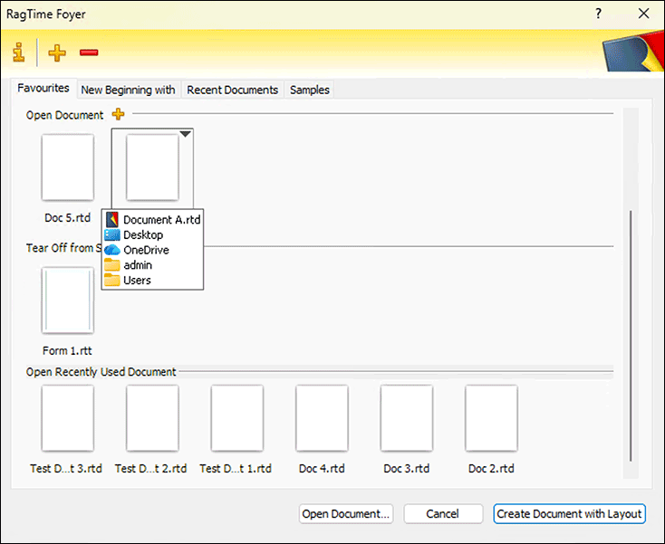
You configure your personal entry point into RagTime 7 in the «Favourites» panel. This panel will probably become the most important one if you work regularly with the Foyer. Here you can determine which components, documents, and stationery pads should be displayed.
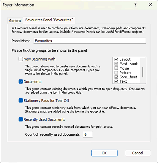
Every personal panel in the Foyer can be renamed in the configuration panel, even the «Favourites» panel (see Fig. 1.4). When renaming in the Foyer, definitely choose short names. The reason for that will be explained later. Further on, you will find four groups, each with a checkbox.
In the group «New Beginning with» you can select which component types should be available for creating a new document in the «Favourites» panel. If you practically always start new documents with a layout, you can also remove the checkmark for the whole group here – the remaining component types are still always available in the separate panel. The meaning of the other checkmarks for «Documents» and «Stationery to Tear Off» are explained in the Foyer panel.
For «Recent Documents» the number of documents to be displayed in the favourites panel is freely selectable. We recommend choosing this number so that with your preferred window size all icons fit on one line. We have chosen the value «8». This number is independent of that for the corresponding separate panel.
1.1.2 New beginning: what first?
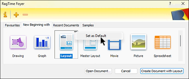
The «New Beginning with» panel (see Fig. 1.3) lists all components with which work on a new RagTime document can be started. The component types are displayed in alphabetical order, which cannot be changed. By default, «Layout» is selected as «Default Action» and therefore listed in bold and highlighted. This is also practical in most cases, but can be changed. More on that a bit later. The «Default Action» determines the command that is available in second place in the File menu. It can also be called with the keyboard shortcut shown with the menu command or the button at the bottom right in the Foyer window. If you do not make a different choice in the «New Beginning with» panel, a new document is always started according to the defined «Default Action», i.e., with a layout.
1.1.3 Your own project panels
Do you work on multiple projects with project-specific stationery pads and your own frequently used documents? Then it is practical to define your own Foyer panel for each project. Click on  in the header bar of the Foyer window and add your own favourites panel for each project. If all documents of the project are stored in one folder, you can also make this project folder into your own Foyer panel, in which all documents contained in the respective folder that can be opened with RagTime are then displayed. RagTime documents have a preview, documents from other programs do not have a preview option. Whether to choose folder or favourites panel is decided in the window that opens first after clicking on (see Fig. 1.5). If you decide on a favourites panel, you can determine its properties in a panel that looks very similar to the one shown in Fig. 1.4.
The document icons in the Foyer can also become “pathfinders”: Move the pointer over the icon. Immediately the full document name is displayed, which is very helpful for long names that are only abbreviated in the panel. Linger with the pointer for a moment, and you will see where the document is located (see Fig. 1.6). If you click on the small black triangle at the top right, you can jump directly to the corresponding folder via the pop-up menu that then opens with the command «Reveal in Finder/Explorer». This way, all documents in this folder become quickly accessible, even those created with other programs.
If you have inserted several of your own panels into the Foyer, the bar with the panel names becomes longer and longer on the Mac. If space is tight, the names are shortened to unrecognizability. Thanks to a different representation (staggering of the category tabs), this problem is eliminated under Windows. To create space in the bar with the panel names, you can suppress the display of the «Recent Documents» panel in the Foyer configuration. You can display the few last recently used documents in all favourites panels, including the self-created ones. Another Foyer panel that you can soon delete entirely is «Samples». The sample files remain accessible via the Help/Info menu. To save space in the bar with the panel names, especially on the Mac, it is recommended to delete those panels whose documents you no longer need for a long time.
- Tip:
-
Anyone who regularly edits more complex projects or documents with RagTime 7 should definitely familiarize themselves more closely with the Foyer. It will soon be experienced as an indispensable organizational aid with every program start.
1.1.4 Favourites to the Foyer
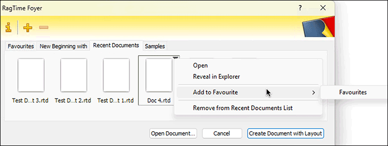
The Foyer really makes sense when you place your most used stationery pads and documents in the general or one of your own favourites panels and thus make them directly accessible. Click on the of the group «Open Document» or «Tear Off from Stationery» to start the corresponding selection dialog. Or you want to permanently include a recently used document in a favourites panel. Then move the pointer over its icon in the Foyer: A border and a small triangle appear at the top right. Click on this triangle to open a pop-up menu with commands, including «Keep in x» («x» is the name of the current favourites panel) and «Add to Favourite» with the selection of the further favourites panels (see Fig. 1.7). This ensures that the document is always readily available in the Foyer – and that it is filed in a way that makes sense to you.
With «Set as Default» you select the document, the stationery pad, or the component type – instead of the preset layout – as «Default Action». The name under the symbol selected as «Default Action» is displayed in bold and highlighted.
The RagTime Foyer is thus a dynamic entry area that can be quickly and efficiently adapted to your own needs. Order becomes child's play, and you can concentrate on your actual work. By the way: With all the operations described here, you only move or delete an icon in the Foyer. In the Finder/Explorer, the document remains unchanged in the same place.
1.2 The Inventory: stronger and clearer
The topic of order and overview also includes the Inventory. From our experience, we know that even experienced RagTime users use this tool far too little. There is a significant difference in the Inventory between the platforms: on the Mac, each document has its own Inventory window. Under Windows, the Inventories of all currently open documents are listed in the same window. When we speak of the Inventory here, we always refer to the Inventory of the document currently in the foreground.
For beginners: The Inventory is the heart of every document. With a click on the  in the toolbar or the corresponding command in the Windows menu, you call it up. The squirrel «Roderich» is the mascot of RagTime. For experienced RagTime users, we will give you a preview of what's new and different so you don't have to plow through pages of familiar information.
1.2.1 This is new and different
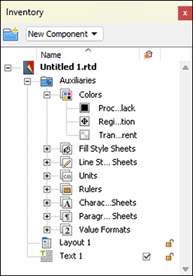
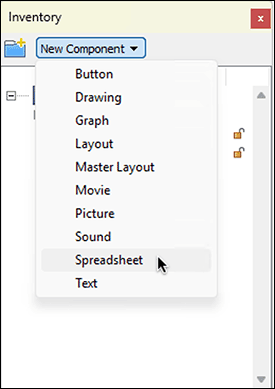
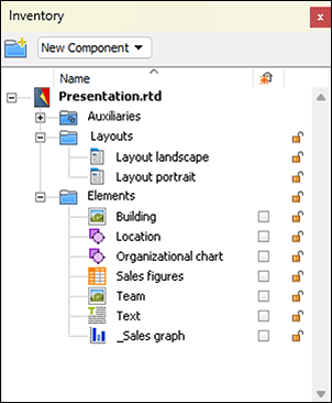
With RagTime 7, you keep the overview in the Inventory even with complex documents; even with a large number of components! The various style sheets for colors, characters, paragraphs, lines, etc. are summarized in an «Auxiliaries» folder (see Fig. 1.8). The designation is not entirely fortunate since RagTime also has a submenu named «Auxiliaries» in the «Windows» menu, which encompasses somewhat more than this Auxiliaries folder in the Inventory. The «New Component» pop-up menu at the top of the Inventory allows you to create new components directly from the active Inventory (see Fig. 1.9). The folder with the plus sign at the top left in the Inventory window generates new folders. By creating folders and subfolders, also in multi-level nestings, you can tidy up the Inventory. With drag and drop, the components are placed in the created folders.
For example, a layout with all components used on it can be collected in one folder. Or folders can be formed for certain component types.
- Tip:
-
In RagTime 7, all style sheets are stored in an «Auxiliaries» folder. New components can be created directly in the Inventory. Folders for all components help to keep the overview even with large documents. New are also various possibilities for sorting.
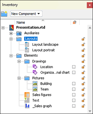
To perfect the whole thing, the Inventory can be sorted by name or by component types. To do this, click in the header bar of the Inventory on the «Name» column or the leftmost column (see Fig. 1.11). With each further click on the same column, the sort order can be reversed, corresponding to the direction of the displayed arrow. This is quickly understood and can be easily tried out. For folders and sorting options, see also Fig. 1.11 to Fig. 1.13.
To keep the overview in the Inventory, you should definitely provide all style sheets and components with your own, descriptive names (see Fig. 1.11). Without assigning clear and especially memorable names for yourself, complex projects quickly become confusing. Working with formulas and calculations involving multiple components leads to chaos without naming. The structure in folders would allow the same name to be assigned multiple times, so for example the name «Text» for components in several folders. But avoid identical names – also for folders and components! The probability is too great that you confuse yourself – and RagTime also refuses if a doubly assigned name is used in a formula.
1.2.2 The Inventory for beginners
Stationery pad (e.g., layout) and content (e.g., text) of a document are basically treated separately in RagTime. A RagTime document therefore typically consists of several components. Normally, at least one layout is present. In it, frames (also called «containers») define the form (or representation). These frames accommodate the actual contents – like text or spreadsheet.
Only the combination of these components results in a document in the usual sense, which can be printed. All components belonging to a document are listed in the Inventory. In addition, all style sheets relevant to the document are contained here: for colors, fills, lines, units, rulers, characters, paragraph and value formats. The variety of style sheets that are saved with each document makes RagTime documents relatively large – which is particularly noticeable with relatively simple documents – but increases flexibility immensely: if you change something in one of the style sheets, you simultaneously change all dependent elements in your document. This makes layout changes quick to accomplish.
For RagTime, the Inventory is thus the document and not what is printed on paper. The fact that multiple layouts (with the same or different components) can be present in the same document and each layout, or even each component, can be printed separately, makes RagTime seem complicated to some beginners. Do not be deterred! Once you have internalized the basic philosophy, RagTime opens up unimagined possibilities. To benefit from the clear structure of the document, you should definitely always work with style sheets. Here is just one example: if you have used a special color for just two objects, perhaps a text and a graphic element, you should define a corresponding color style sheet. If it turns out during printing that the color tone needs to be changed, then you only change this color style sheet and all dependent objects automatically adjust. The same applies, of course, to character and paragraph style sheets. More on this in Chapter 1.3 “The «Auxiliaries» folder”.
1.2.3 Change names and sort
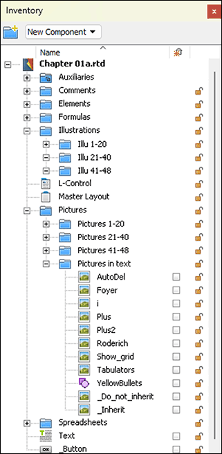
Each newly created component automatically receives a name with component type and sequential number, i.e., «Layout 1», «Text 1», «Picture 1», «Spreadsheet 1», etc. After two slightly delayed mouse clicks on one of these names, you can replace it with your own. Give as descriptive but short names as possible. It is good to know that you can “trick” the alphabetical sorting. If a component should be at the top in the Inventory, put an «A» or a space before the name, see Fig. 1.12 and Fig. 1.13. If the element should be listed last, start the name with «Z» or a special character, e.g., «_Button». In Fig. 1.12, the Inventory is sorted descending. – However, you cannot rename the «Auxiliaries» folder. It is always listed at the top in the Inventory. It also cannot be duplicated or moved to another Inventory.
1.2.4 Structure the Inventory
Basically, you can expand your hierarchical structure arbitrarily and nest folders multiple times. Keep it moderate because your Inventory literally “widens” by indenting each hierarchy level a bit further. This mutilates names, making similarly named components hard to identify (see e.g., Fig. 1.8). As already mentioned above, nesting and “unnesting” of folders, as well as placing components in the folders, is simply done with drag and drop.
1.2.5 Delete? Watch out!
If you want to delete a folder or a component, activate the relevant element and choose under «Edit ➝ Clear» or, even simpler, press the delete key >/>. But attention: if you have selected a folder, you delete – perhaps unintentionally – of course simultaneously all subfolders and components contained therein!
1.2.6 Automatically deleting
A rather insidious – when consciously applied also very practical – option in the RagTime Inventory are the small checkboxes on the right with the icon  above the column. What does it mean if a component has the checkbox marked with a √ – or not (see Fig. 1.13)?
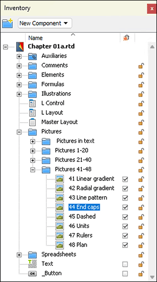
An example: you have a component in a layout page, say a text, where the checkbox in the Inventory is marked with √. Now you delete the frame that contains this component in the layout – or the entire layout page. The said text component will immediately disappear from the Inventory and is thus no longer present in the document. If the checkmark of the text component had been deleted in the Inventory, it would have remained in the Inventory during your deletion operation, so still present in the document. Be careful here! RagTime can only undo one single step . The probability is high that such an automatic deletion of a component is only noticed after another step. Then it is irretrievably deleted and thus possibly valuable work destroyed. If you notice it in time, the only rescue option is to close the document without saving and reopen it. – A component is automatically deleted only if it is not used in any other place in the document – e.g., in another layout. A reference in a formula is not enough!
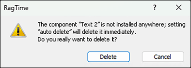
What happens if you activate the checkmark of a component that is no longer used anywhere? A warning message (see Fig. 1.14) helps you prevent unintentional deletion. But with a too quick confirming click, the component is actually irretrievably deleted. However, this deletion can also be useful to get rid of accumulated ballast.
It is therefore worth paying attention to these checkmarks in the Inventory. If you create a new component within another component, e.g., by inserting in a layout page, this component appears in the Inventory automatically with a checkmark.
If it is created using the menu command «Windows ➝ New Component» or using the pop-up menu in the Inventory, the checkmark is missing. This is obvious because otherwise it would be deleted immediately, since it is not yet used anywhere. It can therefore be worthwhile, when developing a new document, to immediately uncheck all new components.
On the other hand, all components that you have deleted in the layout and no longer need remain in the Inventory. A document can thus become unnecessarily large over time and the Inventory can become enormously confusing. That is why it makes sense to regularly clean up the Inventory. If you then provide a component that has already been deleted in the layout with a checkmark, the already mentioned warning appears (see Fig. 1.14). You can then decide whether you might still need the component or actually want to remove it from the Inventory.
Remove the checkmark on the right from all elements in the Inventory that you definitely do not want to delete. ● Check again and again whether the elements that have no checkmark in the Inventory are actually still needed. ● Delete no longer needed components, but do not just delete randomly! ● In the Inventory, you cannot find texts that were created with the «Graphic Text» tool: They are not components, but parts of the layout page or drawing,
1.2.7 The padlock
Another special feature are the small padlocks to the right of each component. If you close such a lock and then protect the document with «Extras ➝ Protection ➝ Lock Document», the thus secured component can neither be changed nor directly deleted. But be careful: this does not prevent “automatic deletion”!
1.3 The «Auxiliaries» folder
Most entries in the «Auxiliaries» folder in the Inventory – as well as in the menu «Windows ➝ Auxiliaries» – concern style sheets. You should use style sheets whenever possible. The probability is high that you will ultimately want to use a supposedly only once used formatting elsewhere. Make it a firm habit to basically make formattings with style sheets. With style sheets, you create order and overview and above all: Style sheets can be easily transferred from one document to another. More on this from section Know inherited better. Since character and paragraph style sheets are usually needed most frequently, we will look at these two in detail first. Many of the basic principles explained here apply to all types of style sheets.
1.4 Character style sheets
As with most other style sheets, you get to the desired editing window in three different ways: 1. In the Inventory, expand the «Auxiliaries» folder and double-click on «Character Style Sheets». 2. Via «Windows ➝ Auxiliaries ➝ Character Style Sheet Editor». 3. Click on the  icon in the RagTime toolbar. The «Formatting» palette will open. Under «Character and Paragraph Style Sheet» click on the for character style sheets.
1.4.1 The Normal Character
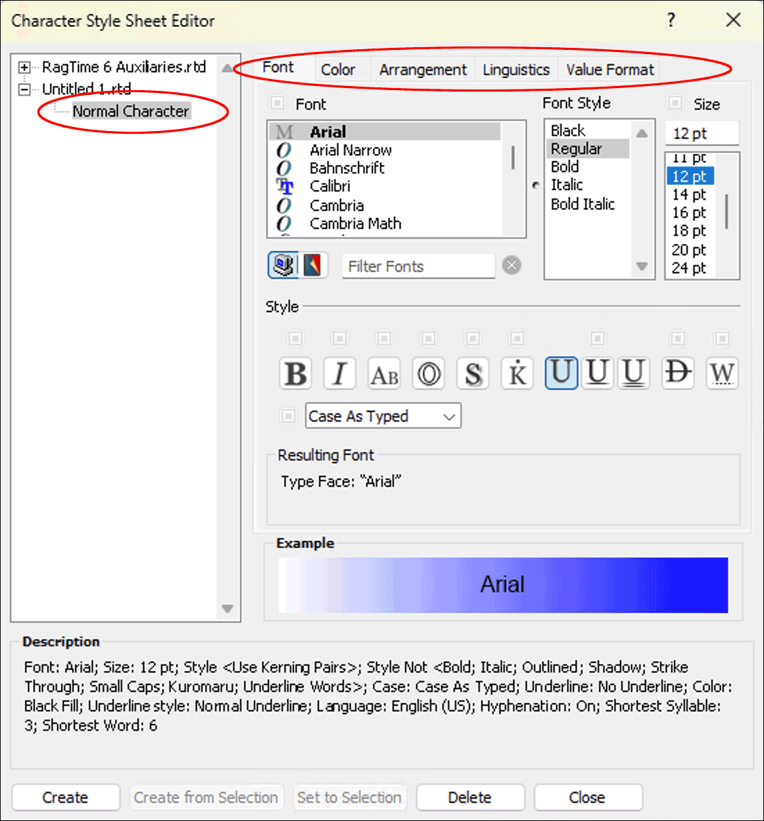
RagTime offers the «Normal Character» style sheet twice. Once under «RagTime 6 Auxiliaries» and once for the currently active document (see Fig. 1.15 top left). In the first case, the formatting of the normal character applies to all RagTime documents that you will open in the future. In the second case, it logically applies only to the relevant document. By the way, the «Normal Character» style sheet cannot be deleted and it should not be renamed – although this is possible – since certain operations assume the presence of this style sheet, and if it is missing, a new one with this name is created.
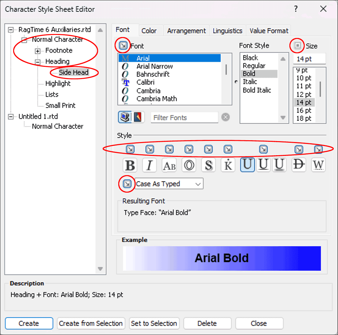
In the «Character Style Sheet Editor» window, a style sheet must be selected to be able to make the corresponding settings for it. The formatting specifications of each style sheet are grouped in five panels: «Font», «Color», «Arrangement», «Linguistics», and «Value Format» (see Fig. 1.15 top right). On the Mac, the names of the panels are unfortunately severely mutilated due to lack of space. But you will soon know how to get to a certain setting.
Under «Example», at the bottom of the window, you can always see how your settings and changes affect the typeface. Either the font name or the text that was selected in the document when the window was opened is displayed as a sample.
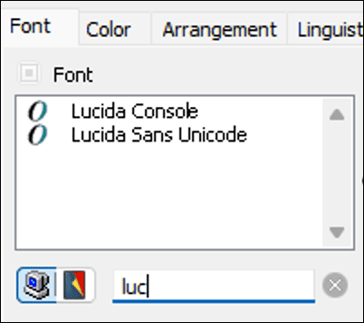
On the «Font» panel, select from your loaded fonts the one you want to use generally in your documents. You can select below the list on the left with the two icons which font list should be displayed, either all fonts installed on the computer, or only those already used in the document. In the field to the right of these icons, you can enter the beginning of a font name, e.g., «Luc» for «Lucida» – but the computer icon must be activated to search among all installed fonts. This way, only the available Lucida fonts are listed. Now you can select the style sheet and assign the found font to it (see Fig. 1.16).
This way, you find a specific font much faster, especially if many fonts are installed on your computer. To display all fonts again, simply delete the entry in the search field.
If you create documents that are to be used or edited on multiple computers, then make sure that the corresponding font is installed everywhere. This is particularly critical for documents that are to be opened on different platforms. They should preferably be so-called Unicode fonts, since with others the same character may be coded differently on the platforms. Particularly annoying is this with the popular symbol fonts «Wingdings» and «Zapf Dingbats». As much used – and reasonably identical – fonts, for example, «Arial» or «Times» have established themselves. But in any case, choose a font that has at least separate cuts for bold and italic. You see this in the somewhat unfortunately labeled «Font Style» (instead of «Cut») table right next to the font overview. In Fig. 1.15, an «Arial» is selected as «Font» and under «Font Style» the English names of the available cuts, «Regular», «Bold», «Italic», and «BoldItalic», are visible. These names of the cuts are not standardized and are again somewhat different for many fonts.
On the far right, under «Size», the desired font size can either be entered numerically (not necessarily integer, so also «8.5 pt») or selected with a value from the font size list.
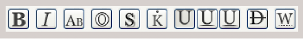
The icons in the middle row leave various «Font Style» options open. From left to right, these are (see Fig. 1.17): Bold, Italic, Small Caps, Outline, Shadowed, Kuromaru (used only with Asian fonts), not Underlined, single and double Underlined, Strikethrough, only words under- or strikethrough. By clicking on the icons, the features are turned on and off. For your normal character, you will hardly need these style features.
Here is a look at the pop-up menu below the style icons. This has four settings: «Case As Typed», «Upper Case», «Lower Case», «Upper Case Initials». In terms of meaning, they are self-explanatory, but in terms of function, they can be misunderstood. If, for example, when writing a text, you write everything in uppercase letters, and then assign a character style sheet to the text that contains «Case As Typed», then the uppercase letters (capitals) cannot be converted. For the other options, it does not matter how you typed the text – its representation is determined solely by the choice made here for the character style sheet.
We assume for simplicity that certain colors are already predefined. At this point, we only show how colors are to be used in connection with character style sheets. (On color definition and the whole topic of colors, color spaces, color management in RagTime 7, see section “Are color spaces habitable?” ff.)
Colored fonts should be used with extreme restraint in a normal document (the same applies, by the way, to excessive use of font styles such as Bold, Uppercase, Underlines, etc.). Always ask yourself what should actually appear important to the reader because the eye tires very quickly with many font and color changes, and a supposed structure through colors and fonts then becomes confusing.
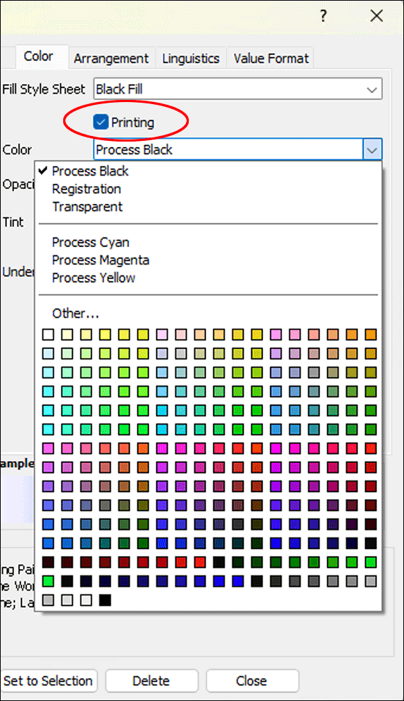
In the «Color» panel, the «Fill Style Sheet» pop-up menu shows you all fill style sheets already predefined in the program or in the document, which can be assigned to the font here. The temptation is great to simply assign a color from the palette shown in Fig. 1.18 to the character style sheet for colored text.
But better create a color and a fill style sheet with this color first. As already mentioned, only with a disciplined style sheet structure is a subsequent change in the entire document simple and quick. – Here it is especially important that the checkmark for «Printing» is set. Otherwise, the most beautiful color cannot appear on the best color printer. Non-printing, i.e., without checkmark, the font remains visible only on the screen, which can be very useful for explanations in stationery pads.
The «Opacity» setting allows an adjustable transparency. Elements lying under the font in the layout become more or less visible and are printed accordingly. More on this – also on setting the percentage values under «Tint» – in the topic Colors (section 1.6.2 “Individually mixed colors”).
Finally, in the «Color» panel, a line style sheet for the line in underlined texts can also be selected. Check that you have assigned the same fill style sheet to the «Normal Underline» line style sheet as to the «Normal Character». So also here: Assign colors not directly, but via fill style sheets!
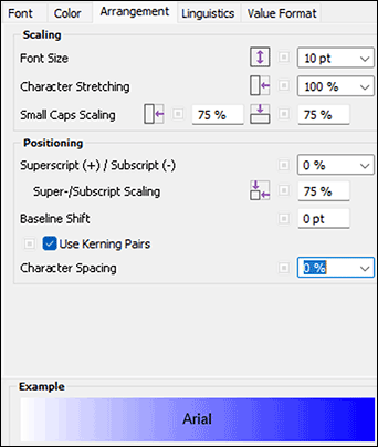
With the «Arrangement» panel (Fig. 1.19), you can set the font size again – also in connection with stretching and other factors. Theoretically, the wildest letter distortions can be produced here, which make every typographer's neck hairs stand up. Use letter stretching and compression only with the greatest restraint! In practice, more important, especially in formula setting and scientific texts, is the super-/subscript and the baseline offset.
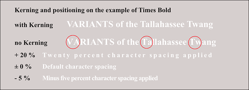
We will go into the baselines in more detail in section 1.5.5 “The fixed baseline”. The property «Use Kerning Pairs» should basically be activated. It helps your text to a more balanced typeface by reducing the otherwise too large distances between A, L, T, V, or W and the following letters, e.g., in combinations like «VA», «Ta», or «tw» (see Fig. 1.20). The letter spacing changes the tracking of the font, i.e., the spaces between the individual characters, but not their width. A specification deviating from 0 thus leads to expanded or condensed text. The typographer speaks of spacing, kerning and/or kerning (see Fig. 1.20 below).
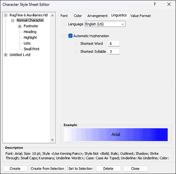
1.4.2 Linguistics: dictionaries
The «Language» pop-up menu is directly related to the installed dictionaries. Select the one that corresponds to your correction and hyphenation mode. The installed language packages of RagTime each contain all variants of a language, so e.g., for German the traditional and the reformed spelling, both in the German and the Swiss version, or the American and the British spelling for English. For the hyphenation, the checkmark «Automatic Hyphenation» is important. Without checkmark, RagTime 7 builds the text without hyphens – with correspondingly large word spaces in justified text.
Only with active hyphenation do the two entries for «Shortest Word» and «Shortest Syllable» have an influence. (See Fig. 1.22). Here, the automatic hyphenation can be restricted so that RagTime does not hyphenate every syllable. For example, the word «Electromagnetism» would be correctly hyphenated at the following places: «Elec|tro|mag|ne|tism» With the entry of «5» (letters) for the shortest (to be hyphenated) word and «2» for the shortest syllable, you avoid most unsightly hyphens.
If certain words should not be hyphenated, or only at certain places, you must include them in your dictionary. Without dictionary entry, there are e.g., for the word «RagTime» two hyphenation points: «Rag|Ti|me». The second hyphenation point is suppressed with the entry «Rag=Time»; «RagTime=» prevents any hyphenation.
Compared to very early RagTime versions, RagTime 7 has dispensed with «automatic style sheets» in favor of stability.
The loss is not serious. Even with automatic style sheets, foreign-language text passages had to be explicitly assigned the language. Now you can – especially if font and/or style should differ – define your own style sheet and then assign this style sheet to such text passages, or just the language. When selecting an entire paragraph that contains such text passages, then the uniform character style sheet is no longer indicated, but either the modification with «+ …» signaled, or «Mixed» displayed for the character style sheet. This is the only really noticeable difference.
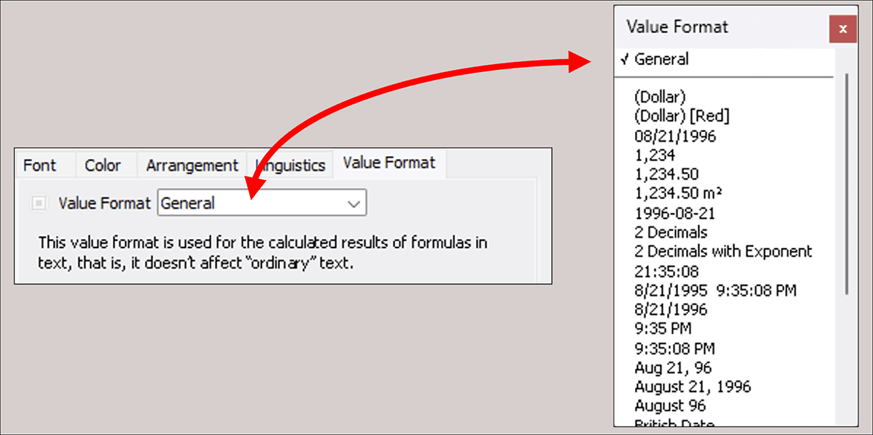
1.4.3 Added value with value formats
Under «Value Format», it is best to keep the «General» setting, unless for very special applications. For example, for character style sheets used for financial topics, instead of «General», «Euro – €» could be the right choice. As explained in the panel, the value formats of a character style sheet are only valid for «Formula Borders in Text». But precisely in an annual report – as a classic example – the numbers in the text are typically fetched with references from spreadsheets (are thus calculated texts), so that text and tables certainly match. This possibility is one of the great strengths of RagTime.
If you have made the settings up to here under «RagTime 6 Auxiliaries», these formatting specifications will be adopted for all your new documents. However, the settings made have no influence on already created documents! The specifications are contained in the «RagTime 6 Auxiliaries», document which on Macs is stored under «User ➝ Library ➝ Preferences ➝ RagTime»; and on Windows under «C:\User\AppData\Roaming\RagTime». The auxiliaries document is saved without intervention when quitting RagTime. When creating a new document, the style sheets from the auxiliaries document are adopted and can then be adjusted in the new document if necessary.
1.4.4 Inherit where you can
The settings for the «Normal Character» style sheet have much more effect! The character style sheets listed below the «Normal Character» in the style sheet overview are indented (see Fig. 1.23). This signals that the indented style sheets inherit all non-deviating specifications from the parent style sheet. For some features, «(inherited)» is in the pop-up menu, but mostly  for «inherited», or
  for «not inherited». Clicking on the icon switches.
Inherit means that changes made in the higher hierarchy level also apply to the dependent character style sheets. Therefore, you can, for example, introduce a new font in the corporate appearance very quickly for all new documents. You only need to exchange the font in the «Normal Character» style sheet under «RagTime 6 Auxiliaries».
1.4.5 Create character style sheets
Creating character style sheets becomes very simple by using the hierarchical dependency with inheritance described in the previous section: if you have selected an existing character style sheet and press the «New» button, RagTime 7 automatically creates a dependent copy of this style sheet, which you can further edit. In this copy, all features are initially inherited from the parent style sheet. So simply change those features that should deviate from the “inheritance”.
In the newly installed RagTime, there is only a single character style sheet for headings, based on «Times New Roman». You want to have the same font for the subheadings of your text, but in a smaller font size? Then activate the style sheet «Heading» in the directory on the left and press the «New» button below. An indented new style sheet is created under «Heading», and you only need to change its name, e.g., to «Subheading», and adjust the font size (see Fig. 1.23).
In the «Description», not all properties are listed for the new style sheet, but only the parent style sheet as well as the properties changed compared to it. If you later want to change your entire layout to «Arial», you only exchange the font specification in the parent character style sheet. All dependent character style sheets automatically adopt the new font, even if you have changed the name of one of the style sheets in the meantime.
You can also build further hierarchy levels by drag and drop. Check afterwards whether all “inheritance properties” are set correctly. You do not have to look in all setting panels, but can simply check the description at the bottom in the style sheet. Every formatting feature listed there after the plus sign is not inherited, but individually defined in the relevant style sheet. If you want to change the normal character in a document, you logically select the «Normal Character» style sheet in the hierarchy group of the relevant document.
If you want a style sheet that you have defined for a document to be available in all documents in the future, then drag the relevant style sheet from the document area up to the style sheets of «RagTime 6 Auxiliaries». Pay attention to the correct hierarchical classification and adjust the inheritance dependencies where desired.
At first, the concept of inheritance and inheritance dependencies may take some getting used to. However, once you understand the logic behind it, the benefits are considerable.
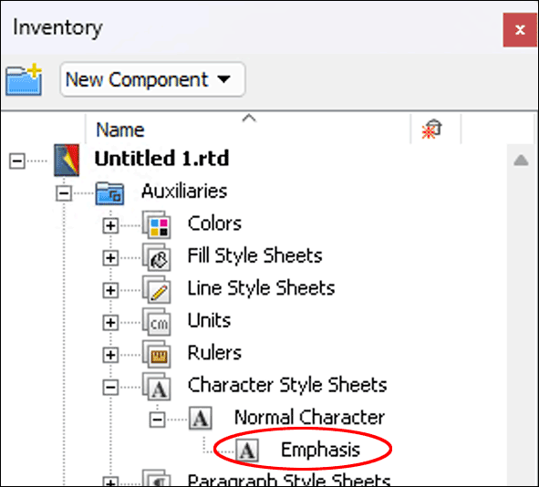
Let's return to the Inventory for a moment. If you have defined style sheets for a document, these are listed in the auxiliaries folder of the Inventory in the corresponding category. As long as you have only worked with the normal character in a document, only this style sheet is displayed there.
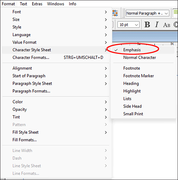
But if you assign another style sheet from the auxiliaries document to a text (e.g., select text passage «Format ➝ Character Style Sheet ➝ Highlight»), this style sheet immediately appears in the Inventory of the document (see Fig. 1.24). At the same time, it is displayed in the pop-up menu above instead of below the line (see Fig. 1.25). Note that inheritance dominates in this style sheet adoption. So suppose that different fonts are assigned to the Normal Character style sheet under «RagTime 6 Auxiliaries» and the Normal Character style sheet in your current document, then the adoption of the «Highlight» style sheet will not display the selected text passage with the “Normal Character” in Auxiliaries, but with the «Normal Character» of the current document. Therefore, it is so important to define the inheritance dependencies correctly.
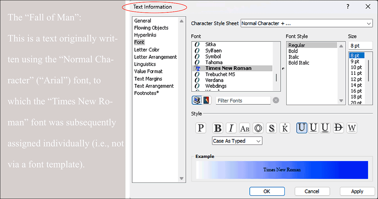
Have you once been unfaithful to the iron principle and formatted text directly, without a style sheet? The temptation is of course great, although it is quick and easy with the formatting palette – or also with the «Text Information» (see Fig. 1.26).
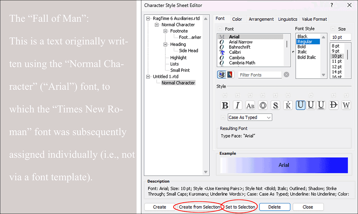
But RagTime 7 forgives your sin! You can easily transfer the individual font formatting afterwards into a “proper” character style sheet: Select the text passage by overwriting or multiple click, or click somewhere in the individually formatted text. Then open the settings window for character style sheets (e.g., with «Windows ➝ Auxiliaries ➝ Character Style Sheet Editor»). With the button «Set to Selection», you adopt the made settings as a change of the style sheet assigned to the selected text passage (see Fig. 1.27).
If this is not desired, create a new style sheet with «Create from Selection». Now you only need to properly integrate it into your style sheet hierarchy, set the inheritance dependencies correctly, give the new style sheet a name, and everything is in good order again. If you had not previously selected the entire individually formatted text passage, you must do so afterwards and assign the new character style sheet to it.
All settings are linked to the relevant style sheet in the future. You can drag the style sheet from the Inventory onto a word in your layout and it is already assigned to it. This “font package” is automatically copied when you copy the text component and insert it elsewhere – the same applies when adopting any other component in which the relevant character style sheet is used.
Be careful when copying texts between documents with different definitions of parent character style sheets! It is worth briefly checking the style sheets transferred to the new document. Experiment with transferring objects and the automatic adoption of style sheets with inheritance (at the moment preferably not with character style sheets due to the mentioned problem).
The cause of this impression is often individually set font features deviating from the character style sheet. If you have a text in the layout that should be set in a different font, you can also move over it with the mouse and click on the «i» in the RagTime toolbar. A «Text Information» panel pops up (Fig. Fig. 1.26), which is confusingly similar to the «Character Style Sheet» panel.
What you change in the «Text Information», however, is saved for the selected text as a deviation from the character style sheet. When changing the character style sheet, such separately determined font characteristics remain. This often leads to misunderstandings. Therefore, once again: Preferably always use character style sheets.
1.4.6 Tips for font formatting
● Create a style sheet for every font formatting you use. ● Character style sheets can also be used for graphic text as well as for texts in spreadsheets, graphs, buttons, and drawings. ● Character style sheets can be hierarchically structured and put into inheritance dependencies, e.g., subtitles from titles, or italic from the normal character. ● Character style sheets are, like all other style sheets “packages”, that can be transported: By dragging from the Inventory onto a word, by copy-paste, or by drag-drop from one Inventory to another. ● When copy-pasting a component that contains a character style sheet, the style sheet is automatically copied. ● In case of display problems of the font, always check first in the style sheets: is the checkmark for printing set in «Color»? Is the hyphenation automatic and if so with good specifications for shortest syllables and words)? Is the correct dictionary selected in «Linguistics» – and are the dictionaries also present? ● If you want to use different heading levels with their own font features, then define hierarchically subordinate style sheets «Heading 2» etc. in advance. ● Character style sheets always apply only to the current document. Even if style sheets have the same name in several documents, or were even adopted by copying from a first one – changes always affect only the style sheet of the current document.
1.5 Paragraph style sheets
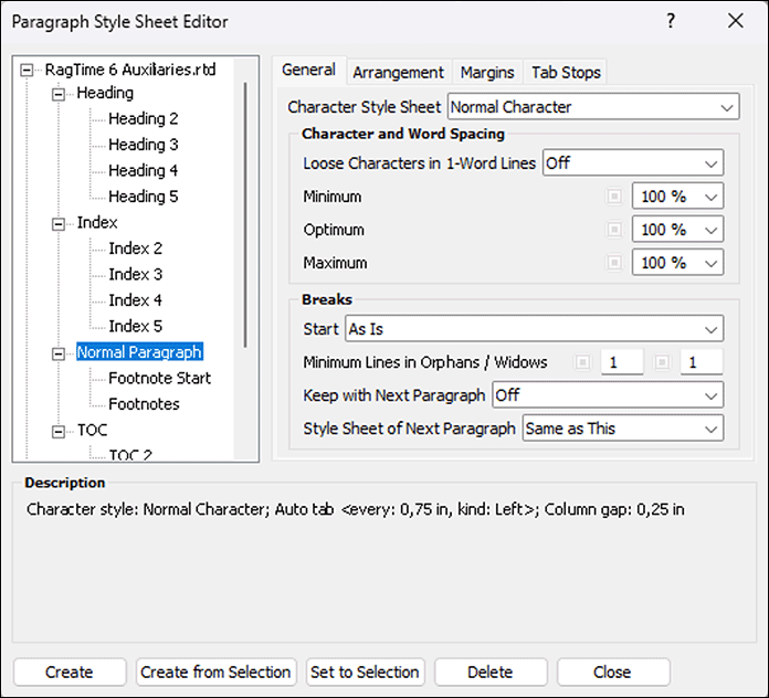
The paragraph style sheets include all settings that influence the appearance of the entire text (beyond the typeface). So properties such as justified or ragged right, indents, tabs, line spacings, baseline grid, etc. The «Paragraph Style Sheets» panel (Fig. Fig. 1.28) shows under «General» the predefined style sheets in RagTime («Auxiliaries») as well as the standard style sheet for the document («Untitled»).
1.5.1 Paragraphs can also inherit
In Fig. 1.28, you can see that also with the paragraph style sheets, exactly like with the character style sheets, inheritance hierarchies can be used. Each feature can be inherited from the parent style sheet and therefore moves with it when the relevant feature is changed there. The families predefined in the auxiliaries for headings, table of contents, and index are typical examples: Within these families, e.g., a uniform font is used in different sizes, different indents, differentiated distances to preceding and following paragraphs, etc.
The second setting option in the «General» panel refers to justified text in narrow columns. If a single word is in a line – so a word space that could be expanded is missing – then this word stays left and the right margin rags – unless the word is set expanded. To force a bilaterally closed block in justified text, the word spaces are enlarged or reduced. The three percentage specifications determine how large this change may be. By reducing the spaces (minimum), a word may still fit on a line. Thanks to reduction or enlargement (maximum), a hyphenation may possibly be avoided.
With «Optimum», the initial size of the spaces is generally determined, i.e., even before the optimization by enlargement or reduction is attempted. «Maximum» applies only to the optimization. Of course, even larger word spaces can occur if a text simply cannot be broken due to too long syllables. The wider the columns, the smaller the problem! The specifications for the word spaces are only considered in justified text.
1.5.2 Widows/orphans
Special attention should be paid to the specifications for «Breaks». When reading, we take the achieved break for granted. In typesetting, the necessary specifications must be made so that, e.g., a title does not end up at the bottom of a page.
The first setting option is called «Start» and determines where a paragraph with this style sheet should be placed. This is very useful especially for title lines that should be at the top in a column or on a page. Because with «Start», you can, for example, specify that the paragraph with this style sheet always starts on an odd page at the very top, no matter what changes are made to the preceding text.
Not very common is the term «Minimum Lines in Orphans/Widows». These terms derive from the typesetter's language of early book printing and refer to an unsightly line flow at column or page breaks. «Widows» designates the last line of a paragraph that stands alone at the top of a new page or in a new column. Here you should definitely enter a «2» or even a «3». That means, only from two, or three lines may these be broken to the next page. Otherwise, also – depending on the specification – one or two of the preceding lines are placed as the last on the new page. In practice, this leads to confusing and somewhat unusual “text maneuvers” when writing: RagTime shows lines double or inserts seemingly blank lines or huge word spaces. But this corrects itself again.
The opposite are «Orphans»: Here it is the first line of a new paragraph that stands as a single line at the bottom in the column or on the page. From a typographical standpoint, this is a “cardinal sin”. So at least a 2 belongs in the input field. If these two lines no longer fit, the whole paragraph is placed in the new column or on the new page.
1.5.3 Connect paragraphs
Here you can also prevent paragraphs that logically belong together from being torn apart at page or column breaks. So for all heading paragraph style sheets, the specification «Keep with Next Paragraph» must be turned on so that a title does not stand alone at the bottom of a page. In normal flowing text, this is not desired – therefore, with the «Normal Paragraph», «Off» is here. When writing, it is pleasant if you can continue writing immediately after a title without having to worry about returning to the standard paragraph style sheet. You can achieve this by selecting the «Normal Paragraph» style sheet for the next paragraph in the heading style sheets. When using a heading hierarchy, however, with the «Heading 1» style sheet, «Heading 2» as style sheet for the next paragraph can also be the right specification.
The templates used for this book serve as an example. The title «Connect paragraphs» used above this paragraph has a paragraph style sheet «Heading 2» and is directly connected to the following paragraph style sheet «Normal Paragraph». When writing the text, we could therefore continue writing immediately after assigning the paragraph style sheet «Heading 2» and the line break with the key </T. RagTime then automatically jumps to «Normal Paragraph». Thus, title and text will always be in the same column or on the same page.
The first four options for «Alignment» in the «Arrangement» panel need no explanation. «Full Justified» leads to the final line of the paragraph being “forced” to the block margin on the right. This is done by enlarging the word spaces until this is fulfilled. If only a few words are on the last line, this will hardly look good. This arrangement therefore certainly only comes into play in exceptional cases and finds little use in style sheets.
The last two options «Text Left/Numbers Right» and «Align Decimals» cannot be used for text formatting, but only for spreadsheet cells.
We strongly advise against using the «Columns» option in the paragraph style sheets. All settings you have chosen for the paragraph break (paragraph start, keeping paragraphs together, preventing widow-/orphan lines, etc.) are ignored with this option at column breaks. Wherever you need multi-column text, design it with text containers that you connect via pipelines. More on this in Chapter 3.2 “Layouts and master layouts”.
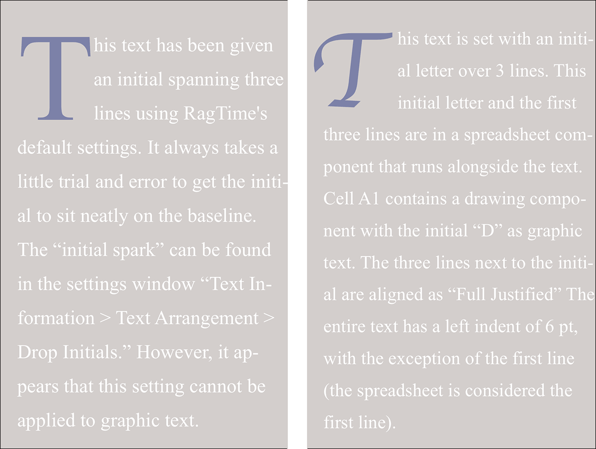
In some texts, especially in fiction, initials (initial letters several lines high) can be very appealing. The handling of initials in the paragraph formats of RagTime 7 is not exactly the best. It takes a few quiet minutes to achieve a satisfactory result. Depending on the font, aligning to the baseline and to the left text axis is quite tricky. Also, the initial cannot be formatted separately in the paragraph style sheet, this must be done manually each time. The initial example created on the left in Fig. 1.29 is nevertheless created with the “on-board” means of RagTime, the one on the right consists of a flowing spreadsheet frame (with the initial in A1 and the first three lines in A2. Paragraph style sheet: First line (corresponding to the spreadsheet frame) without indent, remaining lines with indent.
1.5.4 Margins and line spacings
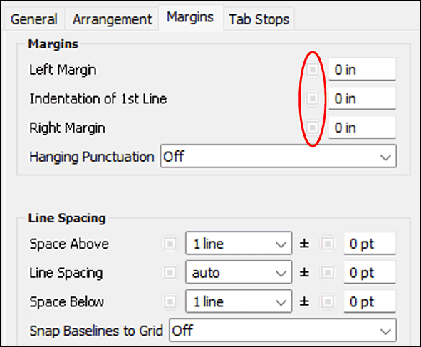
The next setting options of the «Paragraph Style Sheets» are found in the «Margins» panel. Under «Margins», distances to the text container are to be defined; usually these will be indents desired for certain paragraphs. The «Indentation of 1st Line» is to be understood absolutely, not relative to the left margin. A style sheet for bullet points can, for example, have an indent 0 for the first line and 1 cm for the left margin. In the first line, there is then implicitly a tab position at the left margin. However, this is invisible in the text ruler – it is not displayed.
A borrowing from typography is the function «Hanging Punctuation». With certain fonts, punctuation can create unsightly gaps at the beginning and end of lines. If the optical margin alignment is «On», this causes all punctuation, quotation marks, and hyphenation marks to protrude slightly beyond the container edge. We have used this function in this book. If you look closely, or place a ruler on the text edges, you can verify it. Under «Line Spacing», you set the distance between the lines and the paragraphs, either in number of lines or as an absolute measure. Preset is «Space Above = 1», «Line Spacing = Auto», «Space Below = 1» (see Fig. 1.30).
But how is the automatic spacing defined? A short excursion into typography. In a text set without additional interline space (“leading”), the chosen font size determines the line spacing. For a 12-point font, this is thus 12 points, measured from baseline to baseline. The baseline is the lower edge of all letters that have no descender. For a 12-point font, this is approximately 0.42 cm. «Auto» is thus identical to «1 line». But not quite …
With RagTime, the automatic line spacing is calculated according to the largest object in a line. And since in a text with RagTime flowing containers are possible, the automatic line spacing is possibly not based on the font size, but on the flowing container. Also super- or subscripted symbols influence the automatic. Both can lead to very unwanted representations. But the topic of flowing containers is discussed in more detail in Chapter 3.8 “Flowing elements”.
The entry in the fields can be made directly, by entering e.g., «12 pt» or «0.5 cm» in «Line Spacing» or choosing with the pop-up menus: e.g., «Single Spaced», «Double Spaced», etc. To the right of them are further input fields. With them, you can proceed very typographically and enter the size of the font degree (e.g., «12 pt») on the left and «4 pt» (negative values are also allowed) on the right. So you have the font degree plus the actual leading of 4 pt. Measured from baseline to baseline, this results in a distance of total 16 pt. The combination of font size, leading, and column width results in your typesetting in the layout.
1.5.5 The fixed baseline
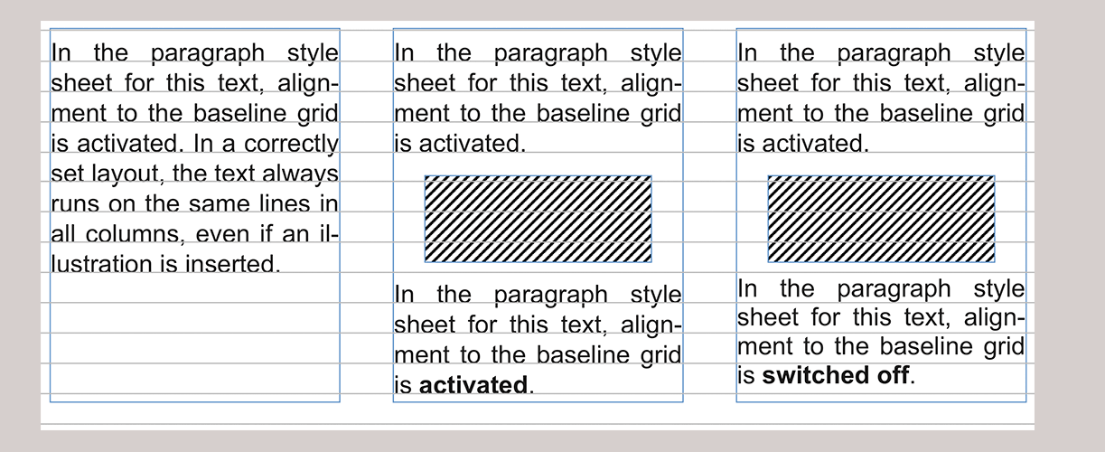
It is always useful to activate the «Snap Baseline to Grid» option when you are using multiple columns side by side and want to ensure that the lines in all columns are exactly at the same height even after inserted illustrations. In the present book, as in almost all normally set books, this is the case (the printer or typographer speaks of “keeping register”).
However, certain problems can be associated with this. Namely, when the already entered line spacing is larger than the baseline grid. It is absolutely recommended to set the baseline grid larger than the line spacing. The baseline grid is “magnetic” and has priority for RagTime over the entered line grid. If RagTime cannot clearly assign the distances, the baseline grid decides. This can mean that suddenly a grid is skipped and an unwanted double line spacing arises.
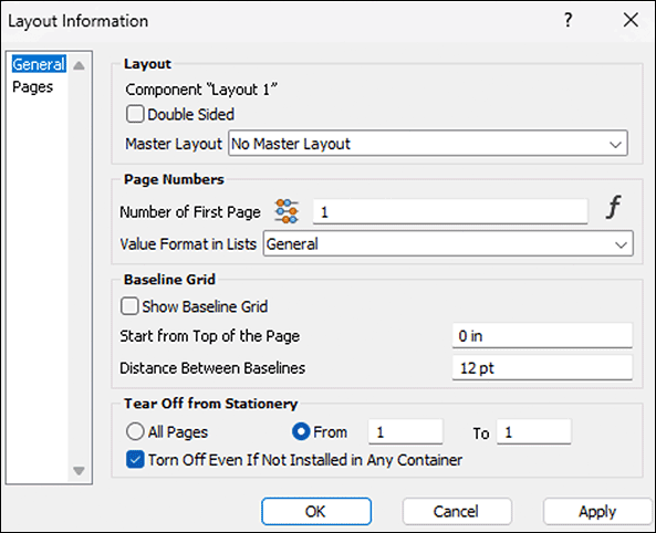
A short excursion into the application: Fig. 1.31 shows the «Layout Information» panel. You call this up most easily by double-clicking on the page tab of a layout page. On the panel, under «Baseline Grid», three options are available. On the one hand, the checkmark to display the baseline grid in the layout. When setting up a layout, this is definitely useful. During the subsequent work, it is rather disturbing to have all layout pages full of lines. If you want to turn the display of the baselines on and off frequently, leave the formatting palette open and click on the icon  in the “Text” section. Since the baseline grid is also closely related to the desired page design, it is also to be defined where it should start.
1.5.6 Jump with tabs
The next setting option on the «Paragraph Style Sheets» panel is for tabs. Basically it's quite straightforward: values can be entered where a certain tab should be. Little known, but very practical, is the possibility to enter a negative value for a right tab, which specifies the distance from the right text edge. The tab key @/@ then causes the cursor to indent to the corresponding position when writing. How the text behaves there depends on the chosen type of tab. Note the icons in the RagTime toolbar  . The first tab in each paragraph style sheet cannot be deleted.
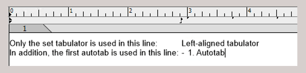
It determines the distance of the “automatic tabs”, which always apply to the right of the last set tab until the end of the line. If the tab markers in the text ruler disturb you (see Fig. 1.33), enter the value «-0.01 cm» for this first tab. Then all predefined tab jumps disappear. However, we find it quite practical if a tab can also simply be used to neatly align text in two consecutive lines under each other without having to define a new style sheet immediately, and the text mark does not jump to the end of the line with the tab. But you can also insert tabs manually afterwards. However, your paragraph style sheet is bypassed and you have a «+» at the end in the name of the paragraph style sheet, which simply means that the paragraph style sheet was manually bypassed in some way.
In the second column of the table with the tabs, you also see whether these are inherited from another paragraph style sheet. Here too, stands for «Not Inherited» and for «Inherited». Paragraph style sheets of the top hierarchy level can inherit tabs just as little as all other features. Therefore, such a symbol is missing for these (compare Fig. 1.30).
A less known tab formatting is «Kintou Waritsuke». That is the Japanese name for «Justified Tab Stop». But this is also in need of explanation for most users. Simplified, it enables switching back and forth between ragged and justified in a left-aligned text without assigning a new paragraph format. For example, by aligning one or more lines to the entire column in the middle of ragged text.
This can be useful with flowing image containers, or with very special typographical gimmicks. In one example, these are symbols, in the other these are capitals, to which a justified function is applied (see Fig. 1.34). The trick is simple: A left tab is set all the way to the left in the column and the justified tab all the way to the right (or where you want it).
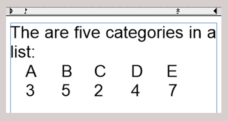
The tab key is pressed twice at the beginning of the line. Between all elements that should be aligned to block (in our case the symbols in flowing image containers or the capitals), the space bar must be used. If the entry on a line is completed, switch to the next with tab. Just try it. Then you will remember it when you encounter a sensible application later.
1.5.7 Tips for paragraph formatting
● If you want to provide the headings of a document also directly for the table of contents, then use in the «Inventory ➝ Auxiliaries ➝ Paragraph Style Sheets ➝ Heading». Attention: RagTime refers exclusively to this formatting when automatically creating the table of contents («Extras ➝ Generate Table of Contents…»). You may neither change the name – the formattings of course yes – nor does it help to give self-created style sheets this name, with the intention of including titles provided with it in the table of contents. For a heading hierarchy, select «Create» and a inherited formatting with the name «Heading 2» is created. You can continue this arbitrarily. ● For flowing image elements, always set the line spacing to «Automatic» and insert the additional distance in the adjacent input field «+/-». This way, you are sure that the flowing elements do not create an unmanageable mess with the font. ● Stay disciplined also when entering tabs. If you define your tabs in the paragraph style sheets, you keep the overview later. And actually no question: By no means direct the text to the desired position with spaces, always use the tab switch. ● All the way to the right in the entry of the tabs, you find three dots. Here you can determine which fill characters you want to use to achieve a “reading guide”. The most common application for this is in tables of contents with a dot as fill character. ● Create a style sheet retrospectively for individual paragraph formattings: if you have nevertheless changed settings directly in the text, mark the text, open the paragraph style sheets, click on a meaningful superordinate, existing style sheet and then click the button «Create from Selection» at the bottom of the panel. Check the formattings labeled with «[inherited]» in the settings. ● The easiest way to create formattings is to copy them from another document (by copying a component or a text paragraph or with drag and drop from one Inventory to another. ● When importing Word documents, the character and paragraph style sheets are adopted with the names they had in the Word document (provided the corresponding option was selected during import). ● Attention with imports: if the names of the style sheets are the same as those in your own document, there can be confusing duplications. You can create the same problem yourself if you use the same names in different hierarchy levels.
1.6 Color style sheets
Here you can predefine all colors you need for your document. Colors as style sheets can get into the Inventory in different ways: First, it is possible, as with other «Auxiliaries» style sheets, to drag already named colors from other documents/Inventories over. Second, every RagTime or EPS object that is copied into the Inventory is “examined” for its colors. So if you import an EPS file, for example, its colors are listed under «Auxiliaries ➝ Colors». This way, color standards like PANTONE, HKS, or RAL can suddenly appear here, although no such color standards can be selected directly in RagTime.
1.6.1 Preset colors
To define colors in RagTime 7, with open Inventory, it is easiest to double-click the «Colors» icon. Then the auxiliaries window «Colors» pops up (see Fig. 1.35), in which you can make the settings.
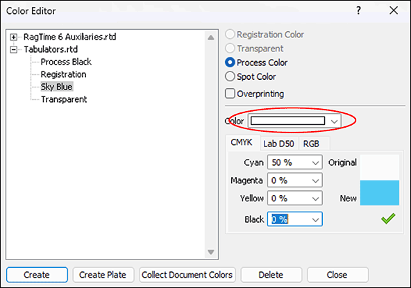
Each color is to be defined as «Spot Color» or «Process Color». The difference is only important for documents that are to be printed professionally. «Spot Colors» are mixed according to predetermined color samples and printed separately. This in contrast to four-color printing, where all other colors are represented in the combined print from the standard colors Cyan, Magenta, Yellow, and Black. In connection with «Process Color», the color space «CMYK» is to be chosen (see Fig. 1.35). Especially with «Spot Color», the selection button of «Overprinting» is significant. Depending on the setting, objects lying behind a spot color are either knocked out in printing, in technical terms «knocked out», or printed and then overprinted with the spot color. The topic of colors is described in detail in Chapter 3.13 “Prepare “Ready for printing””.
With a click on the «Create» button, RagTime generates a new color, which is initially named «White». Under the «Color» pop-up menu (marked red in Fig. 1.35), you get to the RagTime color palette, which you can also tear off under «Format ➝ Color». In the pop-up menu, however, the colors are arranged a bit more clearly. As soon as you have selected a color from the palette with a mouse click, the rectangle shown at the top in the panel takes on this color. In the name list on the left, the designation changes from «White» to the mixing ratio of the primary colors, depending on the chosen color space. Replace this “recipe” with a meaningful name. For this book, we have defined a color «Formula Background», for example.
In non-professional printing, i.e., with your inkjet or laser color printer, the colors usually deviate quite strongly from the screen display. Here only trying helps. For creating documents that are to be printed professionally, you need a calibrated, i.e., set to exact color temperatures screen. Otherwise, the colors you see on the screen may deviate strongly from those you get as a result of a four-color print.
1.6.2 Individually mixed colors
The whole area of mixed colors and percentage values in the different color spaces requires, at least when it comes to professional printing, a basic knowledge of printing techniques and color management. See Chapter 3.13 “Prepare “Ready for printing”” for this.
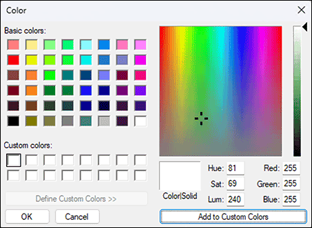
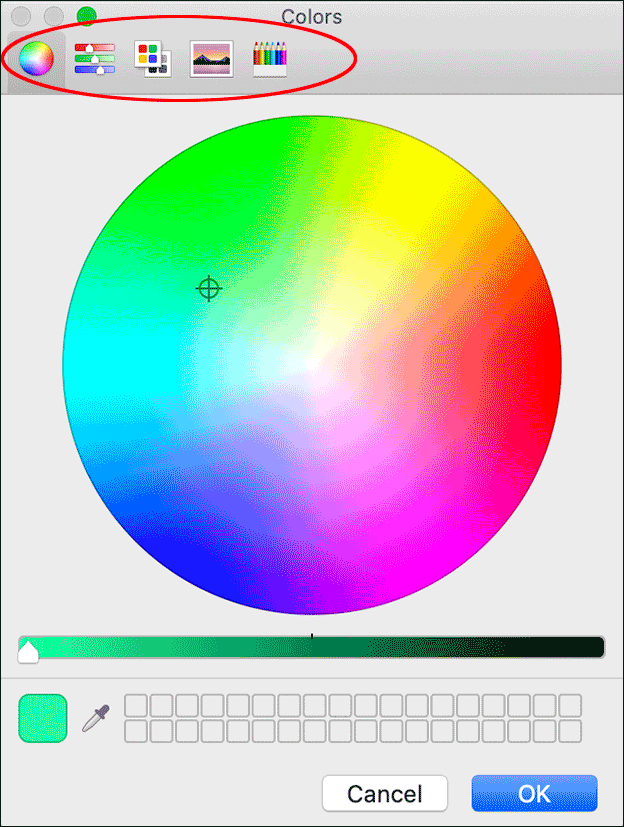
Can't find the desired color in the RagTime color palette? Then mix! There are different approaches for this. Start from a similar color that you have selected in the palette. Change the percentage values of the primary colors of the active color space until the color in the lower half of the sample rectangle («New») corresponds to your ideas. For the values to be adopted in the style sheet, you must confirm the setting with a click on the green √. Instead of changing the percentage values numerically, you can also use the tool offered to you after choosing «Other…» in the color palette in a separate window (Fig. 1.36 for Windows, or Fig. 1.37 for Mac).
On the Mac, you can select between several such tools directly in a toolbar or adopt the color of any point in the layout, also in an image, with the magnifying glass. Depending on the chosen tool, further options are available.
For our introduction to the Inventory and the topic of order, the option «Collect Document Colors» is to be mentioned specifically. This lists all colors that have been assigned to the various components of a document during work, with their “recipe” in the style sheet list, where they can be given meaningful names. Once deleted “recipes” in the style sheet window cannot be reactivated. For frequently used colors, it is best to create a “color archive”.
In an “archive document”, you can store all colors you frequently need. This way, you always have access to your personal color samples. Whenever you copy a component to which a color style sheet is assigned into another document, the corresponding color appears in its Inventory. With EPS files, the corresponding HKS, RAL, or PANTONE colors are also inserted here.
When deleting color style sheets in the Inventory, it is noticeable that – in contrast to other style sheets – no warning message appears. The delete key >/> is therefore to be used with caution. Only with the pre-installed color style sheets of RagTime is there an error message. These RagTime primary colors, i.e., «Registration», «Transparent», and the four process colors, cannot be deleted at all.
1.7 Colors for the second: fills
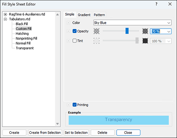
It almost seems as if “double sewn” here. Fill style sheets often only adopt a just defined color. But since only fill style sheets and no color style sheets can be called in individual formattings, this “detour” is necessary. For fills, however, the transparency (called «Opacity» in RagTime) and the «Tint» (brightness) can additionally be preset, in steps of 10% with the pop-up menu, finer with the slider or numerically. At the bottom, you can also set whether areas with this fill style sheet should be printed at all or not. Nonprinting fills are used for comments and their backgrounds that are only of interest on the screen, but not in print.
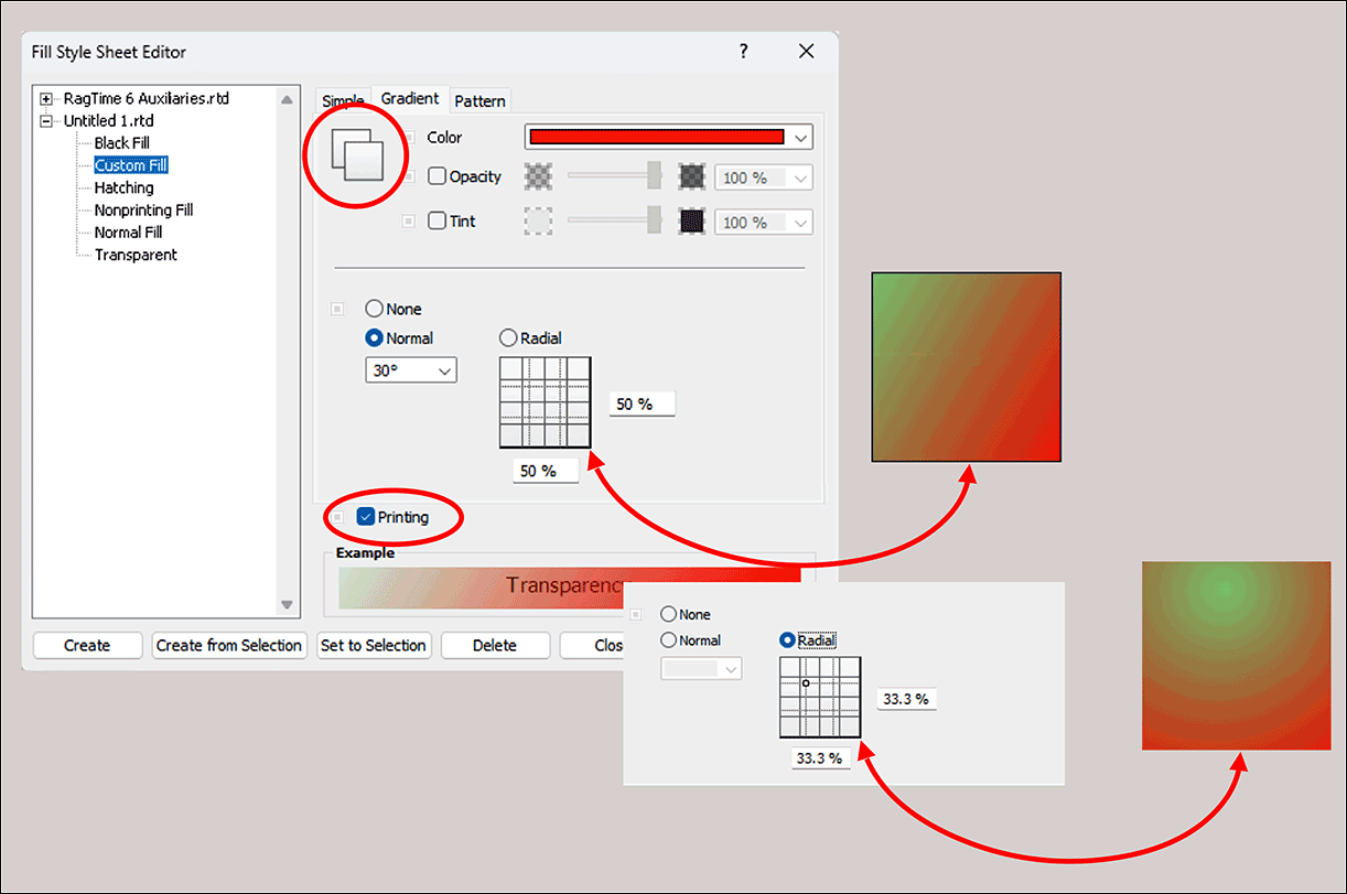
In addition to simple fills, those with two colors can also be defined. For the fill types «Gradient» and «Pattern», the background color is to be specified additionally in each case. The setting for foreground and background color is done with the same means as with the simple fill. The switching between the settings for the two colors is done by clicking on the overlapping squares at the top left.
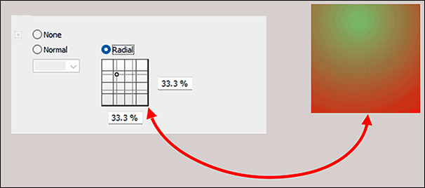
Gradients can be arranged linearly («Normal») or «Radial». For linear gradient, the angle of the gradient direction can be specified. At 0°, the color runs from left (foreground) to right (background). The specified angle gives the rotation clockwise (see Fig. 1.39) For radial gradient, the position of the center (foreground) within the filled area can be specified in percentages of the object dimensions (see Fig. 1.40). In the «Pattern» category, one of the predefined standard patterns can be selected. In the square on the right – or on the command «Other…» in a separate window – you can change the pattern, pixel by pixel. However, the repetition rate cannot be changed. The pattern is limited to the area of the square. Pattern and gradient cannot be combined.
Which fill style sheet all newly created frames should have, you can change very easily: Click on an empty spot in your layout (i.e., without selecting an object) and select a fill style sheet. If you determine «Transparent» in this way, for example, all frames drawn later in the open document will automatically appear with transparent fill style sheet.
1.8 Line style sheets
The most important specification for lines is certainly the width. Use a minimum width of 0.5 pt for lines to be printed. Even narrower lines may remain invisible in print. In professional printing, you can go finer depending on the color (brightness). A prior consultation with the printer is sensible here.
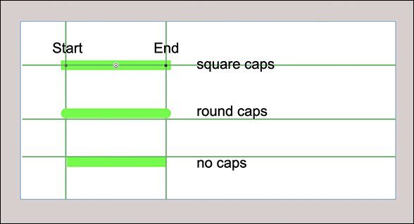
What immediately stands out: to preset the color of a line, a fill style sheet must be selected. In contrast to lines in drawings or in the layout, a color or color style sheet cannot be assigned directly. This forces you to adhere to the discipline and systematically define first a color style sheet, based on it a fill style sheet, and finally a line style sheet. The position of the line is not only relevant for the border of objects, as one would actually assume, but places the entire line width also for simple lines left or right of the line axis. – With «No Caps», a line reaches exactly from the beginning to the end of the line. You read correctly: Lines have a beginning and an end. This is not only important for assigning arrowheads, but also for specifying the coordinates. With «Round Caps» or «Square Caps», lines extend by half the line width beyond the endpoints (see Fig. 1.41).
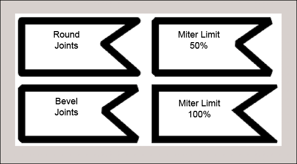
The joints are important for polygons and all frames. «Beveled» and «Rounded» correspond to expectations. With «Sharp Joints» and a «Miter Limit» of 100% – this is the default – the corners are sharp. If you have special wishes, experiment with the percentage specification for the «Miter Limit» of a very wide line, e.g., 30 pt (see Fig. 1.42). This way, the effect of a certain specification is most recognizable.
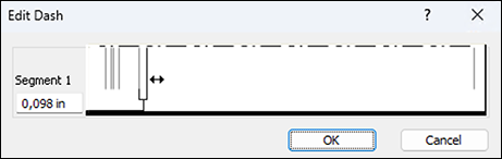
Finally, a specification for the «Dashes» can also be made. Select one of the specifications or «Other…». This opens a window in which the last selected dashing is preset. With each vertical line, the length of a segment can be set, with the even ones the beginning and with the odd ones the end of a dash. With the vertical line all the way to the right, you can create additional segments by dragging them to the left (see Fig. 1.43). Here too, the result must be “tested”.
1.9 “Unit style sheets”
Look at the style sheets for units in the auxiliaries. Do you make sense of them? We also had no overview at the beginning! Nevertheless, useful conclusions can be drawn from them. This is easiest with an example:
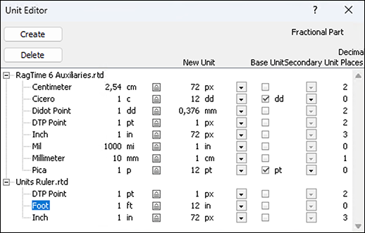
We would like to create a plan sketch in scale 1:50 so that all dimensions can be specified and read in meters. For this, a new unit must be defined. Let's call it “Meters 1:50”. Logically, the following entry seems, building on the already existing units: «1 m» for the «New Unit», corresponding to a «Base Unit» of «2 cm», precisely 1:50. A subunit is not needed. So that really precise entries, also under 1 cm real, are possible, 3 decimal places are needed for the fractional part (see Fig. 1.44).
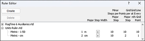
1.10 Ruler style sheets
Based on this unit, a ruler can also be defined. Let's call the new ruler «Metric – 1:50» (see Fig. 1.45). The «Major Step Width» is of course «1 m». This specification determines the numbers displayed in the layout ruler and all coordinate specifications. The specification for «Minor Steps per Major Step» concerns the number of small ticks displayed between the whole units in the layout ruler. However, this number can also be less than the specification depending on the display scale. Depending on how precisely you want to draw, you should make the specification for the number of grid points. In our example, with the specification «10», a grid point will come every 10 cm, i.e., every 2 mm in the plan at a display scale of 100%. If you specify more grid points, positioning becomes tricky because it requires too much accuracy. Unless you choose a larger display scale when drawing.
The last specification, «Grid Line at Every nth Grid Point», is only relevant if you want to display the grid. Do not choose this line grid too tight, otherwise you won't see the forest for the trees, or the drawing for all the grid lines! With the specification of 10 grid points per major division and a grid line every 10 grid points, you will thus get a grid line network of 1 m real, or 2 cm in the plan. When drawing with displayed grid, it may be sensible to increase the width of the standard lines and only set it correctly afterwards. This way, the drawing distinguishes better from the line network of the grid.
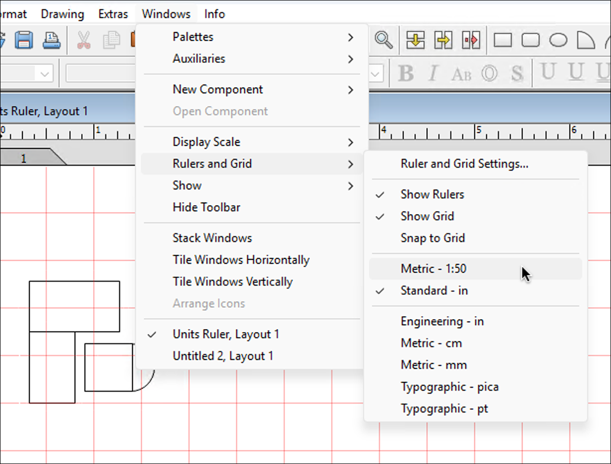
Here a short jump to drawing work with the specifications as explained above, i.e., in scale 1:50. For these specifications to take effect, you must turn on the visibility of rulers and grid in the document under «Windows ➝ Rulers and Grid» and also activate «Snap to Grid». Of course, the just defined ruler must be selected. If you had the object coordinates palette open, you must close it and reopen it so that the correct unit is displayed there. Attention: if you select the item «Ruler and Grid Settings…» all the way at the top in the pop-up menu, a new window opens. In this, you can – even separately for horizontal and vertical – select from the defined rulers as well as activate the visibility and magnetism for the two axes separately. Somewhat unclear in purpose, because not provided with a title, are the dimension specifications in the two input fields at the very bottom. They determine a shift of the grid origin (origin) from the page or drawing edge.
Prepared in this way, you will see a grid network with 2 cm “mesh size” (real 1 m) on your plan (Fig. 1.46). When drawing, all objects will snap to 2 mm positions (real 10 cm). This eliminates the need to align the objects.
1.11 Valuable RagTime
Numbers are stored in spreadsheet cells and as calculated texts in absolute form, which requires the assignment of a value format to be correctly interpreted and displayed.
RagTime offers a whole collection of predefined value formats. Without assignment of such, a number is interpreted with the value format «General», which, however, in many cases results in the desired display. How a format definition exactly affects is displayed in the value format window above under «Example». The field at the top left is always empty. The next three fields show positive and negative numbers with a different number of decimal places. Below in the middle, a time point and on the right a time duration is displayed. If a value format is selected in the list, it becomes apparent with these examples how it affects.
The format «General» is automatically adopted in every new document. All other value formats present in the auxiliaries document are also always available and are listed in the edited document as soon as used. There they can also be changed.
Inspect the predefined value formats and adjust them if necessary already in the auxiliaries, so that they correspond to your ideas in all new documents in the future. So you could preferably display percentage values with 2 decimal places, or replace the weekday with a place name in the value format «Long Date».
1.12 Your own value portfolio
Missing a format in the list? Then define it! You will be amazed at what can be done. Suitable value formats can even make formulas superfluous.
A few things you must know, however. The format names in the left column have no influence on the display. It does not disturb, for example, that the format «1,234.50» is called, although in Switzerland an apostrophe is common as thousands separator, and a point as decimal separator. Decisive is solely the format definition in the right column. For the insertion of «Number Specifiers» like decimal or thousands separator, a pop-up menu is available. Do not be misled by the fact that precisely these two separators are not specified there as corresponds to your ideas. Perhaps you have decided strictly according to Duden for the thousands separator, i.e., neither point nor apostrophe, but – in the entire German-speaking area – a space. No fear – that can be done!
However, some things seem a bit confusing. Prerequisite is that the two separators are preset in the system settings of your operating system as you want them. RagTime adopts these specifications on first start. If you now want to insert a thousands separator in a format definition, select the corresponding «Number Specifier» from the pop-up menu, i.e., a point. In the German version of RagTime, the inserted character is also displayed as a point, in the Swiss version, however, as an apostrophe. After completing the format definition, however, this thousands separator is replaced by the desired space. And so it is then in all numbers with this value format. Everything clear so far?
Also for «Date and Time Specifiers», a pop-up menu with diverse possibilities is available. When entering for a value format, never forget to complete the entry of the name or the format specification so that the input field is no longer framed. Otherwise, your new value format is called «Untitled» again after closing the window.
Value formats can contain multiple specifications that are applied depending on the value of the number to be displayed. An example is the format «Dollar [Red]». The first format specification concerns positive numbers, the second negative. Another would apply to the value 0. But you can go much further and define the conditions yourself under which a format specification should be applied. You do this in square brackets prefixed to the format specification. The conditions are checked from left to right for match and the first format with fulfilled condition is applied. The last specification must be unconditional so that a applicable format specification is always available. So you could specify a format according to Formula 1.1 with appropriately defined fill style sheets «Normal», «High», «Warning», «Alarm».
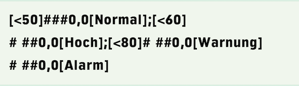
A value provided with this format would then be displayed green, orange, light red, or deep red depending on height and according to the specification for the color in the fill style sheets, without you having to write a formula for it or needing the «Power Functions» extension. However, if the limit values should be variable, the task is no longer solvable with a format specification. Then use the function «MPFApplyFormat», one of the Power Functions.
1.13 Uniform style sheets
In workgroups, it is usually practical if the same settings and style sheets are used at all workstations and by all employees. This is not so difficult at all. Settings and format style sheets are distributed over two files: In «RagTime 6 Auxiliaries», everything is contained that can be specified differently per document, especially all style sheets explained in the previous sections. In «RagTime Preferences.xml», the program-specific specifications and also the activation codes for purchased extensions are located. These two files are normally stored on Windows computers under: «C:\User\AppData\Roaming\RagTime» and on Macs under: «User ➝ Library ➝ Preferences ➝ RagTime».
Replace «<User>» with the name of the respective user. If different people work on the same computer, the files are to be stored with all users. NB: Under Windows, the «AppData» folder is only visible if hidden folders and files are displayed in the Explorer.
Forms no longer need to be stored in a special folder provided for this, as in earlier RagTime versions, to be able to access them directly. The storage location of the stationery has no meaning anymore, since stationery can be included in Foyer panels, no matter where they are located.
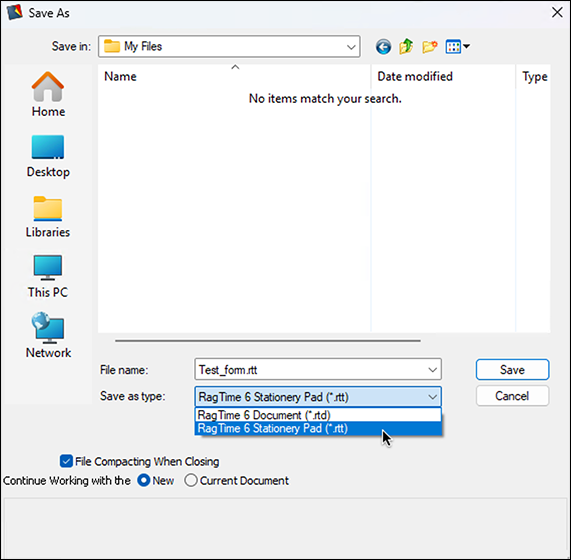
In a group, preferably all should use the same stationery pads. So in this case, the stationery pads are placed on a server anyway. In Mac networks, special attention must be paid. On the one hand, the stationery pads must absolutely be saved in RagTime as stationery. So the corresponding checkbox in the save dialog is to be marked. RagTime stationery pads thus automatically receive the «rtt» extension.
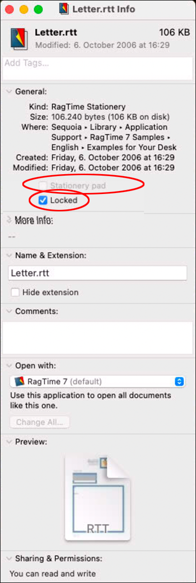
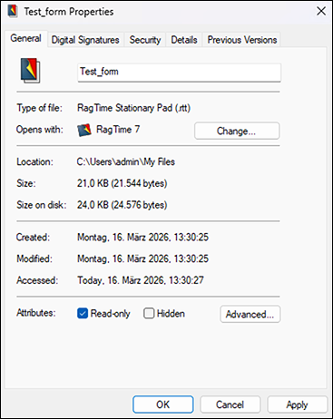
macOS also offers the possibility in the file information (see Fig. 1.47) to designate a document as stationery. This must by no means be used! On the other hand, the document must be protected. Attention: if the stationery pad references another RagTime document, this must also be on the server and protected in the same way. Only then all users connected to the network access can access the form without conflicting with each other. But also in networks with Windows computers, the principle is to be observed that forms must be saved in RagTime as stationery and the pads must be protected on the server (see Fig. 1.48 and Fig. 1.49).
1.14 Formatting as you like
In RagTime, there is a practical formatting palette that makes the most used formatting and display options very directly accessible. This has little to do with the main topic of this chapter, order. Nevertheless, we want to take a quick look at the formatting palette here. First, it is new, and second, it is related to many of the aspects discussed in this chapter.
The palette thus offers a significant simplification in handling the program. However, with a significant restriction: The palette is – if all its sections are expanded – relatively large and thus occupies (too) much space on the screen. To dock and open it again and again would contradict the intention of facilitating operation. The palette consists of several sections that can be simply expanded and collapsed by clicking on their header bar. This way, the space requirement of the palette can be significantly reduced under circumstances if it is only about a few commands that are often needed. Let's simply look at the individual sections.
At the top in this section (see Fig. 1.50), there are the pop-up menus for the font, its cut, size, and color. Below, various style features can be turned on and off. Interesting here is that the rarely used styles «Small Caps, Outlined, Shadow, Kuromaru, Underline Words» are missing, and instead switches for the otherwise only laboriously accessible possibilities for vertical positioning (normal position, superscript, subscript) are available.
The setting options for leading and alignment are fully present. At the bottom left, there is a trigger button each for spell checking and inserting symbols as well as a pop-up menu for special texts. With the switches on the right, the display of baselines, calculated texts, and special characters can be turned on and off.
One reservation must be made. The palette tempts to format text individually, i.e., without corresponding style sheet. We therefore recommend immediately transferring individual text formattings made with the palette with «Create from Selection» into a style sheet. Access to style sheet creation is in the next section.
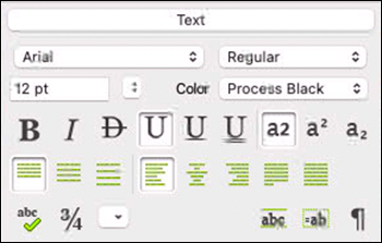
Here (see Fig. 1.51), character and paragraph style sheet can be selected/assigned with pop-up menus. This is a bit more cumbersome than with the separate palettes, where all style sheets are constantly listed and can be selected by clicking. On the other hand, with a click on , you can very easily switch to defining a new style sheet and with a click on to displaying the settings of a style sheet.
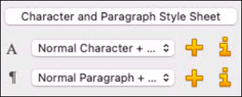
This section (see Fig. 1.52) makes a few important object properties directly accessible: Opacity (transparency), the text wrap, including the associated distances, and printing.
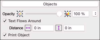
At the top left in this section (see Fig. 1.53), there is a switch for border and fill. Accordingly, opacity and tint as well as a pattern can be assigned. But here too, you can determine whether the chosen should be printed or not. At the bottom, there are setting options for the line: Arrowheads front and back, line width, and dashing.
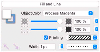
The selection and possibilities in this section (see Fig. 1.54) are analogous to those in the «Character and Paragraph Style Sheets» section.
If the magnifier is selected here (see Fig. 1.55), you can zoom with a click on the document, whereby the clicked spot remains safely in the window. If the key “/6 is pressed simultaneously when clicking on the document, it is reduced instead of enlarged. With the magnifier as pointer, a rectangle can also simply be drawn over a certain spot in the layout. This causes the area specified thereby to be zoomed to the entire window size. The smaller the area you select, the higher the zoom factor. The three buttons next to the magnifier set the display scale to 100%, or fit the page to the window height or width.
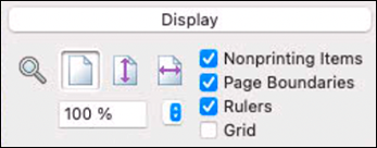
Below, a certain display scale can still be “aimed at” directly. On the right, the display of the listed elements can be turned on and off, this in addition to the possibilities in the «Text» section. Unfortunately, «Pipelines» are missing in this list.
The formatting palette can be very practical with its direct access possibilities. But it takes up considerable space on the screen. Therefore, the possibility should not be overlooked to provide certain commands with keyboard shortcuts. See Chapter “The formatting palette” and Appendix B “Keyboard shortcuts”.
Which commands these are in your case depends on what kind of documents you create with RagTime: Arrowheads front and back, turning visibility of nonprinting elements or the grid on and off, calling the window for inserting symbols, calling spell checking are good examples.
And if you consistently work with style sheets, as we strongly recommend, then the screen space is simply too “expensive” to let it be occupied by the formatting palette for the few simple commands. The command for showing or hiding pipelines, which was forgotten in the formatting palette, you can also make directly accessible with a keyboard shortcut.
The formatting palette seems practical to us especially in the “experimentation stage”, when searching for how a text can be optimally presented. Here, the direct accessibility of all formatting means comes in handy. When you have found this optimum, transfer the formattings into corresponding style sheets and close the palette again.